Showing posts with label tonal. Show all posts

Monday, July 06, 2026

DIY Calibration Chart

 A DIY Calibration Chart for Photographing Your Art (No Expensive Gear Needed)

Ever taken a photo of your artwork only to have it look completely different once it's online? You're not alone. Professional calibration tools from companies like X-Rite or Datacolor Spyder can help fix this, but they're expensive and actually only work on devices you control. The real problem is you have no control over how someone else's screen displays your image.

So, I created a simple chart to tackle the biggest issues that come up when photographing art for the web. It’s a low cost printable calibration chart you can use any time you photograph your art to be shared on-line.

Getting Started

Download the chart (as a .jpg file) and print it at 4 by 6" (10 by15cm) on photo paper. Choose matte or semigloss over glossy to avoid reflections. Any inkjet printer works, or take it to a photo print service like Ted’s, Officeworks or Harvey Norman.

You can use the chart before you shoot, or after, when editing. Fixing lighting issues before you shoot saves time and gives better results overall. Just place the chart on or next to your artwork, under the same lighting conditions.


Why Dynamic Range Matters


Dynamic range describes how much detail a camera captures from shadow to highlight. Your eyes handle huge contrasts easily, from sunlight to starlight, but cameras struggle. That's why bright skies blow out to white or shadows go pitch black in photos.

The chart has grayscale steps down each side, each representing a 2 percent shift in light intensity, plus small target circles for finer detail. The more steps you can distinguish in your photo, the better your lighting is working. If steps disappear into the background, especially on the darker side, add more light, but don't overdo it or you'll blow out the highlights.

With practice, you'll learn to spot overexposure (dark steps look too light) and underexposure (light steps look too dark) just by reviewing the upper or lower greyscale on the chart.

This trick works after the shoot too. Use your photo editing software's exposure, contrast, and shadow/highlight sliders can make changes on your photo containing the chart, then copy those settings to the rest of your batch. Thus you only need the chart in one reference photo per series where all the photos are taken umber the same conditions


Colour is trickier than tone. Our eyes adapt to lighting variations automatically; cameras don't. The chart includes seven reference dots, six colours plus black, representing the core building blocks of the sRGB colour space used in jpeg files. The table below show how each of the tiny coloured lights (red,green,blue) on your TV screen of computer monitor are lit up to get the given colour. Zero indicated the light is off and 255 that the tiny light is fully on. These lights then make up a single pixel within the photo image.

(255,0,0)         R            0 Red
(0,255,0)         G            Green
(0,0,255)         B             Blue
(0,255,255)     C            Cyan
(255,255,0)     Y             Yellow
(255,255,255) M            Magenta

After taking the photo, you could use a colour picker to compare your photo's dots against these values. This won't give you pixel perfect correction, but it'll reveal a colour cast. The main thing to watch for. Do the dots still look clean and bright, or dull and grey?


Dealing with A Colour Cast

Colour cast is sneaky because your brain corrects for it automatically without you noticing. Old incandescent bulbs throw a yellow-orange tint; overcast daylight can add a blue tint. Reflections from walls and furniture are often the biggest culprits, since your brain filters these out but your camera doesn't.


To check for colour cast, look at the white background behind the chart's colour temperature panel. If the white looks yellowish or bluish instead of neutral, you likely have a bias. The nine squares can help confirm this.The three colour squares of the same colour as the bias will appear brighter and/or stronger, while colour on the opposite side will appered duller or darker.

The fix is usually simple, find better light. If using artificial light, Daylight LED bulbs (around 5000k) are cheap and reliable. If using natural light, shoot in soft shade rather than direct sun, like near a window indoors, under a veranda, or in an open garage. A white board opposite your light source can bounce light back and soften harsh shadows.

When editing, use white balance, warm/cool sliders, HSL adjustments, or LUTs, always test these changes on your reference photo first before applying to the batch.

One Final Tip

Avoid the saturation slider orfilters when photographing art. They can make your image look garish, especially on screens where the viewer has already boosted their own contrast and saturation. If colors look flat, use the vibrance slider instead, and go easy with using it.

With this one printable chart, you can catch lighting and colour problems before they ruin your photos, and fix them quickly if they slip through. No expensive gear required.


Thursday, July 02, 2026

Introducing a DIY Calibration Chart

Why You Should Calibrate Your Screens (And How This Little Chart Helps)

Ever wondered why a photo looks perfect on your phone but flat and washed out on your TV or a print? It is not you. It is your screens. Even the best cameras, monitors and printers cannot capture or display the full range of light and colour that your eyes can see. That is where a simple calibration card comes in, and once you understand how to keep your equipment acceptably accurate.

Photographers talk about dynamic range, the span of light a device can capture, measured in stops. Each stop doubles the amount of light involved. Your eyes can handle around 15 stops. A good modern camera manages 9 to 11. Most TVs and monitors only reach 7 to 9, and even quality printers top out around 6.5.

That gap matters. When a device cannot handle the full range, it clips the extremes. Dark tones near black collapse into pure black. Bright highlights blow out into pure white. Detail and colour simply disappear at both ends.

Colour is its own puzzle, it doesn’t really exist as something physical, and there are two divergent interpretations of what creates it. How a device captures and reproduces colour is pure physics and maths of energy and light. How your brain perceives colour is much more personal, shaped by cognitive psychology and the lighting around you. Neither view is more "correct" than the other. The calibration chart will not give you laboratory precision, but it will nudge your average colour rendering and tonal contrast in the right direction.


Step One: Calibrate the Input (Your Camera or Phone)

Tonal calibration, getting the brightness and darkness levels right, is the single most useful adjustment you can make for realistic photos.

Look at the calibration chart and you will see a grey scale gradient running from black to white, with small grey rectangles down each side. On the right, the rectangles start light grey and get progressively lighter toward an almost white target. On the left, they start darker and step down toward a very dark target. Each little step represents a 2 percent shift in light intensity.

Here is the trick: point your camera or phone at the chart and check how many of those rectangles you can actually distinguish. You will probably lose a few, especially near the very dark or very light end. That is completely normal. Digital sensors simply cannot match your eyes' range, and cameras are designed to expose for an average middle grey tone anyway, so they will usually “clip” the extreme tones.

Start with your camera on an automatic exposure mode (A, P, or the green auto setting on a DSLR or mirrorless camera, or the default mode on your phone). Manual exposure is not necessary here.

Check the result somewhere you can actually see the screen properly. Camera and phone screens are notoriously hard to read in bright daylight, so review indoors or in shade.

If you can only spot a few rectangles on the dark side, the chart probably needs more light. If you cannot add light, try adjusting the exposure value (EV) on your camera or phone instead.

Advanced camera calibration (colour accuracy, white balance, lens distortion, sharpness) varies wildly between brands and models, so this card will not replace a proper colour profiling system. What it can do is flag obvious problems, like a consistent colour cast, or tonal issues worth investigating further.

Step Two: Calibrate the Output (Your Screens)

Now views a photo of the ca on your monitor, TV, phone or projector. This is where brightness and contrast come in, usually tucked inside a picture or display settings menu, accessed through a settings button or remote.

Start with brightness. Push it up and the screen gets lighter, revealing more rectangles on the dark side. Pull it down and you will see more detail in the light rectangles instead. The goal is a balance where you can see a good number of steps on both sides.

Next comes contrast. This stretches or compresses the range of visible tones. Getting it right is a bit of a balancing act between contrast and brightness. If you can see plenty of rectangles on one side but hardly any on the other, nudge the contrast up slightly, then pull brightness back to rebalance.

A quiet warning here: if you regularly use your screen in a bright room with strong light behind you, chances are your contrast is already cranked to maximum, which clips both ends of the tonal range. If that sounds like you, reset contrast to the middle, adjust brightness first, then slowly bring contrast back up while rebalancing.

Screen technology has changed a lot over the decades, from old cathode ray tubes to today's LED and LCD panels, and every manufacturer implements these settings a little differently. Materials also degrade over time, which is worth remembering if your screen seems duller than it used to be. When in doubt, the factory reset option is usually a safe, well calibrated starting point.

Step Three: Get Your Colours Right

Once tone is sorted, it is time for colour. Look for settings labelled colour, tint, colour temperature, hue, saturation or intensity, though the exact wording  and what bit changes depends on your device.

Saturation is often cranked up by default to compensate for ambient light, so check the row of coloured dots on the card. They should look natural sitting against the mid grey background, not artificially intense.

Many screens also offer picture modes such as vivid, natural, cinema, standard or eco. These bundle together saturation, brightness and contrast settings, so cycling through them is often the fastest way to find something that suits your eyes, though be aware they can override the careful brightness and contrast work you just did.

The chart itself has a colour temperature section running from warm reds, oranges and yellows through to cool blues and violets, sitting on a clean white background. If that background does not look properly white, you likely have a colour cast issue.

Small reference squares next to this section are arranged in 5 percent increments of colour strength. The top row handles colour temperature, from yellow through to blue purple. The bottom row handles “tint”, from magenta through to green. The middle row, goes from a red to a cyan .

To use them, simply check which square looks whitest against the background. If the background leans slightly green, for instance, a square on the magenta side will probably look closer to true white. That tells you which direction to nudge your tint control.

One last thing worth remembering: your room's ambient lighting will influence how you judge all of this. Do not calibrate for magenta while sitting in a room bathed in green light. Match your adjustments to the conditions you will normally be viewing in, and you will end up with a screen that shows your photos the way they are meant to be seen.


You should now have better screens to judge your images, that may be photographing your art, a portrait or to judge your results as you edit or modify your photographs with filters and app.


Sunday, June 09, 2024

Unlocking Creativity or Daydreaming


 “I’ve been planning a large painting of flamingos for awhile. We artists are mocked for daydreaming but so much of painting is, as I like to call it “internal visualisation” of a finished piece. A large proportion of the planning is not physical work on paper or canvas but turning it over in your mind. Unseen. Definitely not daydreaming.”

from Catherine Ingleby’s article in the upcoming July copy of The Artist magazine

Her article really connects with what I have been absorbed about how creativity strikes. She highlights three things that help her. They start with planning and preparatory work organising everything, which she believes will eventually bring a freshness to your paintings. Secondly, she suggests converting photos of your work into monochrome black or white, if the painting doesn’t work in black and white it’s unlikely to be successful in colour. I fully concur with this observation. Thirdly but quiet important she says try doing your own colour charts just using two or three of your favourite pigments, she suggests you might be very surprised how much you learn.


In the article she also limits herself to only really three tonal ranges light midtone and dark but bounded by black and white. She also limits her palette to two or three colours and things they can mix. I think three or four would still be fine.

Wednesday, June 07, 2023

Why I like Water Brushes

I've been using water brushes for some time, I particularly loved them in the field with a small portable palette, like my little Cotman sketcher box. Alas, I tend to lose them.

On a recent visit to the art shop, I found that Derivan now makes a set of four refillable brush pens. This set is reasonably priced and comes in different tip sizes and a larger barrel capacity. The brushes are made of nylon hairs, one Chisel tip and the other is pointed rounds of three sizes. They are designed for both water and Derivan’s acrylic inks. I decided to add my watercolour ink, diluted about 50% to one of the middle-sized round tips as a worthwhile addition to my sketching stuff. The idea is it could add the mid-tones while I just sketched with a normal black pen. This combination struck me as ideal for getting that first compositional/tonal sketch down quickly. It worked perfectly.

I chose the cyan ink just because I've been using the cyan gel pen which blends in quite well if you want to paint over the top of it. Also, I didn't have any grey watercolour ink on hand. At some future stage, I'll probably try diluted fountain pen ink but I will avoid Indian Inks it's likely to come up the brush tip.


If you want a laugh, read how ChatGPT rewrote this post for Instagram, less the outrageous bit I removed.

Sunday, June 12, 2022

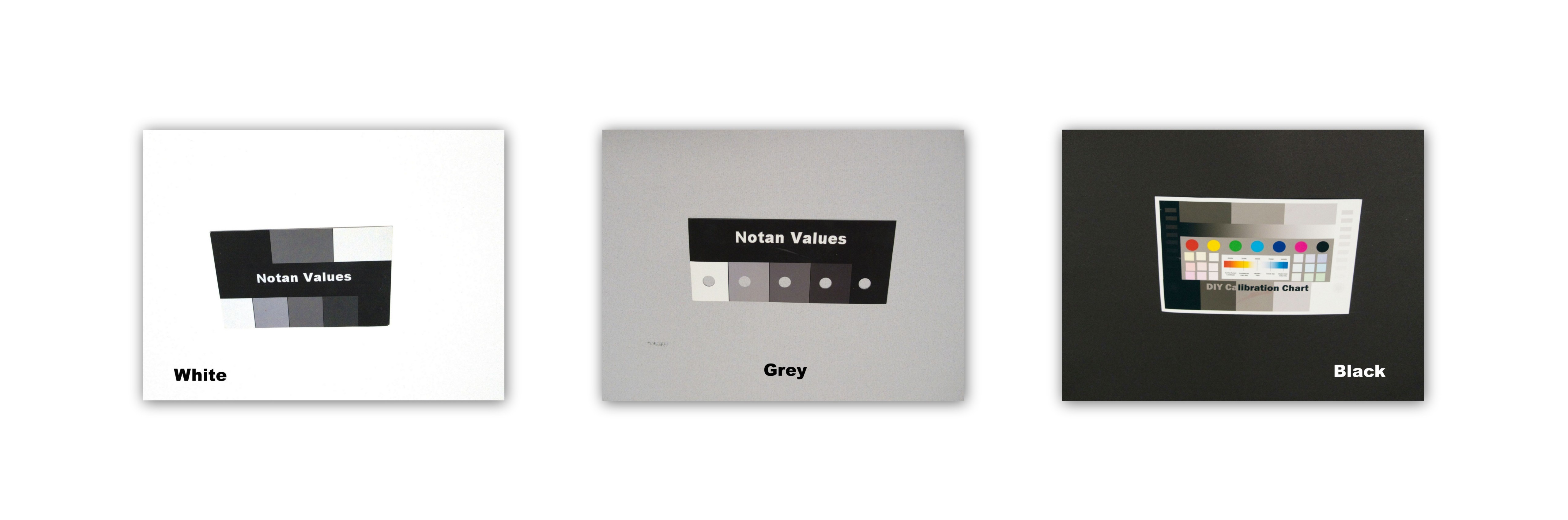
What happens when you separately photograph White, Grey & Black Sheets


It's a simple question.

What happens if you take a white sheet A grey Sheet and a Black sheet and photograph them separately. 

Fill the veiwfinder with just a single colour.

If you have trouble focusing, you can move the center of the viewfinder to the edge and half press the shutter button. Don't push it all the way and move back into the center of the sheet and full press the shutter button.


Hmm, is this what you expected?

All the photos look a pretty similar grey! Is there something wrong with my camera? Well no.

So now put a small reference card in the middle of each sheet. This little card could be a photo, it just needs to contain a decent tonal range (eg from very dark to very light. Take the photos again.


These were all taken with the same camera. The only thing I did was push the shutter button once i has focussed on each sheet.

One hint is my camera is working exactly as it should. There is nothing wrong with it.

Try this out yourself. You can do it with just two sheets (eg black & white). 

If you want you can leave a polite comment explaining what's happening but I might leave my further discussion for a couple of weeks.

Have fun


Saturday, February 25, 2017

Sketching Kit Four :: Making a new drawing board

While I was in Tassy I found the blue folio containing my art gear was a bit awkward to always carry around. weight wise it was fine it just always required being held in one hand (eg I had o put it down to take a photo etc) and it was a little on the largish side anyway. So I started leaving it behind and only sketching with what was in my camera bag (which was probably fine). But leaving my better art gear unused seemed a waste, and while passing the Kathmandu Shop in Salamanca place I decide to ask what they had as a temporary backpack to carry the artgear. After being shown a few expensive unsuitables I was eventually shown the 15L pocket pack (it rolls up into it own little pocket, and is designed to take up little room or weight in your luggage but provide a suitable “day” pack if required) It looked sturdy enough and was about the right size and price, I immediately transferred all my gear, including my Derwent Inktense pencils & blocks (a new favourite). Well, except no drawing board or individual sheets of watercolour paper, which where too large to fit. Happy ending, I carried my art gear everywhere after that.

15L Pocket Pack & Contents

I really like the idea of a backpack, so I resolved to make a slightly smaller drawing board to fit in the pack. It was simple to make from particle board. The shape is a little tapered and rounded at the top so it is easy to slide into the pack. Unfortunately this means half sheets are too big and I will have to settle for quarter sheets of watercolour paper! The board is ample sized for A4 sheets or an A4 sketch book held down with clips or a couple of rubber bands. I have also painted one side white and the other a darker gray. I have also been recently experimenting with notan/tonal value cards, so I figured I’d add a simple 5 step gray scale tone checker. Getting the tonnes reasonably accurate with acrylic paint was a bit harder than I expected (since acrylic paints notoriously dry darker than it looks when first mixed) so a bit of trial and error was required. The greyscale is conveniently always at the on the top or right hand side of my drawing board, so it will be easy hold the board out and check tones. The final embellishment was to drill a small hole as a colour checker. By positioning the hole over an area of colour it is isolated from the surrounding colours, and tones, and easy to compare with your work on the drawing board.

Gray Side of new Drwaing BoardClose up of simple tonal & colour checker tools

I’m not certain who much use I’ll get out of these tone and colour checking tools, but they look neat and they will always be easy to access and ready to use

Friday, November 18, 2016

Notan Versus Zone System

Edsel Adam’s Zone System is a lot like a multi-tonal notan system, It has 11 steps  that correspond to how he could capture light to dark on a negative. Ansel choose to use just 11 there were some variant before his that use 7 or 12, because that gave him a 5 stop range, which he was confident a black and white film negative could capture at the time. Each zone covering half a stop. One F-stop corresponds with a doubling of the quantity of light (luminosity). Using and odd number does mean the average grey tone is centered in the scale. This is magic tonal your camera is trying to average the exposure of the image. Thus this will be one of the intervals rather than fall between them. There are lots of Zone System Charts on the web (like the one below). However few are design as field references, and further most discussion of the Zone system on the web related to post processing.


Ansel numbers his zones starting at the Darkest Black, whereas I see many US based artists tend to start there numbering from the White. The numbers don’t matter really it is understanding where the tones lie in the image. More importantly where they might sit compared with an average exposure, and where you might want them in your final photo. I have put together another little field Chart/Guide this time with the 11 tonal steps. It is more useful as a guide on how you might arrange the tonal mapping for your final photo/print than an aid to composition.

My Extended Notan Field Gague

When I was putting together these notan guides I was using the RGB scale to select by neutral grays. Any colour with the same value for R (red) G (Green) and B (Blue) becomes a neutral grey colour. Since White R,G,B is 0,0,0 and Black R,G,B is 255,255,255 I had assumed that the grey midtone would be half way between ie R,G,B 128,128,128 but it just appeared a fraction or two dark to me (and warmer). I have since discovered that both Adobe RGB (& sRGB supposedly) use a gamma encoding to adjusted scaling that is a type of power curve so the steps not linear. The table below gives the RGB values of the 11 tonal zones above. This difference is subtle but could affect and Tonal check cards you would like to make yourself.

Zone

O

I

II

III

IV

V

VI

VII

VIII

IX

X

RGB

0

33

51

72

94

118

143

169

197

225

255

Monday, September 26, 2016

Tonally adjusting your monitor is important.

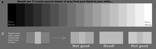
Quick monitor check test pattern

I noticed that the new photofriday included a monitor adjustment. I also found this older article on flickr central, which goes into a far bit more detail about doing the tonal adjustment for you computer monitor and its just as relevant today.

It is not me that benefits from you doing this, it is you that benefits. You will be able the better appreciate the effort good photographers have undertake to capture well balanced and rich tonal ranges.

If you are serious about looking at photos on-line check out the test strip above (it shoud show 17 shades of grey plus black and white. Commonly it is the strips at either end that might look the same. Dive into the post to see what needs to be adjusted

Friday, September 16, 2016

An Update at PhotoFriday

I’ve been submitting photos to the weekly PhotoFriday challenges somewhat routinely for a long time, and I normally post the photos here in this blog. I liked their site but it has been significantly upgraded (specifically you can see the images directly without having to click through. It is much more Instagram like and easy to contribute to. It may take me a while to get used to but I’m willing to keep contributing and that means signing up and perhaps not posting the photos here (just their background story if and when they have one)

image

The one thing that instantly grabbed my attention was the monitor calibration. Something I wish more people would do. However I also know that colour calibration is a big issue (way beyond those devices that supposedly do it for you) and the ambient lighting has a lot more influence on the colours you see. Further it may not always address the tonal accuracy either. I know that it is the tonal aspects (brightness and contrast) that most folk stumble with and either have super contrasty, very dark or extra light monitors and they have got used to it. This sometimes means all the tonal effort a photographer has gone to, often gets lost on the viewers. PhotoFriday’s calibartion screen will probably get you to a much better place to appreciate the tonality of good photo. If you see subtle targets in the black and white circles in the test above you probably ok but if either the black or white shapes is just a single circle you need to do the calibration. Remember to follow the instructions (eg dims the room lights)

Try it its free!

Wednesday, April 20, 2016

Almost Black & White…

The differences between the approach of most photographers and artists can almost be summarised as a difference between black and white.

your cup is always being filledToday I listened to a great podcast,  TWIP Family ep 49.5: Trey Ratcliff On Becoming an Artist. If you haven’t already listened the discussion between Jenny Stein & Trey is really natural, full of inspiration and worth listening too. One of the topics is about analogy that your cup is always being filled (with creativity and inspiration) we just need to be able to get to appreciate the good stuff inside the cup. That analogy of a glass half full or half empty is perfect for this post.

I need to begin at looking how tonality is represented in each medium. An easy way to understand tonality is just to desaturate an image to remove all colour. I’m using the basic tonal range names from lightroom. Black, Shadow, Mid Tone, Highlights, White.

 Desaturated Photo

When taking the photo I have to make sure that the highlights don’t get blown out. I begin at the whites. It is easier to find at least some detail in the blacks and shadows, but post processing the image, whereas once the whites are blown out that’s it, nothing can be recovered (even from a RAW file). If I can make sure that the other tonal zones are well represented I will probably have a well exposed image.

My tonal sketch

When starting to sketch the same subject I’m using a well known artist trick of drawing a series of 5 boxes (some artist use 4 boxes, other prefer 7 grey tones) and use the pencil to stipple a set of graded grey tones. and I have matched them to the lightroom names. I’m sketching directly from the simple still life by observation not copying a photo by the way. The key difference is I begin with the darker tones. I personally start by blocking in the mid tones and  then move to the darkest tones (lightroom’s shadows & blacks) and then finally back towards the highlights, leaving parts of the paper to be the whites. My darker tone marks thus define what is consider highlights and whites. They hold the composition of my image together.

#111_MG_3850-sketching II

While photographers generally exposure for the highlights, artist will generally study the shadows and sketch these shadows to define the composition.

Saturday, April 09, 2016

My thoughts on collecting Photo Reference for Painting

Whilst there is a school of artists that still insist the only landscapes are those painted plein-air. The vast majority will finish their big painting in the comfort of their studio, a few from just sketches but the majority will use photo reference. I love to sketch and paint outdoors but time and the light seldom let you finish a big work outside. However I know that when you try to slavishly copy all the detail in a photo it can make a painting look very flat. Whereas a sketch hurriedly dashed off is more likely to be dynamic and truly capture the sense of the place. So my take on this is to spend time to do a sketch or small composition painting to capture your impressions of the view, and record the important aspect you see. Start with a sketchDo this on site. I like to use a watercolour wash, then add the the detail with a soft pencil afterwards (I’m not filling in a detailed sketch with colour, I’m putting down the area of colour and main composition elements then adding a bit of detail.) Or alternatively I just sketch monochrome in pencil of graphite stick.

So My First Rule of taking reference photos is

Start with a sketch

  • Put your camera down
  • Do some compositional sketch to capture you what you first see and feel. Just the main elements

Waiting for the Sketch to Dry

Whilst I wait for the watercolour wash to dry enough to sketch without damaging the paper. I find this is a good time to pick up the camera and take those reference picture because you now know what is important in the image. The first photo being the obvious, the same view you are painting. This is where a camera with a zoom lens comes in handy because it is likely that your composition will not match a snapshot from your camera. You will probably have to zoom in or out. In my example I have taken two images side by side and then stitched them together, using Austostitch, because my sketch is a little wider than by camera can handle (alternatively I could walk back behind me before I took the scene, assuming their is room and the full scene if not obscured)Lake Pano

However don’t stop there, take at least an additional 4 views, zoomed in (or walking close) to key aspects of detail that will help you finish or zoom out to get the broad feel of the place (you might like to add some slightly out of view detail or subject into your composition). If there are large areas of colour or texture photograph them, they could be the key to visual appeal in your photo.

 Detail of Comorant on postDetail of walkwayDetail of Tree TexturePatern of Ripples & Duck

So My Second Rule of taking reference photos is

Take Five

  • The composition you intention to paint.
  • Plus 4 details zoomed in or out, or concentrating of a key texture or colour

The biggest limitation of trying to copy a photo religiously happens with tonal issues. Whilst modern digital cameras are great they still have limitations with Dynamic Range and photos typically look flat compared with what you saw as you where sketching. There are two approached here that can help here by they may require a upgraded camera.

_IGP3787_IGP3788_IGP3789

The first approach if to take a bracket set of images (many but not all point and shoot cameras can take a set of three EV settings, older camera usually don’t have this built in but there are several camera apps that add this capability. The bracketed set gives you an underexposed version (to focus on the highlight) a normal exposure and an over exposed version (which will give you a lot more details in the shadows). These three images should give you the ability to play with the tonality to suit your composition. If you want to take the tonal representation further you could investigate processing this bracketed set as a HDR image and refine the tonal mapping to bring out the tones as you remember. HDR is an advance post processing technique that requires specialist software but it will give you a lot of freedom adjusting the tonal range._IGP3787_8_9_HDR with simple tone mapping

The second approach is to take RAW format images (probably as well as jpeg). This require software that can handle RAW images (like Lightroom, Aftershop Pro, OnOne or RAW therapy). The advantage here is the raw format records everything recorded by the camera sensor and it is possible to “pull” extra detail out of the shadows and often bring back the highlights. This requires learning how to use this software and extra time to refine the RAW images. However the ability to refine tonality and colour can be wonderfully inspiring. I started to like having the overhanging tree as part of the composition._IGP3780 Post processed in Lightroom

So My Third Rule of photo reference, if you have the technology to do it, is

Why not Take Ten?

  • Use Bracketing
  • Take and Process RAW images

Monday, June 15, 2015

MDR rather than true HDR

I’m using the abbreviation MDR to mean Maximum Dynamic Range, to differentiate these approaches from “true” HDR.

Something I haven’t tried out in a while is Amalence’s HDRAW standalone utility. This utilizes Tone Mapping technique, allowing it to preserve the details while fitting the highest dynamic range image, taken from a single RAW photo, into the limited dynamic range of a single JPEG or any other 8-bit format.

Example of The Hdraw Main Screen

It displays the options in popular filter examples that you just need to click on the most pleasing option (ie not shinny painting please)

Another way  I have seen described to get a HDR set from a single image is to take a well exposed image and create an overexposed version and save that and then an underexposed version. Normally by moving the exposure slider by the equivalent of one f-stop. This might let you use tone mapping tools but it does not get you extra tonal range, you can find in bracketed exposures. If you want to follow this approach the new AfterShot HDR has this as its second option to create a HDR file (I don't recommend this approach)

The final approach, which I feel is the most obvious, is to use software like lightroom to stretch the tonal rendering to its maximum (well maximum acceptable amount). In this example I am using lightroom’s development module I just use the basic tonal controls controls at the top of the development tool panel. I fist try the whote balance, although in this case I feeel the as shot does reflect the warmth of the first dawn light colours well. Next I have a adjusted the exposure up a little (moving the whole histogram a littel to the right because it is so heavily biased to the left, the dark side). Next I adjust the shadows and blacks to keep the forground dark (and hide the shadow detail, for pictorial reasons). Finally I lift the highlights and the whites (there aren’t many as shown by the histogram). I lift the clarity (local contrast) and vibrance (the intensity of the deeper co0lours just a little.  I do have a preset I developed ages ago called SDR+ which follows these steps but I actually prefer to do the steps manually because I can finesse the sliders in each step.

image

A number of software programs offers histogram stretching tools and they can produce HDR like results but they are less easily controlled than the tonal tools in packages like lightoom and AfterShot.

Friday, October 24, 2014

ThePatch :: an Impression of Highkey

When I think of highkey in art I think of the impressionist, they painted light as colour, shunning the murky tonal focus of the art academies of their day. Whilst the french impressionist are well known, few know of a small group of Australian painters usually called the Heidelberg School following the same ideas at roughly the same time. I have always loved their work as a lot of it was painted in the area I grew up and I do like Charles Conder’s “A Holiday at Mentone”. The old baths are no longer there but I can remember them and the white cliffs (also no longer visiable), The strands of dried sea weed still frequently can be seen and the beach and its promenade are still a popular stop on a sunny day. I earnt my first swimming certificate here. I am also a member of the Victorian Artist Society and this painting was first exhibited in their Spring Exhibition of 1888. I have also visited this site previously to test out an upgrade to my homemade tripod watercolour easel. So there is plenty to connect me and a self portrait to this site.

mentone tonal changeI actually took this photo a few weeks ago on a beautifully sunny spring day. Forgetting somewhat that Australian light (even in early spring) is very harsh and contrasty. So I couldn’t exactly get a true high key image without totally blowing out the highlights. Fortunately I took a couple of  EV bracketed sets and  found an image without to much clipping of the shadows and without excessive blown out whites. So all I had to do was use some tonal adjustments. Classic tonal curve stuff and yet an artist would not approach the task in such a mathematical way. I have come to like the basic tonal sliders in lightroom (highlights, shadows, whites & black, these are much simpler to understand in terms of controlling tone of your image). I’ve even found that clicking on one of the tonal ranges in the histogram itself. and sliding the histogram, also moves the corrsponding sliders. So I eased the histogram over to the right (to create the high-key) and lifted clarity and vibrance to keep the colour. The background and my figure had significantly different contrast/tonal ranges so I started to use layers to separate foreground and background and soon got the idea of re-sampling the background layer in corel painter with an impressionist brush. Then using perfect layers to merge the layers back together to give me a very hybrid self portrait this week.


Sunday, October 19, 2014

ThePatch :: Remembering Rembrandt

Whenever I hear of a low key portrait as a style, I think of Rembrandt Lighting, which is a very popular technique taught in studio lighting workshops involving two lights (sometimes one is a reflector). one light is a strong spot or key light and the other is diffuse just to fill in the shadow. The light arrangement is such that one half of the face is well lit and on the other side a small triangle of light illuminates the upper cheek below the eye. A purist interpretation is that the triangle be approximately the width of the eye, and length of the nose tall. It’s actually a modern invention nothing to do with Rembrandt approach, the effect just tends to look like his portraits (see the section Origin of photographic term in the wikipedia link above).

Rembrandt's studio todayI have been to Rembrandt's studio and he only has a row of windows on one-side, (there are heavy shutters to blank off the bottom windows and a bleached canvas blind hanging above an end window) So I suspect Rembrandt himself would probably fail the studio lighting work shop. What he definitely would not have failed is portraiture and particularly low key look  (ie where most of the tonal range is in the darker tonnes) Some of his deep A bit too theatricalrichness may have come with the age of his painting (most are now over 350 years old) but if you have every seen the original of his portarit paintings (such as his 1659 self-portrait) I’m sure you will recognise the fresh feel and emotional connection.

I quickly dropped the theatrics of trying to be visably arty, and just focussed on a natural lighting from a single window. I had to add a dark backdrop and use a white sheet of paper as a diffuse reflector on the righthand side.  With my camera on a tripod and set with a timer on the shutter, it was then only a matter of adjusting aperture (first) and then ISO/speed to get the right low key exposure. A little further adjustment to warm the shadows (raw umber-fy) and adjust the black clipping point in lightroom to avoid too much gloom. Unfortunately I can be seen more worried about the shutter timer working than trying to look artistic. But it is a decent selfportrait.