Showing posts with label scanner. Show all posts

Thursday, July 02, 2026

Introducing a DIY Calibration Chart

Why You Should Calibrate Your Screens (And How This Little Chart Helps)

Ever wondered why a photo looks perfect on your phone but flat and washed out on your TV or a print? It is not you. It is your screens. Even the best cameras, monitors and printers cannot capture or display the full range of light and colour that your eyes can see. That is where a simple calibration card comes in, and once you understand how to keep your equipment acceptably accurate.

Photographers talk about dynamic range, the span of light a device can capture, measured in stops. Each stop doubles the amount of light involved. Your eyes can handle around 15 stops. A good modern camera manages 9 to 11. Most TVs and monitors only reach 7 to 9, and even quality printers top out around 6.5.

That gap matters. When a device cannot handle the full range, it clips the extremes. Dark tones near black collapse into pure black. Bright highlights blow out into pure white. Detail and colour simply disappear at both ends.

Colour is its own puzzle, it doesn’t really exist as something physical, and there are two divergent interpretations of what creates it. How a device captures and reproduces colour is pure physics and maths of energy and light. How your brain perceives colour is much more personal, shaped by cognitive psychology and the lighting around you. Neither view is more "correct" than the other. The calibration chart will not give you laboratory precision, but it will nudge your average colour rendering and tonal contrast in the right direction.


Step One: Calibrate the Input (Your Camera or Phone)

Tonal calibration, getting the brightness and darkness levels right, is the single most useful adjustment you can make for realistic photos.

Look at the calibration chart and you will see a grey scale gradient running from black to white, with small grey rectangles down each side. On the right, the rectangles start light grey and get progressively lighter toward an almost white target. On the left, they start darker and step down toward a very dark target. Each little step represents a 2 percent shift in light intensity.

Here is the trick: point your camera or phone at the chart and check how many of those rectangles you can actually distinguish. You will probably lose a few, especially near the very dark or very light end. That is completely normal. Digital sensors simply cannot match your eyes' range, and cameras are designed to expose for an average middle grey tone anyway, so they will usually “clip” the extreme tones.

Start with your camera on an automatic exposure mode (A, P, or the green auto setting on a DSLR or mirrorless camera, or the default mode on your phone). Manual exposure is not necessary here.

Check the result somewhere you can actually see the screen properly. Camera and phone screens are notoriously hard to read in bright daylight, so review indoors or in shade.

If you can only spot a few rectangles on the dark side, the chart probably needs more light. If you cannot add light, try adjusting the exposure value (EV) on your camera or phone instead.

Advanced camera calibration (colour accuracy, white balance, lens distortion, sharpness) varies wildly between brands and models, so this card will not replace a proper colour profiling system. What it can do is flag obvious problems, like a consistent colour cast, or tonal issues worth investigating further.

Step Two: Calibrate the Output (Your Screens)

Now views a photo of the ca on your monitor, TV, phone or projector. This is where brightness and contrast come in, usually tucked inside a picture or display settings menu, accessed through a settings button or remote.

Start with brightness. Push it up and the screen gets lighter, revealing more rectangles on the dark side. Pull it down and you will see more detail in the light rectangles instead. The goal is a balance where you can see a good number of steps on both sides.

Next comes contrast. This stretches or compresses the range of visible tones. Getting it right is a bit of a balancing act between contrast and brightness. If you can see plenty of rectangles on one side but hardly any on the other, nudge the contrast up slightly, then pull brightness back to rebalance.

A quiet warning here: if you regularly use your screen in a bright room with strong light behind you, chances are your contrast is already cranked to maximum, which clips both ends of the tonal range. If that sounds like you, reset contrast to the middle, adjust brightness first, then slowly bring contrast back up while rebalancing.

Screen technology has changed a lot over the decades, from old cathode ray tubes to today's LED and LCD panels, and every manufacturer implements these settings a little differently. Materials also degrade over time, which is worth remembering if your screen seems duller than it used to be. When in doubt, the factory reset option is usually a safe, well calibrated starting point.

Step Three: Get Your Colours Right

Once tone is sorted, it is time for colour. Look for settings labelled colour, tint, colour temperature, hue, saturation or intensity, though the exact wording  and what bit changes depends on your device.

Saturation is often cranked up by default to compensate for ambient light, so check the row of coloured dots on the card. They should look natural sitting against the mid grey background, not artificially intense.

Many screens also offer picture modes such as vivid, natural, cinema, standard or eco. These bundle together saturation, brightness and contrast settings, so cycling through them is often the fastest way to find something that suits your eyes, though be aware they can override the careful brightness and contrast work you just did.

The chart itself has a colour temperature section running from warm reds, oranges and yellows through to cool blues and violets, sitting on a clean white background. If that background does not look properly white, you likely have a colour cast issue.

Small reference squares next to this section are arranged in 5 percent increments of colour strength. The top row handles colour temperature, from yellow through to blue purple. The bottom row handles “tint”, from magenta through to green. The middle row, goes from a red to a cyan .

To use them, simply check which square looks whitest against the background. If the background leans slightly green, for instance, a square on the magenta side will probably look closer to true white. That tells you which direction to nudge your tint control.

One last thing worth remembering: your room's ambient lighting will influence how you judge all of this. Do not calibrate for magenta while sitting in a room bathed in green light. Match your adjustments to the conditions you will normally be viewing in, and you will end up with a screen that shows your photos the way they are meant to be seen.


You should now have better screens to judge your images, that may be photographing your art, a portrait or to judge your results as you edit or modify your photographs with filters and app.


Monday, November 15, 2021

Return to the Old Chestnut :: Scaning Versus Photography

I have looked at the issues of the best way to get a digital copy of your art work many times. I'm still open to finding the best way, but realise there might be different solutions for different media and how the image is to be used. With watercolour possible the most difficult to find a good solution, because much of it's magic lies in it's transparent colours.


Now it's your turn. The above images have been capture with webcam, phone, mirrorless camera and scanner (in no particular order).

Which best shows the watercolourness? 

Which looks best?

Tuesday, September 25, 2018

Looking at Photographing Art Works (again)

I have known for a while that my conventional flatbed printer/scanner doesn’t do a particularly good job of photographing coloured art works. (BTW Its fine for ink line drawings such as cartoons)

Last night I went to a great talk by Wayne Degenhardt at the Watercolour Society of Victoria, about Photographing Art. This inspired me to take some photos of my multimedia sketch I created at the Discover Nature through Drawing workshop last week, because I was a little disappointed with the scan, it was flat and very pale.

drawing on nature - As scanneddrawing on nature - As photographed on my phone

drawing on nature - As photographed on my HP tabletdrawing on nature - As photographed on my olympus camera

The results shocked me!

I haven’t gone to a lot of trouble to make this a scientific comparison, the cropping and rotation are inconsistent for a start. Further, the results are all jpegs, straight out of camera with only cropping but importantly all taken under the same lighting conditions. Upper left is the conventional scan (on a HP 8110 Photosmart printer) The apper left is my Android HTC 11 Cameraphone. The lower left is camera on my HP Spectre Tablet. The lower right is the jpeg from my Olympus OMD EM10iii.

So which is best?  Well, none really! If I had to choose one it would be the cameraphone but i’d have to lighten and correct the colour f the background. I can see further investigation is required here.

Tuesday, February 07, 2017

More Observations on Photographing Art

I have previously hinted that photographing art might be superior to using a flatbed scanner (well at least the ones built into most multifunction printers). Well I now have a strong case to confirm this suspicion. I have been working on a series of mixed media painting I’ve called the “Summer People” for my larger Endless Summer Project. Whilst I have left the people blank (they are only temporary visitors to the beach) I decided They need to have coloured clothes, and fluro colours are still popular with the summer people. However when I scanned these I was amazed… The fluro colours were flat and very pale. I’ve been looking for an explanation about the direction of light or quality of the light source but I have none to explain this observation. Taking a Photograph the same painting (images on the right below) in daylight the colours are much truer including the non-fluro ones.
Scanned on flatbed scanner Photographed Art WorkScanned on flatbed scanner Photographed Art Work
My Studio set up with the copystandThe main advantage of a flat bed scanner is it (in theory) avoids dimensional distortion, such as non paralleled edges produced when the camera is tilted. I did make an old fashion copy stand out of an old enlarger mounting and can connect my canon camera to my studio computer in tethered remote live view mode (see below). The image is upside down here because of the way the camera is mounted on the stand and because the painting is facing me. I could fix this by putting the painting upside down on the table top or just as easy fix in while post processing in lightroom, I can also focus and control exposure from the computer and once I have every thing set up just slide the canvases one at a time check focus and exposure and click. Its actually faster than loading a scanner closing the cover and click then waiting for the scan, Looking at the preview screen doing adjustments (like rotation) and loading the next canvas…
Remote Live View screen
I also need to be careful not to use a zoomed in or wide angle lens, which can cause barreling (curved rather than straight edges to the canvas) A focal length between 50 and 70mm on my crop sensor canon avoids distortion so I have to adjust the camera height up of down to best frame the picture. In this case I lifted the copy stand onto an adjacent counter top.

Another issue with using a camera, is there is less control of the light source and a colour cast can be common. I prefer to only photograph art (and in fact only paint) in daylight. Not direct sunlight but a strong diffuse light such as a window. Even so the colour of the room and its contents will affect the light so it is also wise to consider white balance. By taking RAW format this can easily and well adjusted in post processing. I therefore take a calibration photo using just a commercial colour wheel and one of my notan (greyscale) cards.
Original Photo of Test ChartsAuto White Balance in Lightroom
In this case the test is a little “warm” but may be acceptable. I use lightroom and it has a very decent Auto White Balance, in this case it is colder and more clinical, but better colours and grey scale. You can manually adjust the degree of correction but I’m happy to go with the auto correction. Further lightroom lets to refine the adjustments on one image and then copy that to all others captured at the same time.

I prefer to leave room on the margin to allow for trimming later and to individually crop and rotate each picture (again its easy in lightroom) but if you are copying a lot of items the same you could put masking tape as location makers and then fill the frame and have the cropping automated as well.
I am pleased. Using my DSLR canon camera, mounted on my homemade copy stand and tethered to my studio computer, I can reliably and quickly get superior copies to those achieved with a flat bed scanner. By also taking a calibration shot, and photographing in RAW format and then post processing in lightroom, I can also automated white balance and minor exposure adjustments across a whole series of images. Giving me much better and consistent set of images of my art to post on-line.

Sunday, October 23, 2016

DIGITIZING ART :: Flat Bed Scanner .vs. Photography

Flat Bed (HP Photosmart) Photograph Canon EOS
rubens0003 IMG_0068
rubens0002 IMG_0065
image image

Whilst I have been scanning my smaller sketches and artworks on a conventional flat bed scanner for many years now, the copystand I re-manufactured a while back, then automated the process with a tethered camera has convinced to compare scanning on the flat bed versus photographing my art. I was a little surprised I think you get a much better scan from a photograph, interms of tonal detail. The default scan is perhaps a little over-exposed an the colour detail is not as continous (as shown by the spiky lines in the illumination histogram). The photo is not perfect but the fact that it is a RAW ,cr2 files (and 12 bit colour) make it easier to correct the exposure and colours. Also the lighter tones in the pencil sketch show a better gradation.

I can see a little further investigation is required but photographing your art may be a much better way to get the best results.

Tuesday, May 24, 2016

CreativeSpaces :: Automating the Copy Frame

Placing my sketch book on the floor & copy stand on tableEarlier in the year I modified a small enlarger stand to become a desktop copy frame. I love it and use it often. However one tiny draw back compared with a conventional desktop scanner is you have to wait, take the card to the computer and load it before you see the scan in detail. Not a big hassle but can mean you need to go back and re-photograph some works if something was not quite right.

eos utility remote control panelI had an A3 sketchbook full of quick life studies and figured it was time to automate things. With the Copy stand on a desk and the sketch book on the floor, it was easy enough to get a good photo. Also I had previously run the canon tethered through lightroom but not everything on the camera can be adjusted so I when back found the original CD that came with the camera and reloaded the EOS Utility program Live View Windowwhich among other feature (such as uploading photos from the camera) allows you to set ALL the controls on the camera. It also can work in a live view mode to check lighting and exposure. Perfect for what I wanted.

So I can put the live view & remote control on the big screen in the studio and took the mouse down to the floor and control everything from there as I turned the pages in the sketchbook, click, turn the page, click … I powered through the 45 pages of sketches in less than 5 minutes (actually faster than I could have scanned smaller pages on my desktop scanner)

an example scan

Saturday, November 19, 2011

The internet of things

I heard about an interesting project on a recent science show podcast.  Its a project between several UK universities and based on open source software and existing technologies that enables things (objects) to become know and have their own presence on the internet. At the simplest level each object gets an entry in the the internet of things, a website specifically created for this project, and gets issues its own QR code. A human (eg you) has to do this. There are also phones app for the iphone and android that make your phone into one of these QR tags readers. So when you happen upon one of these tagged objects you can scan it and read about out it, leave comments or even like it. Then depending on how its entry is configure it might tweet that you a have visited, share your comment or update its facebook status. Suddenly things can have their own form of memory and history in our cyberworld. Sound far fetched? No its very real and very simple.

Wednesday, August 24, 2011

Some interesting photographic assistance to a cartoonist

It has been a while since I have posted a cartoon, over on meet the people, primarily because I’m travelling. So I don,t have my scanner or access to the myriad things in my normal software in my corel draw and paint tool kit. It was rainy today so I decided to investigate if I could achieve the typical “alvin look” (hand draw, but computer inked) cartoon with a simpler kit. Turns out I could, and it was easy once I assemble the right tools.

2011-08-23_11-55-08_831origI started as usual with a pencil sketch in my sketch book. Then did some basic inking of the main linework. Now the tricky bit, how to scan it and clean it up. Using a camera gives a grey image with poor line definition and uneven illumination. Not the greatest starting point for cartoon. Then I remember a utility that I had reviewed years ago that lets a cameraphone function like a scanner. That system is still around but a quick look on the android app market revealed CamScanner. It worked like a charm, not only doing the basic scanner stuff, you can adjust for perspective, IMGP4653cropping and stretching the image and it will also write to nice compact PDF files.

Then I just used paint.net, a much under-rated general graphics program, to do the colour fill, and linework tidy up. I then did a bit of magic wand selection to cut and paste my characters onto at photo I had taken. Ok it took a lot longer than the 30 minutes I had set myself in the quick pic days, However developing the new technique was fun on a rainy afternoon.
2011-08-23_11-55-08_831

See the final cartoon over in meet the people.

There are a couple of earlier post about my original technique and then the Big Step Forward.

Friday, October 29, 2010

Doubling the size of my scanner

The world of paper sizes has standardized a lot on the A size ranges, well except for the USA which still clings to a multiplicity of inch based measures. So most of us now have A4 sized printers and scanners and life is easy, right?

Not quite, most photo systems are still geared to those American sizes, 4” by 6”, 10” by 8” etc. wasteful if you can only print on A4 sheets. It is ok most printers can not print to the edge of the page so a blank border is necessary. The conspiracy deepens because most pre-cut frames are also made to suit those inch based, so now perhaps a bit of trimming is required. The mistmatch becomes even more frustrating when it comes to flat bed scanners. Few of use want to scan nice A4 sheets, we want to scan thick text book, notebooks and even perhaps your own painting and sketched, like me. The trouble is whilst most of my sketch books are in fact A3 or A4 I like to paint on quarter watercolour paper sheets (which is approx 11" by 15"" and these are too large to fit on the scanner bed. The best watercolour papers are still largely "handmade" using same "Impreial sheets"  (22" by 30") as in pre-industrial times. Interestingly the paper weight is now usually measure in grams, and 300 grams is my favourite.

scanned in two stripsThe solution is really very simple, just scan the image in two (or more passes) and use your photo stitching software to paste the two images together.Voila! you have just doubled the size of your scanner. You need to ensure there is sufficient overlap between parts, 10% is probably the minimum 20-30% might be extravagant. If your stitching software is having trouble you can always add your own registration marks to the edge of the scan drawn on a price of masking tape if you don’t want to mark the work.
Off shore Breeze - watercolour on paper

Most scanners will try to automatically adjust Picasa tuning optionsthe scanning to get the “best” image quality and many now have  “advanced” filtering but using photo software will also give you access to more control of colour bias, contrast and brightness controls, cropping and straightening than you Multi-function printer bundle includes. As I mainly manage all my picture in picasa I find the simple tuning and filters jus perfect to bring the scan as close as possible to the original.

An ordinary scanner & your favourite photo software can make a powerful combination

Sunday, July 06, 2008

QRious'r & QRious'r

qrious site

I am finding all the hype by telstra about "their" QRious codes just a bit hard to stomach. I like the idea of these QR codes and have posted about them last year. Despite what telecom implies they are very late adopters of the technology, not creators of it. You don't even havQrious mobilese to buy a new phone (or sign up for an outrageous contract). Ok these new 3G phones will have QR reader built in, but if your phone has a camera and web access you probably are ready to go. You just need to download some software. If you are with Telstra, and are happy with them  you can type in the tediously long www.mobius.telstra.com.au on your phone's web browser and if your phone model fits there current limitations, it will be delivered to your phone. Alternative there are free sites that provide generic downloadable readers, like i-nigma & Kaywa. [Also Quickmark, see deans collin's comments on this blog, he obviously has an interest in marketing qr codes.]

One final item you should consider is reviewing/including a mobile data plan onto your phone to avoid the outrageously high charge that most service providers charge on adhoc data usage, because the websites ,the QR codes connect you to, might put a heavy dataload onto your phone (eg downloading movie previews etc.)

The world of physical hyperlinks, or hardlinking, could totally reform how you use your phone and the web.

Thanks also to wolfcat, a twitter friend, for the heads up on this issue

Saturday, October 13, 2007

What the heck is this?

It is a QR Code, a type of two dimensional bar code, which I heard described as a cross between a chess board and a crossword. on a recent BBC digital planet podcast. The really great thing about them, and why I bothered to blog about them, is that most new mobile phones, well the ones with cameras and web access, can probably already scan them and use them for instance connect to a web address.

wandering in the light QR code

Thats exactly what this one does, it is the URL (web address) of this blog, just point your cameraphone at the image, on the screen! and take a picture. The next step depends on your phone, (HINT: you may need to read its instructions), activate the QR CODE READER option and you will get taken to your phone's web browser and directly to this very blog site! On your phone, no difficult thumb and finger typing required!

If your phone doesn't have a QR Reader built in (most phones less that 2 years old will have it), but a camera you can download the free KAYWA Reader into your phone.

If you want to create QR Codes of your own, snapmaze is a simple on-line application. Not only web URLs can be encoded, simple text, addresses and contact details, the applications are pretty endless. The QR stands for quick response, and the process of linking directly to the web on your phone is now very popular in japan and has become know as hardlinking, or physical world hyperlinks.

Tuesday, September 18, 2007

Make your cameraphone into a scanner

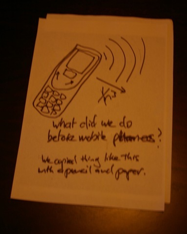
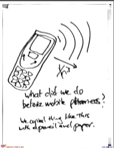
Qipit is a great little website and applet. It allows you to send in a photo taken with a digital camera or even a mobile phone, and the website converts it into a more conventional scanned image. Great for recording notes on white boards or handwritten notes, downloadable as a PDF, emailed or sent to you as a fax. All you need to do the test it out is email your image to copy@qipit.com

original photo as scanned by qipit

I thought I should try out the service with a very ordinary, low contrast, low resolution photo of a badly hand written page. I was impressed with the result but received an email saying -

Qipit has scanned your image but the resulting document may not be satisfying because the resolution of your original image is too low.

To avoid this:

  1. Ensure that your camera phone is 1 megapixel or greater. This information is generally found near the lens of the camera.
  2. Ensure that your camera is set to the appropriate resolution and image quality 
  3. Ensure that your camera is not resizing images

If you like the service you should register, its free, you can store up to 100 pages.

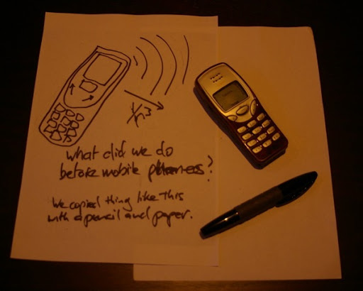
original photo as scanned by qipit

This last test pair, I wanted to try out what happened to a real object, and it worked well.