Showing posts with label artist. Show all posts

Saturday, May 18, 2024

You are invited

 I’ve given myself a little challenge for my paint out next Tuesday. Everyone is welcome to come along and especially those who want to do a bit of plein-air painting. It’s scheduled to take place from 10am to 3pm on the 21st of May in Parliament Gardens, in the city. It’s that little triangular piece of gardens opposite the Northern End of Parliament Station at the intersection of Albert Rd and Nicholson St. It is primarily aimed at creating interest for the “Luminous: A Festival of Watercolour” Exhibition at the Victorian ArtistSociety just up the road in Albert Street. Anyone who wants to paint is welcome, more than welcome.

I’ve been experimenting with my own dot charts set up on DVDs as very simple portable palettes for plein air painting. For those familiar with painting outdoors 10am to 3pm or 5 hours is a very long time. The light will change dramatically over that time frame, especially this time of year. Therefore I plan to do say 3 or 4 paintings/sketches and I also thought it would be a good idea if I made them using different artists colour palettes. 

So I’ve made up two new dot chart colour wheels on DVDs. The first is based on Andy Evansen’s palette which is a fairly conventional traditional English style watercolour setup although he’s American. He recomends starting with a painted value study and I’ll try to follow this recommendation. He also looks to join as many shapes as possible with his first midtone wash another idea I really like.


My second palette also on  a DVD is based on Vincent Van Gogh’s later palettes, which were of course for oils, not watercolours. I had previously researched the colours through his letters to his brother Theo. He had recognised he was having trouble with fugitive colours like emerald green and his red carmine and lake colours,  also he worried about using alizarin crimson. These days there are more permanent versions of these colours available. I did research into Vincent’s colours for a project last December where I was asked by Royal Talons to be their Instagram artist of the month and they kindly supplied some art materials. It was fun. 


Depending on the lighting I’d like to tackle something that Turner might do. I’m certain he  would be looking for a dramatic sky or foreboding shadows. If nothing else there’s the waterfall, sure to produce some interesting fluid shapes. A few years ago I made up palette a turner inspired palette following the recommendations of Tony Smibert, a real expert on JWM Turner. I plan to focus on warm versus cool colours and look for a moody emotional connection.

Finally I’ve got my current palette based on six families of hues, red, yellow, green, cyan blue, and magenta. I trust it will afford me the best opportunity to mix stronger intense colours, higher chroma in artist jargon of colour pigments.

Even though the garden’s pretty small there’s plenty to see and paint. Alternatively just come along to see me paint and also visit the exhibition.

Monday, October 03, 2022

Are we having fun yet?

It hasn't taken long for my AIart works to fall foul of the censors. Ok not the real censors, the perceived NFW (not for work, standards of the USA based morals on the internet) Whilst I can only see blur in one of the images generated, I expect that it was being interpreted as NUDITY. Which isn't surprising for anything Salvador Dali inspired

I also believe the warning is probably coming from Stable Diffusion itself. That might be a very good thing, indicating they are concerned with the ethics (aka complying with social norms) of the types of images they are being asked to generate. I do know that certain words are not allowed in the text submitted. Again, a bit restrictive but overall, a good thing.

Back to what I was playing with, just having fun. Which I learnt from a Catherine Price in a recent Ted Talk, involves Play, Connection & the Flow State. I like self-referential (meta) subject so I have submitted the phrase "Are we having fun yet?" Firstly the phrase just by itself and the results were totally underwhelming. Perhaps AI doesn't know what fun is yet?

Then by 3 well known artists  / cartoonists / photographers each as modifiers. The results are more encouraging. I've picked the most appropriate in each group of four thumbnails.

Moral: Be careful what you ask for!


Tuesday, November 30, 2021

"Exploiting" (aka Faking) Banksy? as an NFT

Here is an interesting article from The BBC about a bansky work "warning sign" being "re-created" as an NFT by its current owner. The story contain a link to the you tube below, which appears to be a spoof of the film, "exit via the gift shop". superficially its all noble sounding, a proportion of the purchase going to charity. etc...

Looking deeper it appears a lot like a not so subtle attempt to ramp up dark memories of a terrible tragedy and opportunity to get publicity and probablu a lot of money from an asset propped in a lounge room. 

At the heart of the issue is can you believe social media and the NFT market (if DAOs or truly anything organized like that truly exists). Is it actually people scamming and exploiting others? Are NFT a real long term investment. What does ownership of something that is public and anyone can "look" on line (and potentially make decent exact reproduction). We do also know Bansky doesn't really like the art investment “establishment” and has gamed them previously. Who can we believe?

Former Christie's auctioneer Charles Allsopp said the concept of buying one [NFT] made "no sense" and "people who invest in it are slight mugs".

 I'm inclined to see this as a story, parts of which (may all) might be just to ramp up sales of something virtual. I would suggest Charles Allsopp advice is worth considering. However please read the details and make up your own mind.

Wednesday, March 27, 2019

The Empire (of Dust)

It didn't take me long to break my own #TURNOFFSOCIALMEDIA campaign. I had the fortune to get tickets to Rone's Lastest Exhibition/Installation at Burnham Beeches. Its amazing, so I just had to upload a photo of the flooded Library via WiFi from my Olympus camera to my phone and then onto Instagram. All so easy and I've fallen off the wagon already

Monday, October 02, 2017

INKtober and now for something completely different

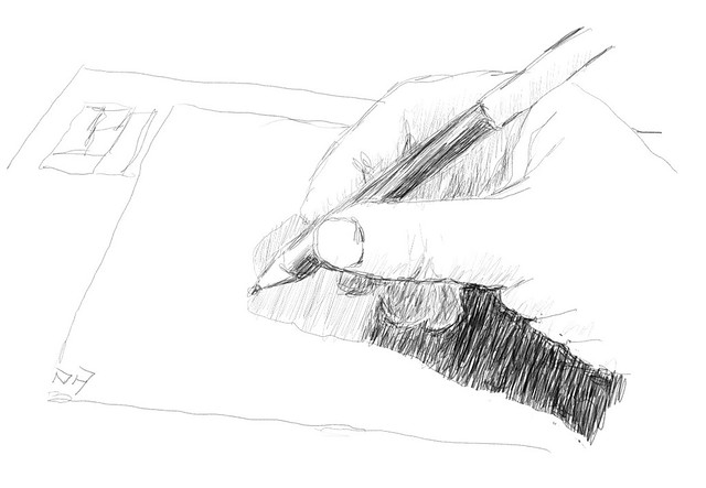
Day 1 pencil sketch of wacom tablet

October seems to be the month for Sketching, flickr are running INKtober (so expect my photofeed there to suddenly become drawings), the YouTube SketchBookSkool are running monthly sketching themes on Instagram (some background on @oz_endless_summer) and pastel artist Marla Baggetta is also recommending a month long sketchbook challenge.

Given that I was unable to keep up a year long daily sketch routine last year I figured I should at least give a one month of drawing & posting a reasonable chance. So expect less photos and more drawings, wish me luck and get drawing yourself.

Day2 the strawberry with watercolour washpreliminary pencil & ink

Monday, July 10, 2017

My “Endless Summer” Sketching Kit

I've been progressively refining the gear I take on my endless summer travels, my sketching kit is now cut back to just the essentials.

I've had a little fun posting the contents of my stuff on KIT.com. It’s very sales oriented (with big green buy me buttons under each item, and I get no commission by the way) but it is fun, a nice and clean presentation and a FREE way for me to share a little of what I find useful, and I get to tell a brief story or two of why I like/use the stuff. My advice is read the stories and look though the kit, before you hit the green buttons.

Sunday, June 04, 2017

PhotoProject :: Seeing more with your photos

I have become convinced that there are two opposing objectives when you are collecting photographic reference material for creating art works. Firstly the documentary aspects, the objective recording of important visual details, form, shape, lighting etc. An aide-memorie. Such tasks are really performed well with a digital camera or smart phone. However there is a second subjective/expressive side of how you feel about the scene, the atmosphere or your connection to the place. Single photographs will seldom capture these things. Whereas a sketch or small plein-air painting probably will.

I suspect ignoring the second component when painting from a single photo is why they so often look bland and lifeless.

I had already come to recommend to artist wishing to collect photographic reference that they should make at least an tonal/compositional sketch in the fields and take at least 5 photos to support it. Actually it’s better to take 10. By coincidence this ties in nicely with capturing both the objective and subjective aspects. A great metaphor is to use your hands to remember what to photograph.

Documentary

1-IMG_20170602_164305_processedTaking an Objective View (Detailed left Brain Stuff)

  1. Take the obvious snap shot.
  2. What is the main subject, get as much detail as possible.
  3. Take a wider view.
  4. Evaluated the tonal balance.
  5. Textures and surfaces

Its quiet normal to pick a snapshot type view of any new vista, It might actually be what you are going to paint to take the shot, get it out of the way. It could also be the scene you sketch, that’s fine you’ve already got a photo to copy. However now you need to look for a bit more detail of the scene. In particular detail of the main subject could really help future drawing or painting back in the studio. Therefore zoom in on the important subject details, or walk up and take some closer photos. Similarly it is wise to take a wider view, zoom out or walk back, or use a wide angle lens. Even take a few over lapping images to stitch or cut an past together. This will help you understand what part of the scene makes the best framing and composition. The last two items have a lot to do with the quality of the light. The tonal aspect are a very important in realistic art as they help the eyes more that any other visual features understand the three dimensionally of what we see. This is a bigger topic than I can even begin to cover here in a single blog post but you want to avoid just have one photo with a bleached out sky (or other highlights) and solid black shadows. It might be best to take one exposure of the sky and another of the shadows (or use HDR style exposure bracketing) or even take one photo without and with a flash providing fill light of any close subject. Perhaps you might look at using black & white to better understand the tones. The eye is also interested in edges, texture and the small detail of surfaces that help our brain identify an object, However it often ignores other information once its has found itself a satisfactory explanation. so it is a wise option to get some documentation of the dominant textures usually requires very close up detailed photo(s).

Expressive

Finding a Subjective View (big picture right brain stuff)1-expressive hand

  1. Include a photo your plein air work
  2. What interests you most in the scene.
  3. Look for main abstract shapes .
  4. Main colours and mood
  5. Atmosphere

If you have not made a sketch you won’t be able to photograph it. However a photo of your work in position with the scene in the background can be a great help in putting your sketch and colours in context, this cross reference will be a big help back in the studio. It is also a wonderful way to establish provenance, works in progress posted on social media are a better way to promote your work than yet another selfie. The next two items to attempt to photography are similar to items 2 & 3 in the documentary set but know you need to focus on what interested you the most. It may not the the old house but the path disappearing behind it. To the tree but the show it cast across the path beside it. Take you time to understand what attract your view don’t just assume it was the subject you first choose in the snapshot. Next you should look for the larger abstract shapes , They are probably defined tonally and the small composition sketch many art make are perfect here, another well established trick is to squint. However a camera can be a great help here. Deliberately put your camera out of focus. The main shapes of dark and light design will jump out at you. The final items are also related to the quality of the light but you need to consider how they affect you and what mood they invoke. Despite all the colour matching and calibration technology perception of colour can be a very personal thing and strongly connected to emotions. This is a bigger issue is not just white balance and colour temperature, but extends to colour harmony and compliments (classic colour theory). Another important aspect to remember is few experienced master painter fill there creations with endless detail a lot of the images was left with a suggestive colour, tone, texture and our eyes filling in what it thought it saw, where as way to many photographer's are obsessed with tack sharp focus and copying such photos doesn’t excite our eyes and brains so take a few photos of the distant mist, the heat haze or sun glare. 

Tuesday, May 23, 2017

A drawing board for my tablet

One goal I had set myself on the last endess summer trip was to create more art directly onto my tablet. I had updated to corel painter 2017 and downloaded few free apps to test, including wacom’s Bamboo Paper, Well they do work but trying to use the tablet outside with just my finger, a stylus or the HP pen proved very difficult. So difficult I gave up.

The first problem was glare, which made the LCD screen almost impossible to see. Any direct sunlight on the screen meant all I could see was the mirror reflection of a very frustrated me. picking up the tablet and tilting it away from the sun worked but it soon got heavy and difficult to hold in one hand as I sketched with the other. Normally when I paint I rest a drawing board on my knee or easel.The tablet proved a little slippery for that or trying to rest on a book of box. It was fine flat on the table but …. I just couldn’t see what I was drawing. Tilting the kickstand up into the normal typing position was better but it was not a good angle for sketching freedom.IMG_2223The draw board idea stayed with me. I got an old board and cut some notches in it to exactly match the width of the ick stand and then I turn turned the kickstand right up so the table “hung” on the drawing board. I could rest the drawing board on my knee and the whole configuration was looking move stable, till I split and push up a little and the table slid off the notches and slipped around again.
IMG_2227

2-IMAG0626


It was quite literally back to the drawing board.

I had the brilliant idea of adding a small plastic clip to hold the kickstand from slipping off. Firstly I glued it on but that was no where near strong enough, and soon the tablet broke free and slide off my lap and onto the floor (phew no damage done). So it was both glued and riveted next. I also put a couple of furniture felt wear pad at the position the base of the tablet sat on the drawing board. Magic the whole thing is very stable now.

Time to try it out in a variety of ways.

As a way to keep the tablet steady on my lap or propped against a table, it was perfect. Next I tried to see if it was a way to 1-IMAG0625have a small sketch book open on the drawing board and using the tablet for the reference. It seemed a little cramped at first but it proved wonderful to have the sketch and reference in close proximity. Then I got bold and attached my “portable” wacom bamboo tablet with the pressure sensitive pen underneath the HP screen but paper clipped to the board, except for the usb connector cable hanging down this is a real winner, especially with the touch controls so I don’t need my mouse, I’m sure I will get very productive with this set up. Finally  I tried out just straight photo editing, on my lap (eg while on the couch watching TV). Again pretty comfortable, no extra hands required and no slippy/sliddy tablet behaviour.


Directly sketching onto the tablet Using the tablet to show reference with small sketchbook also attached to drawingboardTablet with Wacom Bamboo attached Photo Editing on my lap

Sunday, April 02, 2017

The Challenges of Watercolours at the Beach

final (5)I now have a very comfy beach chair that is perfect to sit and do some sketching at the beach. I also have a nice little backpack that holds my art gear. So I should have little trouble making decent sketches. However there are two challenges wind & sand that introduce a fair bit of stress to the watercolour sketching process.
Using my wet/watercolour portable pallette on the beach is a like a magnet for sand. The mixing areas in particular have areas of wet paint being mixed and any small sand grains tend to collect here. The sketch book itself often collects a lots of sand on the damp areas and the little grains tend to suck in the surrounding moisture and pigments creating a speckled effect (nice for foliage and sand but not attractive in the flat wash of sky). If I put the sketch book down on the beach to dry … sand everywhere.
_IGP5074
However it is the wind even just a brisk breeze that plays more havoc. It blows around more sand and also pulls at the pages of my sketch book )one sketch book was pretty much unbound on this trip so it is now a lot of loose pages. Also the wind makes it hard to balance my portable paint pallette, brushes and water
There are a couple of  good solution to windy days, that I discovered, and relied on, on my recent trip. The first is big bulldog clips and/or masking tape. to hold my sketch book securely on my drawing board. The second is my set of Derwent Inktense Blocks which I use little like a “dry” pallette. Using a water brush I can just pick up the paint I need from the blocks and essentially leave the blocks dry (and less sand attracting). I tend to then mix the colours on the sketchbook page and I’m pleased with the results.
scan0003scan0004

Sunday, March 26, 2017

Collecting Photographic Reference Material

Most artist have their very own way of collecting reference material for a later studio painting. Some might just take one snapshot style photo (or perhaps a few) then essentially just copy that.
image
I must be from a more plein-air background, I much prefer to do a sketch or two (or three) on location. There is more time to breath in the atmosphere, listen to the sounds and get a real sense of the place, than just pressing a shutter button and moving on. More significant you still generally have only limited time so you have to gloss over the less important details, ones you might be tempted to copy from a photo. Instead you have to concentrate on what will be your subject/centre of interest, getting the relative tonality right and pulling together the colour palette. This requires keen direct observation, but with a little practise it come easy. In my initial pencil sketches I could see I needed to include the distant people to consolidate the vastness of the beach (Seven Mile Beach near Gerroa, South Coast of NSW )_IGP5449-2
Where a photograph will just reproduce the colours (and detail in a scene) within the technical limits of a camera, an artist will usually refine the colour palette to enhance or subdue the atmospherics. Possibly tweak the relative tonality to emphasize the subject. I always feel even rough sketches capture the essence of a place and are fresher than just a photo.
_IGP5480-3

Take 5

However it doesn’t hurt to have some extra detail and this is where photography can be a great assets for any artist. My advice is always Take 5 
  1. The snapshot (first impression of the scene)
  2. Wider perspective (wide angle, panorama, or just adjacent overlapping shoots)
  3. Zoom in on your subject
  4. Take some atmosphere (eg the sky, the surf)
  5. Look behind you (ok not literally but do look around and get a context photo or two of the place).
image
You may as well get the obvious snapshot out of the way. However next spend a bit of time looking for a wider view. Camera phones are already slightly wide angle but unlike a DLSR you can’t change lenses but there are lots of panorama apps that will allow to get a wider view. Alternatively you can take several overlapping photos and use a stitching program to join them. The next option is to zoom in close (most phones can do digital zooming) and a DSLR with a good zoom lens will save you leg work. Otherwise just walk in to get a closer view. It is also wise to take a couple of atmospheric photos, if it is a cloudy sky, take a photo just of some of the clouds. If the light is intense take some photos showing deep shadows, A blue sky is a lot of blue but it will give you a good reference for tonal changes, particularly towards the horizon, Make sure you can record the direction of light (shadows in photos will help here). Don’t forget to look around, sometimes what's behind you can make a stronger picture.

Make that 10


That set of five type of references should give you a big start back in the studio, but why stop there. Here are a further set of optional photos you should consider as well. You don't have to follow my suggestions here exactly these steps they should just be an excuse to do something different, perhaps more create.

  1. Take a photo of the sketch in place
  2. Try a range of different framing options
  3. Try a range of exposure options (eg EV bracketing)
  4. Look for Abstract shapes (or lines) and focus on them
  5. Get in really close, record interesting texture (this could be very close up or plants, rocks, ripples in the sand or a stream)

  6. The photo of your sketch in position will give a great reference of understand any difference in the colours captured by your camera versus what your sketch recorded. If nothing else any white background of your sketch book will be perfect to do a white balance on the photo later (which decent software should let you can carry to your other reference photos). Next is the idea of trying different framing options (its a little like steps 2 & 3 but instead of focusing on the subject you should move the frame around shifting the subject up and down or to right and left).  You might like to change your position so you are looking up or looking down (eg standing or sitting on a beach makes a big difference to perspective). Perhaps you can find a track, fence line that leads you nicely to the subject. Walk around. Perhaps a portrait orientation (vertical) may be better than a landscape (horizontal) orientation. Your camera viewfinder or phone screen are fixed aspects but you might like an image with a slightly different aspect. For example I am finding many sunny vistas lend themselves to a super wide format and I even sketch across two pages (3:1 aspect), so why not take two or more photos and join them later. image
    A lot of folk don’t like the default HDR style of photos (chunky detail and over vivid colours) but taking a set of images at different exposures can give you details in the shadows right through to delicate highlights. A single photo even when perfectly exposed can not provide these in a very contrasty situtaion. Learning to use HDR methods/software in a constrained manner can deliver photos that are much closer to what you remembered of the light & colour. Most DSLR have bracketing options and now many phone camera apps do as well or can do HDR multi-exposures directly on the phone. You don’t have to put up with bleach out skies and blown out highlights anymore.image
    The second last task is slightly obscure but it relates to balancing the tonal areas in your final painting. You can use your camera to help find the dominant shapes of dark and light. It requires looking at the scene in a more abstract manner. Its a lot like the advice to half blur your eyes in order to better see tone. If you have a DSLR put it in manual focus mode and then blur the image until you just see abstract shapes. Strong diagonals, curved lines and edges or sharp shapes can lead the eyes of the viewer. Try framing those shapes such that the lightest light against the darkest tone become the centre of interest (such contrast is generally what involuntarily draws a viewer’s eye first). Then refocus the camera and take that view. Mobile phone cameras generally don’t have a manual focus but you can resort to any of those camera/filter apps that change what is displayed on the screen as you take your photo. Changing the camera display to black & white or using a posterizing filter with only a few steps will help make it easier to see the tonal shapes. If you don’t have a phone with such apps find a some software that can help you perform these steps (I have used Paint.net on my computer and Snapseed on my phone) This is much the same step as doing a small tonal composition/notan sketch. As with the framing step it pays to move your view around, even a little. It can also help you zero in on what contributes  to an interesting composition and what can become just a broad area of tone, and perhaps a little texture.image
    Finally a few really close ups that record pattern & texture and/or some of the details you particular want included in your painting, a few quick detail sketches of such items might be useful as well. After realising I needed some people to give me scale I took a few difference photos of people both near and far walking on the beach.
    1-people

    Saturday, February 25, 2017

    Sketching Kit Four :: Making a new drawing board

    While I was in Tassy I found the blue folio containing my art gear was a bit awkward to always carry around. weight wise it was fine it just always required being held in one hand (eg I had o put it down to take a photo etc) and it was a little on the largish side anyway. So I started leaving it behind and only sketching with what was in my camera bag (which was probably fine). But leaving my better art gear unused seemed a waste, and while passing the Kathmandu Shop in Salamanca place I decide to ask what they had as a temporary backpack to carry the artgear. After being shown a few expensive unsuitables I was eventually shown the 15L pocket pack (it rolls up into it own little pocket, and is designed to take up little room or weight in your luggage but provide a suitable “day” pack if required) It looked sturdy enough and was about the right size and price, I immediately transferred all my gear, including my Derwent Inktense pencils & blocks (a new favourite). Well, except no drawing board or individual sheets of watercolour paper, which where too large to fit. Happy ending, I carried my art gear everywhere after that.

    15L Pocket Pack & Contents

    I really like the idea of a backpack, so I resolved to make a slightly smaller drawing board to fit in the pack. It was simple to make from particle board. The shape is a little tapered and rounded at the top so it is easy to slide into the pack. Unfortunately this means half sheets are too big and I will have to settle for quarter sheets of watercolour paper! The board is ample sized for A4 sheets or an A4 sketch book held down with clips or a couple of rubber bands. I have also painted one side white and the other a darker gray. I have also been recently experimenting with notan/tonal value cards, so I figured I’d add a simple 5 step gray scale tone checker. Getting the tonnes reasonably accurate with acrylic paint was a bit harder than I expected (since acrylic paints notoriously dry darker than it looks when first mixed) so a bit of trial and error was required. The greyscale is conveniently always at the on the top or right hand side of my drawing board, so it will be easy hold the board out and check tones. The final embellishment was to drill a small hole as a colour checker. By positioning the hole over an area of colour it is isolated from the surrounding colours, and tones, and easy to compare with your work on the drawing board.

    Gray Side of new Drwaing BoardClose up of simple tonal & colour checker tools

    I’m not certain who much use I’ll get out of these tone and colour checking tools, but they look neat and they will always be easy to access and ready to use

    Saturday, February 18, 2017

    More time doing, no time for blogging

    Photo by my wifeMy endless summer project trip to Tassy was great, did lots, saw lots and got plenty of inspiration (not necessarily a lot of sunshine). C’est La vie.

    My instagram @oz_endless_summer has just some of the of the stuff.

    In the end it was better to do than blog about it, right?

    Thursday, February 02, 2017

    Sketching Kit Three :: The Original (Blue Folio)

    This is actually my long standing sketching kit, having undergone many changes yet remaining much the same.My trusty old folding palette It is based around my small portable folding palette preloaded with colours, I experimented with the layout of colours but reached the current set up a few years ago now.  Top Row are warm colours, and from left to right, Cotman Dioxazine Violet, W&N Alizarin Crimson, W&N Cadmiun Red, Cotman Indian Red, Cotman Yellow Ochre, W&N Lemon Yellow, W&N Cadmium Yellow, Cotman Gambage Hue, Cotman Raw Sienna, W&N Burnt Umber. Bottom row is the cooler colours again from left to right,  Cotman Chinese White, Cotman Lamp Black, W&N Paynes Gray, Cotman Sap Green, W&N Viridian, W&N Phthalo Turquoise, W&N Phthalo Sapphire, W&N Cerulean Blue,W&N Cobalt Blue, W&N French Ultramarine  These started out as mainly Windsor and Newton Artist’ Watercolours (in tubes & expensive) but this has given way to a few Cotman colours (also in tubes but affordable). Where transparency is not a characteristic of the colour I desire, such as in earthy tones like yellow ochre, I suspect the Cotman’s are just as good. For small/quick sketches the Windsor and Newton watercolours may be overkill anyway but they come into their own on good quality watercolour paper and larger works. I have been known to put this folding palette in my camera bag with a couple of brushes a small sketch book but kits one & two living permanently in the camera bags have made that unlikely now.
    My most comprehensive field Sketching Kit
    I carry the paints and media in a blue canvas folio. It holds my field drawing board, which has a appropriate sized nut glued on the underside so I can amount it on my camera tripod if a portable easel is required, but normally using it on my knee is fine. This board is just a bit larger than a quarter sheet of watercolour paper and I usually carry 4-8 sheets held in place for transport with rubber bands. I often have a sketch block or watercolour pad included, although I now like the idea of having a few post card sized pieces of watercolour paper as well. I sometimes finish a sketch, write a message on the back and post it (my post cards from Canada were popular with my family). I can also fit a full sized plastic palette and my canvas roll of my watercolour brushes. Its a pretty light setup and the canvas handles make this easy to carry. I usually also carry a full set of watercolour tubes in my luggage in a largish plastic screw top jar which can double as a water jar when needed, I seldom take these out sketching. The orange flagging tape is to make the kit easier to find in the field, whilst the blue is strong it can disappear when left in the shade, the orange tape against the blue is hard to miss.
    I also still have my foldout studio always ready when I want to create a decent work place on the go. However this blue bag kit is what I will be taking in my luggage for most of my Endless Summer project trips.

    Sunday, January 08, 2017

    The Summer People Series begins

    _MG_0048-EditAfter mucking around with the frame within a frame idea. I remembered a painted I did almost a decade ago, of beach people in outline with a loosely framed sections of a stylized beach (it is about 900 by 900cm square). I still like it and despite a couple of decent offers have not sold it.

    So I decided to update the idea of a smaller instargam-ish fashion image (only 20cm by 20cm) and just paint the background of the sky, surf and sand in bright acrylic colours in a beach sand inspired frame. Once I started I released I should also paint the brightly coloured (or not beachwear) but leave the people blank (representing they are only short term summer visitors to the beach). I also wanted strong outline so I found some Indian ink and cut some reed pens.

    _MG_0049-Edit  _MG_0050-Edit

    _IGP1001_HDR

    I like the result (at least this first attempt)

    This is a small step in my EndlessSummer project, and you can follow along on my @Oz_EndlessSummer instagram

    Friday, December 09, 2016

    David Hockney Current @NGV

    I had a short amount of time in the city today and went to the David Hockney Exhibition at NGV. It was wonderfully Inspiring, Big and Colourful. I loved it

    Some Instagram post about the exhibition

    I loved the comprehensive nature of what is exhibited from the tiny IPhone and IPad drawings. the large colour blow up and the videos of the painting and the multi-camera movies. Especially the Four Season, a synchronised set of 36 videos of driving down a country lane in the four Seasons. Having the experience of seeing “Bigger Trees Near Warter” full size was amazing.

    Sunday, September 18, 2016

    ArtInspired :: Fun with Deep Style

    I must admit I liked the Henri Rousseau Style images from my photos using google’s deep dream generator. So I decided to have a bit of fun using half a dozen famous Australian Landscape Painters.

    IMGP3410_HDR_Suburban_BushIMGP3413_HDR_Dandenong Creek

    Can you guess whose style I am using to render my two photos (above)? (answers in comments)

    Suburban_Bush styled on McCubbinDandenong Creek styled on McCubbin

    Suburban_Bush styled on HeysenDandenong Creek styled on Heysen

    Suburban_Bush styled on Aurthur BoydDandenong Creek styled on Aurthr Boyd

    Suburban_Bush styled on DrysdaleDandenong Creek styled on Drysdale

    Suburban_Bush styled on Fred WilliamsDandenong Creek styled on Fred Williams

    Suburban_Bush styled on WhiteleyDandenong Creek styled on Whiteley