
Showing posts with label red. Show all posts
Showing posts with label red. Show all posts
Tuesday, March 03, 2026
The mythical origins of Dragon's Blood


Saturday, July 28, 2018
Lunar Eclipse & Blood Moon
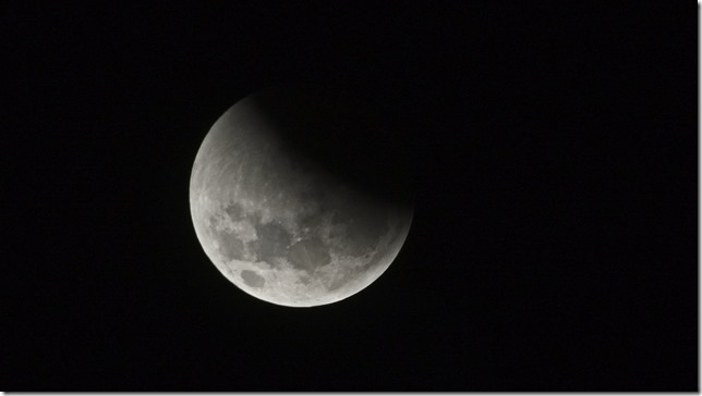
The press was full of hype about the longest eclipse and blood moon for a century. So I did want to photograph it and figured Venus Bay would be a great spot to do it. It was until the clouds rolled in. C’est la vie
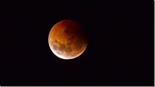
PS Flickr. Instagram and the various local news programs where swapped with similar images, yet there is some pridein that these are my own.
Monday, September 11, 2017
On a Bright Day

Experimenting with a long lens for macro photos (in my garden). Unlike portraits flowers can still look beautiful in the harsh Australian sun
Monday, August 15, 2016


Friday, June 17, 2016
ArtInspired :: The Banksia in the rain
Still thinking of the process used by artist to create an image versus how a photographer might capture that image. It has been a overcast and drizzly day but I managed to get a photograph of a banksia cone in flower. A almost good photo in itself and I had run a bracketed set (handheld) but it was windy so it was hard to merge and properly register. Rather than commit them to the reject bin it was a worthwhile starting point to reconstruct an image in the manner an artist might.
I’m just using my HP Spectre Tablet in tablet mode so I started with the original image and used the Polarr app to add a little contrast, contrast and strength to the red (both luminance and saturation, but not two much). I might have normally preformed this in lightroom and/or OneOne but they are not as touch screen aware as Polarr, which is a pretty neat photo edit app with really intuitive and easy to use basic tools that can easily be used by hand in tablet mode. An artist might start with the background and the overall colour, so I switched to Corel painter essentials and first set up what they call smart blur (which help highlight the strong compositional elements) and also refined the colour palette (I just wanted to enhance the two colours red and green, classic complimentary colours so I pulled back the saturation of any other colours). I use painter essential to do a very quick starter clone painting of the background. Unfortunately this smeared out the red so I use a soft clone brush to bring out sharper edge of the Banksia flower (this helped later registration of the images). Next I re-ran the HDR merge using Aftershot Pro, with particular focus on getting best registration on the banksia. However the droplets of water where no longer perfect.


I now had three separate and subtly different images and used OnOne 10.5 layers to blend them together. The background from the clone painting, the foliage and water droplets on the upper stamens from the original photo and the flower itself a combination (a soft blend mode) of the original photo and HDR image (mainly to enhance the colour). With a Brush Border from OnOne Enhance

I’m not sure how to refer to this style of image. Is it digital art, a faked photo (aka photoshopped which of course it isn’t) or photomontage or something different (and new)?
“We called it photomontage because it reflected our aversion to claiming to be artists” …Hannah Höch
Monday, May 16, 2016

Saturday, December 12, 2015

Wednesday, July 08, 2015
Red Sky in the morning
 I must admit I’m normally still snuggling in a warm bed at this time of the morning, and it has been a very cold spell. However I was up and awake early today and able to capture the first light of dawn. Giving me a great opportunity to compare my “girls” (the three current mistresses, aka photo managers/editors, I’m using rather than picasa/google photos) as I would normally edit/tweak them. The Photo on the right is the original unedited Jpeg. The photos below are edited by AfterShot , Lightroom and Perfect Photo Suite 9. These three systems render my .pef file (Pentax’s RAW format) differently but their RAW file renders all look very flat compared with the jpeg. I liked the dark silhouette of the trees, so I have left the images very low key and just just concentrated of adding a little extra contrast and vibrance.I also straighten and cropped each version. In the edge they all look somewhat similar, supporting the observation that it probably doesn’t matter a lot which software you use as long as it does what you want.
AfterShot Pro 2, which has become my first stop on my laptop. In this case I have just click on Perfect Clear and lifted the vibrance slider a little. With a straightening and crop to finish. All over in seconds
 Lightroom 4.4, was a little more considered and all done in the development module, lifting clarity (rather than contrast) and a little vibrance (not saturation) then straightening and crop.
Perfect Photo Suite 9, was a actually my second port of call but I have left it till last as it seems to match my memory of the moment best. I started in Perfect enhanced (which is where cropping and straightening are normally undertaken. Whilst there I couldn’t resist using their wonderful content aware magic perfect eraser to remove the two light poles (which would have bee a very time consuming task with a cloning tool on the second post behind the tree). I also finished with perfect effects, a natural Dynamic Contrast, A fall enhancer Colour Enhancer bought back to 60% layer opacity and a soft darker vignette
Tuesday, July 07, 2015
 Photographed at
 Thursday, December 25, 2014
Friday, August 29, 2014

Monday, June 09, 2014

Wednesday, May 07, 2014

Tuesday, April 15, 2014
Lunar Eclipse


Sunday, December 08, 2013


Wednesday, November 27, 2013

Sunday, May 05, 2013

Tuesday, March 26, 2013
PhotoProject :: One Colour at a Time


 |  |
 |  |
This is all extremely easy (and fun) but it is actually pretty easy to make your own colour filers using the HSL,Colour, B&W group on the develop menu in lightroom. In this case I’m using the HSL (Hue, Saturation & Luminace panel) and I have destaturated all but the colours green, yellow,aqua & blue, So these desaturated colours are greyed but the colours I selected remain. Time to have some fun with colour, one colour at a time.

Monday, March 25, 2013
PhotoProject :: Colour My Day
 |  |  |  |  |  |
Over the past week I have been trying to take a coloured themed photo each day, and it was harder than it might seem. Yet colour is everywhere, pretty much anywhere with light starts to deliver a spectrum of wavelength that we see are colours. The photographic challenge here was to see those situations where one colour dominated.
Subscribe to:
Posts (Atom)