Sunday, January 11, 2015
Sharing (aka Self promotion) from Red Bubble
Saturday, January 03, 2015
Creating a PhotoImpression for the final patch
The basis of my approach is I am trying to think of colour and composition as an artist might when confronted by a blank canvas. So the first step is like the composition sketch. Not all images are suited to creating a mosaic, you need a strong composition, with a good mix of positive and negative shapes. I often do this step with monochrome versions of the photos.
The next step is to prepare all the tile images, which I usually
put in a separate sub-directory (so they are easy to load) and reduce the resolution (about twice the resolution of the size on the final mosaic, this save time and disk space). I also like to control the colours in the palette of tiles. In this case last week’s theme was contrasting colours so I wanted to stick with strong primary colours. The entries through the year are a wide variety of colours, so I decided to run them through a variety of post processes. rather than use the saturation slider, which can make images look very lurid I have instead used the vibrancy sliders in lightroom to simply enhance and/or suppress colours. Alternatively I used some OnOne presets for lightroom to limit the image to a single primary colour.
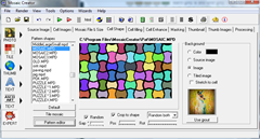
The final step, like any mark making by any artist, is very important to conveying your style and intention. I particularly like mosaic creator because I can use a range of tile shapes (as long as the make a regular tessellation). Different shapes create different textures and can have a big impact on the final image appeal.
You will need to zoom in to recognized the individual patch entries
Tuesday, November 19, 2013
The Gaia Birds Revisited :: My PhotoImpressions Method
It is a while since I created my first photo mosaics of parrots, for a group challenge on Redbubble. I have recently returned to the theme for inclusion within My Monash Exhibition at the Highway Gallery. However my PhotoImpression technique has developed a lot since the original Gaia Bird series back in 2005So I figure it is time again to explain some of the processes I use and why I am applying them. I actually adopted the term photoimpression to describe my process back in 2006, and I have noticed that the term is used a lot now for other photo related things, including as the name for a few competing phone apps which have nothing to do with my process. Further the wide spread use of “magic” filters and photoshop trickery means that a lot of people seem to believe I am just using a one click style filter or pre-set. Nothing could be further from the truth, so I’m taking this opportunity to explain my steps and why I do them. My focus of late has been on trying to look at the photographic processing as an artist might. In this series I have refined my workflow into four basic steps which map into four processes any artist might recognize and probably uses.
The Sketch, the first step is to look at the composition and tonal values of the image. Not all images make for good photomosaics, they need to have a strong compositional toning. I have found the easiest way to construct my sketch is to work in black and white. There are dozens of methods to create a black and white image of your photos, including a lot of presets and filters. In fact it is a bit of a holy grail to many traditional photographers,
that perhaps yearn for film days. A lot of these conversions try to closely match the original film look and many of those popular films had different responses to different colours, for example red are often represented by darker tones and some blues or greens will appear lighter. This could misrepresent my tonal composition, so I have found I like to do my black and white conversion myself just by bringing saturation right done (moving the slider fully to the left). Most photo editor let you do this and it is very simple in picasa or lightroom. I might crop my image and possibly use the tonal sliders to better balance the highlights and shadows. At this stage I also like to generate a test mosaic, for which I still use mosaic creator. I pay particular attention to the shape of the tessellations I am using for the mosaic tiles. In the case of this series I liked a simple diagonal diamond tile which compliments the birds feathers. What has happened now is the photo has been largely deconstructed into a very pixelated image that still has the lorikeet just visible but you will probably only see it if you know it’s there and half close your eyes.
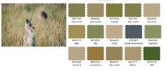
The Kuler Palette, the next step is to mix my colours. Whereas in the past I have used a conventional colour wheel and the theory of harmoniously and complimentary colours or computer based palette pickers (such as now in many web design tools). Adobe has such a utility called Kuler and under their Creative Cloud Service, the new version now has the facility to select the colours
directly from your photo in a variety of moods from colourful, deep, dark or muted. This chooses 5 colour in a suitable palette and indicates the area on the photo that was used. You can also move these point to get subtly or even radically different colour schemes. You can save and edit these schemes in the more familiar colour wheel format. There are a few images on lorikeets in my series so I created a set of complimentary colour palettes, some harmonious some complimentary around the Lorikeets and their forest background I thus choose my palette from a number of related images not just the photo I had selected to process. This hopefully reflects the way an artist might take in the atmosphere and ambience of a place, when painting “en plein air”. Not just "copying" a single photo.
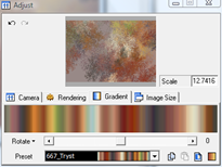
The Brushes, my next step relates to how I make my marks, the type of brush strokes I wish to use is a simple artistic analogy. My objective here is to use the limited colour palettes I have selected above and introduce a little variety in the texture of that “brush mark”. I know that it is frequently this strength and direction of these small textural details that make the work of some artist so distinctive, appealing and interesting. In essence it is these marks that let you see the artist’s hand. For this aspect I have been experimenting with using mathematical patterns
based around fractals (geometric shapes first identified by Benoit Mendelbrot that have special dimensional aspects) With the aid of a computer these crumpled shapes can be simulated in theoretically infinite detail and echo many real world phenomena. For this series I have use a open source program called Apophysis since it not only allows me to select and control the shape of the fractal trace it also allow the selection of the colours of the rendering, for both the background and the gradient of colours mapping the multidimensional fractal into a two dimensional rendering. I took care to use a strong triangular seed shapes for the fractals and thus into the patterns generated so as to compliment the diamond lozenge shape of the tilling for the mosaic. For this series I generated these tile patterns in considerable detail (over 3000 pixel wide). I also generated over 350 coloured and textured tiles to give the mosaicking process a decent range of brush strokes to selected but limited palette of colour.
Applying the Paint, this is the final step and again carried out in mosaic creator. This time the resolution of the image to be generated is increased and the library of new coloured fractal tiles is used to infill the photomosaic, but within the same tilling as the preliminary grey scale mosaic. I return the colour (Hue) and use not only the best match for tone but also a closest match for colour. Many colours in the original photo thus needed to be “shifted” slightly to match the selected palette of colours and the degree to which tone is matched is also refined making the matching within the mosaicking process by going from minutes to almost hours for this final render.
If you now look closely the individual diamonds in my tile tessellations are now replaced with the swatches of the fractal flames, which add new colour and texture back into the image. The magic is that your eye now sees the photoimpression (see first image above for the full image) as having nice detail and the colours as perhaps richer but the bird is again realistic, it just no longer has the detail or exact colours of the original photo. These have been refined as if by an artists eye.
Saturday, November 02, 2013
Hung and open …”meet the artist” next weekend
My exhibition “An Artistic Journey :: In Search of Sir John Monash” is hung and open at the Highway Gallery in Mount Waverley. It includes a range of my works, few of which I have been posted on the social webs, so if you are in Melbourne and interested in my geological panels, photography, and photo mosaic collages please consider coming along to the “meet the artist” on Sunday 10th. November.
My Monash works follow on from my previous geological panels and paintings, on the surface they are firmly represented by earthly things, the soil and rocks. Yet they also reflect on three key aspects of Sir John's life. His military life, his life setting up the SEC and powering Victoria and his passion to build the Shrine of Remembrance. They have been created with the assistance of an arts and culture grant from the Monash City Council, which allowed me to learn about casting and moulding, to bring stronger dimensionality into my geological panels, experiment with a range of materials and hold this exhibition.
Sunday, August 11, 2013
Thinking of colour as an artist might
The nice feature when building your colour scheme with Kuler is you have a range of automatic select colour modes (colorful, bright, dark, deep, & muted) which select a complimentary colour scheme from parts of the image. You see little circular spots above the parts of the image that colour appears. You can also just drag the dots to any part of the image you like and that colour becomes part of your custom swatch. (I have added the lines below to highlight the colour dots)
If you save the swatch, but you have to have an Adobe ID to do that, you can then edit the swatch. For example below I did alter the green to add more yellow, to bring the main colours into a more harmonious triad style. I left the brown beige (which has a yellow orange tint) as a compliment to the blue. Since the photo was a little dark I lightened the tones a little by dragging the circle in the colour swatch to the right on some of the colours. Like the impressionist I’m attempting to use colour to add light!
The next step was a bit of a shortcut, which involved using corel painter essentials which has a really neat
I’m quiet happy with the result. What do you think?
Friday, September 21, 2012
Colourful Shades of Grey
Wednesday, June 27, 2012
PhotoProject :: self portraits into photoimpressions
Yesterday’s post was inspired when I found myself being a part time portrait model for the Victorian Artists Society. Normally I’m one of the students. I figured if I mounted my camera on a tripod and used the remote control, I would be able to take some photos as I posed. I also figured if I put the images on my computer it could also be running up some self portraits using Mosaic Creator, all while I posed. An automated self portrait? That was the theory!
I’ve also posted the two photoimpressions above, along with my “words” version, from the post below, over in flickr to let you see the detail, Just click on the images to see them larger.By the way I adopted the term photoimpression back in 2008 to describe my approach to creating photo mosaics, I note a growing number of, phone apps, software packages and websites now also use the term, and my techniques have nothing to do with any of these.
Friday, August 27, 2010
More on Photo Impressions
Importance of Colour
If I can get the colour balance and harmonies right, I knowMark Making
The other area, where I can get the photo impressions to resemble an artist's work, using in the mark making. Here it is the texture within the tiles and shape of the tiles themselves that can be harnessed to reflect the personal dabs and strokes of an artist. This is where a lot of artistic style and individuality lies. Those marks can make any work interesting and accessible, or just messy and confusing. I haven't found anything yet to best choWednesday, April 21, 2010
My Photo Impression Methodology
I have been creating a type of Photo mosaic, I call them Photo Impression, for several years now yet I find it is the thing I end up re-explaining most. I’m not trying to keep the method a secret or mystify it but it is considerable more complex than “using photoshop with a background texture”. In fact I like the way collage, mosaic and Photomontage can extend a subject, there is a lot more that digital photography can offer than just photoshop trickery. Quiet a few notable artists like Dali, Chuck Close, Andy Warhol & David Hockney have been investigating parts of this process before me.
There are three main steps I undertake. They map nicely into painting steps and terms. The initial tonal map is like a sketch where I am investigating the tone, balance and composition. I prefer to work monochrome here. Next is the paint stage, where I analyse the colour in the original image looking at colour contrasts, compliments and harmonies. I like to restrict the number of colours, much like the impressionist painters, as it gives a more powerful results with potentially a stronger emotional connection for the viewer. At this stage I select existing photos or make computer generated patterns or even take new photo to build a small library or images that form my palette of tile. Next I get to choose the brushes to make my marks, only these are the patterns and shapes of the small sub-tiles which make up the final image.The shape, size and type of pattern repeated in the images develop the texture that allow me to bring a delicious additional depth into the works.
I do use computer software, mosaic creator, to build the final image and this can take several hours, frequently requiring over night runs. The preliminary stages are sometimes done on the computer sometimes manually and usually take weeks to months of contemplation.
Wednesday, March 24, 2010
Mother Goose :: revisited
For Photofriday's Topic Children
Wednesday, January 14, 2009
My Photo Impressions (an update)
Whilst I have not been publishing them here, my photo impressions of birds in particular, have become my best selling works. This one, of a lone gull flying into the sunset, focusing on the theme “extinction is forever”. It has been in preparation for some time for the Venus Artist Contemporary Showcase. I always end up doing lots of tweaking of colour palette and tiling textures. In the end I have opted not to include in the exhibition (it is the first photo impression I has included a written message on) but have also posted it on RedBubble (you can purchase a poster or a large canvas version from them).
Please note I have stopped using the term Photomosaic, which with this spelling has been registered as a trademarked by Robert Silver. I use the professional version of Andrej Olenik's Mosaic Creator, which is based on different patented techniques to those covered by the patents filed by Robert Silver through Runaway Technology Inc.If you would like to be kept informed of norm's work, send an email to the address below and you will receive an occasional email newsletter of upcoming projects and exhibitions.
Monday, December 01, 2008
Barista School

Making a good coffee is as much an art as taking a good photography. Having the best subject, best equipment is not enough you still need inspiration, experience and understanding of the medium as well. Even with the best beans and the best espresso machine you still need a dedicated barista's touch to appreciate the magic. As well as great coffee I had enough photos for firstly create a super wide panorama using autostitch then use mosaic maker to create a multi-image mosaic (you will need to click on the image below to appreciate the "detail").