Showing posts with label thepatch. Show all posts

Saturday, January 03, 2015

Creating a PhotoImpression for the final patch

My final entry for the patch, was a photomosaic of all my weekly entries over the year. There are several photomosaic programs around, andreamosaic is a good one which is free to download. To the best of my knowledge there is not a photoshop add-in/filter that can make this type of collage. I have developed my own technique, I call the results photoimpressions, and I have used a variety of software to prepare the image but use a wonderful little utility called mosaic creator to construct the actual mosaic, it has a free trail, a lite and a pro version. The pro version is reasonably priced and gives you the ability to create you own patterns (tile tessellations) and ability to produce enormous mosaics, but would still I recommend you try it first.

The basis of my approach is I am trying to think of colour and composition as an artist might when confronted by a blank canvas. So the first step is like the composition sketch. Not all images are suited to creating a mosaic, you need a strong composition, with a good mix of positive and negative shapes. I often do this step with monochrome versions of the photos.
Choosing the image is a lot like making a compositional sketch

The next step is to prepare all the tile images, which I usuallyenhancing comtrasting colours and supressing the others in lightroom
put in a separate sub-directory (so they are easy to load) and reduce the resolution (about twice the resolution of the size on the final mosaic, this save time and disk space). I also like to control the colours in the palette of tiles. In this case last week’s theme was contrasting colours so I wanted to stick with strong primary colours. The entries through the year are a wide variety of colours, so I decided to run them through a variety of post processes. rather than use the saturation slider, which can make images look very lurid I have instead used the vibrancy sliders in lightroom to simply enhance and/or suppress colours. Alternatively I used some OnOne presets for lightroom to limit the image to a single primary colour.

My library of image tiles based on re-coloured patch entries

The final step, like any mark making by any artist, is very important to conveying your style and intention. I particularly like mosaic creator because I can use a range of tile shapes (as long as the make a regular tessellation). Different shapes create different textures and can have a big impact on the final image appeal. posterizing the lorikeet image in Paint.netTo help strength the lorikeet I have also opted to have gaps between my shapes (simple puzzle pieces) and have the original image showing through the gaps. Also in this case because I only have a limited number of images I had to choose reuse duplicates of the images, and ensure that they are not use too close together, rather than have then used once and resulting in a  very course mosaic, Finally I wasn’t happy with my first few trials, so i ended up converting the lorikeet image to a posterized image with only a few version of the R G B colours (I used paint.net for this). This helped to keep the final colours “cleaner” Then I chose to sample both the toning and colour during the mosaic creation step.


You will need to zoom in to recognized the individual patch entries

Sunday, December 07, 2014

The Patch :: Leading Lines & ‘tis the Season

My eye problems over the past couple of weeks means I have not been carrying my camera or out taking photos so this next the patch has come quickly. Today I saw this composition in a local shopping mall so I only had my trusty old HTC/Wildfire Phone to get a photo.
Comparing original photos and various processing options
Whilst I did try a HDR Camera image (it takes and processes the image in your phone). I liked the simple phone photo more and have used Perfect photo to clean up the noise, used dynamic tonal adjustment and warmed the colours as my leading lines composition.

Apologies to Cliff, for being so similar, but maybe its the problem of having such generic shopping “temples” .

Tuesday, November 25, 2014

The Patch :: Falling back on joiners

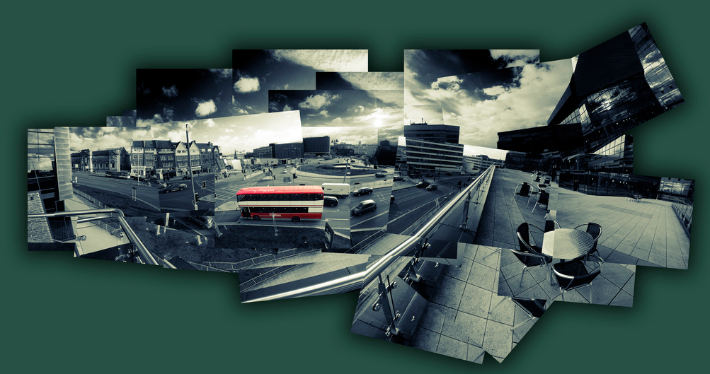
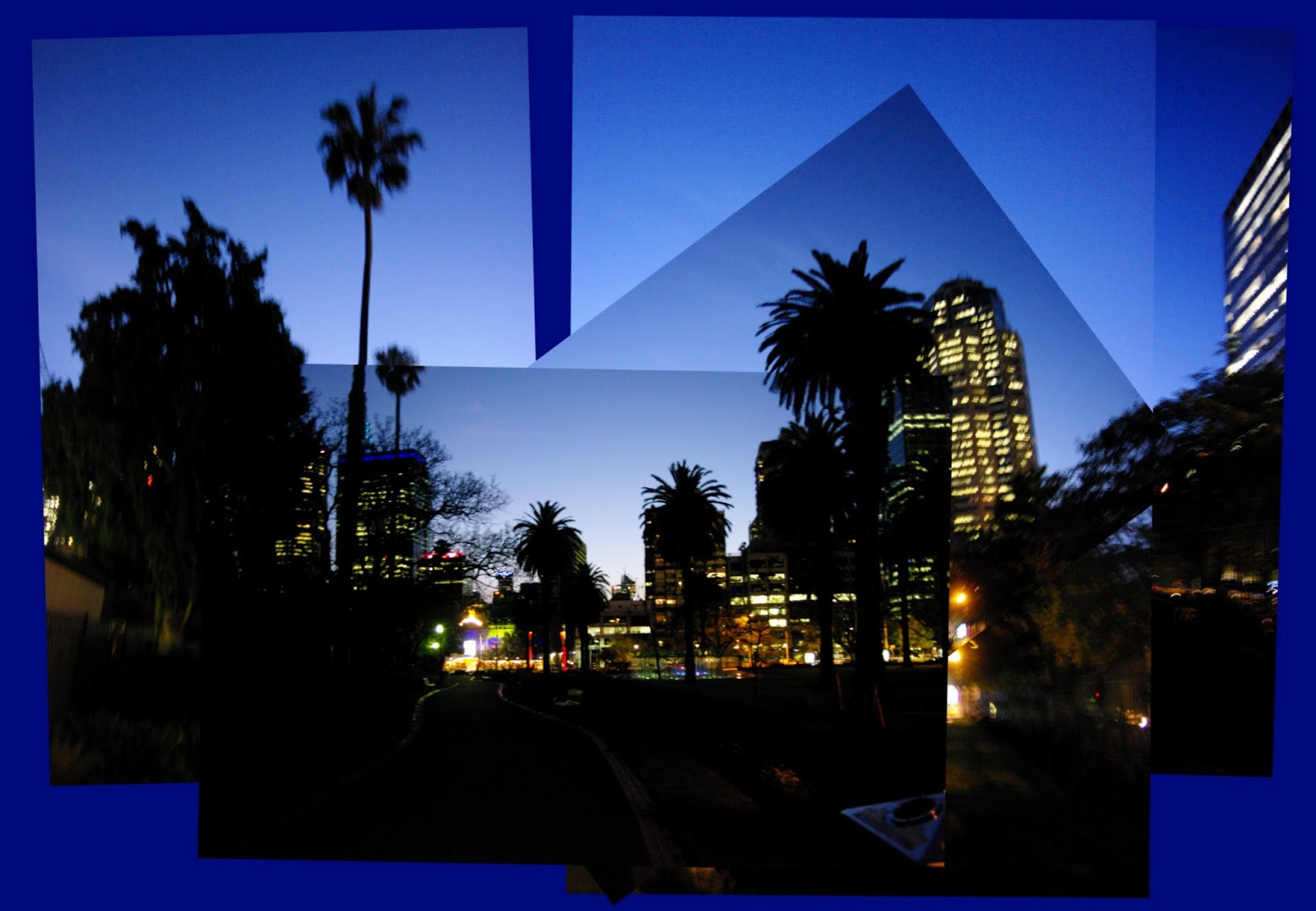
I had been scouting around for a photoworthy urban landscape and whilst I live in a “vibrant” city I really don’t fine it so attractive (infact this week I was more confronted by the ulgy side of the urban aspects), So whilst I took many photos of buildings and motorways, the only ones that even inspired the idea of a worthwhile landscape for me was a group of shoots I took hand held looking back on Melbourne at dusk.  However rather that try and work up a panorama I felt there was extra charm in leaving them as a stack of images.

Whilst photo collages have been around a long time its is the joiners developed by David Hockney that can bring a rich artistic feel of personality and being an original work. His original joiners where just polaroid images (lots of them) assembled and stuck down to make a larger image. Not necessarily taken from the same vantage and often deliberately not quiet matching. I have found the collage maker in picasa is an idea place to build similar joiner style collages. However there is plenty of software out their to do a similar job (Hockneyizer is a wonderful “filter” style app,originally for flickr photos but you can upload any photo to it directly, that will take a single image and break it into a hockney style collage)
Picasa collage ScreenIn picasa you just need to select the photos you want and the select the collage builder tool (either the Create/Picture Collage menu item or collage button if you have one on the bottom toolbar).  The first step is to select the picture pile format which is as if you are just scattering the photos on your desktop. under that is a series of border templates (the collage above has the polaroid frames, in homage to Hockney but they are not what I wanted for the final image. I prefer borderless option.) However I like to using a drop shadow which emphasis (rather than hides) the join between photos. The next step is to move around and possible resize and reoriented to photos. When you select a given image a control circle if overlayed on the photo click on in and moving your mouse slides the photo over the surface. You can resize the photo with the mouse wheel (or clicking on the orange dot on the little control button on the edge of the circular tool and moving it in and out (horizontally). To rotate the image again click on the orange dot and now move the mouse vertically and you will see the image rotate. the controls are very easy to master and you will soon be able to rotate and resize at the same time.
Picasa collage ScreenOne of the bigger charms of Hockney’s later joiner work is that he did not try to fill the whole space and left ragged edges and some gaps but he did take time to judge a suitable background colour, something that could bring the whole together. I like this approach and so I used the eye dropper tool to select the dark blue of the sky as my background, Then a bit more rescale and realignment of all the photos together (press select all at the top of the workspace and all the photos will be outlined and can be reoriented and scaled as one). You must then hit the create collage button, which creates the composite image and puts them in a separate album called collages. You can then work on this as any other photo in picasa so I did a fraction more cropping. The advantage of the picasa’s tool is you can return and re-edit the original collages in the collage album at any time.

There should of course be some “art” applied to your selection and arrangement of the images but if you are lost for inspiration you could always try the scramble and/or shuffle button at the bottom of the collage workspace (remembering that any alignment of images will be lost)

Tuesday, November 18, 2014

ThePatch :: Landscape & Water …aka At the Billabong

IMGP9737-HDR-001My original intention for this week’s The Patch theme on Landscape and Water was to be a dramatic surf seascape, but circumstance keep me from getting down the coast, and a usual time was running out. Saturday night bought the heaviest overnight rain for many years so I next morning I headed for the Jells Park Lake expecting to see flooding everywhere (or at least some good puddles to get a reflected landscape. Trouble was the sky was a dull grey, with just the occasional glimpse of blue and it was still drizzling!

The Creek was certainly in flood and I had to get my feet wet to get around the back of the lake (several very average water photos later I got to a normally dry billabong and with the sun briefly peeked through breaks in the clouds long enough to get a panorama set with bracketed exposure of the reflections and a nearby river gum, When I realized I probably had the makings of the unofficial Australian Nation Anthem (well the one any True Blue Aussie knows the words to) Waltzing Matilda. Ok it is not a real Coolabah tree but it is a real Billabong, and with some water in it!
At the Billabong- Autostiched Pano/HDR* setAutostitched Vertarama of the River Gum in HDR*

Back to the Photo assignment, first step was let google+ do its autoawesome HDR* and then I used autostitch to join up these photos. Finally I used the new Perfect Photo Suite 9 (I’m still  checking out the trial version) to do the crop and a little further tonal tweaking, especially toning down the lurid HDR* colours and adding a little warmth. Finally adding that great Big Softy vignette (every so slightly off center).


Tuesday, November 11, 2014

ThePatch :: Landscape/Sunrise

This was one theme I was really looking forward to, I like the striking lighting of sunsets and sunrise but have learned whilst they make wonderful images they don’t sell as prints, I suspect everyone thinks they can do better themselves with their iPhone or compact digital camera. So I hadn’t been putting as much effort (perhaps subconsciously) into being there at the right time and in the right place recently. However I had figured getting nice reflections off the nearby lake in Jells Park would be perfect. Well nature let me down! I had a week of very ordinary overcast lighting and so little colour. Its not as if I got bored or discourage. There was actually plenty of things going on to photograph. Which reinforced the 50/50 time limit rule, at least that’s what Matt Kloskowski called it in a recently. The idea is to take your intended shot(s) and then take a many again trying something different and perhaps more creatively. You will return home happier trust me! Here are just a few of the things I saw & photographed
_IGP9564 nice backlightingCheckout the bottom two items in the park signs_IGP9644 the Ibis returning to roostIMGP9536 the full moon setting as the sunrises
Returning to the theme at hand. I only got one morning with much colour and I was not in the spot I planned, but I did find a couple of interesting compositions and thankfully took a couple of bracketed sets. The autoawesome HDR* created by Google+ was very good by their normal performance BUT it was teetering on the surreal, not what I wanted. Oo I redid my own HDR this time using Picturenaut to just merge the images and give me a 16bit file which I further manipulated in Lightroom with some additional tonal and colour tweaks in Perfect Effects 8 ( A sobering thought is I probably wouldn’t have gone that route if I hadn’t seen the google+ HDR*, see the first two images below).
_IGP9542-Edit in Perfect EffectsIMGP9492/94 Merged Layers in Perfect Photo


PS please excuse the lateness of this post I was actually hoping for a good sunrise this morning.

Friday, November 07, 2014

Perfect Photo Suite 9 is out and a giveaway

I've become quiet a fan of Perfect Photo as an ad-in to Lightroom, it plays nicely with the Adobe Lightroom environment and it brings layers and masking, The new version 9 (there is a trial version available) is out now and promises a fast smooth browser experience (ie you don't have to wait for ages while lightroom does her thing) if you want to do a quick review, culling and edits, also the smart photo option which allows you to reuse and change previous edits seems real winners.

Speaking of winners Scott Davenport, an OnOne Instructor and fellow The Patch Community member on google+ is generously giving away 7 copies of the new Perfect Photo Suite 9, all you need to do is sign up to his great email newsletter and blog about his giveaway blog post. Its as easy as this.

Tuesday, November 04, 2014

ThePatch :: Trees in the Landscape

I must admit this weeks thepatch subission caught up with me right on the last day, so I had a pleasant walk around Jell's park after a great BBQ dinner (its day light saving here now). I figured there are plenty of interesting trees there. There are perhaps a few to many!

The ibis where flying in for the night and a waxing moon  made for some good shots, albeit distractions.  The light was fading as I reached the Oaks Picnic area with its wonderful stand of young Oak Trees, complete with a flush of new leaves for the spring. The green-ness was amazing (remember that green Derwent pencil everyone loved) and this stock standard google+ Autoawesome HDR did the place justice. So it is this week submission


Friday, October 24, 2014

ThePatch :: an Impression of Highkey

When I think of highkey in art I think of the impressionist, they painted light as colour, shunning the murky tonal focus of the art academies of their day. Whilst the french impressionist are well known, few know of a small group of Australian painters usually called the Heidelberg School following the same ideas at roughly the same time. I have always loved their work as a lot of it was painted in the area I grew up and I do like Charles Conder’s “A Holiday at Mentone”. The old baths are no longer there but I can remember them and the white cliffs (also no longer visiable), The strands of dried sea weed still frequently can be seen and the beach and its promenade are still a popular stop on a sunny day. I earnt my first swimming certificate here. I am also a member of the Victorian Artist Society and this painting was first exhibited in their Spring Exhibition of 1888. I have also visited this site previously to test out an upgrade to my homemade tripod watercolour easel. So there is plenty to connect me and a self portrait to this site.

mentone tonal changeI actually took this photo a few weeks ago on a beautifully sunny spring day. Forgetting somewhat that Australian light (even in early spring) is very harsh and contrasty. So I couldn’t exactly get a true high key image without totally blowing out the highlights. Fortunately I took a couple of  EV bracketed sets and  found an image without to much clipping of the shadows and without excessive blown out whites. So all I had to do was use some tonal adjustments. Classic tonal curve stuff and yet an artist would not approach the task in such a mathematical way. I have come to like the basic tonal sliders in lightroom (highlights, shadows, whites & black, these are much simpler to understand in terms of controlling tone of your image). I’ve even found that clicking on one of the tonal ranges in the histogram itself. and sliding the histogram, also moves the corrsponding sliders. So I eased the histogram over to the right (to create the high-key) and lifted clarity and vibrance to keep the colour. The background and my figure had significantly different contrast/tonal ranges so I started to use layers to separate foreground and background and soon got the idea of re-sampling the background layer in corel painter with an impressionist brush. Then using perfect layers to merge the layers back together to give me a very hybrid self portrait this week.


Sunday, October 19, 2014

ThePatch :: Remembering Rembrandt

Whenever I hear of a low key portrait as a style, I think of Rembrandt Lighting, which is a very popular technique taught in studio lighting workshops involving two lights (sometimes one is a reflector). one light is a strong spot or key light and the other is diffuse just to fill in the shadow. The light arrangement is such that one half of the face is well lit and on the other side a small triangle of light illuminates the upper cheek below the eye. A purist interpretation is that the triangle be approximately the width of the eye, and length of the nose tall. It’s actually a modern invention nothing to do with Rembrandt approach, the effect just tends to look like his portraits (see the section Origin of photographic term in the wikipedia link above).

Rembrandt's studio todayI have been to Rembrandt's studio and he only has a row of windows on one-side, (there are heavy shutters to blank off the bottom windows and a bleached canvas blind hanging above an end window) So I suspect Rembrandt himself would probably fail the studio lighting work shop. What he definitely would not have failed is portraiture and particularly low key look  (ie where most of the tonal range is in the darker tonnes) Some of his deep A bit too theatricalrichness may have come with the age of his painting (most are now over 350 years old) but if you have every seen the original of his portarit paintings (such as his 1659 self-portrait) I’m sure you will recognise the fresh feel and emotional connection.

I quickly dropped the theatrics of trying to be visably arty, and just focussed on a natural lighting from a single window. I had to add a dark backdrop and use a white sheet of paper as a diffuse reflector on the righthand side.  With my camera on a tripod and set with a timer on the shutter, it was then only a matter of adjusting aperture (first) and then ISO/speed to get the right low key exposure. A little further adjustment to warm the shadows (raw umber-fy) and adjust the black clipping point in lightroom to avoid too much gloom. Unfortunately I can be seen more worried about the shutter timer working than trying to look artistic. But it is a decent selfportrait.


Monday, October 13, 2014

ThePatch :: Self Portrait with a Unique Perspective

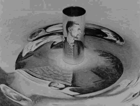
My plan to do all self portraits for this months ThePatach themes, gives me a lot of scope to be more artistically inspired with the curly topic of a unique perspective. I had been experimenting with conical mirror projects for my “handmade” little planets of the Queenscliffe Observatory and immediately thought of MC Escher’s Infinite Reflection. Yes its all done with mirrors, a cylindrical one, and an anamorphic transformation to produce the image the mirror is sitting on. The resulting image you see in the mirror appears to magically floating above the otherwise very distorted drawing on the table.

I started with a very simple front on self-portrait, rather than a profile, as in Escher's drawing. I deliberately keep the background and table simple and pretended to sketch. Then with a minimal tonal tweaking and a basic conversion to a greyscale, I had my starting image to transform. Whilst I wanted colour in the final photo I felt staying in grey tones for the reflection would be truer to Escher's concepts.

Whilst I do have a neat anamorphic transformation utility, called Anomorph Me, I don’t have a cylindrical mirror. What I do have is a stainless steel milk frothing jug and a stainless steel espresso cup. Now a coffee association is much more me anyway. So the first job was to work out roughly the right sizes to make the transformations.  I managed to get close on the first attempt. So far so good…
_IGP8892x npolar _IGP8892x-polar2
IMGP8913-001 _IGP8907
The stainless steel is not as clear as a true cylindrical mirror and also the items don’t have straight sides so the reflected images are not as sharp as Escher's and more obviously distorted. So out with a polishing rag and  back to make a new set of transforms this time with some conventional perspective shift to allow for the cup surface leaving out and the jug surface leaning in. For the final photos I had the cup filled with an espresso shot and the jug with frothed milk. I liked the one with the coffee best as it is a better self portrait of me (I love my coffee, I’m from Melbourne!) even though the reflected image isn’t quiet as clear. I think Escher would understand.


Thursday, October 02, 2014

The Patch :: Contemplating (Self) Portraits


This months challenge on the patch is based around selfportraits. I’m not scared of self portraits of sitting for portraits, I have done plenty both with camera and paintbrush. The real challenge is, with the over popularity of selfies is coming up with something creative and original. So of course I went looking at some classic self portraits, not to copy but for some inspiration (the irony of looking at the work of othesr for inspiration on creativity and originality is not lost on me! That's what art is, isn't it?). Nor I am trying to spoof the great portraits or copy them to closely. I’d rather just be inspired and add something like Rodney Pike’s wonderful famous portaits reimagined with Mr. Bean (aka Rowan Atkinson). The trouble is if you try to copy the style too closely, you get in the uncanny valley situtation, somewhere between a fake and not quiet right, just disturbing. I particulalry liked the strong contrast of Yousuf Karsh’s Hemingway portrait (hes a beraded old bloke, what's not to like) and I figure it was very strong (studio) light, extra development time and a high contrast paper. I’m assuming perhaps Kodak Tri-X and Ilford grade 5 wasn’t available back then, but they where in the 60s & 70s. There are a lot of good portraits of pop icons and even artist like Andy Warhol that testify that strong light can work in very memorable portraits. But strong contrasty light is not considered complimentary for portraiture in fact there is a whole set of paraphernalia to give soft light, soft boxes, gels and filters, not to mention portrait skin smoother and glow post processing filters. No wrinkles, bumps and blemishes for the rich and famous these days. Anyway I figured strong and contrasty is something I could play with for the first sub-theme sidelight. Another less than complimentary photographic technique is HDR, it also tends to highlight wrinkles bumps and blemishes. Perfect two wrongs to make a right!

IMGP8620-HDR (1) copySo with a high contrast HDR in mind I noticed that in a very grey overcast day drawing to a close with the last light coming in a west facing window I had the opportunity to use the light and as I set up the table light behind me came on (its on a timer). I had my camera on a tripod beside me and I took a few experimental shots including some EV bracketed sets, The light didn’t last long and it was time for dinner. The image below is a google+ autoAwesome *HDR created while I had my dinner and watched repeats of spicks and specks. I did try some of the HDRscape filters in google+ but they where just too hash and a little too surreal, but there was potential so I compromised by bringing the image back into Photo Effects and my favourite dynamic contrast filter and a touch of clarity in the tone enhancer. This is one image that does also look good in black and white (I often desaturate or do a quick black & white to check tonal composition)  but I wanted to stay with colour,

Tuesday, September 30, 2014

ThePatch :: Toy on Parade & Transportation


_IGP7406x_IGP6906x

It is the last outing for my virtual creation the Blue Lego Guy on the Patch, and it was about transportation. I was down at Point Lonsdale and a lot of the things to move around looked like fun, but they where possibly more sport than pure transportation. Anyway why deny the Blue Lego Guy some fun.

I had photographed cars, boats & even container ships, but the guy didn’t look happy. Then I realised he needed to be with lego, real lego. So my young grandson helped out again. This time building a technical lego monster truck. The Blue Lego Guy was in his element helping out.


Monday, September 15, 2014

ThePatch :: Toy on Parade & Games

I figure I should at least have some fun with this weeks theme at ThePatch , Toy on Parade & Games. It has to be the same toy,(ie the Blue Lego Guy) . So what games would he like to play, or more particularly be part of? Why not chess, I could design the pieces in Lego!  Which I did. (Ok that took a fair while but I have designed a proper lego chess set, and the complete build instructions are available on request).

Some preliminary tests shot for composition escaped (more precisely they were vacuumed up by google auto-backup, which I had only turned on to see if I could get a couple of *HDR autoawesome images from my photowalk on Tuesday). These test shots were made into a short *Motion animated gif. Not exactly exciting but you can see me experimenting with f-stop to try and get a better depth of field. The next issue was to perspective. To get a decent close up I needed a wide angle lens (ie zoom in) but I only had a near orthographic projection (common in CAD systems) available in LDD (Lego Digital Designer) To get such flat perspective I’d need to use my telephoto lens and take the photo from many meters away (and my room is not that wide). So a compromise was needed. First I experimented with tilt shift filters (with ordinary results), Then with 3D adjustment/perspective in Corel Photo Paint (much better but fiddly to set). This is getting complex.

Finally my planning turned to where to place the other chess pieces around the Blue Lego Guy and I had the grandiose idea of using a famous chess game (such as game 5 between Kasparov and the computer Deep Blue, which ended in a draw). From a low down view these games look over crowded and confusing and no one, even a chess expert could possibly recognize the game. Time to simplify the image and layout for simplicity and good composition.

Assembling the final image I ended up creating 3 layers (the the photo of me and  the chess board, the piece I am holding, and the chess pieces themselves) and adjusted them to fit in Corel Photo Paint. However as before I keep the layers separate and reassembled the image again in OnOne's Perfect Photo layers and some tweaks in Perfect Effects to get a overall photographic look. Perhaps more work than play but fun all the same.

PS for those that like Where's Wally style puzzles, there is one actual Lego piece in this picture, can you find it?

Monday, September 08, 2014

The Patch :: Toy on Parade at Work

blg at work in office
image
My first plan for this week’s thepatch theme, Toy on Parade At Work was to have the Blue Lego Guy working as a Lego designer (see above), a nice bit of self reference there. Nice clean desk by the way guy. Which was fun to set up and shoot but he was creating an artist and artists work too, right! So the idea snowballed to becoming a en plein air outdoor painting set, nice again but the artist idea had taken hold and I needed something a bit more creative.

blg selpotrait_oil Painting A selfportrait … perfect, now we are really talking self reference. It ended up as three separate layers and three separate images. The background was a real easel, the self portrait was a front on image of the lego guy (the one used in the photo above) but re-rendered with corel painter light, using oil bristle brushes and marker pens (a very loose self-portrait it is, but have you seen the size of his brush! The Blue Lego Guy was a separate layer again direct from LDD (that’s Lego Digital Designer). The layers where assembled in Corel Photo Paint but retouched in OnOne's Perfect Effects to get a more photographic finish.


Sunday, August 31, 2014

ThePatch :: Toy on Parade in Nature

Meet Blue Lego Guy (created with Lego Digital Designer)The patch theme this month is Toy On Parade, and the same toy needs to be in each photo. After having fun with my grandson making the automobile awesome motion gif earlier in the year I figure this was a challenge made for a bit more lego fun. If you have seen the lego movie on DVD and watched the special features you will have seen one of the designers describing some of the designs He is using a program called Lego Digital Designer, which can be downloaded from Lego. The models for the lego movie where largely developed with this easy to use CAD like program. It can be a little daunting (if your older than 6), it has a database of every lego part there is!  I quickly realized it does give me the ability to create a character that could be easily pose & animated. Perfect for this challenge, assuming a virtual character can be on parade. My young lego advisor loved the project and wisely helped choose a very simple character with which to build some adventures and hopefully some good photos. Meet Blue Lego Guy.

blue wren & blue lego guy in Paint.NET LayersHis first adventure in Nature, clearly was to be based around a small blue wren I had seen and photographed at a Jells Park lake on Friday. With some head scratching, even reading the manual and using the layers in Paint.NET I was soon able to acquaint blue lego guy with the blue wren.  Ok not so convincing and I liked a different photography anyway, with some raindrops on the grass around the wren but with depth of field giving a more blended background onto which to superimpose blue lego guy. A little bit of posing adjustements back in Lego Digital Designers and adding a camera, yellow of course. Getting convincing perspective was a bit of a challenge and I had to wing that in the end as well as guessing the relative height he might be.  A little bit of cloning to put a couple of blades of grass in front of his legs and some suggestions of shadows. Finally a cinematic wide screen crop.
Voilá ….Smile Mr Wren!


Preview of blue lego guy at work


Wasn’t so hard after all. Stay turned for more Blue Lego Guy adventures.