Lake Entrance main Beach looking west :: The coming storm #janesweather pic.twitter.com/LO5RaXsaY0— oz_endless_summer (@OzEndlessSummer) March 30, 2017
Friday, March 31, 2017
Sunday, March 26, 2017
Collecting Photographic Reference Material
Most artist have their very own way of collecting reference material for a later studio painting. Some might just take one snapshot style photo (or perhaps a few) then essentially just copy that.

I must be from a more plein-air background, I much prefer to do a sketch or two (or three) on location. There is more time to breath in the atmosphere, listen to the sounds and get a real sense of the place, than just pressing a shutter button and moving on. More significant you still generally have only limited time so you have to gloss over the less important details, ones you might be tempted to copy from a photo. Instead you have to concentrate on what will be your subject/centre of interest, getting the relative tonality right and pulling together the colour palette. This requires keen direct observation, but with a little practise it come easy. In my initial pencil sketches I could see I needed to include the distant people to consolidate the vastness of the beach (Seven Mile Beach near Gerroa, South Coast of NSW )
Where a photograph will just reproduce the colours (and detail in a scene) within the technical limits of a camera, an artist will usually refine the colour palette to enhance or subdue the atmospherics. Possibly tweak the relative tonality to emphasize the subject. I always feel even rough sketches capture the essence of a place and are fresher than just a photo.


You may as well get the obvious snapshot out of the way. However next spend a bit of time looking for a wider view. Camera phones are already slightly wide angle but unlike a DLSR you can’t change lenses but there are lots of panorama apps that will allow to get a wider view. Alternatively you can take several overlapping photos and use a stitching program to join them. The next option is to zoom in close (most phones can do digital zooming) and a DSLR with a good zoom lens will save you leg work. Otherwise just walk in to get a closer view. It is also wise to take a couple of atmospheric photos, if it is a cloudy sky, take a photo just of some of the clouds. If the light is intense take some photos showing deep shadows, A blue sky is a lot of blue but it will give you a good reference for tonal changes, particularly towards the horizon, Make sure you can record the direction of light (shadows in photos will help here). Don’t forget to look around, sometimes what's behind you can make a stronger picture.
That set of five type of references should give you a big start back in the studio, but why stop there. Here are a further set of optional photos you should consider as well. You don't have to follow my suggestions here exactly these steps they should just be an excuse to do something different, perhaps more create.
Take a photo of the sketch in place
Try a range of different framing options
Try a range of exposure options (eg EV bracketing)
Look for Abstract shapes (or lines) and focus on them
Get in really close, record interesting texture (this could be very close up or plants, rocks, ripples in the sand or a stream)
The photo of your sketch in position will give a great reference of understand any difference in the colours captured by your camera versus what your sketch recorded. If nothing else any white background of your sketch book will be perfect to do a white balance on the photo later (which decent software should let you can carry to your other reference photos). Next is the idea of trying different framing options (its a little like steps 2 & 3 but instead of focusing on the subject you should move the frame around shifting the subject up and down or to right and left). You might like to change your position so you are looking up or looking down (eg standing or sitting on a beach makes a big difference to perspective). Perhaps you can find a track, fence line that leads you nicely to the subject. Walk around. Perhaps a portrait orientation (vertical) may be better than a landscape (horizontal) orientation. Your camera viewfinder or phone screen are fixed aspects but you might like an image with a slightly different aspect. For example I am finding many sunny vistas lend themselves to a super wide format and I even sketch across two pages (3:1 aspect), so why not take two or more photos and join them later.
A lot of folk don’t like the default HDR style of photos (chunky detail and over vivid colours) but taking a set of images at different exposures can give you details in the shadows right through to delicate highlights. A single photo even when perfectly exposed can not provide these in a very contrasty situtaion. Learning to use HDR methods/software in a constrained manner can deliver photos that are much closer to what you remembered of the light & colour. Most DSLR have bracketing options and now many phone camera apps do as well or can do HDR multi-exposures directly on the phone. You don’t have to put up with bleach out skies and blown out highlights anymore.
The second last task is slightly obscure but it relates to balancing the tonal areas in your final painting. You can use your camera to help find the dominant shapes of dark and light. It requires looking at the scene in a more abstract manner. Its a lot like the advice to half blur your eyes in order to better see tone. If you have a DSLR put it in manual focus mode and then blur the image until you just see abstract shapes. Strong diagonals, curved lines and edges or sharp shapes can lead the eyes of the viewer. Try framing those shapes such that the lightest light against the darkest tone become the centre of interest (such contrast is generally what involuntarily draws a viewer’s eye first). Then refocus the camera and take that view. Mobile phone cameras generally don’t have a manual focus but you can resort to any of those camera/filter apps that change what is displayed on the screen as you take your photo. Changing the camera display to black & white or using a posterizing filter with only a few steps will help make it easier to see the tonal shapes. If you don’t have a phone with such apps find a some software that can help you perform these steps (I have used Paint.net on my computer and Snapseed on my phone) This is much the same step as doing a small tonal composition/notan sketch. As with the framing step it pays to move your view around, even a little. It can also help you zero in on what contributes to an interesting composition and what can become just a broad area of tone, and perhaps a little texture.
Finally a few really close ups that record pattern & texture and/or some of the details you particular want included in your painting, a few quick detail sketches of such items might be useful as well. After realising I needed some people to give me scale I took a few difference photos of people both near and far walking on the beach.


I must be from a more plein-air background, I much prefer to do a sketch or two (or three) on location. There is more time to breath in the atmosphere, listen to the sounds and get a real sense of the place, than just pressing a shutter button and moving on. More significant you still generally have only limited time so you have to gloss over the less important details, ones you might be tempted to copy from a photo. Instead you have to concentrate on what will be your subject/centre of interest, getting the relative tonality right and pulling together the colour palette. This requires keen direct observation, but with a little practise it come easy. In my initial pencil sketches I could see I needed to include the distant people to consolidate the vastness of the beach (Seven Mile Beach near Gerroa, South Coast of NSW )

Where a photograph will just reproduce the colours (and detail in a scene) within the technical limits of a camera, an artist will usually refine the colour palette to enhance or subdue the atmospherics. Possibly tweak the relative tonality to emphasize the subject. I always feel even rough sketches capture the essence of a place and are fresher than just a photo.

Take 5
However it doesn’t hurt to have some extra detail and this is where photography can be a great assets for any artist. My advice is always Take 5- The snapshot (first impression of the scene)
- Wider perspective (wide angle, panorama, or just adjacent overlapping shoots)
- Zoom in on your subject
- Take some atmosphere (eg the sky, the surf)
- Look behind you (ok not literally but do look around and get a context photo or two of the place).

You may as well get the obvious snapshot out of the way. However next spend a bit of time looking for a wider view. Camera phones are already slightly wide angle but unlike a DLSR you can’t change lenses but there are lots of panorama apps that will allow to get a wider view. Alternatively you can take several overlapping photos and use a stitching program to join them. The next option is to zoom in close (most phones can do digital zooming) and a DSLR with a good zoom lens will save you leg work. Otherwise just walk in to get a closer view. It is also wise to take a couple of atmospheric photos, if it is a cloudy sky, take a photo just of some of the clouds. If the light is intense take some photos showing deep shadows, A blue sky is a lot of blue but it will give you a good reference for tonal changes, particularly towards the horizon, Make sure you can record the direction of light (shadows in photos will help here). Don’t forget to look around, sometimes what's behind you can make a stronger picture.
Make that 10
That set of five type of references should give you a big start back in the studio, but why stop there. Here are a further set of optional photos you should consider as well. You don't have to follow my suggestions here exactly these steps they should just be an excuse to do something different, perhaps more create.
The photo of your sketch in position will give a great reference of understand any difference in the colours captured by your camera versus what your sketch recorded. If nothing else any white background of your sketch book will be perfect to do a white balance on the photo later (which decent software should let you can carry to your other reference photos). Next is the idea of trying different framing options (its a little like steps 2 & 3 but instead of focusing on the subject you should move the frame around shifting the subject up and down or to right and left). You might like to change your position so you are looking up or looking down (eg standing or sitting on a beach makes a big difference to perspective). Perhaps you can find a track, fence line that leads you nicely to the subject. Walk around. Perhaps a portrait orientation (vertical) may be better than a landscape (horizontal) orientation. Your camera viewfinder or phone screen are fixed aspects but you might like an image with a slightly different aspect. For example I am finding many sunny vistas lend themselves to a super wide format and I even sketch across two pages (3:1 aspect), so why not take two or more photos and join them later.

A lot of folk don’t like the default HDR style of photos (chunky detail and over vivid colours) but taking a set of images at different exposures can give you details in the shadows right through to delicate highlights. A single photo even when perfectly exposed can not provide these in a very contrasty situtaion. Learning to use HDR methods/software in a constrained manner can deliver photos that are much closer to what you remembered of the light & colour. Most DSLR have bracketing options and now many phone camera apps do as well or can do HDR multi-exposures directly on the phone. You don’t have to put up with bleach out skies and blown out highlights anymore.

The second last task is slightly obscure but it relates to balancing the tonal areas in your final painting. You can use your camera to help find the dominant shapes of dark and light. It requires looking at the scene in a more abstract manner. Its a lot like the advice to half blur your eyes in order to better see tone. If you have a DSLR put it in manual focus mode and then blur the image until you just see abstract shapes. Strong diagonals, curved lines and edges or sharp shapes can lead the eyes of the viewer. Try framing those shapes such that the lightest light against the darkest tone become the centre of interest (such contrast is generally what involuntarily draws a viewer’s eye first). Then refocus the camera and take that view. Mobile phone cameras generally don’t have a manual focus but you can resort to any of those camera/filter apps that change what is displayed on the screen as you take your photo. Changing the camera display to black & white or using a posterizing filter with only a few steps will help make it easier to see the tonal shapes. If you don’t have a phone with such apps find a some software that can help you perform these steps (I have used Paint.net on my computer and Snapseed on my phone) This is much the same step as doing a small tonal composition/notan sketch. As with the framing step it pays to move your view around, even a little. It can also help you zero in on what contributes to an interesting composition and what can become just a broad area of tone, and perhaps a little texture.

Finally a few really close ups that record pattern & texture and/or some of the details you particular want included in your painting, a few quick detail sketches of such items might be useful as well. After realising I needed some people to give me scale I took a few difference photos of people both near and far walking on the beach.

Saturday, March 25, 2017
Refining the Travelling Kit
This is my third endless summer trip and I am starting to refine the gear I am carting around. I can almost carry everything at once but normally I don’t have too, The backpack in which I carry two computers, (why two computers? why not) is fine for travelling on an airline, where one of the camera also goes in the backpack and the second camera (normally the Pentax) 
In the field I leave the computer back in the room (or car) and just carry one of the cameras and the sketching gear, with papers (A4 or quarter watercolour sheet size) already taped to my A4 plus sized drawing board that fits inside the little red backpack.
For more established and longer sketching I have an A3 sized sketch board in the blue folio which takes half sized Watercolour paper, it also has a bolt on the underside that can screw into a tripod for a make shift portable easel. The blue folder also holds about half a dozen watercolor sheets and a couple of extra sketch book.
Thursday, March 02, 2017
HDR on the forest floor
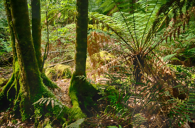
I visited the Tahune Air Walk and forest on a largely bright (summer) sunny day, but rainforests are typically dark (shaded) places on the forest floor. Shouldn’t a sunny day be a better time to photograph?
The answer is NO! The dynamic range of light (the range in strength of illumination, from darkest to brightest) on a sunny day is significantly higher on the sunny day, The bright splashes of foliage where shafts of full sun light is reflected many times brighter than the nearby glom of full shadow, yet there is detail there also. Whilst our eyes can handle this situation a camera and the dynamic range it can capture will probably be a lot less than required. Typically you will your photo will have correctly exposed (or maybe slightly overexposed foliage behind dark silhouettes of tree truck of overhanging vegetation. On an over cast day this difference is much narrower, and you are much more likely to get a decent picture.

I have returned to using lightroom to mamage photos on my HP Spectre and definite use two organization tools, Colour (eg. I flag bracketed
I also have gone one step further in this image and used OnOne 10’s enhance and magic eraser to reduced the impact of a dead fern frond in the upper right and also detail filter to reduce overall digital noise, but keep as much detail as possible.
Subscribe to:
Posts (Atom)