The complexity of colour doesn’t stop at RGB versus CMYK or even the traditional colour wheel. Different industries and investigators have established a myriad of others ways to express colour systems. For now it is enough to group them into 5 main groups.
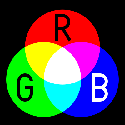 RGB, (Red, Green, Blue) is used in Camera Sensor, LED Computer Screens and Digital TV Screens, they use these three colours from light emitting or sensing technologies to produce any given colours, through Additive Colour Mixing of the light. Its not really a colour space but a colour model.
Unfortunately there are several variants and this is the first place many digital photographers can get caught out. in 1996 HP & Microsoft cooperated on developing a stand 8-bit colour space based on RGB and it was subsequently adopted as standard for monitors, printers and widely internet applications (eg Browser) and is know as sRGB. With the result that most printers, monitors and software can now correctly render this colour space. When in doubt this is the best colour space to use to avoid disappointing changes in colour and tone. In the meantime other colour spaces with greater bit deep have developed such as Adobe RGB and ProPhoto which can in theory render more colours, BUT your monitor or printer may not be able to show them.
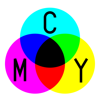 CMY[K] (Cyan, Magenta Yellow)The CMK model is relative new, as it required intense and transparent synthetic inks & dyes the can mix cleanly. Also the technology of Halftoning (or screen) whereby tiny dots of ink are printed in a pattern small enough for humans to perceive a solid colour, A set of separations for each primary colour was made and overprinted with close attention to properly registering the images.
These days there complex but reliable colour space converters that can take an RGB image and render it in the closest CMYK colours and these are usually built into your printer drivers. This approach forms the fundamentals of ink Jet printer technology., Older printers, including some high end larger format printers may still need conversion (or even tone separation) carried out separately. However most photo services will accept SRGB and do conversion automatically to CMY if required.
 LAB (or CIELAB) is a special colour space in that it includes all perceivable colours. It is extensively used to compare the colour rendering and matching capabilities of a wide range of technologies and devices, particularly the CIE XYZ graph shown on the right. The L is for lightness and the A and B represent Green-Magenta and Blue yellow components but they are non linear mappings with elaborated transformation functions. However the key is the the three axes use real numbers (rather than positive integers, for bit mapped colours) so an infinity number of colours can be represented. The CIE chromaticity diagram, shown on the right, covers all the colours visible to the human eye and the outside of the convex curve enclosing the colour space show the Wave length of light that corresponds with that colour. You are likely to see this diagram when a manufacturer is extolling their virtues, aka wide colour gamut, of their new devices
Adobe’s PhotoShop has a LAB mode to allow device-independent colour.
.
 HSL or HSV, are the cylindrical equivalent of the RGB additive colour model but include the brightness of luminance L (sometime B for brightness), as well as hue H as a radial measure and saturation S as distance from the centre. The system was originally invented in 1938 by George Valensi as a
 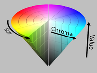 method to add colour to and existing monochrome (L signal) Broadcast (see also below how this might be encoded). The V in HSV stand for value and in the variant of the colour model to top of the cylinder is white and the base if black and may better represent how paints are mixed. It is frequently represented as a cone. This model has been widely accepted and applied in most image editing and computer graphic applications and
 YUV, of Y’ (luma) UV (chrominance) is a technology that was widely used in analogue colour TVs , PAL Digital and some movie formats. Its original begin when B&W analogue TV was being upgraded to colour. The Luma channel is exactly the original Black and White signal. The colour channels U & V utilize the fact that the green sensitivity of the human eye is somewhat overlapped by the red and blue cone receptors and therefore the signals bandwidth could be reduced by not transmitting the green information. The original TV engineers, following VAlensi model, brilliantly worked out that rather than use absolute R (red) and B (blue) they could send the U & V the difference from a reference average and tell the TV to just shift the colour of a specific pixel without altering its brightness. Thus an older B&W TV which could not decode the difference signals would just how the normal B&W picture, thus avoiding making older TVs redundant! When you use the yellow plug, composite video, you will be using some variant of Y’UV. Standard Digital PAL and HDTV also use modern variants of this colour encoding method.
If my very limited description has confused you Cambridge in Colour has a great article of visualizing and comparing colour spaces (well except they use the color spelling)
Now for the really interesting part, many of these colour system describe colours, that we can not see, our cameras (even the expensive ones) cannot differentiate or cannot be reproduced either on our computer monitors phone screens or inkjet printers. In fact most devices have a limited capacity to reproduce colours, and the range of colours they can produce is usually referred to their colour gamut. More on that to come in future posts.


 Another area where there is a lot of misconception about colour is the topic of colour bit depth. Really there should be, because it is a simple the numbers of binary numbers (0 or 1) have to describe each primary colour (red, green, blue) in the pixel (colour channel) the more unique colours will be available (and the closer the steps between colours will be. It does not necessarily mean that a wider range of colours will be possible (ie


 I have been following with some interest the much hyped Auction at Christies of a the “first” AI produced artwork to be sold at auction. The expect price range was USD$7,000 to $10,000 but
 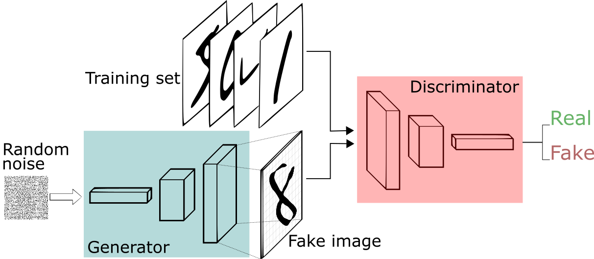 of characteristics they where interested in and used this to train their AI (presumably a neural network). Next they applied a GAN (
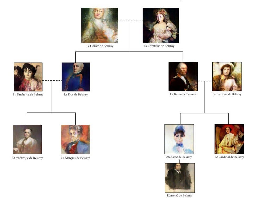
 [Public domain], <a href="https://commons.wikimedia.org/wiki/File:SubtractiveColor.svg">via Wikimedia Commons</a>)


