Showing posts with label DigitalColourWheel. Show all posts

Tuesday, November 06, 2018

Colour Should be Fun

I am aware that up to know I have probably been boring you with terminology, models and variations on colour wheels. I consider that stuff as necessary context but now it is time to play with colour. I’d like to start with colour pickers (specifically the ones that let you investigate the colours in your own images. There are three class of pickers

  1. Stand alone web-app
  2. Stand alone computer app (including Smartphone & IPad)
  3. Eyedroppers, built into software.

I have found the second group which often rely on the built in camera to take a photo. The are the least reliable and frequently very poor at picking even a close match (I suspect the problem is related to getting theimage correct exposure (luminosity of the colour) for the image taken). Also unfortunately all  class of these apps work on either jpeg files or the RAW file only after it is rendered.

There are way to many variation in the first group of web base colour pickers to even start recommending the best (perhaps except for adobe’s colour heel see below). A lot are more focussed on “WEB colours” and harmonious schemes for blogs and websites. The HEX numbers displayed in these sites are the numeric code for various colour in HTML (see also the X11 Colours). In general terms this are unlikely to be great tools for your photography.

imageMany photoediting and computer graphics programs include an eyedropper tool (lightroom doesn’t but I believe photoshop does) which lets you choose a given colour from the image.  The colour selection could to be used by your current brush, our choose all the pixels with a similar Hue and Luminosity (eg Nik Software). The example here comes from Corel Painter and the eyedropper will select the appropriate Hue Circle as well as position on a triangle representing Tint, Tone and Saturation. These tools are very useful when it comes to working with colours. If your software has them now is a good time to learn how to use them.

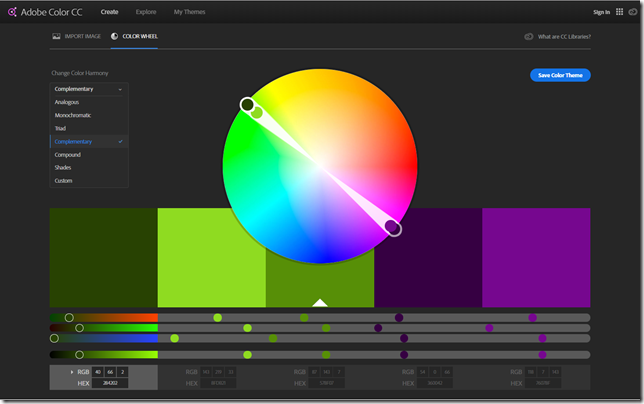
The Adobe Color Wheel app, originally called Kuler and now an app in the CC libraries is also worth investigation. Even if you don’t have a creative cloud subscription you can still access it, however you won’t be able to save the colour schemes (as swatches that could be access by other Creative Clouds software) without a CC account. The main Colour wheel Screen lets you select a number of accepted harmonies to any hue you pick around the perimeter of the circle.
image

Note that on the digital colour wheel the complimentary colour for a light foliage green is magenta or more precisely a blue violet. Constable's famous “splash of red” to tame masses of green, may not help your landscape photo as much as a girl in strong pink or magenta coloured raincoat!

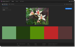
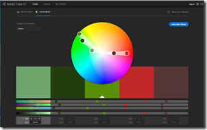
The real beauty of this Adobe colour wheel app is that it can select colours straight off your photo (again only seems to work with jpeg files) and your are then able to select colours chosen under a set of moods (rather than Colour Harmonies). Alternatively you can select your own colour scheme. You then see the select set of 5 colours as member of the digital colour wheel (in a HSL context but you are supplied sRGB (8 bit) and HEX numbers). This should help you get an insight into which colours you might like to enhance, and which can afford to become duller.In this case I could emphasis the split complimentary of greens and deep reds in my photo of some orchids.
imageimage

In any event just playing around with the colour schemes your photography will undoubtedly give you a whole new dimension to compare your images.

Friday, October 26, 2018

Building a Digital Colour Wheel

PA260003Most of us are familiar with the conventional colour wheel. It is the colours of the rainbow wrapped around and joined at the purple/violet segments. It normally shows 12 colours, the primaries (Red, Yellow & Blue) then the secondary colours easily mixed from those (Orange, Green & Purple). Finally the six tertiary colours mixed from the adjacent primary and secondary colours. Whilst many people instinctively know a harmonious colour scheme (eg red & green, Blue & Orange, Yellow and Purple) They might find it difficult to describe why. The tradition colour wheel can come to the rescue here, colours on opposite sides of the circle are called complementary, beside each other are call analogous, In addition if one of the complimentary colours is left out but the analogous colours either side of the missing compliment are present then this is described as a split complementary. All these combinations are know to be harmonious (and desirable for an artist, photographer, home decorator or fashion designer). The colour wheel is very useful and you can read a bit more about Basic Colour Theory at Color Matters.

PA260004PA260002

Some complications arise when you start to look at how cameras and TVs work. They use a three colour palette RGB (Red, Green & Blue). This doesn’t fit onto the traditional colour wheel very well (first image below). These three colours are also know as the additive palette. These three colours do work well in terms of how our eyes (specifically the three types of  “cones” in our retina) recognize colour. A lot of people not familiar with this system are very surprised at the lack of yellow, but if you add red and green light sources you will see yellow. Things get even more strange when you consider the approach developed by traditional colour printers (including your ink jet printer) which use the  CMY [K] (Cyan Magenta & Yellow) subtractive palette. The K in square brackets stands for blacK, as printers find they need a true black, because a mixture of magenta, cyan and yellow inks or dyes tends to be a muddy dark grey and leaves images flat. Black is not really a colour, but I wish to avoid the argument on that for now. It is even harder to fit these colours on a traditional colour wheel (there is no matching segments for Magenta or Cyan for a start). You can read a bit more on the RGB & CMYK colour systems at Colour Matters.

Trying to fit the RGB coloursTrying to fit the CMY colours

This is the point where I decided to combine these two palettes, and form 6 new primary colours. I’ve since discovered I’m not the first to have attempted this (eg see Warren Mars website) and this configuration is often known as the modern or digital colour palette, sometimes even the RGBCYM[K] palette.

Formulating a Combined RGBCYM paletteThe New Digital Colour Wheel's 6 primary colours

You can then fill in the intermediate segments with new secondary colours to get a simple 12 colour wheel again. Amazingly if you employ the idea that opposite colours can be complimentary or adjacent colours analogous and you find they are also harmonious. What is going on here is the traditional colour wheel wrong? Perhaps for both their photography and printing aspects digital photographers might be wise to adopt or at least consider this new colour wheel. I will be discussing many of the issues for digital photographers in coming blog posts.
The New Digital Colour Wheel's 12 primary & secondary coloursThe Colours offered by Adobe

The very last image shows the colours Adobe Photoshop and Lightroom give you control sliders over. I’m still no closer to being able to explain this colour selection.

Wednesday, October 17, 2018

Towards a new Colour Wheel, but Why?

For a while now I have been bending the ears of my colleagues and friends incessantly about a “digital” colour wheel with 6 primary colours rather than 3. Looking back in the blog post I  hadn’t posted anything in here (yet!) So now is the time to fix that.

Adobe Primary &
Secondary
Tertiary
Red Red
Red Orange
Orange Orange
Yellow Orange
Yellow Yellow
Yellow Green
Green Green
Aqua Blue Green
Blue Blue
Blue Violet
Purple Violet
Magenta         ?Red Violet

I started to personally  question the colour wheel adopted by adobe ( within lightroom and photoshop) for their omission of some colours in their digital post processing. It only gave me 8 colours, halfway between the convention 6 primary & secondary or the 12 primary secondary & tertiary colors I expected)?

Why have they done that?

So I looked at the ways are colours are handled in the camera, computer screens and then onto printers. Well they are not even in the same colour spaces, or built using the same colour models. Cameras and Computers screens (and any direct transmission of light) follow the RGB (Red Green Blue) colour model.  This an called an additive model of how colour works, because different wave lengths of light get added together. This somewhat matches the rods in out eyes which give use colour perception. We can only discern colour because different cones in or retina can detect different wavelength. If you mix projected light of these three colours you get pure white. Ok good but should that be yellow rather than green (green is a secondary colour isn’t it?). Damn if I mix colour wheel idea 2green and red light I can get yellow?

Things get even more bizarre when you start looking at printing colour.  Traditional three colour printing and many inkjet printers use a different set for their primary colours (CYM) Cyan Yellow and Magenta! This is called a Subtractive colour model because certain wavelengths are removed from the reflected image. What is going on here? When in comes to reflected light and pigments mixing colour is again different, for example to get green you mix your light blue (cyan) and yellow!! If you mix all the three colours you get a dark muddy colour, close to black but not a true black. So many primers (and ink jet manufacturers) also use a per black to create the CYMK (K for black) scheme.

Close to a year ago I was doodling in my sketch book, and realized by combining these two colour schemes I had a new colour model with 6 primary colours. Not surprising, the idea of a RGBCYM[K] colour scheme has occurred to others and is sometimes called the modern or digital colour wheel.

I know I haven’t answered the big question why Adobe and many other photoeditors only give to eight color sliders. I can’t find out why (at the moment). This is a big topic so I will build and develop over several blog post to come.

Other Blog posts in here around the mysteries of Digital Colour Theory