Showing posts with label colourtheory. Show all posts

Sunday, May 05, 2024

Mastering the Rainbow - What is Colour?

Welcome to "Mastering the Rainbow" - a captivating exploration of the enigmatic world of colour. This serialized journey, spanning blog posts here and on my website, YouTube videos, and occasional social media posts, is a progress report of my decade-long quest to unravel the mysteries of colour and its elusive nature.

As a geologist and retired part-time lecturer, I've long been fascinated by the scientific method and its ability to shed light on the intricate workings of our world. However, as I delved deeper into the question "What is colour?", I found myself venturing down a rabbit hole that grew increasingly complex and paradoxical. Contrary to our everyday experience, I've come to realize that colour, as we know it, is not a tangible entity but a highly personal illusion. Colour is not a real thing.

In this series, we'll embark on a historical odyssey, revisiting the groundbreaking discoveries of those who came before us, many of which I unwittingly rediscovered myself – a testament to the cyclical nature of scientific inquiry.

We'll dive into the various representations and models of colour, navigating through the controversies and debates that have shaped our understanding. Brace yourselves, for nothing is more contentious than the application of colour wheels. Fear not, for I shall embrace these geometric shapes as tools to unify disparate ideas and shed light on the counterintuitive aspects of what we call colour theory.

Through practical examples and hands-on fun, you'll have the opportunity to convince yourself of the profound insights that await. Whether you're an artist, a photographer, or simply a curious soul, this series promises to broaden your perspective on the kaleidoscopic world that surrounds us.

The vibrant realm of colour is a wondrous canvas upon which we create and experience art. Join me on this journey, and together, we'll unlock the secrets of the rainbow,


Sunday, December 02, 2018

Seeing Colour :: Through The Camera Lens

Let’s move onto the more Scientific/Enginering aspects of how the camera captures light of a specific intensity and wavelength. My schematic sketches of the camera cross section is meant to represent both traditional DSLR and newer mirrorless cameras. Both have exchangeable lens elements that focus an inverted image onto the sensor (or in the case of older SLR film). The DSLR however has a mirror that reflects the light up into a prism whose job it is to turn the inverted image up the right way and back through the view finder. So the DSLR user sees optically what the lens is focussing on. Whereas the mirrorless camera (obviously doesn’t have a mirror) and the image is captured on the sensor (often continuously) and this is sent to a graphics processor in the camera where the data from the sensor is converted into a conventional image (a jpeg) and this is displayed in a small screen behind the view finder (or alternatively the LCD screen on the back of the camera). The diagrams do not include the shutter and both systems have a shutter which control the length of time the sensor can capture light to give the required exposure.

The camera sensor (or film) collects the light that falls on it and the more light the closer to white the resulting image will be. In conventional SRGB Black is given the value 0 (zero) and white 255. This is usually called luminance. In a digital camera there are a multiplicity of small compartments each collecting its own luminance value.
How does this create colour, well it doesn’t for each compartment, but instead each set of 2 by 2 compartments have a set of coloured filters (known as Bayer Filters) over them. Each allowing only Red, Green or Blue Light to pass through. In a process known as demosaicing sets of these 2 by 2 colours are combined into single pixels with 3 colour. See the Cambridge in Colour page for a more detailed discussion of bayer demosaicing.

The best way to consider what is happening is to use the CIE chromaticity diagram, Unfortunately I have not been able to locate and camera manufacturers publishing their colour gamut, they seem to prefer to say they have better “colour science”. They all seem to offer a close fit to sRGB colour space and some offer the extra colour space and bit depth of Adobe RGB &/or ProPhoto RGB

I will again hand over to Craig Blackwell, To continue the journey of how the RGB colour space can be used to create colours.

Saturday, December 01, 2018

Seeing Colour :: Spectral Colours and other basics

Let’s begin taking a look at the Spectral Colours. They are the colours in white light that can be split out using a prism, discovered (or at least first analysed) by Issac Netwon. They are the colours of the rainbow.

As an aside How many colours are ther in the rainbow?

There is actually a broad range of colours and each corresponds with a given wavelength of light. The light passing through the prism (or drops of rain) gets refracted (bent) according to the wavelength. the short wavelength bent toe least, medium wavelength greens and yellow slightly more and the long wavelength reds bent the most.

Craig Blackwell, an ophthalmologist, has prepared a series of videos that provide great summaries of the technical aspects of understanding the basics of colour, then colour matching and finally leading to the chromaticity diagram. I will include videos from his series as I move through the various aspect of seeing colour.

For now we will start at the beginning.


Next investigate creating all colours just mixing Red Green & Blue

Thursday, November 29, 2018

Seeing Colour :: Where to begin

imageHow we see colour is definitely a complex subject. There is more than the relatively straight forward physics of light at various frequencies. Much of the so-called Colour Science is focussed on this, and is about matching colour (specifically the Hue). However there is a lot more to understand how Human Vision works, and what we call colour. This itself has two components a Physiology (to do with the vision apparatus, eg retina, rods,cones) and the Cognitive Psychology (to do with how the brain creates our concepts of colour)

imageI was fascinated that Tony Northrup was so surprised by his own user blind poll of the colour quality of various camera and Lenses. He compares their user ratings with a “colour science” study of the cameras using colour calibration charts. This evaluation really covers the transmission of light through the lens and onto the sensor, comparing known colour charts. This is all good science but that’s as far as the study goes, from the subject through the lens and onto the sensor. Yet Tony’s subject where looking at photo of common snapshot style subjects, and their vision was adding a lot to how colour was perceived, including their personal biases (including brand loyalty.

Thus I will begin a series of blog post about seeing colour, armed with the schematic hand drawn diagrams above and some context from Tony’s “Best Colour Science” You Tube Video. I trust that as I developed the discussion of seeing colour you too will understand why peoples’ perception of colour quality often differs from the “Colour Science

Watch for Tony’s great quote “Colour is like Wine”


Tuesday, November 06, 2018

Colour Should be Fun

I am aware that up to know I have probably been boring you with terminology, models and variations on colour wheels. I consider that stuff as necessary context but now it is time to play with colour. I’d like to start with colour pickers (specifically the ones that let you investigate the colours in your own images. There are three class of pickers

  1. Stand alone web-app
  2. Stand alone computer app (including Smartphone & IPad)
  3. Eyedroppers, built into software.

I have found the second group which often rely on the built in camera to take a photo. The are the least reliable and frequently very poor at picking even a close match (I suspect the problem is related to getting theimage correct exposure (luminosity of the colour) for the image taken). Also unfortunately all  class of these apps work on either jpeg files or the RAW file only after it is rendered.

There are way to many variation in the first group of web base colour pickers to even start recommending the best (perhaps except for adobe’s colour heel see below). A lot are more focussed on “WEB colours” and harmonious schemes for blogs and websites. The HEX numbers displayed in these sites are the numeric code for various colour in HTML (see also the X11 Colours). In general terms this are unlikely to be great tools for your photography.

imageMany photoediting and computer graphics programs include an eyedropper tool (lightroom doesn’t but I believe photoshop does) which lets you choose a given colour from the image.  The colour selection could to be used by your current brush, our choose all the pixels with a similar Hue and Luminosity (eg Nik Software). The example here comes from Corel Painter and the eyedropper will select the appropriate Hue Circle as well as position on a triangle representing Tint, Tone and Saturation. These tools are very useful when it comes to working with colours. If your software has them now is a good time to learn how to use them.

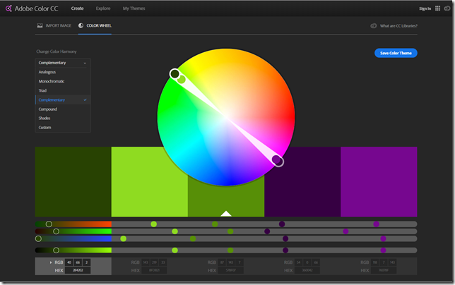
The Adobe Color Wheel app, originally called Kuler and now an app in the CC libraries is also worth investigation. Even if you don’t have a creative cloud subscription you can still access it, however you won’t be able to save the colour schemes (as swatches that could be access by other Creative Clouds software) without a CC account. The main Colour wheel Screen lets you select a number of accepted harmonies to any hue you pick around the perimeter of the circle.

image

Note that on the digital colour wheel the complimentary colour for a light foliage green is magenta or more precisely a blue violet. Constable's famous “splash of red” to tame masses of green, may not help your landscape photo as much as a girl in strong pink or magenta coloured raincoat!

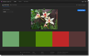
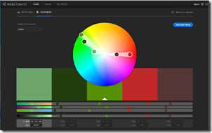
The real beauty of this Adobe colour wheel app is that it can select colours straight off your photo (again only seems to work with jpeg files) and your are then able to select colours chosen under a set of moods (rather than Colour Harmonies). Alternatively you can select your own colour scheme. You then see the select set of 5 colours as member of the digital colour wheel (in a HSL context but you are supplied sRGB (8 bit) and HEX numbers). This should help you get an insight into which colours you might like to enhance, and which can afford to become duller.In this case I could emphasis the split complimentary of greens and deep reds in my photo of some orchids.

imageimage

In any event just playing around with the colour schemes your photography will undoubtedly give you a whole new dimension to compare your images.

Monday, November 05, 2018

HSL Luminously and Tint (Tone) & Shade.

The ability to adjust a specific hue is great and the HSL slider also gives you the ability to adjust Saturation and Luminosity but when they are used together there are some complications.

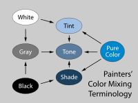
To understand this better we should first look at the way artist use and name their their colour mixes. When you add White to a colour it is called a TINT and stays in the same hue (family) but it looks paler and lighter. Paler and Lighter means the saturation of the colour is lower and the luminosity (brightness) is higher. When you add Black to a colour the result is called a SHADE and the reverse happens. The colour gets duller and darker, which is again lower saturation and also its luminosity is lower.

Artist also often use the term TONE when they mix in a Neutral Grey. This should not be confused with Tonal Values meaning when talking about relative exposure (particularly in Black & White images). In Photography the alteration of the RGB colours are only lightened (adding luminance or sometimes reducing saturation) or darkened (either reducing Luminance and saturation) so the best way is just to think in terms of Tint or Shade.Many artist never add black when painting (and I’m one of those) because even a tiny amount or black pigment “kills” the colour mix. So they may use a dark neutral (like Payne’s Grey) or better still mix their own dark neutrals with complimentary colours.

To get a feel for how much colour and colour judgment is actually related to luminosity (through tints and shades) a great experiment is to take saturation down fully (-100 in Lightroom so you essentially have a black and white image, but there are many other ways to get black and white but not for this exercise) next adjust the tonal values in the normal manner you undertake. This could be contrast & brightness, or separate shadows and highlight sliders etc. Finally restore the saturation back to its original setting (in Lightroom set it back to zero).

imageimage

imageimage

You probably will be surprised, your colours are likely to be richer and more balanced! Try it yourself,

Sunday, November 04, 2018

Colour Names and the “Martian” Colour Wheel

The naming of colours is not as simple as you may think. There is more or less reasonable agreement on the 6 primary colours of the digital colour wheel  (Red, Yellow, Green, Cyan, Blue, Magenta). Things get a little out of hand after that for example look at some of the outrageous names of interior paints of the latest fashion colours.  You will also be amazed at what are supposed to be common colour names or the so called standard X11 web colour names.

I have found a nice website belonging to Warren Mars who has also adopted the combined GRB and CMY colour spaces and produced a 24 hues wheel (actually based on the HSV (or HSL) cylinder).

martian_colour_wheel_24_hue_f

His colour wheel  is originally and well thought out and a perfect format to adopt, get a copy and place beside your computer monitor or easle.  His opening question is “Do you need another colour wheel?”. Really you should read his arguments and discussion rather than just follow me, but I do strongly believe the answer is yes. His run down of his named set of colours, their tints and shades is wonderful and includes real world examples (mainly photographs) or each colour and its tints and shades, the outer two and inner two rings.

Thursday, November 01, 2018

The Gamut of Different Colour Spaces


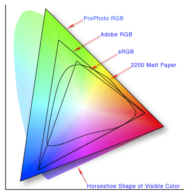
In the previous posts I hinted you may be using colour spaces in which exist some unique colours that can not be displayed or printed.  This post will explain why. A nice way to compare these is with the the CIE 1931 xy chromaticity diagram, which is designed to encompass all colours the average human eye can see (the horseshoe shaped background). The full extents of the colours perceived is termed the colour gamut.

This version of the graph shows the extent of common colour spaces applied in camera capture and editing software. For instance  8-bit sRGB if the default space for jpeg files and most new LCD screen. It is probably adequate, but is under half the possible colours we can see.  Compare this to Adobe RGB (12-bit) which gives more definition of unique colours in the greens and some blues. But remember if you are looking at the photo on an older computer screen you are probably only looking at a small colour space equivalent to sRGB. ProPhoto RGB (12 or 16bit) gives an even wider range of green and blue and some extra eds. However now it is possible to generate colours that our eyes can not discern.

The real rub comes when you output shown as the more curved shape , 2200 matt paper) indicates the colours possible when using CMYK colours (eg ink jet printer inks) on a standard matt paper. Gloss papers which appear more contrasty can give a slightly higher gamut.

The software we use in theory takes care of the conversion between t6hese colour spaces, but not always. If you think the colour look strange, before you buy and expensive colour calibration system. Check the colour space, your monitor or printer might not be able to handle your setting of ProPhoto in lightroom. If in doubt using SRGB is the safe setting in lightroom or your favourite software. Also setting exported files you take to the local photolab, should always be OK when you set to SRGB.

It is possible to use the higher gamut colour space if you use appropriate colour profiles but they generally need to be set up for your software, printer model and type of paper. This is so individualised most paper supplied offer a calibration service, where you load up a test image and print it on their paper, then send that to them and you get a customised colour profile returned. The gamut of the result is not wider because the colour gamut depends on the inks and the paper, However the mapping of colours back into that gamut will be significantly improved.

Friday, October 26, 2018

Building a Digital Colour Wheel

PA260003Most of us are familiar with the conventional colour wheel. It is the colours of the rainbow wrapped around and joined at the purple/violet segments. It normally shows 12 colours, the primaries (Red, Yellow & Blue) then the secondary colours easily mixed from those (Orange, Green & Purple). Finally the six tertiary colours mixed from the adjacent primary and secondary colours. Whilst many people instinctively know a harmonious colour scheme (eg red & green, Blue & Orange, Yellow and Purple) They might find it difficult to describe why. The tradition colour wheel can come to the rescue here, colours on opposite sides of the circle are called complementary, beside each other are call analogous, In addition if one of the complimentary colours is left out but the analogous colours either side of the missing compliment are present then this is described as a split complementary. All these combinations are know to be harmonious (and desirable for an artist, photographer, home decorator or fashion designer). The colour wheel is very useful and you can read a bit more about Basic Colour Theory at Color Matters.

PA260004PA260002

Some complications arise when you start to look at how cameras and TVs work. They use a three colour palette RGB (Red, Green & Blue). This doesn’t fit onto the traditional colour wheel very well (first image below). These three colours are also know as the additive palette. These three colours do work well in terms of how our eyes (specifically the three types of  “cones” in our retina) recognize colour. A lot of people not familiar with this system are very surprised at the lack of yellow, but if you add red and green light sources you will see yellow. Things get even more strange when you consider the approach developed by traditional colour printers (including your ink jet printer) which use the  CMY [K] (Cyan Magenta & Yellow) subtractive palette. The K in square brackets stands for blacK, as printers find they need a true black, because a mixture of magenta, cyan and yellow inks or dyes tends to be a muddy dark grey and leaves images flat. Black is not really a colour, but I wish to avoid the argument on that for now. It is even harder to fit these colours on a traditional colour wheel (there is no matching segments for Magenta or Cyan for a start). You can read a bit more on the RGB & CMYK colour systems at Colour Matters.

Trying to fit the RGB coloursTrying to fit the CMY colours

This is the point where I decided to combine these two palettes, and form 6 new primary colours. I’ve since discovered I’m not the first to have attempted this (eg see Warren Mars website) and this configuration is often known as the modern or digital colour palette, sometimes even the RGBCYM[K] palette.

Formulating a Combined RGBCYM paletteThe New Digital Colour Wheel's 6 primary colours

You can then fill in the intermediate segments with new secondary colours to get a simple 12 colour wheel again. Amazingly if you employ the idea that opposite colours can be complimentary or adjacent colours analogous and you find they are also harmonious. What is going on here is the traditional colour wheel wrong? Perhaps for both their photography and printing aspects digital photographers might be wise to adopt or at least consider this new colour wheel. I will be discussing many of the issues for digital photographers in coming blog posts.
The New Digital Colour Wheel's 12 primary & secondary coloursThe Colours offered by Adobe

The very last image shows the colours Adobe Photoshop and Lightroom give you control sliders over. I’m still no closer to being able to explain this colour selection.