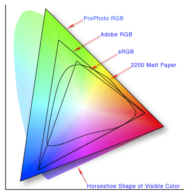
In the previous posts I hinted you may be using colour spaces in which exist some unique colours that can not be displayed or printed. This post will explain why. A nice way to compare these is with the the CIE 1931 xy chromaticity diagram, which is designed to encompass all colours the average human eye can see (the horseshoe shaped background). The full extents of the colours perceived is termed the colour gamut.
This version of the graph shows the extent of common colour spaces applied in camera capture and editing software. For instance 8-bit sRGB if the default space for jpeg files and most new LCD screen. It is probably adequate, but is under half the possible colours we can see. Compare this to Adobe RGB (12-bit) which gives more definition of unique colours in the greens and some blues. But remember if you are looking at the photo on an older computer screen you are probably only looking at a small colour space equivalent to sRGB. ProPhoto RGB (12 or 16bit) gives an even wider range of green and blue and some extra eds. However now it is possible to generate colours that our eyes can not discern.
The real rub comes when you output shown as the more curved shape , 2200 matt paper) indicates the colours possible when using CMYK colours (eg ink jet printer inks) on a standard matt paper. Gloss papers which appear more contrasty can give a slightly higher gamut.
The software we use in theory takes care of the conversion between t6hese colour spaces, but not always. If you think the colour look strange, before you buy and expensive colour calibration system. Check the colour space, your monitor or printer might not be able to handle your setting of ProPhoto in lightroom. If in doubt using SRGB is the safe setting in lightroom or your favourite software. Also setting exported files you take to the local photolab, should always be OK when you set to SRGB.
It is possible to use the higher gamut colour space if you use appropriate colour profiles but they generally need to be set up for your software, printer model and type of paper. This is so individualised most paper supplied offer a calibration service, where you load up a test image and print it on their paper, then send that to them and you get a customised colour profile returned. The gamut of the result is not wider because the colour gamut depends on the inks and the paper, However the mapping of colours back into that gamut will be significantly improved.


 Another area where there is a lot of misconception about colour is the topic of colour bit depth. Really there should be, because it is a simple the numbers of binary numbers (0 or 1) have to describe each primary colour (red, green, blue) in the pixel (colour channel) the more unique colours will be available (and the closer the steps between colours will be. It does not necessarily mean that a wider range of colours will be possible (ie