
 For PhotoFriday‘s topic Brightly Lit
 When I think of highkey in art I think of the impressionist, they painted light as colour, shunning the murky tonal focus of the art academies of their day. Whilst the french impressionist are well known, few know of a small group of Australian painters usually called the Heidelberg School following the same ideas at roughly the same time. I have always loved their work as a lot of it was painted in the area I grew up and I do like Charles Conder’s “A Holiday at Mentone”. The old baths are no longer there but I can remember them and the white cliffs (also no longer visiable), The strands of dried sea weed still frequently can be seen and the beach and its promenade are still a popular stop on a sunny day. I earnt my first swimming certificate here. I am also a member of the Victorian Artist Society and this painting was first exhibited in their Spring Exhibition of 1888. I have also visited this site previously to test out an upgrade to my homemade tripod watercolour easel. So there is plenty to connect me and a self portrait to this site.
  I actually took this photo a few weeks ago on a beautifully sunny spring day. Forgetting somewhat that Australian light (even in early spring) is very harsh and contrasty. So I couldn’t exactly get a true high key image without totally blowing out the highlights. Fortunately I took a couple of EV bracketed sets and found an image without to much clipping of the shadows and without excessive blown out whites. So all I had to do was use some tonal adjustments. Classic tonal curve stuff and yet an artist would not approach the task in such a mathematical way. I have come to like the basic tonal sliders in lightroom (highlights, shadows, whites & black, these are much simpler to understand in terms of controlling tone of your image). I’ve even found that clicking on one of the tonal ranges in the histogram itself. and sliding the histogram, also moves the corrsponding sliders. So I eased the histogram over to the right (to create the high-key) and lifted clarity and vibrance to keep the colour. The background and my figure had significantly different contrast/tonal ranges so I started to use layers to separate foreground and background and soon got the idea of re-sampling the background layer in corel painter with an impressionist brush. Then using perfect layers to merge the layers back together to give me a very hybrid self portrait this week.
 I have been to Rembrandt's studio and he only has a row of windows on one-side, (there are heavy shutters to blank off the bottom windows and a bleached canvas blind hanging above an end window) So I suspect Rembrandt himself would probably fail the studio lighting work shop. What he definitely would not have failed is portraiture and particularly low key look (ie where most of the tonal range is in the darker tonnes) Some of his deep
  richness may have come with the age of his painting (most are now over 350 years old) but if you have every seen the original of his portarit paintings (such as his 1659 self-portrait) I’m sure you will recognise the fresh feel and emotional connection.


Before photography any artist wanting to make a self portrait had to resort to a mirror (and therefore the resulting portrait will be back to front). A few brave artists, and MC Escher is a prominent one of them, dared to include reference in their painting and illustrations that they were indeed looking at reflections. Thus I think it is cleverly both.
Adobe have released a new version of Photoshop Elements, version 13, surprising as boxed software (not as part of their subscription service!). I must admit my version (7) has languished in the seldom used category and is only running on my studio laptop, and supposedly where I connect to creative cloud). Whilst photoshop elements tends to be looked down on by the purists, it has always struck me as a better way to get most of the features of Photoshop with a much simpler learning curve and a much more affordable price. The new version looks a lot different in terms of the User Interface, so what I am showing here is not likely to be immediately beneficial to a new purchaser wanting to learn how to use the software (and version 13 is clearly aimed at the new user) However I have chosen to show it before my look at the lightroom workspaces because it helps put in place the abobe concepts (and work flow) Organize –> EDIT (FIX) –> Create –> Share and how they have become separate workspaces.. The significance of these “workflow-centric” concepts still pervades adobe’s software offerings.

The Fix (aka Edit) modules is where you do most of the refinements and retouching, Each of the buttons on the panel on the right-hand side takes you into a separate tool (or set of tools) to do that task. Several of these begin with Auto and these are essentially wizards that attempt (they are not perfect) to correct or enhance specific aspect of your photo. For any one new to photography they are probably wonderful but more novelty that long term tools. at the bottom are three keys that bring up a separate edit window with the serious edit tools.
There are many edit tools and filter options but the simple icons and small thumbnails on the filters make it easy to understand what they do, so the system is easy to pick up. The big feature that photoshop elements offers that few other inexpensive photo editors do is layers (a topic that requires more detail that I should spend now). The layer controls are simple but are really focussed on copying part or all of the source image and allowing a good range of blend modes between them (ie they are very useful but you probably need to know what you are trying to achieve).. I suggest they require a bit of understanding of how layers and blends work before they become useful to a new user (ie this is one area I trust the new version of Photoshop elements has refined)


So whether you spend most of your retime in the organizer windows and use the auto wizards or dive into the more photoshop-like edit windows you should find photoshop elements a well though through image management and processing system, delivering a significant number of features that the full photoshop reputation is based on.. It is clearly marketed as an introduction for new users and is likely to be a great stepping stone towards photoshop. Having said that many would probably be quiet satisfied with it as their only software. Thus selling this as a standalone box software does make sense, at a time when adobe is moving towards subscriptions for its higher spending users
Somewhat interestingly you can only get help on-line, (which is what you get is you press the help key) back to version 11 of photoshop elements. Don’t despair the user forums have a list of various useful archive references files, covering most things back to version6).
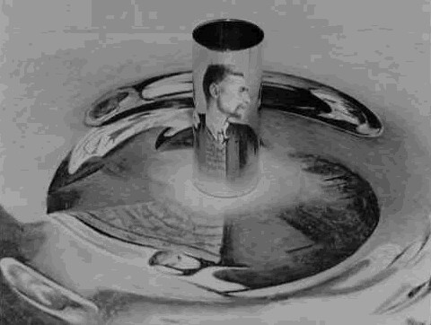 My plan to do all self portraits for this months ThePatach themes, gives me a lot of scope to be more artistically inspired with the curly topic of a unique perspective. I had been experimenting with conical mirror projects for my “handmade” little planets of the Queenscliffe Observatory and immediately thought of MC Escher’s Infinite Reflection. Yes its all done with mirrors, a cylindrical one, and an anamorphic transformation to produce the image the mirror is sitting on. The resulting image you see in the mirror appears to magically floating above the otherwise very distorted drawing on the table.
 |  |
 |  |


I am getting more and more convinced that it is being familiar with your workspace and tools is much more important than following a specific workflow. For a creative, how is not an an artificial deadline, the key is being able to find what you want when you need it. That is what saves time and avoids distractions. In a recent status note on known, about the apparent need to “spring clean” my studio I strayed into the issue of roughly organized but not necessarily neat, I realized this applies to computer workspaces as well.


One refreshing trend, is that some Browser style software (like Perfect Photo Browser & AfterShot Pro) let you browse in these cloud location. Even File Manager lets you view them providing you have set up the little apps that create and synch directories on your computer. Providing you cloud places are not to large this is wonderful because you can visually scan what's there. Picasa lets you define how you an scan these drives. Other Software that has databases of images and metadata like Lightroom, have to import the images and this can be a hassle if your cloud place changes a lot.


This is all well and good for smallish numbers of files, a quick scan of thumbnails is normally all that is required to find the group of photos or photo you were after. It start to become unworkable if you have a lot of images on the cloud spread across several services. I had started to fall into that trap but I’m pulling back. Google+ photos attempt with autobackup to bring all your photos and posts onto their web server and adobe’s are not real solutions for me. Each has some nice features but keeping track of photos could be a lot better.
The cloud is a good place to shares and exchange photos, and browsers that let you see then in conjunction with larger photo collection are a step in the right direction, but storage on-line has a fair way to go, at least for me.
The best solution for me at the moment is still to have a logical network drive (I use the letter S: for Scrapbook, actually the directory name is photo Scrapbook) which I link on all the PCs on my network. (I haven’t figured a way to get my phone connected, but I am considered linking part of it at least to Dropbox.). Do have a scrapbook area on each of my traveling laptops, but I regularly synch these and my recent photos from Dropbox back to the share directory. This directory is backed up to my NAS, but I end up heavily culling this area, since my original photos are archived elsewhere. I only keep the better post processing, and special events stuff. I haven’t figured out the best way to archive this stuff (yet!) so the collection is growing.

 copy") So with a high contrast HDR in mind I noticed that in a very grey overcast day drawing to a close with the last light coming in a west facing window I had the opportunity to use the light and as I set up the table light behind me came on (its on a timer). I had my camera on a tripod beside me and I took a few experimental shots including some EV bracketed sets, The light didn’t last long and it was time for dinner. The image below is a google+ autoAwesome *HDR created while I had my dinner and watched repeats of spicks and specks. I did try some of the HDRscape filters in google+ but they where just too hash and a little too surreal, but there was potential so I compromised by bringing the image back into Photo Effects and my favourite dynamic contrast filter and a touch of clarity in the tone enhancer. This is one image that does also look good in black and white (I often desaturate or do a quick black & white to check tonal composition) but I wanted to stay with colour,
So with a high contrast HDR in mind I noticed that in a very grey overcast day drawing to a close with the last light coming in a west facing window I had the opportunity to use the light and as I set up the table light behind me came on (its on a timer). I had my camera on a tripod beside me and I took a few experimental shots including some EV bracketed sets, The light didn’t last long and it was time for dinner. The image below is a google+ autoAwesome *HDR created while I had my dinner and watched repeats of spicks and specks. I did try some of the HDRscape filters in google+ but they where just too hash and a little too surreal, but there was potential so I compromised by bringing the image back into Photo Effects and my favourite dynamic contrast filter and a touch of clarity in the tone enhancer. This is one image that does also look good in black and white (I often desaturate or do a quick black & white to check tonal composition) but I wanted to stay with colour,%2Bcopy-001.jpg)


