
I took some time out from shifting and reorganizing stuff in my studio to take a few photos of the sunset in HDR, all based on three 1EV Bracket steps (-1EV,0EV,+1EV) and using HDR merge in Aftershot Pro.

I took some time out from shifting and reorganizing stuff in my studio to take a few photos of the sunset in HDR, all based on three 1EV Bracket steps (-1EV,0EV,+1EV) and using HDR merge in Aftershot Pro.

Fred’s work often has two levels a rich colour ground, and then an almost calligraphic decoration of texture, squiggles and lines that are a kind of shorthand to describe the terrain, the trees and other aspects of the landscape. So I have decided to create two separate dreamcope images. One that captures the colours in a rough fashion. I tried a few filets including a couple of my own and ended up using two stacked filters, one after the other. First a watercolour then a sketch filter. There are not conventional parametric filters that adjust a given slider like exposure of saturation. The deep dream process takes the image and builds a neural network like matrix and iterate through looking for parts of the image that have the same characteristics as the filer. In this case I was looking to enhance the colours, and colour harmony (ie not just pumping up vibrance of saturations) Then I created a separate layer that focuses on the lines and textures, for this I used the money filter, which I have used before and it definitely searches out the strong design elements, shapes and textures.

The final step is to combine them, and I must admit I liked the way you could still see the three layers, fully exposed in different parts of the image on my previous art inspired piece, the autumn leaves on the ground. In this case I used OnOne 10 layers again but used soft light blend mode for all layers, to let each layer bleed through but I also used simple gradational filter to start with the original photo at the top that fades into the strong line work and with the background coming through and dominating the bottom.
Reality transforms to abstract.

Photography doesn’t have to be just a fair weather persuit. As long as it safe to do so, rug up and go out and enjoy the atmosphere, keep you camera and gear dry . Then look for that moment that conveys the place and time (and cold!)
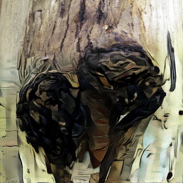
Still thinking of the process used by artist to create an image versus how a photographer might capture that image. It has been a overcast and drizzly day but I managed to get a photograph of a banksia cone in flower. A almost good photo in itself and I had run a bracketed set (handheld) but it was windy so it was hard to merge and properly register. Rather than commit them to the reject bin it was a worthwhile starting point to reconstruct an image in the manner an artist might.
I’m just using my HP Spectre Tablet in tablet mode so I started with the original image and used the Polarr app to add a little contrast, contrast and strength to the red (both luminance and saturation, but not two much). I might have normally preformed this in lightroom and/or OneOne but they are not as touch screen aware as Polarr, which is a pretty neat photo edit app with really intuitive and easy to use basic tools that can easily be used by hand in tablet mode. An artist might start with the background and the overall colour, so I switched to Corel painter essentials and first set up what they call smart blur (which help highlight the strong compositional elements) and also refined the colour palette (I just wanted to enhance the two colours red and green, classic complimentary colours so I pulled back the saturation of any other colours). I use painter essential to do a very quick starter clone painting of the background. Unfortunately this smeared out the red so I use a soft clone brush to bring out sharper edge of the Banksia flower (this helped later registration of the images). Next I re-ran the HDR merge using Aftershot Pro, with particular focus on getting best registration on the banksia. However the droplets of water where no longer perfect.


I now had three separate and subtly different images and used OnOne 10.5 layers to blend them together. The background from the clone painting, the foliage and water droplets on the upper stamens from the original photo and the flower itself a combination (a soft blend mode) of the original photo and HDR image (mainly to enhance the colour). With a Brush Border from OnOne Enhance
I’m not sure how to refer to this style of image. Is it digital art, a faked photo (aka photoshopped which of course it isn’t) or photomontage or something different (and new)?
“We called it photomontage because it reflected our aversion to claiming to be artists” …Hannah Höch
1. P5233079, 2. 27-mar_04, 3. Always look on the bright side..., 4. waiting for the comet, 5. _IGP2361_2_3_norfolk_gaol_gate, 6. #106_IGP4642-Australia Rock II, 7. Autostitch panorama sunset II, 8. #167 Autumn Leaves
Flickr actually don’t choose the photos to be included in Flickr Explore manually, they are based on a combination of flickrs interestingness algorthmn, which does in part quanitify populaity, activity within the flickr community and trending tags. The result is an ever changing collection of very original, interesting and astounding images. Its an honour to be included occasionally.
Scout, by big , huge labs, is a nice little app that keeps track of any of your photos included in the explore stream and makes a small “badge” of those images of yours (or a given username) that have made it into explore.


Today was only my second photographic outing and it was good to be out in the fresh air with a strong sun, but at a low angle. Perfect to try and get some close up texture in the spent flower heads of reeds on the edge of the lake.


The first trick was to avoid getting the sun directly on my lens, because that causes flare and “fogging” of the image. I wanted the reed heads to be the detail (ie only things in focus so that means reducing the depth of field by going for the lowest aperture). I tried a variety of background/exposure. These reed heads are all with a couple of meters of each other. So whether I’m shooting up (with the sky as the background), straight ar the lake, or more down let me achieve three completely different backgrounds.

Cracking and bruising some ribs a couple of weeks ago has slowed me down a lot. Especially in terms of getting out specifically to take photos.
This week I was planning to do some more on macro/closeups and just focusing on textures. Unfortunately that typically means a lot of bending, not something I want to do at the moment. However my favourite telephoto (a old sigma 70-300 DL Macro Super, no idea what the super stands for) has a macro setting, that basically lets you focus in close when using the longest focal lengths.
Focusing close in this case is however 0.5 to 2 meters, not inches, away. This is perfect because I can stand and just focus at around ground level, ie no bending required. So I was able to get out in the garden (between rain showers) and have some close up fun.

In fact, we’ve found that projects which showcase the creative process actually get more exposure than content posted using the WIP feature specifically. This is one reason we’ve decided to phase this feature out. Our mission at Behance is to help you get the exposure you deserve, and we believe that this transition away from the WIP feature will help you get the most visibility possible for what you create.I suppose I should not be the one to complain I haven’t updated my Behance projects in a while now.
It is close to a decade since I last attempted the one image three cameras trick, this time I wasn’t looking to create a screen wallpapers just a creative way to build some self-reference into an image about the changes in camera technology. Yesterday’s daily photo was a camera taking a set of selfportraits of itself as seen in the screen of my new tablet. A kind of spiraling droste effect of recursion, as much about composition as the cameras (the picture duplication devices) or use of layers in the post processing (the technique).

I decided this photo needed to be reproduced through the eyes of other cameras, a self-referencing recursion, a photographic quine, where each generation reflect the previous within its own bounds, a self coping replicant project. All you need is a camera that can display the photo it just took, and another camera to take its photo … … …


And so on, till I reached today’s daily photo.

For a change there is more detail on the cameras used back in my flickrstream
I’ve just finished my colour theme daily photos, and finished off with a black image. I discovered largely black subjects (my camera gear) against a black background are hard to capture. First issue is of course that black is not really a colour, it is what happens when all light (including all colours) is absorbed by the objects surface and no light (or Colour is reflected. Thus black is really the absence of colour, however expect intricate arguments on this question because a lot of folk have strong views.

Secondly taking a black on black photo with a modern digital camera 
One way to compensate for this to use exposure compensation, to deliberately underexpose your photo when you are capturing the image. This is available on most digital camera but might require a bit of investigation. Look for a little +/- button(with an icon like that shown on right). The allows the camera to shift towards under exposing (increasing negative 
or over expose (Increasing positive numbers). Normally this will be achieved using an EV (exposure value) which is a number to reference the amount of light reaching the sensor. Bu convention each unit increase in EV represents a doubling on the light. (eg EV=1 is twice as much light as EV=0). For the image on the left I deliberately underexposed to EV=-3 (a 1/16 of the light compared with the image on the right above. This is much closer to what my eye sees. Some default phone camera apps may not allow EV compensations but may offer modes to achieve this eg night, snow etc. Also most DSLRs do not allow EV compensation in all modes, but you should be able to use it in P (programmed auto) Tv (shutter priority) Av (Aperture priority) and M (manual) modes.
A favourite shortcut of mine when I am not sure of the right amount of exposure compensation is to use bracketing, where the camera takes a series of exposure (usually 3) but varying the EV (offend 1 EV or 0.5 EV). Most DSLRs will let you set the number of exposure and the steps size. My camera lets be set the starting EV as well so In the series below I took EV=-1.5, EV=-0.5 & EV=+0.5.
I ended up selecting the EV=-1.5 image, and being Raw photos I have more flexibly to alter the white balance and exposure in post processing, but I have only done some minor tonal tweaking.
One problem I have not solved in my photo at the top is related to light sources. There was natural light coming from a window behind the camera (on a very dull day) and I had an incandescant side light (and had to do a little white balance in post processing). But I should have used at least one white reflector just on shot to bring a little bit of sift backlighting to highlight the outer shape of the cameras. There is always time to learn
I have been diligently posting a parallel set of images in Instagram, to my daily photography (366 project) currently about colour just incase you hadn't noticed the current theme. My initial impression of Instagram is ho-hum, why bother, all the hype about the in-place for photographers and community feel at first appears hollow. I was there in the early days of flickr and it offered so much more a decade ago. Heck there isn’t even a groups or circles facility in Instagram! Everything is eclipse by celebrity, or the desire to be one a game of likes, follows and followers
Instamuseum for @Apimageo by imageo on Sketchfab
However it is the instagramers themselves that have worked out ways to share amongst themselves and the wider worlds. This is partly due to instragam’s api which allows outbound sharing. It does not however allow a third party to post photos into instagram and apparently are unlikely to. So I must write it off as a potential POSSE tool (other than being the original place to post, albeit a very fundamental and bare place).
I have been working on 3D photography and joined sketckfab as a way to display the 3d works. So I was pleased to find this great little app call instagramuseum, a nice way to get my colour themed Instagram photos on a display on a Wall (virtual wall at least). Click on the blank white box in the image above and take a virtual tour.
For those with VC gear, click on the small awkward goggl-ish icon.


