Showing posts with label tree. Show all posts

Sunday, October 01, 2017

Does Exposing to the Right make a difference?

Exposing to the right, isn’t magic and it not applicable everywhere.  Its a relative simple method (“trick” is not the right word) to help capture more light and reduce the underlying signal to noise ratio issues in lower tonal ranges. Whilst it can be applied in jpeg format, with lesser success, it really needs photos to be taken in RAW format, which records more detail and  give the capacity to adjust tones with suitable post processing software for the “finished” photo. It also helps to have a digital camera that can display a histogram (of the light illumination levels) on the back of the camera.

Just a word of warning there is a lot of rubbish written about exposing to the right that will come up early in google searches. If you read this post and try it out for yourself you will realise that it isn’t a hoax or a myth (they are just BS, Fake news)

The other requirement before you can exploit exposing to the right, is having an image with some “head room” in the histogram to increase the exposure without hitting the dreaded white clipping. Once your sensor fills with photons to its maximum, no extra detail can be captures. in 8-bit RGB terms you have reach 255 level in each colour channel. The histogram will be hard up against the right hand edge (see lower right of the examples below). If your camera has the settings you can turn on the feature to show this clipping. They are frequently displayed by blinking zones of colour usually referred to as the “blinkies”.

Originial Exposure Exposing to the right +1 EV Blinkies, opps too far +2EV

I took this series of photo on the way home, trying to beat a storm, the new growth on the oak trees looks photo worthy so I stopped for a quick shot. The sky was darkening and the trees largely in shadow so I got a typical result (photo above left) with what appeared to be an reasonably exposed sky and most of the foreground in deep shadow. Looking at the histogram the exposure is probably ok in terms of average illumination. There is very little  bright light recorded on the right hand side of the histogram. The photo on the left is just not what the scene looked like, it appears darker than what I saw. This is the type of situation where exposing to the right can help achieve a better image.

In my series I am using the exposure compensation to try letting in more light, but if your are shooting on a DSLR you can use any combination of ISO, F-stop or Shutter speed. Just changing f-stop by one stop doubles the light, change to +1.0 EV achieves the same. I have taken +1 Ev (the middle photo above) and +2 EV (The photo on the right above). Immediately I can see that the +2 EV option is too much I am clipping the sky and no matter how much darkening I try to perform it will remain pure white. The histogram for the center photo looks better the histogram is just touching the upper edge but now a lot of the illumination has moved to the upper right, This is what exposing to the right is trying to do. The trouble is, the photo looks overexposed, particularly in the sky.image

The important next step in the exposing to the right method is to post process (the center photo) to “pull back the tones”, particularly the whites & highlights, the sky in this case. I’m using lightroom and just the basic tonal sliders. I’ve moved the exposure slider back –1 (one stop),  highlights most of all, white & shadows less and blacks hardly at all. I have moved all slider to the left, darkening the tones. Essentially I’m reversing the lightening step I deliberately took in the camera, when using the +EV compensation. Avoid pressing Auto (tone) here because it will take you photo back to essentially the same as your first exposure. Just experiment with the sliders and remember “less is more”, be gentle don’ try and over do it.

The result (shown below) better captures both the sky and the shadow detail, with the important side benefit of reducing noise in the dark tones and making the colours and mid tones a little clearer (without having to use the clarity of vibrance sliders). It is definitely closer to what I saw.

Afternoon walk in Jells Park (before the storm)

It is also worth looking at a bit of the detail

Detail from original photo

An insert from the original photo shows some noise in the shadows and flatness in the mid tone details.

detail from tonally adjusted final photo

Similar insert of the tonally adjusted Photo that was originally exposed to the right, showing less noise in the darks and also better detail in mid tones and slightly richer colours.

With RAW it is also possible to also lift the tonal range, (ie lighten the darks/shadows) of the original but this will only increase the obvious noise.

Exposing to the right can be a rewarding approach if your shoot in RAW, and have access to good software for post processing. Try it out next time you see a photo with the “head room” in your histogram to up the exposure (and collect more light).

Sunday, April 09, 2017

Seeing :: The Essence of a Tree

My SketchAs an exercise in Seeing, suitable for a PhotoWalk style session, I figured the ideal subject might be a tree. So first you need to make a sketch of an idealized tree (could be a line drawing, a rough tonal sketch, or even coloured in). This exercise works well in a group so let the other photowalkers see it but then put the sketch away. The challenge is to find and photograph a tree that most closely resembles you tree. It might be harder than you think. Especially if you don’t keep checking your sketch.

DeepDream_tree (Based on my sketch)Ok I cheated a bit I  knew there was a round tree

What is going on here. Well you are doing three things

  1. Previsualising the image
  2. Learn to see a photo before you take it
  3. Framing your photo to match your expected view

These are three skills to expand your seeing good photograph beyond just looking in the viewfinder or phone screen.

Monday, July 11, 2016

Art Inspired :: Finding Faces in Texture

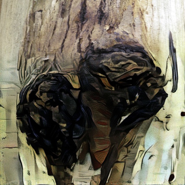
The face of dispairThis is a gumtree truck bleeding gum. Perhaps from burrowing insect damage or cracks sustained in strong winds. It suggests a face perhaps not a happy one a disdaining haughty look.


So I sketched some lines and used them as my training filter in dreamscope (second image below) but this was a bit weak so I used that image as another training for another dreamscope and then another generation each modifying the photo with a deeper and deeper filter.


Finally I took the results into Nik’s Colour Efx Pro to bring out the abstract, just a suspicion of a face but perhaps a little more contorted now a spirit in the shadows or just a trick of the light.  Squiggles & colours that suggest tone and form.


Abstraction from a close up on reality

 face0002final (2) copyface0001final (1) copy

final (1) copy

Everything we call real is made of things that cannot be regarded as real.

…Niels Bohr

Friday, June 24, 2016

Artinspired :: from Photo into Mark Making

_IGP6426 Original PhotoI am very inspired by the works of Fred Williams, at the obvious level they are very abstract, yet at the same time they capture both the colours and textures of the Australian Bush. more particularly the bush around here. That's not surprising as Fred used to regularly spend one a day a week in the bush painting and sketching what he saw. Today I am beginning with a “non-bending marco” taken of the truck of a gum tree in jells park. A couple of limbs have “dropped’ and left large gashes where the gum is leaking out. Parts of the bare truck can be seen as well as the corky rough bark normally around the base of the tree. Its a pretty ordinary subject to photograph.

Fred’s work often has two levels a rich colour ground, and then an almost calligraphic decoration of texture, squiggles and lines that are a kind of shorthand to describe the terrain, the trees and other aspects of the landscape. So I have decided to create two separate dreamcope images. One that captures the colours in a rough fashion. I tried a few filets including a couple of my own and ended up using two stacked filters, one after the other. First a watercolour then a sketch filter. There are not conventional parametric filters that adjust a given slider like exposure of saturation. The deep dream process takes the image and builds a neural network like matrix and iterate through looking for parts of the image that have the same characteristics as the filer. In this case I was looking to enhance the colours, and colour harmony (ie not just pumping up vibrance of saturations) Then I created a separate layer that focuses on the lines and textures, for this I used the money filter, which I have used before and it definitely searches out the strong design elements, shapes and textures.

coloured background Line work

The final step is to combine them, and I must admit I liked the way you could still see the three layers, fully exposed in different parts of the image on my previous art inspired piece, the autumn leaves on the ground. In this case I used OnOne 10 layers again but used soft light blend mode for all layers, to let each layer bleed through but I also used simple gradational filter to start with the original photo at the top that fades into the strong line work and with the background coming through and dominating the bottom.

Gum Bark Texture II

Reality transforms to abstract.

Thursday, November 28, 2013

Silky Oaks Golden Crown


Posted by Picasa  The outburst of yellow florets on the silky oak seem earlier this year and perhaps fuller than usual. Normally the golden flush is in the week leading up to Christmas.

Friday, April 05, 2013

HDRi in16 bits

the stump bracketted set
This is a bracketed set of a stump that had interesting morning lighting. The normal exposure was fine but I thought this was a good set to try out doing the tone mapping in Lightroom on a 16 bit or 32 bit image after doing the HDR merge in Picturenaut. I tried creating a few versions in Picturenaut. Firstly Lightroom would not recognize the colour profile in the 32bit images (not sure why) but loaded the 16bit images perfectly. However if I exported the base merged image the results where not even close to the results I got if I did some preliminary tone mapping in Picturenaut. The image below is a standard adaptive logarithm tone map that has been tweaked a little in Lightroom. If you look at the tone histogram you can see how well the light distribution has been handled by the extended dynamic range.I just think the photo is now a lot closer to what I remember seeing.THE STUMP1

Thursday, September 06, 2012

Happy River Gum


River Gum on the edge of Dandenong Creek enjoying the regular rainfull this year.
Posted by Picasa

Friday, April 08, 2011

PhotoProject :: Beneath your feet

IMGP3547The wonderful Chamber’s walk, though part of the Te Mata Park, was a great place to do a PhotoProject, looking down at the detail of what is around and beneath your feet.
IMGP3521  IMGP3540IMGP3551   IMGP3522IMGP3589   IMGP3594

Saturday, November 27, 2010

Napier’s “Tortured” Trees

IMGP7524IMGP7525IMGP7526IMGP7528
The weather for Hawke's Bay is pretty mild. Yet these foreshore trees have developed interesting and very individual “tortured” and twisted trucks
IMGP7527