Showing posts with label composition. Show all posts

Saturday, February 15, 2025

A little bit about "Littles"

 I watched an interesting YouTube demonstration by Al Klein on the American Art School Live Channel about a little tool/technique he uses for plein air sketching. He creates what he calls “littles”. These are small colour studies/composition sketches/almost tonal studies. He creates them in his sketchbook and uses a small viewfinder frame that he made to be the exact ratio of his potential larger work later. 

His beautifully simple next step is to place the viewfinder on a blank sketchbook page and use the cutout area as a template and trace out the frame shape onto the page. Thus eliminating any virtual scaling in your brain when transferring your sketch to a larger studio work. It also helps firmly position the main shapes you observe into the correct position within the composition.

I don’t necessarily agree with all his terminology and explanation, for example, colour temperature is independent of tone. I prefer to limit the term tone to describe the difference between light and darkness. what I did like is the idea of a small sketch in the field that looks at seeing and defining those shapes of colour and tone. So I had to make up a couple of viewfinder frames that would suit any A5 sketchbook.  I like working initially in an A5 sketchbook on site with some basic tools, a small portable colour palette and a pencil. I have made up a variety of such kits based on cheaper A5 visual diaries/sketchbooks to do my little experiments in the field. I’ve also started using them pretty exclusively for my tonal studies in the style of Andy Evanson, these are just monochrome and all about understanding where to put the initial washers and how to join the various toned shapes. They definitely are not colour studies.

I happen to have some internal offcuts of Mat from frames and set about cutting my viewfinder frames. I’m not using sheet and half sheet sizes for my watercolours much anymore I tend to work in sizes A3, A4 and A5. So decided to try out some viewfinder cutouts based on smaller A-size ratios. I quickly dismissed the A6 size hole as it was too large, my arm wasn’t long enough. Basically, when you hold it in front of your eye it takes in too much of the view to be useful in terms of refining a decent composition. So I ended up cutting 2 frames, one with an A7 size hole and one with an A8 size hole. The A7 size is probably my favourite and works very well at roughly arm's length, you can swing it around and see the various compositions very quickly. The A7 viewfinder seems incredibly small but it’s very useful for zooming in and out, moving it closer or further from your eye and can make an outline for a very neat little colour study in your sketchbook.

The issue of finding the best framing is not just limited to plein-air artwork, it also applies to photography. The vast majority of folk still just lift the camera to their eye roughly centred on the subject they are photographing and press the shutter. A small amount of time spent changing the view (frame) can have remarkable results. Changing a ho-hum composition into something striking. This is really simple with a modern digital camera if they have a suitable LCD screen on the back to preview your test photograph and is really straightforward on any modern smartphone with a camera. Remember to try the zoom feature to get closer or a broader view. If you don’t have a zoom lens you can always zoom with your feet.


Wednesday, June 07, 2023

Why I like Water Brushes

I've been using water brushes for some time, I particularly loved them in the field with a small portable palette, like my little Cotman sketcher box. Alas, I tend to lose them.

On a recent visit to the art shop, I found that Derivan now makes a set of four refillable brush pens. This set is reasonably priced and comes in different tip sizes and a larger barrel capacity. The brushes are made of nylon hairs, one Chisel tip and the other is pointed rounds of three sizes. They are designed for both water and Derivan’s acrylic inks. I decided to add my watercolour ink, diluted about 50% to one of the middle-sized round tips as a worthwhile addition to my sketching stuff. The idea is it could add the mid-tones while I just sketched with a normal black pen. This combination struck me as ideal for getting that first compositional/tonal sketch down quickly. It worked perfectly.

I chose the cyan ink just because I've been using the cyan gel pen which blends in quite well if you want to paint over the top of it. Also, I didn't have any grey watercolour ink on hand. At some future stage, I'll probably try diluted fountain pen ink but I will avoid Indian Inks it's likely to come up the brush tip.


If you want a laugh, read how ChatGPT rewrote this post for Instagram, less the outrageous bit I removed.

Tuesday, March 21, 2023

Composition - Cropping and Framing


The next photowalk is coming up this weekend. Seeing in Detail, and will include some surprise discussion of Composition and Framing, which can be carried out in the field, but Cropping, an underutilized photo editing tool, can also help in seeing more detail, but after the fact in post-processing.

In a photowalk a couple of years ago we tried out hand-held viewfinders to select the best composition before we took our photos. John Noble had made some wonderful adjustable viewfinders from matte board that could be adjusted to some common aspect ratios.

These aspect ratios become very important when it comes to composition because it is the frame that naturally constrains our vision and brain. It is seldom discussed in photographic compositional rules yet it is the most fundamental aspect of how the composition is perceived. These four boundary lines (I'm assuming for now the frame isn't oval or circular, and that introduces different compositional considerations) change the width and height as the aspect ratio is changed, Each proportion affects the dynamics of what is happening inside that frame.

 ratio common applications
 1:1  Square eg Instagram 
 1:2 Panoramic
 2:3 most Digital Cameras & some phones
 3:4 Micro Four Thirds Cameras
 4:5 Once favoured for Portraits eg 10" by 8"
 9:16 Wide Screen TV, phones
 10:16 Newer Wide Screen Monitors & TVs

As an exercise, mainly to convince yourself that the frame is the most important compositional aspect (and the cropping tool is one of the best ways to improve your photo). Find a photo you have taken, and then create a series of sub-photos from it but cropping to a few if not all the common ratios shown in the table above.

Saturday, July 23, 2022

Are shadows really there?

 Shadows are an example of something visual that our conscious mind normally ignores. Most often folk don't really see them or at least can't recall them.


Yet they can be wonderful aids to getting interesting compositions or even telling an intersting story.  Also on a sunny day they can help get the best exposure (even without a light meter)

So remember "Whats in the Shadows

Friday, May 22, 2020

Colour Composition - complimentary colours

Complimentary colours, those on opposite sides of the colour wheel generally make for an interesting composition.
142/366 Showing his true colours

Color Matters is an excellent site to brush on some of the basics of colour theory

Friday, April 10, 2020

The Window II:: #photoproject


Ok this looks a lot like a snapshot but I was actually trying to follow the idea of sticking with the "rule of thirds" (I despise it, its not a rule its a myth but in some ways its close to the golden mean). So this more about trying to get a pleasant composition and the three panels do lend themself to a three-way split.

When you take a photo inside you may not be able to get far enough away from a subject and have to use a wider angle view to get everything in the frame. However, what happened is the edges of the resulting images can tend to bend and often curve in. Typically if you are photographing slightly down the verticals may bend out, if your looking up the verticals can bend in. I'm sure you have seen these effects. So you might have a couple of issues to fix. On really wide-angle lens you get what is often called barrel distortion. Things are wider in the middle and bend in at top and bottom. If you are using an exchangeable lens camera a lot of software (like lightroom, On1 & CaptureOne) will have lens correction tabs and tools which will recognize the lens type and focal length then will correct for this barrel distortion. The second item to fix is the converging or diverging verticals, and for this you should use a tool usually called Keystoning, Some cameras now have this ability built-in, the great little app Snapseed (see Tools/Perspective) can do it on your phone and many large software packages can also do it nicely (but not always called keystoning). 

Sunday, October 14, 2018

Can you find the Kookaburra?


Find the Kookaburra

Taken on the Jells Park Photowalk :: Seeing as the Camera Sees.

This is a good example of my new approach to handling a (big) batches of photos without wasting time and waiting for (slow) software. (ie bringing the fun back into photography). Taken from the camera card with Photo Mechanic (180 images, 90 pairs of jpeg+raw), adding metadata, select and rating the best (under 3 minutes) then pumping 40 raw files out to photolemur 3.0 to see what is possible (another 2 minutes for that to happen, time to make an espresso) Then I sat down (5 minutes later) and choose half a dozen photos to work on.  All I had to do with this one was crop the photolemur output. Voilà.

Then I used Photo Mechanic Upload tools to send this cropped image to both flickr and twitter (in less than 2 additional minutes)

For a couple of photos I will go back and take them into On1 Photo RAW and three sets of 5 images each I will take into AuroraHDR 2019. Even though I’m not under any time constraint taking the chore aspect out of culling ranking and caring for my photos before I can even start the fun of enhancing things, give to time to reflect and hopefully lift my creativity

Wednesday, October 11, 2017

Sketching before taking the photo

Field tray of "soft" sketching stuffI had made up of couple of small plastic trays for a selection of my pastel  to use in the field on my trip through the Kimberleys. I only used them a couple of times, and not so successfully. The little plastics trays where fine, a great size for portability. As well as the pastels I made up a “soft” sketching kit with charcoal, compressed graphite, woodless pencil and conte. These are traditional sketching media but somewhat fragile, so not exactly field friendly.


example of notan/compositional sketches However because the kit is nice and small, I’ve been trying it out as a way to prepare composition/notan sketches for my pathway project. My intention is to make quick composition sketches and possibly a few alternatives that incorporate the tonal balance BEFORE I take any photos. So I am thinking/seeing more like a “plein air” painter preparing a new canvas. The charcoal is quick and gives a strong contrast but it smudges easily, the compressed graphite is good but delivers a very pencil draw tonal range (its hard to get the deep darks). The woodless pencils seemed ideal, I have two hardnesses HB and 4B. They gave me the fast loose sketching of the main shapes and a decent spread from light to dark.


The set of bracketed photo submitted to Aurora HDRThe composition was fine and I wanted to emphasise the lead in of the pathway in the lightest tonesand the contrast of the intersecting but hidden path and bush behind it. The strong dark blocks of the bush on the right hand side blocks this in a balanced sort of way. The lacy effect if the overhanging tree had some potential so I went to a wider angle and took a series of vertical (portrait orientation) bracketed images going from –2.0 EV to +2.0 EV. I have just recently purchase Aurora HDR 2018 and wanted to test it out. The default result was pleasing but having a notan sketch beside me when I did the post processing guided me to set the tonal balance to better match with what I saw. It also prompted to do a crop closer to the original framing of my sketches.

Final post processed photo from Aurora HDR

Thursday, August 03, 2017

Seeing inside the frame

I’ve happened upon on a couple of simple tools to really help you see the important aspects of tonal balance and composition. This approach is specifically for the analysis your existing photos, but the insight gained from using them to prepare some composition sketches is very enlightening and of majour benefit for your future photography. There may be some one click filters that undertake similar methods, but it is the act of doing these steps yourself that will not only improve your observational skills but with make looking for tonal balance an automatic habit.

The first step is too find a software tool, a simple photo editor, that will allow you to do the basic editing like lightening, darkening, [cropping]. It should also let you make a black and white version and possibly posterized versions. It is important that it can display the photo full screen (or as close to full screen as possible). In this case I am using Paint.net, which is a great little user supported editor. Once you understand what’s going on the process, I suggest you migrate to a non-destructive editor. I  played around in Luminar & Polarr , they are also easy to use and do the job required beautifully. Picasa, if you still have a copy, is also perfect and with the added advantage of scrolling through your collection and also rating the photos you like. Lightroom or AfterShot pro could even be used here, if you are already familiar with them (don’t get them just to do these steps, eperiment with something free to start).

image

Load up a photo you the are interested in analysing, I’m using the Day 5 photo from last week a Foggy Afternoon in Olinda. The next step is to make it black and white. I prefer to just remove all saturation, but any convert to black and white approach is fine. The next step is to have close your eyes and look for the shapes in just 5 tones. You can lighten or darken the image to get the balance better. Only use the contrast if you must. Controls that let you adjust the highlights or shadows independently are preferable to just altering overall contrast. Now display that image full screen. Only save this version if you want to and be careful to give it a different name if you are not using a non-destructive editor.

The second tool is a neat little sketching program, called mischief, which allows you to draw over the photo, as if on a light table. There are several expensive graphics programs that allow you do something similar to this via layers but they are complex to use and set up. Mischief by comparison is really intuitive to use,  infinitely scalable and is no more complex than putting a piece of tracing paper over your photo and grabbing a pencil.   So I strongly recommend you try these steps with it. Looking on the mischief web site you will see a free and a paid version, you only need the free version to follow my method.Notan test Mischief starts full screen and there are a few controls you need to become familiar with so I have already made an Anatomy of Mischief post back a bit in the blog. Next change the window background opacity (you can use the Ctrl+W keyboard shortcut or the toolbar). I find it helpful to make a little Notan legend of 4 greyscales tones somewhere on the edge. You can later use the eye dropper to pick these shades later as you work on your “tracing”. Using the marker brush (its the bottom brush in the free version brush palette) and make it fairly thick and 100% on the opacity slider. Now start colouring over all parts of you photo that have the same tone. This is a lot easier than you might think. If you paint over something and you can not really see where you painted you have got it right. If you can clearly see where you have made brush marks, its time to back off, erase those marks, or use the undo tool (CrtlZ)  Think of yourself as doodling in the shades. It doesn’t have to be perfect it is about training your hand eye coordination to almost do it in autopilot. Turning off and on the background transparency now and again lets you check your progress. You should avoid getting too detail but you need to cover the main tonal regions (and arrive at something like the sketch on the right.

Now is the time for the most interesting steps. First look for the main positive and/or negative shapes (pick a colour to outline them and outline simple geometric shapes).image In this case the subjects (the positive shapes, my dotted light blue outlines) are the dark shadowy trees and the negative space is the central column of light. The four dark positive shapes are a little asymmetrically balanced either side of that. This is a great start.

Next look for the high contrast edges (and lines). A viewers eyes will involuntarily flow along these high contrast paths paths, because that's what our vision does and our brains use this information to make sense of the image. The direction of the eye will usually be from less contrast towards more contrast along these edges/lines. Also the eye & brain love to play the lost and found found game (lost and found lines and edges is one of a painters secret tools). It is best if these paths can converge on a “sweat spot” or lead onto another path. It is very important that they don’t lead the viewer off the edge of the photo, particular at the corners of the image. If that happens you risk the viewer moving on, scrolling down or turning the page.

Study your tonal doodles and compositional squiggles with squinted eyes. Then close your eye for about 30 seconds and half open them again but follow a different path or focus on an alternate center of interest. Close and half open your eyes a few times until you are following the same paths to the same sweat spots.

Are these what you wanted to show when you took your photo?

You really don’t have to save any of this activity. Its more important that you do it, Doing it as if sketching develops your skill to accurately observe tone and understand composition at an innate level as opposed to following sets of rules. You will be starting to see with an artists eye.

If you have been using a non destructive editor, bring up the colour saturation again (close to the normal mid slider setting) leaving your tonal adjustments. You will probably be amazed, the photo is likely to look less washed out and the colours look more natural (closer to what you remembered when you took the photo).

Monday, November 28, 2016

Biggest Notan Sketch to date

2016-11-28_16-11-12_HDR

It was a very pleasant afternoon and I was waiting for a new contact lens so I took the time to make a quick notan sketch before I took a three panel panorama on my phone.

big pano

Thursday, May 19, 2016

PhotoProject :: Experimenting more Artist Tools into Photography

_IGP5359 Gingko leaves again


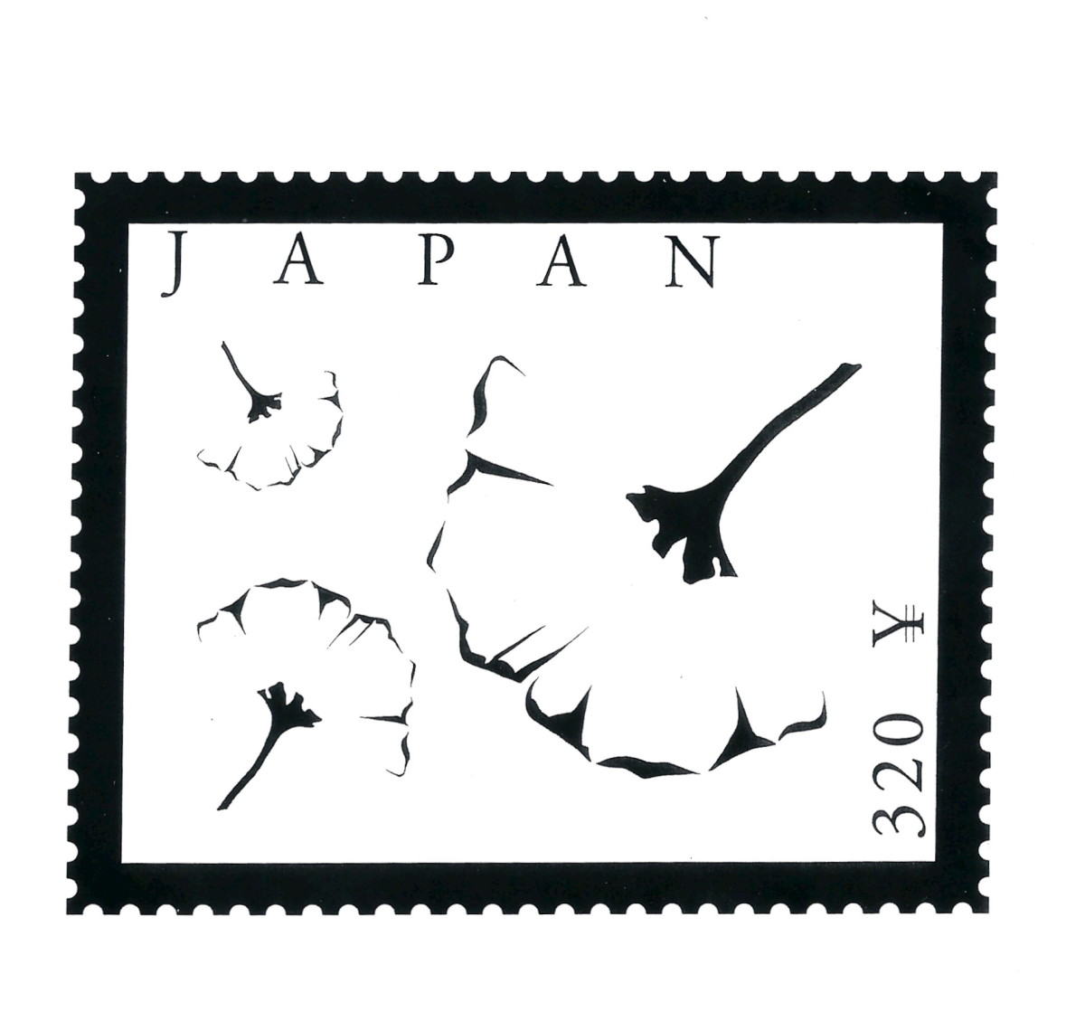
A very well known technique artists to help make compositions more interesting using  a simple techniques of lost and found lines (or edges). These leaves room for interpretation of the the image or more particularly the form of the subject.


This very simple black and white image on a japaneese stamp that show gingko leaves, but none of the leaf edges actually join to the stems but the image can be clearly interpreted as three independent leaves. Our subconscious vision processing has happily seeks where hidden lines or non obvious edges are likely to be and presents us with an easily understood image. The artistic hook here is the brain has become more interested in the image.

IMGP7245


An experiment with lost and found lines in a photo

Saturday, April 09, 2016

My thoughts on collecting Photo Reference for Painting

Whilst there is a school of artists that still insist the only landscapes are those painted plein-air. The vast majority will finish their big painting in the comfort of their studio, a few from just sketches but the majority will use photo reference. I love to sketch and paint outdoors but time and the light seldom let you finish a big work outside. However I know that when you try to slavishly copy all the detail in a photo it can make a painting look very flat. Whereas a sketch hurriedly dashed off is more likely to be dynamic and truly capture the sense of the place. So my take on this is to spend time to do a sketch or small composition painting to capture your impressions of the view, and record the important aspect you see. Start with a sketchDo this on site. I like to use a watercolour wash, then add the the detail with a soft pencil afterwards (I’m not filling in a detailed sketch with colour, I’m putting down the area of colour and main composition elements then adding a bit of detail.) Or alternatively I just sketch monochrome in pencil of graphite stick.

So My First Rule of taking reference photos is

Start with a sketch

  • Put your camera down
  • Do some compositional sketch to capture you what you first see and feel. Just the main elements

Waiting for the Sketch to Dry

Whilst I wait for the watercolour wash to dry enough to sketch without damaging the paper. I find this is a good time to pick up the camera and take those reference picture because you now know what is important in the image. The first photo being the obvious, the same view you are painting. This is where a camera with a zoom lens comes in handy because it is likely that your composition will not match a snapshot from your camera. You will probably have to zoom in or out. In my example I have taken two images side by side and then stitched them together, using Austostitch, because my sketch is a little wider than by camera can handle (alternatively I could walk back behind me before I took the scene, assuming their is room and the full scene if not obscured)Lake Pano

However don’t stop there, take at least an additional 4 views, zoomed in (or walking close) to key aspects of detail that will help you finish or zoom out to get the broad feel of the place (you might like to add some slightly out of view detail or subject into your composition). If there are large areas of colour or texture photograph them, they could be the key to visual appeal in your photo.

 Detail of Comorant on postDetail of walkwayDetail of Tree TexturePatern of Ripples & Duck

So My Second Rule of taking reference photos is

Take Five

  • The composition you intention to paint.
  • Plus 4 details zoomed in or out, or concentrating of a key texture or colour

The biggest limitation of trying to copy a photo religiously happens with tonal issues. Whilst modern digital cameras are great they still have limitations with Dynamic Range and photos typically look flat compared with what you saw as you where sketching. There are two approached here that can help here by they may require a upgraded camera.

_IGP3787_IGP3788_IGP3789

The first approach if to take a bracket set of images (many but not all point and shoot cameras can take a set of three EV settings, older camera usually don’t have this built in but there are several camera apps that add this capability. The bracketed set gives you an underexposed version (to focus on the highlight) a normal exposure and an over exposed version (which will give you a lot more details in the shadows). These three images should give you the ability to play with the tonality to suit your composition. If you want to take the tonal representation further you could investigate processing this bracketed set as a HDR image and refine the tonal mapping to bring out the tones as you remember. HDR is an advance post processing technique that requires specialist software but it will give you a lot of freedom adjusting the tonal range._IGP3787_8_9_HDR with simple tone mapping

The second approach is to take RAW format images (probably as well as jpeg). This require software that can handle RAW images (like Lightroom, Aftershop Pro, OnOne or RAW therapy). The advantage here is the raw format records everything recorded by the camera sensor and it is possible to “pull” extra detail out of the shadows and often bring back the highlights. This requires learning how to use this software and extra time to refine the RAW images. However the ability to refine tonality and colour can be wonderfully inspiring. I started to like having the overhanging tree as part of the composition._IGP3780 Post processed in Lightroom

So My Third Rule of photo reference, if you have the technology to do it, is

Why not Take Ten?

  • Use Bracketing
  • Take and Process RAW images

Saturday, September 26, 2015

PhotoProject :: Knowing a bit about Notan

Composition is a subject that most artists feel intrinsically, whereas photography themselves often struggle. They may not be to blame as popular photography literature generally only superficially covers a few over simplified aspects of composition, like the rule of thirds and perhaps leading lines. Yet there is a lot more to how and what our eye see and find interest, particularly in terms of light and shade. Artist learn about positive & negative shapes, points and movement of interest. The harmony necessary between light and dark and how this can be designed. There is a “secret” artist principal called notan that deals with using this light and dark, mostly through very quick black and white sketches. The word and concept of Nōtan come from japan, if it were a real word it would have a meaning like the the play and placement of light and dark in harmony next to each other. It is taught in some art circles as as a way to develop a strong design at the preliminary sketching stage, however the notan of an image can easily be “reverse engineered” and is thus very relevant to photographers as a very useful post processing compositional tool.

Picasa's posterize toolPicasa, which you can still download for free, has a wonderful little posterizing filter that is ideal for investigating the Notan of an image. This filter is in the second last filter tab on the main tools panel displayed when a single photo is selected. It is design to reduce the number of colours actually being used (the top slider) and this is original of the name posterization because the image begins to look like older style posters which where printed with only a few colours. In the case of investigating notan we are looking for just a black and white image, and all you need to do is move all the sliders to the left (BTW In picasa you never get a pure white using this tool but it is very close), Our eyes are always drawn first to edge of sharper contrast, so it is easy to see that the movement all flows along there strong boundaries of dark and light shapes to the wheel of more particularly the hub cap ( and this puts the main point of interest right on the edge of the frame. Poor design and bad composition. This is so called two value notan, and some artist recommend including a third tone (the mid grey) three value notan. In picasa you can tweak the top slider a fraction to the right an get the three value version (see centre image below). There is also a very useful detail slider which will progressively display more detail (smaller bumps and shapes).
To see how this might be applied to photgraphy I will use  couple of photographs I took for this week’s PhotoFriday’s topic clean. My original idea was to have the foam and green bucket being the focus to covey the story clean(ing). Ok the photo is really bland, so lets look at the notan.
Two Value Notan Version  Three Value Notan Version  The original Photo
Once I saw the black and white shapes I realised that the cleaned section of the car and the soap suds where lost in the composition. Worse still is the light and shapes just break the space in two and the movement and point of focus are on the wheel at the edge of the photo. Even when I consider the mid tone I am not gaining any interest around the cleaning story. Luckily I took more photos including some of me actually cleaning.
  Two Value Notan VersionThree Value Notan Version  Final processed version (more focused in the cleaning)
The balance of light and dark is no longer so symmetric, and thus more interesting also, the dark shape of my arms help draw the flow of interest into the area being cleaned. With this insight I could them focus on this balance when doing my final post processing.

This video nicely covers the concept of using notan in building the underlying strength and composition of a painting, but it does also use notan examples created from photos

Thursday, August 21, 2014

ThePatch :: Kitchen/Let’s Eat

This is the last of the patch themes on the kitchen and simple captioned let’s eat. I had already figured out in the ingredient challenge that there is a fair bit more to photographing food than a simple set up and snap. Perhaps I can become a food blogger after all.

In search of Colour &/or Composition

My first investigation was colour, more specifically the impact of the background colour on the richness of the food. No surprises here, the background colour has a big impact! But which smoked salmon roll looks the tastiest?
_IGP5972  IMGP5967  _IGP5970_1
My next thought it I need to add something to Strengthen the composition, more dramatic positive & negative spaces or maybe just simplify the subject matter?
`  `  IMGP6006-Edit-001

Over-cooked with HDR

IMGP5968-HDR (1)-001  IMGP5979-HDR-001  IMGP6009-HDR (1)-001
I thought I would also try out some more HDR, the google+ autoawesome variety (above) and also even using HDR Camera (below) on my android phone (to consolidated the food blogger feel), They are snappy but I’m not convinced that the clinical sharpness and strength of HDR dynamic range stretching is how I like to see food, I think food needs to be gooier and softer, perhaps even with a warmer glow.
2014-08-21_13-12-51_HDR  2014-08-21_13-17-39_HDR

Some Pop Art Inspiration

I am still reading (and enjoying) Beyond Digital Photography. It has a chapter of using pop artist as an inspiration for a creative photo manipulation. Personally I find Andy Warhol’s Campbell Soup cans pretty boring and mundane (but I believe that was his point). I do like both Wayne Thiebaud and David Hockney’s food still-lives, but neither really considered themselves pop artists. They both use simple colour and shadows to help the form and composition so I figured I needed to get outdoors, to stronger light. My first objective was to use fewer colours and the technique usually call posterization let me limit the palette to just 7 colours. Yes that gave me an “arty” look but it was very dull (and contrived) so I just upped the saturation and contrast (ok a little harsh) so I use layered compositing and masking to add some detail and tone down selected areas with a semi translucent (lower opacity) using OnOne’s Perfect Layers. Success! I like the result it is ambiguously between a photo and something an artist might paint.
Original Photo Posterized Version Heavy on Saturation_IGP6024-002

This technique does required a few steps and jumping between programs. I did like the shadows on the wooden table in a different photos (without the place mat) so I ran that through the method again, with a less heavy hand on the saturation on the posterized layer and more feathering of the opacity between the original photo layer and the posterized version (see below)

Its a slice of banana, nut & chocolate cake with some strawberries & greek yoghurt, was delicious!


The Moral: I’d probably rather eat the food, than delay the enjoyment while I photographed it.
However using this as an art inspired challenged was fun.But enough playing with food.