Showing posts with label sketching. Show all posts

Monday, July 22, 2024

My Most Portable Sketching Setup

One of the primary objectives with my art gear that I took to Queensland was figuring out the minimum I required when painting or sketching. A significant oversight was that I forgot to pack a small sketchbook, so I had to purchase an A5 Visual Diary at the airport. I managed to find one with 110gsm Cartridge paper which I figured would be okay for pencil and pen, but maybe a bit thin for watercolour.

It was just the right size, combined with my dot chart, a water brush, and sometimes a gel pen. I actually did a lot of sketching with this. Anyone else who has tried sketching people at the beach knows that no sooner do you start the sketch than the people move away, stand up, change positions, or go home. Capturing people on the beach can be a fun challenge, but you probably only have a short time to get the basic gestures and textures.


What I found is that these sketches could capture a lot more life in the figures than a photograph. If I was careful how much water I used with the water brush, I had no problems with wrinkling the page as I was painting, so decent-weight cartridge paper is probably okay for this size sketchbook if you're just using it to collect some gestural pictures quickly.

I really appreciate the dot chart on the CD laid out like a colour wheel. On this particular dot chart, I may have overdone the number of colour dots. It's easy to mix the colours you want onto the paper as you go, and I really didn't need that many colours - going back to the 6 basic families is probably okay, possibly with one or two darks and an earth colour.


Creating the dot chart like this is both practical and very cheap and won't discourage me from experimenting. So I've already started making up a few, -CD colour wheel dot charts to start very minimal sketching kits based on a water brush and a small collection of pencils and/or pens.I have a few water brushes, but I really liked the Pentel waterbrush with the bulbous water barrel - it's easy to load with water, always has a decent flow, and the bristles are easy to clean. On the trip I also bought a cheap set of water-soluble graphite pencils in two grey shades and black, and I liked them. Perhaps I'll look out for more upmarket suppliers, like Derwent.. I also like gel pens, particularly the ones with soluble ink.I'm okay with just using the cheaper spiral-bound A5 visual diaries, as long as they have thicker pages (e.g., 120 gsm) rated for mixed media, which should mean they can take a little water media if I want colour.. My intention is to have several of these kits easily accessible everywhere so there is never an excuse not to stop and sketch - e.g., in my studio, office, car, art bag, and perhaps even in the back pocket of my camera bag.

Plenty of fun to come!

Saturday, August 24, 2019

My (Repaired) Camera Bag

I have my much loved ThinkTank Mirroless Mover camera bag back in service (with a repaired zip). It is perfect for my little OMD 10 mkiii Olympus mirroless camera plus two extra  lenses. (I also acquired a forth lens along the way which also fitted in easily). It was never overcrowded and very light compared with carrying my older Pentax DSLR and just one lens.

#218/365 Whats in My Camera Bag

The big bonus for me is I have enough room to carry an A3 sketch book (or two) and also my mini Cotman sketchers palette and a couple of pens and water brushes giving me the ability to sketch anytime I was out with my camera, which was always. Even if I just sat down for a coffee or waiting for a lunch order, I could sketch.

As I was only carrying one camera body I made sure I had my smartphone and the old but reliable pink FujiPix compact camera as backups (not required). Again I can report that I used everything I took (see my Flickr posts)

The small tripod is really small and just ok for my light Olympus, importantly it fits in my suitcase, as does the various chargers and cables on the pink microfiber cloth. I didn’t normally carry them around.

My slimmed down Art Kit

I thought I should recommence semi-regular blogging with a couple of short posts about the creative tools I took on my recent travels. Traveling out of a suitcase does put a big restriction on what you can reasonably include. Further on other trips I have carried items I never used.

#217/365 My Plein Air & Travel Art Kit

This time I wanted everything to fit into the little red Pocket Backpack (it looks like a soft purse but expands out in a simple backpack. I had considered long and hard and decided to take a very sketch oriented set of tools (two palettes of watercolours, inktense blocks and pencils my watercolour brush roll, a roll of sketching pens & pencils and a variety of papers) and a small drawing board (see if you can find it). Whilst travelling on planes this fitted nicely at the base of my case but the rest of the trip was always on hand in the red backpack. I actually had a small extra sketch kit in my camera bag but that can wait till the next post.

I can report back that I used  all of it as some time and because everything as always at hand I used it often. You can see some of my work over at @normhansonart on instagram.

Friday, March 15, 2019

#TURNOFFSOCIALMEDIA :: Work in progress

Seems there was a lot of angst generated yesterday, because the social media drip was taken away. The really sad part was that the emergency services in Australia (triple zero) has to take to conventional media  to stop ringing to report Facebook and Instagram. So sad….

Well there is a good alternative #TURNOFFSOCIALMEDIA and go and do something in the real world, the more creative the better or actually talk to someone, especially a friend. It will be really good for your health.

Yesterday I when for a walk for with my sketchbook, watercolours & pens (the actually fit in my camera bag) Sat in the sun (and strong breeze) and sketched.

Time disappeared into a flow of seeing and sketching. The only rude reminder of reality was fighting against the wind. Such is life and it is good.

Tuesday, November 13, 2018

David Hockney’s thoughts on the Art of Seeing

Those coming to the next Sketch Crawl, Sunday 18th November (there is still time to register at eventbrite) might like to view this BBC documentary which covers much of David Hockneys views on photography and the important Art of Seeing. The documentary does run for almost an hour and mainly covers Hockney’s revised inspirations from landscapes and lead up to Hockney’s Bigger Picture series of landscapes. The PhotoWalk/SketchCrawl is based around many of the same issues. So this You Tube is not only a very interesting in itself, it is also great context for the walk.


The harder to look the more you see.

Saturday, January 06, 2018

Back to experiments in HandDrawnPhotography

I’ve been sketching at the beach and also took a photo (or two) so it is a good time get back into the Hand drawn photo project. which is an elaborate way to say I’m merging my sketching with a digital photo. In this examples I’m using google deep dream generator  (in Deep Style Mode) and using my hand drawn sketch a the training image. I’m using the mark making style from the sketch but trying to maintain the colour from my photo.

Original Photo Half Moon Bay My Sketch

Half Moon Bay ""HanDrawnPhoto" ?

Thursday, August 31, 2017

Refining the sketching pencil roll

1-IMG_5805

My collection of pencils and pens in my small pencil roll has move for all graphite pencils of various hardness to a few conventional graphite pencils HB to 6B range a couple of woodless pencils, a charcoal pencil a couple of clutch (mechanical) pencils, a sharpener and a water brush, as well as a small watercolour round. Whilst there is room to keep this in the outer pocket of my camera bag, I normally keep it in my smll art kit backpack

I also like to start new sketch books by drawing anything, usually something ordinary (and probably bad)  just to “break in” the book and avoid any feeling that it might become to precious to use. If its different to one you have used before turn to the back page and make a reference “colour chart” with you current media. Different papers make a big difference at the sketching level. This is a new A4 book spiral bound to see if I can avoid the falling apart in the wind problem with the conventionally “glue” bound sketch books.                                                                                

My Camera Bag Diet

1-IMG_5610
I’m not obsessive about my gear, but I do like it to be safely stowed, I have been very happy with my thinktank bag I bought last year for my trip to Canada. Even though its a Mirrorless Mover 30i it has plenty of room for my bulky Pentax K20 with my big tamron zoom and a 300mm zoom sigma lens, also on the large size. However I have been slowly trimming the ancillary stuff to give plenty of room for my sketcking gear. I have the mandatory clean small towels (aka face washers). I also have two lens cleaners, an old fashion blower brush and a lens pen. There is also a polarizing filter and a case for SD cards. I am rotating the SD cards, so there is a temporary backup of photos there as well as on the two external backup drive (back at my accommodation). I also have an old HTC phone that has no sim card but it has a good gps receiver so I just need to turn it on, start My Tracks and put it back in the camera bag to get a continuous wayfile. I also have my trusty but redesigned string monopod.

Art gear wise I still carry an A5 sketchbook, and a couple of pencils and/or pens, often a water brush style pen. And of course my small Cotman sketcher box. I am now even move convinced a sketckbook is a great camera accessory (for seeing).

Monday, July 31, 2017

Getting up to some Mischief

My disdain for workshop or trainers that just teach their “work flow” as the ultimate (perhaps only) way to use software and carry out various photographic or artistic tasks is continuing to grow. Such attitudes are a guarantee to remove originality, innovation and individual expression. Those that religiously follow the “work flow” rules end up producing much the same work over and over again and whilst it can be good, even excellent it is soon an avalanche of sameness, blunting our interest. If you don’t believe take a look at someone scanning their social media. they thumbs or fingers are barely allow more that 2 second to view any image. Swipe. swipe, swipe….

I favour a lightly slow more honest evaluation of the tools, workspace and characteristics of the material. You still need some instruction in the basics but ability comes more quickly if you just play with the media and tools. Its not unlike many of the early craft guilds (which included painters, or newspapers in the old days when they had staff photographers). Here you where probably apprenticed to a master and they expected you to grind the pigments, mix the inks, wash the brushes and even sweep out the work shop. You got to handle all the media and saw how it was used and eventually you where guided into doing it yourself. Some apprentices adhered to the methods of their master but fortunately for us enough students experiments and expanded on what they had learnt and their masters where wise enough to encourage them. I believe the same approach needs to apply in using the modern tools or art and photography. The masters, can be those guru photographers and the You Tube Stars, you no longer need to be in their workshop but the familiarity with the workspace and the tools is still down to us, the “modern apprentices”.

I’ve told you all this because I want to resume short blog posts about the work space in software and the key tools to use, so that you can understand the steps in the work flows you are taught but also have enough confidence to experiment and try something of your own. I happened upon the Mischief sketching software whilst looking at ways to prepare some composition/notan sketches. It was a it was a real relaxation, simple to use and powerful at the same time, no work flow required. There is a free version which is perfect to get started with, and is what I am using here, If you an make a mark with a pencil on paper you good to go.

Mischief Workspace

The Mischief work space is a single screen and it normally starts in full screen mode. There is the normal windows style menus bar with drop down menu items that run all the programs function. Mischief Tool BarThe more commonly used are also shown in a vertical tool bar (normally over on the right). One very unique aspect of this work surface is the “canvas” you work on is that it is truly infinitely. You can scroll off the edge of the screen or zoom out to reveal more canvas. This an incredibly liberating feature. Start by drawing something that runs off the page, pan across a bit and keep drawing. The last two icons are for the the undo (another feature without a limit) and redo. All the tools and functions have keyboard short cuts, if you prefer those (look under help).

The next important set of tools are found in the brush panel (normally down on the lower left). The free version only has three brushes (aka pens) and Mischief Brushes Panelthey only have simple controls on size and opacity but this has been cleverly used to create a faint lines (pencil) for rough sketching a solid line (ink pen) and a thicker chisel style semi transparent line (Marker pen) These three pen will give you a decent sketching experience. probably the thing you will want to change most is the pen size, which uses the [ and ] brackets (for thinner & thinker) r the little slider pull out by clicking on the second bottom tab. the opacity can also be controlled by the number keys (again see the shortcut keys under the help menu.

The final on screen panel is the colour picker, normally on the upper left. Compared with many other packages this is a very simple format, but it does allow select for Colour (the slider under the colour square, Tone, the vertical position and Intensity, Mischief Colour Pickerthe horizontal position on the colour square. Unlike the paid version, the free version doesn’t have the ability to save your own swatch of colour, but size the canvas can be of infinite size you can place a small swtach of colours directly on just visible edge of the canvas, then return to that with the eyedropper to pick one of the few colours you have selected. So for simple composition sketch with 5 grey tone I have just used an approx 25% grey 50% grey, 75% grey & Black, using the white of the canvas as my 5th tone. You can either erase this later or just pan so that it is not displayed on the screen when you export a picture.

A really unique feature of this program (I haven’t seen another implement such a simple idea) is the ability to change the canvas opacity. This basically changes the canvas into tracing paper. Mischief Tool BarBy putting a suitable photo full screen and loading mischief over the top of it and either using the Window> Activate Window Opacity function from the menu or just use the slider on the side of the vertical tool bar. Moving the slider closer to 0% makes the canvas more translucent. You can trace lines of colour in the basic tonal shapes.

You really either need a Wacom style tablet of a touch screen with a pen, to get the natural feel of drawing. I have used it with the touch screen on my HP spectre and the touch mode on my old Bamboo tablet, but It is definitely wasn’t as good and trying to use the mouse is a little too fiddly. If you haven’t ever draw3 on a computer screen before the free version of the program is worth a trial. I’m already moving onto the Pro version (mainly to get layers & pins, more about those later hopefully. In the meantime never be afraid to experiment with your own “working methods” and occasionally just have a good “play”.

Thursday, June 08, 2017

Plein-air onto tablet and some pleasing #AIart

Me deeply absorbed in sketching on my tabletYesterday I bit the bullet and tried out drawing my daily sketch directly on my HP spectre in Tablet mode, using the HP pen. There is a massive disincentive to working with the tablet, in fact anything with an LCD screen, in the outdoors, the screen is quite reflective and fine detail (and specifically small icons and text in the likes of Corel Painter are almost impossible to read) so sketching soon becomes a frustrating squinting, dabbing, missing, and confusion resulting in random lines all over the place. Thus I figured I’d start with a simple application, and the free version of Wacom’s Bamboo Paper fits the bill perfectly. There are hardly any on-screen control’s and they are big anyway. Further updates to the Microsoft ink workspace (that seemed to arrive in the Creator update to Windows 10) have improved the response of my pen and added a couple of levels of pressure sensitivity. There are only a pencil and highlighter style marker pen, with three width options in the free version of the bamboo paper app but that seems plenty to start with. Its also very natural to use. There is a colour change/select feature but accurately choosing colours in the glare didn’t appeal so I tended to pick the stronger colours and not worry too much..
My Pein air sketch using Bamboo paper app on tablet
I found a good spot, got out the tablet, shaded the screen with my body and made a start, timidly at first but I got brave and sketched lines and coloured over them with the highlight marker brush then back for more lines. Suddenly about 20minutes had slipped by and what I had done looked ok. I moved under the shade of a nearby tree and it looked better, ok better for my first outdoor attempt. It was after all just a field sketch (see above).
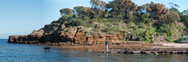
Sunny Day at Table Rock, Beaumaris
Today I stitched together 3 photos I took of table rock from the same vantage point and thought I should try improving the colouring (and tone of my sketch). It didn’t take long to realize this would be a perfect little test for the Neural Style feature of google deep dream generator. What I tried out was to use my bamboo paper sketch as the neural training image to filter my photographic panorama BUT to borrow the colour scheme from my photo rather than the sketch. In other words adopt the line work and flat highlighter style shading.from my sketch but stay close to the photographic colours (and tone). I must say I was impressed. I’m not sure how to take this AIart (Artificially Intelligent art) further but it does produce something with the sense of my touch and the way the place felt, something excitingly worthwhile.
The deep dream results, combining my sketch linework & photo colours

Friday, June 02, 2017

Sketching my digital cameras

dreamscope deep dream after Van Gogh of me sketchingIn a bit of self reference fun I have been sketching by journey through digital photography, Starting with an old Logitech webcam (last used to make a short stop motion film), then my first real Digital Camera the little Olympus. Compact then my first Pentax, the Canon and now the bigger Pentax K20D. It just happened that when I was looking around for something to sketch they where there.I could see then a-fresh not as complex instruments/tools with lots of knob, buttons and dials by see them objectively as items catching the light. Perhaps there was a bit of objectivity creeping in as I love using these things. These represent almost 2 decades of digital imagery

You can see the latest incarnation of my daily sketches on instagram @oz_endless_summer


Old Logitech webcam dressed up in tripod legs in soft pencilOlympus C-4000 in brush pen and pencilPentax 100D in soft pencil


Canon 1100D in soft pencilPentax K20D in charcoal

Wednesday, May 24, 2017

Resurrecting the #DailySketch

image

Whilst my attempt to create a daily sketch (on Tumblr) quickly dwindled. It doesn’t mean I wasn’t sketching. It was just erratic and on different media. The disappointment of not being able to sketch directly onto my tablet and the new drawing board has inspired me to get back to the routine. Not wanting to be too slack I’ve decided to move the action into Instagram and sketch the same item three ways (or two ways with a deep dream filter of the same subject). I think I can manage a months worth.

Lets see how I go.

Tuesday, May 23, 2017

A drawing board for my tablet

One goal I had set myself on the last endess summer trip was to create more art directly onto my tablet. I had updated to corel painter 2017 and downloaded few free apps to test, including wacom’s Bamboo Paper, Well they do work but trying to use the tablet outside with just my finger, a stylus or the HP pen proved very difficult. So difficult I gave up.

The first problem was glare, which made the LCD screen almost impossible to see. Any direct sunlight on the screen meant all I could see was the mirror reflection of a very frustrated me. picking up the tablet and tilting it away from the sun worked but it soon got heavy and difficult to hold in one hand as I sketched with the other. Normally when I paint I rest a drawing board on my knee or easel.The tablet proved a little slippery for that or trying to rest on a book of box. It was fine flat on the table but …. I just couldn’t see what I was drawing. Tilting the kickstand up into the normal typing position was better but it was not a good angle for sketching freedom.IMG_2223The draw board idea stayed with me. I got an old board and cut some notches in it to exactly match the width of the ick stand and then I turn turned the kickstand right up so the table “hung” on the drawing board. I could rest the drawing board on my knee and the whole configuration was looking move stable, till I split and push up a little and the table slid off the notches and slipped around again.
IMG_2227

2-IMAG0626


It was quite literally back to the drawing board.

I had the brilliant idea of adding a small plastic clip to hold the kickstand from slipping off. Firstly I glued it on but that was no where near strong enough, and soon the tablet broke free and slide off my lap and onto the floor (phew no damage done). So it was both glued and riveted next. I also put a couple of furniture felt wear pad at the position the base of the tablet sat on the drawing board. Magic the whole thing is very stable now.

Time to try it out in a variety of ways.

As a way to keep the tablet steady on my lap or propped against a table, it was perfect. Next I tried to see if it was a way to 1-IMAG0625have a small sketch book open on the drawing board and using the tablet for the reference. It seemed a little cramped at first but it proved wonderful to have the sketch and reference in close proximity. Then I got bold and attached my “portable” wacom bamboo tablet with the pressure sensitive pen underneath the HP screen but paper clipped to the board, except for the usb connector cable hanging down this is a real winner, especially with the touch controls so I don’t need my mouse, I’m sure I will get very productive with this set up. Finally  I tried out just straight photo editing, on my lap (eg while on the couch watching TV). Again pretty comfortable, no extra hands required and no slippy/sliddy tablet behaviour.


Directly sketching onto the tablet Using the tablet to show reference with small sketchbook also attached to drawingboardTablet with Wacom Bamboo attached Photo Editing on my lap

Tuesday, April 18, 2017

Directly Painting on a Tablet

I figured a good challenge for today would be to directly paint on my HP Spectre in Tablet mode using the HP pen. The Sun was coming out but there Corel Painter's Colour Wheelwere a few fluffy cloud around and I figured they would be a great subject. So I fired up Corel painter and set up a coloured canvas with a rough paper texture. I then experimented with the pastel “brushes” and a directional blender.

Obstacle one was the high reflection (glare) off the screen even in the shade of an umbrella. Similar to tring to sketch directly onto my phone. Just had to preserve with this one, sunglasses didn’t help, they probably imagehindered.

Concern two was out in the sun the colour wheel tool doesn’t seem to give me and even range of colours. The deep blues all looked purple and the cyan decidedly green. I switched to the mixing tool but still found the blue of the sky difficult to judge. The screen blue was intense but the sky was more so. I can see a lot of practise will be required on matching colour if I want to continue plein-air tablet work.

After a small siesta and a G&T I retuned to do another, this time more clouds around and I took a wider view and a lot more blending.. I did the colour matching from the shade and seemed to get more natural colours

clouds1clouds2

Sunday, April 02, 2017

The Challenges of Watercolours at the Beach

final (5)I now have a very comfy beach chair that is perfect to sit and do some sketching at the beach. I also have a nice little backpack that holds my art gear. So I should have little trouble making decent sketches. However there are two challenges wind & sand that introduce a fair bit of stress to the watercolour sketching process.
Using my wet/watercolour portable pallette on the beach is a like a magnet for sand. The mixing areas in particular have areas of wet paint being mixed and any small sand grains tend to collect here. The sketch book itself often collects a lots of sand on the damp areas and the little grains tend to suck in the surrounding moisture and pigments creating a speckled effect (nice for foliage and sand but not attractive in the flat wash of sky). If I put the sketch book down on the beach to dry … sand everywhere.
_IGP5074
However it is the wind even just a brisk breeze that plays more havoc. It blows around more sand and also pulls at the pages of my sketch book )one sketch book was pretty much unbound on this trip so it is now a lot of loose pages. Also the wind makes it hard to balance my portable paint pallette, brushes and water
There are a couple of  good solution to windy days, that I discovered, and relied on, on my recent trip. The first is big bulldog clips and/or masking tape. to hold my sketch book securely on my drawing board. The second is my set of Derwent Inktense Blocks which I use little like a “dry” pallette. Using a water brush I can just pick up the paint I need from the blocks and essentially leave the blocks dry (and less sand attracting). I tend to then mix the colours on the sketchbook page and I’m pleased with the results.
scan0003scan0004

Sunday, March 26, 2017

Collecting Photographic Reference Material

Most artist have their very own way of collecting reference material for a later studio painting. Some might just take one snapshot style photo (or perhaps a few) then essentially just copy that.
image
I must be from a more plein-air background, I much prefer to do a sketch or two (or three) on location. There is more time to breath in the atmosphere, listen to the sounds and get a real sense of the place, than just pressing a shutter button and moving on. More significant you still generally have only limited time so you have to gloss over the less important details, ones you might be tempted to copy from a photo. Instead you have to concentrate on what will be your subject/centre of interest, getting the relative tonality right and pulling together the colour palette. This requires keen direct observation, but with a little practise it come easy. In my initial pencil sketches I could see I needed to include the distant people to consolidate the vastness of the beach (Seven Mile Beach near Gerroa, South Coast of NSW )_IGP5449-2
Where a photograph will just reproduce the colours (and detail in a scene) within the technical limits of a camera, an artist will usually refine the colour palette to enhance or subdue the atmospherics. Possibly tweak the relative tonality to emphasize the subject. I always feel even rough sketches capture the essence of a place and are fresher than just a photo.
_IGP5480-3

Take 5

However it doesn’t hurt to have some extra detail and this is where photography can be a great assets for any artist. My advice is always Take 5 
  1. The snapshot (first impression of the scene)
  2. Wider perspective (wide angle, panorama, or just adjacent overlapping shoots)
  3. Zoom in on your subject
  4. Take some atmosphere (eg the sky, the surf)
  5. Look behind you (ok not literally but do look around and get a context photo or two of the place).
image
You may as well get the obvious snapshot out of the way. However next spend a bit of time looking for a wider view. Camera phones are already slightly wide angle but unlike a DLSR you can’t change lenses but there are lots of panorama apps that will allow to get a wider view. Alternatively you can take several overlapping photos and use a stitching program to join them. The next option is to zoom in close (most phones can do digital zooming) and a DSLR with a good zoom lens will save you leg work. Otherwise just walk in to get a closer view. It is also wise to take a couple of atmospheric photos, if it is a cloudy sky, take a photo just of some of the clouds. If the light is intense take some photos showing deep shadows, A blue sky is a lot of blue but it will give you a good reference for tonal changes, particularly towards the horizon, Make sure you can record the direction of light (shadows in photos will help here). Don’t forget to look around, sometimes what's behind you can make a stronger picture.

Make that 10


That set of five type of references should give you a big start back in the studio, but why stop there. Here are a further set of optional photos you should consider as well. You don't have to follow my suggestions here exactly these steps they should just be an excuse to do something different, perhaps more create.

  1. Take a photo of the sketch in place
  2. Try a range of different framing options
  3. Try a range of exposure options (eg EV bracketing)
  4. Look for Abstract shapes (or lines) and focus on them
  5. Get in really close, record interesting texture (this could be very close up or plants, rocks, ripples in the sand or a stream)

  6. The photo of your sketch in position will give a great reference of understand any difference in the colours captured by your camera versus what your sketch recorded. If nothing else any white background of your sketch book will be perfect to do a white balance on the photo later (which decent software should let you can carry to your other reference photos). Next is the idea of trying different framing options (its a little like steps 2 & 3 but instead of focusing on the subject you should move the frame around shifting the subject up and down or to right and left).  You might like to change your position so you are looking up or looking down (eg standing or sitting on a beach makes a big difference to perspective). Perhaps you can find a track, fence line that leads you nicely to the subject. Walk around. Perhaps a portrait orientation (vertical) may be better than a landscape (horizontal) orientation. Your camera viewfinder or phone screen are fixed aspects but you might like an image with a slightly different aspect. For example I am finding many sunny vistas lend themselves to a super wide format and I even sketch across two pages (3:1 aspect), so why not take two or more photos and join them later. image
    A lot of folk don’t like the default HDR style of photos (chunky detail and over vivid colours) but taking a set of images at different exposures can give you details in the shadows right through to delicate highlights. A single photo even when perfectly exposed can not provide these in a very contrasty situtaion. Learning to use HDR methods/software in a constrained manner can deliver photos that are much closer to what you remembered of the light & colour. Most DSLR have bracketing options and now many phone camera apps do as well or can do HDR multi-exposures directly on the phone. You don’t have to put up with bleach out skies and blown out highlights anymore.image
    The second last task is slightly obscure but it relates to balancing the tonal areas in your final painting. You can use your camera to help find the dominant shapes of dark and light. It requires looking at the scene in a more abstract manner. Its a lot like the advice to half blur your eyes in order to better see tone. If you have a DSLR put it in manual focus mode and then blur the image until you just see abstract shapes. Strong diagonals, curved lines and edges or sharp shapes can lead the eyes of the viewer. Try framing those shapes such that the lightest light against the darkest tone become the centre of interest (such contrast is generally what involuntarily draws a viewer’s eye first). Then refocus the camera and take that view. Mobile phone cameras generally don’t have a manual focus but you can resort to any of those camera/filter apps that change what is displayed on the screen as you take your photo. Changing the camera display to black & white or using a posterizing filter with only a few steps will help make it easier to see the tonal shapes. If you don’t have a phone with such apps find a some software that can help you perform these steps (I have used Paint.net on my computer and Snapseed on my phone) This is much the same step as doing a small tonal composition/notan sketch. As with the framing step it pays to move your view around, even a little. It can also help you zero in on what contributes  to an interesting composition and what can become just a broad area of tone, and perhaps a little texture.image
    Finally a few really close ups that record pattern & texture and/or some of the details you particular want included in your painting, a few quick detail sketches of such items might be useful as well. After realising I needed some people to give me scale I took a few difference photos of people both near and far walking on the beach.
    1-people