Saturday, September 29, 2012

Three Ways to extend Dynamic Range from RAW files

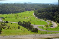
autostitched panorama-created from 2 lightroom tonally enhamced RAW imagesI have been seriously looking at how much I really need to “stretch” the dynamic range in my “big landscapes”.In wide panoramic views there are actually a few different issues at play. In simple terms the dynamic range describes the ratio between the maximum and minimum measurable light intensities (white and black, respectively). This is actually different for the overall illumination of the scene being photographed, and then the capabilities of how well the camera and screen or printer can reproduce that range. Some scenes like the one used here, that have quiet a range of incident and reflected light from a bright sky to a deep shadow, such a range is intrinsically difficult for the cameras light meter to correctly expose. However the human eye tends to allow for such a high dynamic range better and we often see photos taken in such light as flat or dull.

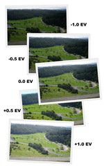
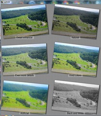
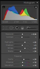
In traditionally in film photography there were some well established dodge & burn techniques during enlarging and development but are there equivalents for the digital photographer? Here are three example approaches to widen the dynamic range. In the end I used the tonal histogram guided adjustments in lightroom to firstly enhance the two images before stitching them in autostitch for my panorama above.
HDRi (Picturenaut – 5 photos) hdRaw (single RAW file) Lightroom (tonal development)
cardinia HDRdraw_thumbnails_cut lightroom histogram
picturenaut_photoreceptor hdRaw reinhardt park2-2

Friday, September 28, 2012

Late Afternoon Rainbow


The rain clouds cleared a little and for a few moments a rainbow appeared against the dark clouds as the last rays of the sunset lit a few low clouds. Just enough time to grab my polarizing filter to enrich the colours of the rainbow. Then it was gone.
Posted by Picasa

Market Fresh - Still Life


Posted by Picasa

Wednesday, September 26, 2012

Just in time?

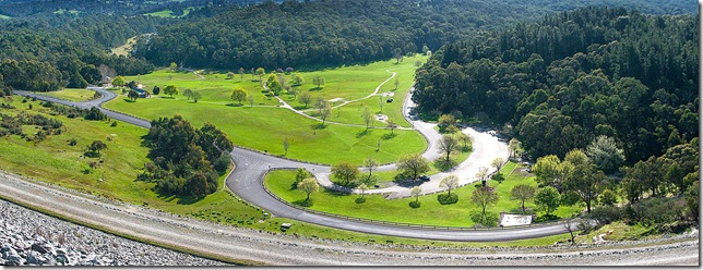
cardinia dam pano smalI visited Cardina Dam yesterday, and have never seen it so full. So I was a little surprise to hear on the radio this morning that the Wonthaggi Desalination Plant will begin pumping “high quality” water (their term) into the dam from  today. However I would estimate there is less that 2m of freeboard available until the dam start naturally emptying itself via its spillway, which seems to contradict the claim that its website claim that it is only at 79.9% of its capacity. Just in time or not needed?

IMGP6330The panorama above was constructed from 22 images, using autostitch. I was trying out a new gadget, the little green cube on my camera, which is a multi-level slide into the flash hot shoe and it worked a treat. No matter how you position the camera on the tripod (portrait or landscape orientation), there are two bubble levels that help you ensure good horizontal and vertical alignment.

Tuesday, September 25, 2012

Sunday, September 23, 2012

Friday, September 21, 2012

Colourful Shades of Grey

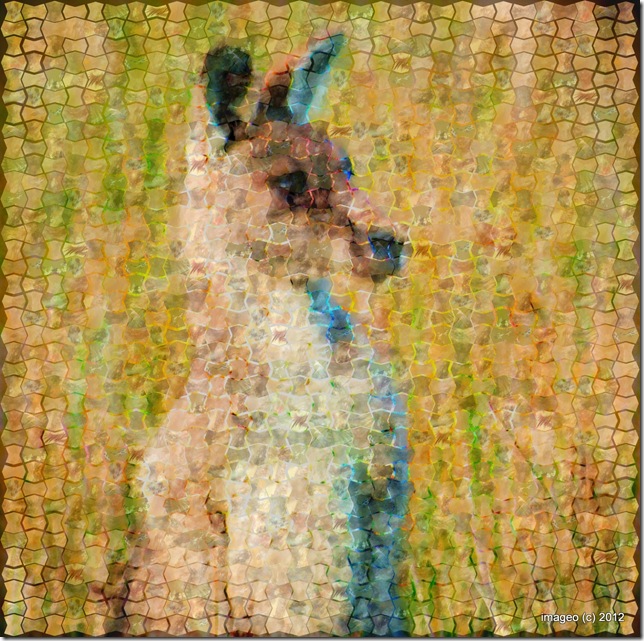
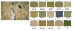
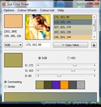
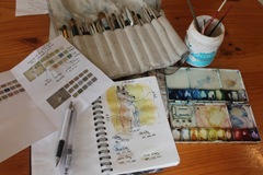
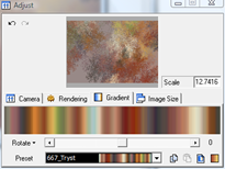
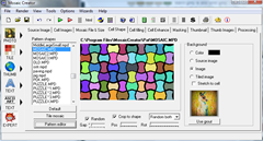
kangaroo photo ImpressionI have been working on a new photo impression series of wildlife, and have been working on ways to bring the process closer to the way and artist might create the image. In particular I wanted to achieve a characteristic Australian colour scheme, but at the same time keep the colours to a harmonious scheme an artist might choose. kangaroo3 colour paletteI began using an old favourite utility from big huge labs, called colour palette generator. This take a photo, analyses the colours and produces a harmonious set of colours based on that photograph. I did this for all the images I am contemplation turning to mosaics and discovered that all the images shared 5 shades of grey, a mid grey, a light grey, a blue grey, a warm grey & and olive grey. just color picker dialogueI then used another favourite software tools called Just Color Picker, Which allows you to point to any group of pixels in an image on screen and displays its code in a variety of formats: HTML, RGB, HEX, HSB/HSV and compositional sketch & colour testHSL. It was the RGB codes that I would use later. At this point I made notes of the contrasting and complimentary colours which are displayed in the lower panel of just color picker. Just to make sure the colours worked I then made a series of watercolour & pen compositional sketches, to give myself more confidence that these automated colour tools where not leading me astray, and that the 5 shades of gray where in fact a good foundation for the colour scheme of my photo mosaicing process.My next task was to generate my palette of tiles that both followed this colour schemeimage and also complimented the texture within my photos. I was again using Apophysis, a free fractal flame generator project, which has the facility to control both the flames shapes, and thus texture and also the tonal gradient, and colour scheme. I made up 75 fractal flamed coloured tiles using 5 sets using backgrounds based the 5 shades of grey with 5 rotations of the patterns using 3 tonal gradients that used complimentary imagecolour schemes.The final step was to use mosaic creator, which is a very powerful mosaicing tools, that can create a mosaic based on a source photos using a palette of other images (my file library shown below). For this series I choose to use a random grout (a visible gap between tiles) based on a colour enhanced version of the source photo.photo tiles in my kanga-lib palette

Thursday, September 20, 2012

Spiraling into Divine Composition

croping overlay  in lightroom 4I need to begin this discussion by making a strongly held point, that most people intrinsically know good composition and will probably do better than say “the rule of thirds” or similar composition “rules”, just using their eye. However I must admit I have been having a bit of fun trying figure out why the Fibonacci Spiral (its called the Golden Spiral in Lightroom) might be a composition aid? The ratio behind the fibonacci series is roughly 1.618, so it doesn’t neatly cut a shape into one third two thirds but it is close. so I have heard this gold number referred to as the rule of thirds on steroids.  More importantly it has been known to artists as the Divine Proportion since the renaissance, and often used unwittingly by artists and architect before that.


I have found two ways to use the spiral as a guide. Firstly using the inner focus of the spiral to target the main point of interest (the ducks head in this example). So you need to toggle the orientation of the spiral overlay (using <shift> O repeatedly in Lightroom. Alternatively I have found the outer arc of the spiral a good place to line up strong contrast changes, letting them follow the sweeping curve (not shown here). While this second approach doesn’t draw your eye to a specific focus point but it does guide your eye around the image, in a pleasing way. The android app ProCapture has an onscreen Fibonacci spiral to aid composition, which is also fun on the phone because you see it as you are taking the photo..
vistor to my garden-cropped in lightroom

Sunday, September 16, 2012

Many Mistresses but Master of None

alvin's many mistressesFor the past couple of years, I have been dithering over which is the “best” photo management software to use. I have been a big fan of Picasa since I first downloaded it but I Photo Utilities on my Photography Laptopalso have had the software supplied with my cameras (all good but unfortunately not universally appealing) I’ve also got Windows Live Photo Gallery running it on a few computers, and I have Adobe Lightroom and Photoshop Elements on my “photography” computer  (I have never actually got enthusiastic enough to outlay on the cost of Photoshop). On my old laptop I still have an original version of Corel Photobook (which I still like).  I also have Corel Painter, with a Wacom tablet and  CorelDraw Creative suite X6, (mainly for its illustration capabilities) and its Corel Photo-Paint is a favorite for “special” editing needs, especially its smart carver & clip mask. Then there is a whole menagerie of special tools (picturenaut, autostitch, mosaic creator,geosetter, noiseware and not to forget paint.NET), Just in case I also have Portable Gimp and XnView on my USB Portable apps key and adobe photoshop express and aviary apps on my android phone. I have a great collection of photo utilities but I suspect theyPhoto Utilities on my are getting the better of me, I often find myself following one processing path only to realize I might have been better going a different route.

The two packages picasa and lightroom are my definitely favorites because they are both non-destructive editing systems. They leave the original untouched, and instead of adjusting the pixels in the image itself, they store the process that is used to edit the photo and can reproduce the exact same result again whenever the photo is viewed or printed.. Picasa is great in its easy of loading new photos and scanning through load of photos its fast and has nice basic editing tools (cropping,straightening and “light” exposure controls. Windows Live Photo gallery is also fast but it not transparent in how it edits photos and where it puts the originals, it is Photo Utilities on my Desktop Computernot as obviously non-destructive and has fallen from favour. I’m also a fraction worried (ok quiet worried) that google will strangle the life out of a nice mature package like picasa as they rebadge and social network it into just a google photo product . The new Lightroom is really a better way to edit RAW files and has a more serious editing features, However it is really slow to load in a lot of RAW photos, painfully slow even in the 64 bit version. Thus I tend to load everything into picasa, review it and tag what I like and only take a small subset into Lightroom. My biggest hassle is remembering, did I do the adjustments in Lightroom or Picasa or both! The really annoying issue is that neither program can (or deliberately wants to) see the adjustment they other has made. Or was it a special edit in Corel Photo-Paint or a final cleanup in noiseware?  Keeping track of all the foibles of this many mistresses is not as easy as it might appear, but it would be nice if they at least talk to each other, and stop the gossip of who’s prettier or a better housekeeper.

So am I going to settle down and just choose one system, one workflow and ignore the rest. I doubt it, vive la différence.

Thursday, September 13, 2012

Golden Horizon

A 10 photo series were taken as a few late afternoon rays of sunshine, lit up the reeds along the lower reaches of the Tarwin River, to create a golden horizon. Then stitched together into a single panorama with Autostitch.
lowet tarwin pano wide-001

Tuesday, September 11, 2012

Monday, September 10, 2012

Sunday, September 09, 2012

TextFilters over CameraPhone Images

iphonenokiaandroid
These found abstractions of the same sculpture outside the monash gallery of art where taken with three different camera phones. I was thoroughly enjoying the experimental mobile photography workshop with Misho Baranovic, especialy the Shoot,Edit,Share message. Whilst the photowalk task was to take a background texture and overlay it over a subject, all on the phone. I tried a few Aviary filters, on my android, and they remined me of the Alchemy add on to corel paint.. Thus I have cheated by uploading my images to a computer and doing the text-brush filter on the computer, not the phones, but I like the result,

Friday, September 07, 2012

PhotoProject :: Self Reference, Self Portrait 3 CameraPhones

self reference camerphone selfportrait taken using three camera phones
This self referencing attempt was more challenging than I have envisage, and less successful than I hoped. Primarily because of the degeneration of the image on the phone screen as it was photographed by the next phone. I’m still not sure if this is a limit with the marco capabilities of the phones or the difficulty they have focusing on the image on an LCD screen (my preferred explanation). The exercise also highlights how differently each phone handles white balance (seen as colour cast shift between screens).

So here is a semigraphic storyboard of how it was done
Noika 6120 Classic IMGP1575 My old Noika did not actually take this image but it was very much part of the original self-portrait
HTC Wildfire (Android Phone) 2012-09-04_16-08-12 My Android Wildfire was then used to take a photo of the Nokia, with the original self-portrait displayed
iPhone 3G IMG_0253 A borrowed IPhone was then used to photograph the Wildfire with the photo it had just taken.

I must admit I had immense troubles getting the iPhone to focus
Pentax 20D IMGP6006 All I I had to do to finish was use my Pentax to photograph the iPhone.

Simple really.

Thursday, September 06, 2012

Happy River Gum


River Gum on the edge of Dandenong Creek enjoying the regular rainfull this year.
Posted by Picasa