
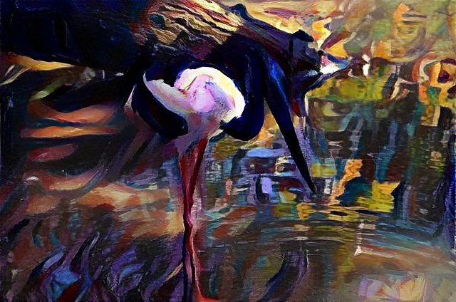
I was certainly an early follower of the developments in the deep dream style art filters, which use neural networks to recognize and amplify aspects of any photographic images. I must admit I like the potential of the forward seeking neural networks that can replicate line work and other mark making characteristics of the training image. I chose to this called Deep Dream Style, and starting giving such creations the hashtag #AIart (which seems to have caught on on Instagram). My prediction that these might become over used Art Filters is probably also an astute observation, there is certainly a plethora of such apps. Fortunately most are based around famous artist and great art, Even Adobe is joining the crowd offering researching a AI style filter that can “copy” the look from another photo. I still think these filters can be used creatively rather than as “look at me” plagiarism so obvious in social media today.

This photo was just an experiment, the first photo I took with my new HTC U Play mobile phone. I was trying out the AutoHDR feature and it handled the difficult strong lights and shadows well. Its just afternoon tea, aka Coffee & fresh figs. It is an interesting enough composition so I thought I would try the image across a variety of current #AIart tools (google deep dream style, on computer, Dremscopeapp & Prisma on phone)
Which rendering do you like best?

However three packages which offer such one-click filters, but with the ability to modify them and/or stack them, are changing my mind. Googles first version of snapseed, as implemented in Google+ photos let you select a filter and make standard changes but with the option that you arrive on a page with various sliders that created that look and then lets you refine the changes. In other words you select the basic look and then can tweak it (often just to bring it back a little). Unfortunately snap seed is no longer used for default edit in google photos on the web and has gone missing on the android phone app for google photos. However you can still download it as a standalone app on the android (albeit with less effects filters)
The second software, which surprised me, but had the biggest influence on my change of mind is OnOne 10. In their effect tools they has been working towards the analogy that the effect worked like adding a set of filters in from of your lens. However there was always the actual sliders, buttons and dials very prominently on the left hand side. This is where you did most of the adjustments. there where thumbnail of the main tools on the right hand side and you could get larger version showing the effect on your photo from there. The Version 10 interface has been reworked and it a lot cleaner however I think most of the tools remain. (Resizing images was one overlooked but has been added back now (version 10.1.0) There is now more emphasis on the tiles (they are bigger than thumbnails by default now) and it is easier to start on the right. Many tools have a few tiles with slightly different settings on the original sliders. I’m now becoming convinced it is easier and more natural to judge an effect visually than remember how far or my what setting to adjust a given slider. As before you can save the filters stacks as presets, making the system very powerful. You could previously add effects on top of each other but the analogy of stacking filters is really obvious and powerful. even when they are stacked you can still make refined adjustments individually over on the left, OnOne have done great things here, even though they are essentially cosmetic.
The third app is dreamscope, which is a total surprise to me, because it was the classic, up-load your photo and here are a number of alternative looks to select (end of options). Admittedly the effects were very interesting (and often could be creatively used). I have been using them off and one for a while mainly for icons or simple graphics to support my blog posts. They must have been listening closely to user feedback and have now added larger output, customizable filters and most recently the ability to stack filters. Their users have embraced these changes and their home photostream is looking a lot less like “more of the same” and more “wow that interesting”,
Creativity is allowing yourself to make mistakes. Art is knowing which ones to keep.
Summer can be hot here in Australia, and today it is supposed to reach 41°C and trying to get a decent photo during much the day just results in a totally bleached out sky. There are basically three solutions-


Because the polarizer is removing light (in specific directions) it acts a lot like a neutral density filter making the exposure longer, diffusing the harsh contrast a little and frequently enhancing the colours a little.
A circular polarizing filter is almost a necessity in an Australian summer
 Thanks to +Scott Davenport for the heads up on the offer for a free download of OnOne’s Perfect Effect’s 8 (which is part of their perfect photo suite). It will only be for a limited time. You have probably gathered I’m not a fan of zanny presets and wacky/cool/auto fix filters but I do have a few OneOne Presets and Perfect Effects 8, and I use them. (I did run into a weird memory issue using perfect effects in the standalone browser mode, but it was easily fixed). I guess the big difference I noticed was the OnOne stuff can the “stacked”, one effect can be built on another. The Layers in Perfect Effects don’t give you all the layering tools that are in Perfect Layers but they are wonderfully powerful and easy to use (and reuse). As Scott suggests in his video the really wonderful thing about OnOne stuff are the videos and on-line training (available even if you are just using the trial or free downloads). It is Perfect Inspiration.
 This month patch themes are based around Composition, can you see me smiling? I have long maintained that it is composition that separates good photos from ordinary snapshots. However I was a little miffed when I saw the first sub theme was rule of thirds. Not only don’t I like rules but from an art perspective I know the rules of thirds is just a lazy approximation of the golden mean (aka The Divine Proportions). So I decided it was time to have some fun (again). My last two patch submissions were probably a bit too conventional anyway. So I decided to keep it simple and use a staged scenario loosely paying homage to Da Vinci’s "Vitruvian" man, his famous sketch of the proportions of the human body, just using my little wooden sketch manikin. I quickly realised that just copying the pose was wrong and I should instead manipulated the pose to better suit a divine proportion of the fibonacci spiral as opposed to following the rules of thirds. Rules are meant to broken, right? As a backdrop I used an underpainting I happened to be working on with a bit of swirl to help emphasis the spiral. There is a golden spiral overlay in lightroom so I just took my photo and cropped it to suit that composition guide. Next I used the “sketched” filter in picasa to quickly make a new simple black and white backdrop, but now including the manikin. I then drew two dotted lines indicating the thirds onto it, and re-photographed the set up.


 My original intend was to take this into black & white but that looked boring to me, the three way split is not obvious enough. I looked on my paint palette and quickly did three coloured washed on the background image. Much better. I also had a play with the OnOne cross processing pre-sets in lightroom (I still miss slide film) and felt the photo centre below was getting close to what I wanted. Then while typing this google+ backup has whisked away the photos and created a couple of HDR auto-awesomes. Now I have three slightly stronger images. The irony of all this is in trying to break the rules I have ended up with an offset pose that does in fact closely connect to the basic idea of putting the key points of interest on or close to the lines marking one third of the width or height. QED?


“In applying the Golden Rule, the only pair of compasses at the photographers disposal is his own eye. Any geometrical analysis, any reducing of the picture to a schema, can be done only (because of its very nature) after the photograph has been taken, developed and printed – and then it can be used for a post mortem examination of the picture. I hope we will never see the day when photo shops sell little schema grills to clamp onto our viewfinder; the Golden Rule will never be found etched on our ground glass”
…extract from The Decisive Moment


 First there is the death of the “mine is bigger than yours” paradigm.Hardware, gear envy and megapixel concerns should be a thing of the distant past. Most camera, from smartphones, point and shoot, through mirror less to the big DSLR are all pretty good. The camera you have is probably the best one to use right now. Go take lots of photos rather than worry about new camera hardware. The obvious camera for you, will make itself obvious when you get to about 10,000 photos. It may well be the one you already have.
  defunked), Photofeed (I’m still persevering) and Picturelife (given up with its slowness). but honestly I have been underwhelmed and I still use the dropbox facility which has been around for a while now. This just synchs my phones via available WiFi, if and when it is available to a place both on the net and on my harddrive. Sending all your images to “free storage” on the net has a dark side it will use up a lot of your precious bandwidth (and from a smart phone that could become expensive) and if you are not careful this may expose more than you might want to the world. That 10,000 photos equal 1.6 terra bytes if they are RAW 16 megapixels images, that might be several months of your bandwidth!
  Photo Filters and Photo Apps, the zannier the better! This unfortunately is not a good trend in my view, because they get overused and instead of creating something new and exciting, they are just really boring, after you’ve seen the same effect for the third image in a row. It could have been a great trend but it really requires some user constraint and a lot less “copycat”,”look at me”, fashionista social media self promotion. Perhaps I am being a bit judgemental?
 My polarizing filter has been on my camera for most of summer and it does a great job, although I have noticed the general exposure is often appears a little under exposed on some foreground detail, It is well know to photographers that such filters do a great job making the sky more interesting, specifically making clouds look whiter and giving depth to the sky. This is well know and discussed often and probably the main reason given to use a polarizing filter. However there is an even more amazing feature that filtering polarizing light.can fix. That is cutting the glare reflected on the surface of water. This glare is strong polarized itself by the reflection from the flat surface of the water,and crossing the polarizing filter normal (ie at 90°) to this actually cut the glare so you can see into the water.
| Vertical | Horizontal |
 |  |
 |  |
On my polarizing filter their is a small triangle ∆ etched into the rim of the filter, That marks the direction of the polarizing filter alignment. So I can reference this to see when it is vertical (Ie on top of the lens), Or rotated to horizontal (ie point to the right or left side of the lens). You can also see the effects are fairly dramatically through the view finder.


 |  |
 |  |
This is all extremely easy (and fun) but it is actually pretty easy to make your own colour filers using the HSL,Colour, B&W group on the develop menu in lightroom. In this case I’m using the HSL (Hue, Saturation & Luminace panel) and I have destaturated all but the colours green, yellow,aqua & blue, So these desaturated colours are greyed but the colours I selected remain. Time to have some fun with colour, one colour at a time.
I have ben experimenting with the idea of deconstructing photos into something built up like an artist might construct a painting and how artists tackle colour is in general quiet different to the way a camera records it. The artist uses tone to establish a realistic 3D representation on the canvas, well that’s the way most artist have tackled it from the renaissances onwards. They first develop a monochrome underpaintings, not unlike a black and white photos, and then added colours in glazes and washes. The camera collects the intensity of the light and its wavelength at the same time, further it is the reflected light from the subject, not the colour of the object itself. Moreover artists have developed a lot of tricks with colour harmony, warm versus cool colours, shadow tints and how they can and can’t be mixed to make sure the results more pleasing to the eye. Reflected light knows nothing of these intricacies, and just delivers colour casts and all (which is why white balance is so important) Frequently traditional paintings will actually only have a few colours, but skillfully mixed and tinted. So I have been experimenting in ways to reduce 
Ok, Is it art? …or even close.


Normally I shy away from using photo manipulation, I’m not a fan of the many over tweaked images (you know the ones with the contrast & saturation sliders moved over fully to the right) that are so popular on social networks now. However I have had some fun with “filter” effects apps of my android camera phone and I was pleasantly surprised by my extreme astronomy to art results. So I was inspired to further investigate some of the new filters in Picasa (there are even more effects (aka most of Picnik’s filters) in the Creative Kit in Google+ Photo, but you have go on-line to use these).

How many faces (within faces) can you see?
There are museums a plenty in Amsterdam, and a lot have very long queues or complaining tourists, yet Het Rembrandthuis seems to be slightly off the main tourist trail.It doesn’t deserve to be and if you are interested in the life and works of the great master it is worth a visit. It will include demonstration o his etching methods and how paint was mixed, in his studio and printmaking work rooms.
The image on the right is the camerphone photo of Rembrandt’s house, in the middle, that has been enhanced with the Adobe Photoshop Express app. Just a little contrast and colour enhancements, don’t expect to be able to do much more.

Very distraught about my former support of the fun side of “artistic” camera filters for phones. I went back at night and took some more cameraphone filtered images. These I can excused as fun, and recommended both the HDR Camera and Camera Fun Apps and worth a bit of playing with.


