Showing posts with label bracketing. Show all posts

Tuesday, October 09, 2018

The Sunset in HDR :: three ways

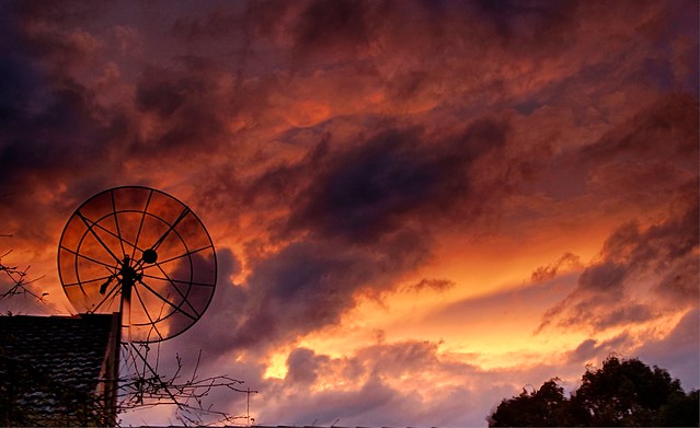
There was a half decent sunset tonight, and a perfect opportunity to test out a 5 bracket exposure and three different approaches to post processing the higher dynamic (and 32 bit colour) image in the new AuroraHDR 2019.

PA090051PA090052PA090050PA090053PA090054

PA090050aurPA090050aur vividPA090050aur warm landscape

Firstly I really confirmed that the default tone mapping is pretty good (almost good enough by itself). However it was then easy with the adjustable Gradient filters to add a little vibrance and warmth to the top of the photo. Giving a result perhaps a bit closer to what I experienced. Then I tried a couple of presets (now called “looks” in Aurora HDR) and settled on Warm Landscape as the best match albeit perhaps a little too colourful. This is powerful stuff and a joy to use.

Friday, April 14, 2017

Extending Dynamic Range

Contrary to want a lot of people believe Digital Cameras, even the best ones, are not capable of capture the full extent of light from the darkest blacks to the purest white. They struggle to get close to the capabilities of traditional film and they are certainly no where near as capable as the human eye. This range of illumination is usually referred to as Dynamic Range. This limited range coupled with an automatic light meter that is trying to get an average exposure (ie matching a mid tone grey overall) is the reason a lot of images turn out boring, washed out and flat looking even though you remember much stronger light (and often colour)._IGP6498 Untouched RAW Image as Rendered by Lightroom

Here are a couple of techniques that can help you get a wider apparent Dynamic Range in your final photo.IMAG0167 - AutoHDR using HTC UPlay CameraThe first is the use a camera app on your phone that will take an “AutoHDR” (this usually means it will take 3 exposure and combine then using software with the app, a few will do pseudo HDR a bit like the next approach.) This is the simplest approach and results can be surprisingly good.

_IGP6497A second approach is to take a RAW image (this is in .PEF format) and use software (I’m using lightroom Develop basic panel only.) I’m following what I once called SDR+ (standard dynamic range plus) and I even wrote a couple of presets to do it. The basic idea is I bring up detail in the shadows (usually moving the shadow slider to the right, sometimes I also change the blacks using the approach often called “finding the black point”, while on the black slide hold down the <alt> and the scree turn black,image the adjust the slider till a few whit areas (these are the areas that will be rendered pure black) show up. You can do a similar operation with the white slider. The objective is to get the illumination histogram to be as evenly spread across the range as possible. This doesn’t take all that long  and I prefer to do it manually to even my own preset, but it requires specialist software, some skills in the oftware and a camera that can take RAW files. Many RAW purist will explain this is why you should always take RAW images.

_IGP6496_HDRThe third approach is classic HDR (High Dynamic Range) and here I am using three bracketed +/-1 EV exposures. Then the Nik HDR Efex Pro 2 software and the balanced preset to create a new 16-bit colour .Tiff file. There are many variation of the HDR technique and software, but it normally involves two steps. First collecting and preserving the full range of illumination values from the three or more exposures. Then a second step of “tone mapping” these into the available dynamic range of your image (and this is also related to how you might reproduce the image, eg print or screen). The downside is these steps and any image prep take extra time and a lot of folk get carried away with the slider options in the “tone mapping” step, thereby producing the sickly vivid and disturbingly surreal images that have given HDR  a bad name. I personally think this method has give me a final photo much closer to the late afternoon light I was photographing in. I have to admit I do take a lot of HDR images, particularly in contrasty light or where I know I need to preserve the Highest Dynamic Range possible.

So if you are disappointed with flat washed out images you might like to investigate at least one of these approaches.

Thursday, May 12, 2016

Fire in the sky

_IGP5455_HDR Fire In the Sky

Tonight’s sunset was spectacular, for a few minutes at least, as the clouds parted and then closed over again. I was keen to get a few more bracketed EV photo sets to test out the three options for making HDR images I currently have on the silver spectre (my new laptop).

image


My old favourite Picturenaut, is not exactly on the laptop (it lives off site on my backup disk drive and/or my Black Darkroom USB key. It is fortunately software that does not have to be installed on a specific computer and can run as a portable app). I purely use it to do the merge and feature alignment, deghosting and colour balanced and the most basic of tone mapping then “finish” the 16 bit HDR tiff-image using OneOne or Lightroom. 


Image result for aftershot pro 2 logoMy new toy, is the HDR merge within Aftershot Pro 2, which tries to take over all the steps, and can lead to those over the top surreal images. However by being a little constrained it can do a realistic albeit snappier results and optionally align features. It can also work directly from the RAW files and can store 16 bit tiff files, to give gorgeous results without a lot of tone mapping required.


Image result for nik hdr efex logoThe really new kid on the block is Nik’s HDR Efex Pro 2, which is currently free to download thanks to google loosing interest in it. I haven’t had much of a chance to play with it but It can be used as an add in from Ligthroom and now OnOne 10.5 (although I can not figure out how to do the merge direct from Onone 10 browse. I can get the merge, alignment, deghosting and defringing done in one set as a special export from lightroom. the raw HDR file actually looks pretty good, ie natural but maybe a little contrasty & dark. It has a number of tone mapping presets to finish the image.


Picturenaut

Aftershot Pro 2 HDR

NIK HDR Efex Pro 2

picturenaut HDR with adptive log tonemapping Basic HDR Merge NIK HDR Efex defalut tonemap
Finished in Lightroom, a little contrast & saturation of purples Finished with OnOne 10.5 Tonal tweak & Dynamic Contrast NIK HDR Efex pro 2 balanced Preset

So which image have I chosen as my Daily Photo?

You need to go the flickr to see.

Saturday, April 09, 2016

My thoughts on collecting Photo Reference for Painting

Whilst there is a school of artists that still insist the only landscapes are those painted plein-air. The vast majority will finish their big painting in the comfort of their studio, a few from just sketches but the majority will use photo reference. I love to sketch and paint outdoors but time and the light seldom let you finish a big work outside. However I know that when you try to slavishly copy all the detail in a photo it can make a painting look very flat. Whereas a sketch hurriedly dashed off is more likely to be dynamic and truly capture the sense of the place. So my take on this is to spend time to do a sketch or small composition painting to capture your impressions of the view, and record the important aspect you see. Start with a sketchDo this on site. I like to use a watercolour wash, then add the the detail with a soft pencil afterwards (I’m not filling in a detailed sketch with colour, I’m putting down the area of colour and main composition elements then adding a bit of detail.) Or alternatively I just sketch monochrome in pencil of graphite stick.

So My First Rule of taking reference photos is

Start with a sketch

  • Put your camera down
  • Do some compositional sketch to capture you what you first see and feel. Just the main elements

Waiting for the Sketch to Dry

Whilst I wait for the watercolour wash to dry enough to sketch without damaging the paper. I find this is a good time to pick up the camera and take those reference picture because you now know what is important in the image. The first photo being the obvious, the same view you are painting. This is where a camera with a zoom lens comes in handy because it is likely that your composition will not match a snapshot from your camera. You will probably have to zoom in or out. In my example I have taken two images side by side and then stitched them together, using Austostitch, because my sketch is a little wider than by camera can handle (alternatively I could walk back behind me before I took the scene, assuming their is room and the full scene if not obscured)Lake Pano

However don’t stop there, take at least an additional 4 views, zoomed in (or walking close) to key aspects of detail that will help you finish or zoom out to get the broad feel of the place (you might like to add some slightly out of view detail or subject into your composition). If there are large areas of colour or texture photograph them, they could be the key to visual appeal in your photo.

 Detail of Comorant on postDetail of walkwayDetail of Tree TexturePatern of Ripples & Duck

So My Second Rule of taking reference photos is

Take Five

  • The composition you intention to paint.
  • Plus 4 details zoomed in or out, or concentrating of a key texture or colour

The biggest limitation of trying to copy a photo religiously happens with tonal issues. Whilst modern digital cameras are great they still have limitations with Dynamic Range and photos typically look flat compared with what you saw as you where sketching. There are two approached here that can help here by they may require a upgraded camera.

_IGP3787_IGP3788_IGP3789

The first approach if to take a bracket set of images (many but not all point and shoot cameras can take a set of three EV settings, older camera usually don’t have this built in but there are several camera apps that add this capability. The bracketed set gives you an underexposed version (to focus on the highlight) a normal exposure and an over exposed version (which will give you a lot more details in the shadows). These three images should give you the ability to play with the tonality to suit your composition. If you want to take the tonal representation further you could investigate processing this bracketed set as a HDR image and refine the tonal mapping to bring out the tones as you remember. HDR is an advance post processing technique that requires specialist software but it will give you a lot of freedom adjusting the tonal range._IGP3787_8_9_HDR with simple tone mapping

The second approach is to take RAW format images (probably as well as jpeg). This require software that can handle RAW images (like Lightroom, Aftershop Pro, OnOne or RAW therapy). The advantage here is the raw format records everything recorded by the camera sensor and it is possible to “pull” extra detail out of the shadows and often bring back the highlights. This requires learning how to use this software and extra time to refine the RAW images. However the ability to refine tonality and colour can be wonderfully inspiring. I started to like having the overhanging tree as part of the composition._IGP3780 Post processed in Lightroom

So My Third Rule of photo reference, if you have the technology to do it, is

Why not Take Ten?

  • Use Bracketing
  • Take and Process RAW images

Monday, October 12, 2015

PhotoEditingTools :: HDR well After the fact

 The unprocessed Bracketedv Set of Photos

IMGP7994_HDR VersionSome time ago I used to take 5 photos in my bracketed sets. I was experimenting with different EV steps and this set remained unprocessed. Further these are all jpeg not RAW. Its not a gripping image but has a little potential as an abstract composition. I came aross the set when I was checking through my photos and thought I should give Aftershot Pro”s HDR merge a try out with 5 images rather than just 3. There was no need to worry it worked perfectly. The only item of note was, it is very important to run the feature based align when you are merging 5 hand held images, but Aftershot did a great job.

Not yet a great photo but a pleasing improvement none the less, much closer to what I feel I would have seen and attracted me to take the photo. These days I normally only take three photos but 1.5 EV apart and in RAW on my Pentax and 3 photos 2 EV apart on my Canon. There is lots of well meaning advice of the right settings for HDR, most of it apparently given with authority but totally prescriptive and usually without explanation. If you have decent software I suggest you experiment for yourself and find those settings that best suit you and your camera, and be gentle with the sliders during tone mapping (aka avoid the lurid colours).

Tuesday, August 04, 2015

The Darkside of AUTO HDR

I have been in the habit of taking bracketed exposure sets for a long time. Not so much that I want to do a formal HDR but really just as a safeguard against getting and exposure wrong. Particularly when I’m not confident the light meter is giving me the right exposure, the exposure I want rather than an average grey. In some case I can use one of the exposures only, or perhaps I can make a composite from two or all three of the images or I can use the various HDR techniques to gain a broader dynamic range.

Troubles can surface if all the decisions are passed onto an automatic process. This can be appealing because you can save time. It also removes your input into the creativity or aesthetic decisions. However more and more systems are offering HDR and it is now so often a one click solution.
Bald Hill windfarm makes itself noticed
This example might make the look like Tony Abbot’s comment about blots on the landscape could have a glimmer of truth. The reality is this image is the google+ autoawesome HDR has over adjusted the sky and produced the telltale halos of inappropriate tone mapping of high contrast areas and dirty skies. There are techniques to fix these halos but the best solution is to avoid them in the first place and don’t rely of automatic processes to get it right.
Postscript: A small upside is it has highlighted that I have a couple of dust particles on my sensor, and time for a clean

Thursday, August 28, 2014

PhotoProject :: How to Photograph Nothing

I just read an interesting article in The Artist Magazine by Paul Talbot-Greaves titled “How to paint nothing” (January 2014), in which he comments,

“Many people have said they probably wouldn’t notice the subject in one of my landscapes and would probably walk straight past the scene, … So just how do you notice a composition of nothing?”

There is a video of Paul painting a watercolour below (it is speed up but takes just over 10minutes, and is well worth watching to see how he uses a simple colour palette and strong tonal shapes, lines of the river, skyline and a few trees to quickly build a wonderful yet conventional landscape composition). Unfortunately a well meaning (and probably very experienced) photo critic would suggest his landscape needs a red canoe with the canoeist in a bright yellow life-vest positioned at the first bottom “thirds point of interest”, but he would be wrong it doesn’t need to be like that (ok it might be if you want to win the camera club photo of the month and he is judging!). It needs the artist eye to see the colour, composition and tone! That’s all.

I am inspired to apply his insights into the photographic process. One in particular is that  “compositional designs are best when strong lighting is involved”, for example using shadows to create exciting negative shapes and add dimension to an image. Paul also is attracted to “the bright, high chroma colours against darker muted tones”

So over the past couple of days I have been quick to pick up my camera whenever I see that strong light variation and strong colours against shadows, and particularly interesting shadow patterns. My photos of nothing setDid not really matter what the subject was after all it is a photo of nothing, I was just looking for the right lighting ambience, boldish colour and shadows.

This set of images (on the right) are simply of the shadows of a potted yucca plant on my partly open patio doors. I was sitting enjoy a coffee in the sun at the time. I had the foresight to include an EV bracketed set of exposure, so I sent that set off to Google+ Autobackup and this time they did return a decent *HDR autoawesome, but the composition, as shoot, was a bit boring. Also it had a few damaged leaves on the yucca and they were an unnecessary distraction. My favourite tool to fix composition in any photo is the crop tool, It is normally a simple logo of two opposing L shapes, occasional with a curved rotation arrow. Google+ photos has some good edit tools on-line and the crop tool (shown below) has a feature to control the ratio (aspect of horizontal & vertical axis) to keep the crop within given standard size combinations. There is a separate icon at the top of the panel on the right to do any rotational (straightening) adjustment.

Google+ photo crop tool

I have not bothered about the rule of thirds of any other compositional rule, I was looking for a pleasing combination of colour and shadow and I like the contrast of the vertical door frames and the angled shadows with their lost and found lines feel. An image like this is a great place to experiment with all sort of crops, so don’t stop at your very first try. The wooden door handle on the white door frame is a little distracting but I have not managed to find any cloning tools in Google+ Photo so I have had to downloaded the edited image and then take it through OnOne’s Perfect Enhance 8. Perfect Enhance has a really magic Perfect Eraser which is content aware and does a both quick and reasonable job of removing the handle. Finally I add a big softy vignette.

Final photo of nothing

So the exercise of photographing nothing can be rewarding, and encouraging both seeing more like a painter might but also forcing some creativity in you post processing (in this case perhaps a little more abstract albeit more thoughtful cropping).

Friday, July 11, 2014

Bracketing, HDR & ToneMapping via RAW

W

hilst much of the web based advice on HDR focussed on using a bracketed set of jpeg file, you can and perhaps should, consider working with the RAW files. With a fair bit of conscious effort. I did avoid using detailed technical terms in my previous discussion of HDR, but in the context of why begin with RAW files is better, I will need to get technical. RAW files start with a larger bit depth (12 or14 bits for each colour) in the colour space than jpeg which only use 8 bits, so you begin potentially with more detail in terms of the intensity reading. Not all HDR can read RAW files but most of the better packages claim to. I have found Picturenaut (which is a community supported effort that came out of Germany to fill the void that HDRShop left when it languished as it became commercial) suits my approach, the raw format i use and other software tools I have (particularly lightroom). It has the advantage of being able to do automatic image alignment, color balancing and ghost removal during import and merge (great features if you don’t always use a tripod). It also does the tone mapping fast.

The first step in any HDR system is to merge the source images and these will get combined into a large and higher dynamic range file (normally this will work on a 16 or 32bit colour space. Like RAW files these are frequently in a propriety format (and large). The software Picturenaut generate HDRcalled radiance HDR, with a format designed by Greg Ward (now often referred to as RGBE) which can store all this information and it is becoming somewhat of a standards. Some issues that can affect this merge are poor registration of the images (ie not taken on a tripod) and this is can cause ghost and shadows or just “soft” images. Better programs like picturenaut and photomatrix can do some alignment by feature match, or subjects that move between exposure (ghosting again) or strongly overexposed and/or underexposed source images in the bracketed set. Most packages then display this composited file and it will probably look flat and perhaps a little dark. Don’t worry the best bit is about to take place.

Example using the Reinhard tone map in picturenautThe tone mapping step is where you map all the detail of intensities back into an image that can be reproduced within the dynamic range limits of the intended display or print that hopefully will match what you saw when you took the photos. This is a large and intricate topic and many approaches have been applied. For gene4ral use I like the approach described by Eric Reinhard, which draw heavily of traditional darkroom techniques such as those of Ansel Adams. It is  a logarithmic dynamic range compressor but with a more linear portion of the dark and light ends. There are many variant with names such as Photoreceptor or just Reinhard. Better Tone mapping software lets you adjust the various key settings, and at the same time shows the intensity and/or a preview, letting you refine the tone mapping.

hdr picurenaut tonemap

The three panels below  show three other common tone mapping approaches. The Adaptive Logarithmic, also know as Drago, after its developer, is also popular and suits situations where you want to preserve the colour in highlights (such as a sunset), The Bilateral  is an example of an unfortunate choice in tone mapping that falsify the colours in this particular image.

Example using the Drago tone map in picturenaut Example using the Exposure tone map in picturenaut Example using the Bilateral tone map in picturenaut

Adaptive Logarithmic

Exposure

Bilateral

hdr ltr histoTo finish my photos for display of the web I have imported the files into lightroom, fixed any excessive clipping in the blacks, then exported the images, at a lower pixel count (made then smaller) sharpened for the screen and set them to sRBG but with no other post processing.


This good blog post by Klaus Herrmann which to put in his words creating HDR images the right way, does deal with creating 16 and 32-bit Colour in HDR images. His HDR cookbook is worth a read as well.
(I have found that whilst picturenaut can create both 16 and 32 bit TIFF images, I have been a little disappointed with the 32bit versions which often can’t be read by lightroom or “flatten out” when edited. The images show here is based on 16bit HDR)