Showing posts with label photographer. Show all posts

Monday, October 03, 2022

Are we having fun yet?

It hasn't taken long for my AIart works to fall foul of the censors. Ok not the real censors, the perceived NFW (not for work, standards of the USA based morals on the internet) Whilst I can only see blur in one of the images generated, I expect that it was being interpreted as NUDITY. Which isn't surprising for anything Salvador Dali inspired

I also believe the warning is probably coming from Stable Diffusion itself. That might be a very good thing, indicating they are concerned with the ethics (aka complying with social norms) of the types of images they are being asked to generate. I do know that certain words are not allowed in the text submitted. Again, a bit restrictive but overall, a good thing.

Back to what I was playing with, just having fun. Which I learnt from a Catherine Price in a recent Ted Talk, involves Play, Connection & the Flow State. I like self-referential (meta) subject so I have submitted the phrase "Are we having fun yet?" Firstly the phrase just by itself and the results were totally underwhelming. Perhaps AI doesn't know what fun is yet?

Then by 3 well known artists  / cartoonists / photographers each as modifiers. The results are more encouraging. I've picked the most appropriate in each group of four thumbnails.

Moral: Be careful what you ask for!


Wednesday, April 20, 2016

Almost Black & White…

The differences between the approach of most photographers and artists can almost be summarised as a difference between black and white.

your cup is always being filledToday I listened to a great podcast,  TWIP Family ep 49.5: Trey Ratcliff On Becoming an Artist. If you haven’t already listened the discussion between Jenny Stein & Trey is really natural, full of inspiration and worth listening too. One of the topics is about analogy that your cup is always being filled (with creativity and inspiration) we just need to be able to get to appreciate the good stuff inside the cup. That analogy of a glass half full or half empty is perfect for this post.

I need to begin at looking how tonality is represented in each medium. An easy way to understand tonality is just to desaturate an image to remove all colour. I’m using the basic tonal range names from lightroom. Black, Shadow, Mid Tone, Highlights, White.

 Desaturated Photo

When taking the photo I have to make sure that the highlights don’t get blown out. I begin at the whites. It is easier to find at least some detail in the blacks and shadows, but post processing the image, whereas once the whites are blown out that’s it, nothing can be recovered (even from a RAW file). If I can make sure that the other tonal zones are well represented I will probably have a well exposed image.

My tonal sketch

When starting to sketch the same subject I’m using a well known artist trick of drawing a series of 5 boxes (some artist use 4 boxes, other prefer 7 grey tones) and use the pencil to stipple a set of graded grey tones. and I have matched them to the lightroom names. I’m sketching directly from the simple still life by observation not copying a photo by the way. The key difference is I begin with the darker tones. I personally start by blocking in the mid tones and  then move to the darkest tones (lightroom’s shadows & blacks) and then finally back towards the highlights, leaving parts of the paper to be the whites. My darker tone marks thus define what is consider highlights and whites. They hold the composition of my image together.

#111_MG_3850-sketching II

While photographers generally exposure for the highlights, artist will generally study the shadows and sketch these shadows to define the composition.

Saturday, February 28, 2015

Rethinking the Sketch Approach for a Photographer

I haven’t actually used my camera this week (a very unusual situation) but I have been thinking about the different way an artist might approach an image via a sketch and a photographer that just needs to press the shutter. They are quiet different approaches yet they are both about being able to “see” the final work.

Original Photo in Paint.NETThis is a photo of my small sketchbook and sketching gear. I have drawn a quick watercolour sketch of my own eye. It is in fact the small A7 sketchbook that I carry in my camera bag, taken last weekend as I was waiting for the sketch to dry. It is a nice example to explain the difference in an artist’s approach to seeing via line, tone and colour. It is also a nice bit of artistic self reference as I have long used such an image as my blogger and more recently google+ profile photo. I am also going to use Paint.NET, which is still free to download, (donations are appreciated) and a wonderfully simple yet powerful and intuitive photo editor for this demonstration. See also my post on the anatomy of Paint.NET Workspace

1. Line

Paint.NET  Menu Item Adjustments/CurvesIt is very common for an artist to begin with lines. Our eye love lines and edges, they quickly follow these subconsciously. Eye tracking is a relatively new high tech applied science with lots of applications, and it demonstrates that our eyes tend to follow lines almost involuntarily. Artist have traditionally realised this intuitively and they selectively lay down the lines they need to build their image, so as to capture the viewers gaze. Often these lines are edges, something that is the boundary between light and dark or just a thin change of contrast. Whilst an artist will probably use a pen or pencil a photographer can easily find the strongest lines by converting their image to just black or white. Some software give this as a separate tools with a threshold Paint.NET  Curves dialgue screenslider that changes the point an image changes from black to white. Another common way to achieve this is using the “curves” (tone curves). These are a very mathematical looking tool but they just allow you to remaps given luminosity (light intensity or tone) and often colours with considerable precision. In this example, using Paint.NET the horizon axis represents the input intensity and the vertical axis represent how this intensity is to be output. The upper right is the lightest tones (the whites) and the lower left is the darks (the blacks) So if I grabbed just the luminosity curve and move that point up to the top of the graph suddenly and tones this shade and lighter become white. If I then grab a nearby point just to the left and take it down to the base of the graph, suddenly all these tones and darker become black. If I moved these points horizontally the threshold of the black to white change moves through the tones. I’ve chosen a threshold that avoids focussing on the eye sketch itself. What is created is a black and white silhouette that highlights all those strong lines that out eyes like to follow. This is very useful in understanding our eye flow and establishing points of interest. An artist “trick” is look at their sketch upside down (in this case I’ve simply done a flip vertically) as this tends to let them see the shapes in a more abstract way rather and interpret the objects they represent.

Upside down black/white image showing the likely visual flowThe pink lines show the likely flow of the eye. Those that bringing the eye into a center of interest, such as my eye sketch in this case, will be keys to help the artist build his composition.  A photographer should also study these lines and help in the composition because they might need to be enhanced during post processing. Unfortunately strong lines at the boundary (the red dotted arrows) will tend to draw the eye out to the edge and possible away from the image. An artist would probably not even drawn these, however it will be important for a photographer to see these and perhaps dampen them in the post processing, by using a vignette or central focus that blurs the edges, or even a gradation mask and Gaussian blur.

It is probably unnecessary to keep this liner version of your image, so just Undo these “enhancement” with a couple of  <Ctrl> <Z> or clicks on the big blue back arrow icon on the menu bar.

2. Tone

Paint.NET Menu Item Adjustment/Hues/SaturationMost artist know that half squinting their eyes tends to desaturate the image and allows them to better judge the tone of the subject. Tone is “king” in realistic painting/sketching and it is important to understand how that tone maps onto lines and shade on the page. Where are the darkest darks and lightest lights? There are lots of ways to convert a colour image to black and white, edit tools, presets, filters and plugins. Paint.NET  Hue/Saturation SliderHowever for the tonal sketch aspect the simplest and best way is just to remove the saturation by moving that slider to the right. in this example I have moved the slider all the way to the right.

Half closing the eyes has a slight disadvantage in that it also lowers the light entering your eyes and thus darkens the image a little. There is no need to replicate this.

Greyscale image looking and tone (& composition)

This black and white (actually its a greyscale) image should really help you understand the distribution of tone. Where the darkest tones are, where the lightest tones are and how these tonal areas connect. Often it is the areas of greatest contrast that interest our eyes and make for natural centers of interest. I find this greyscale images is also very helpful in guiding composition, ie the best way to crop the image. Notice I’m not trying to follow the rule of thirds I’m just trying to balance line, form & tone.

Once again it is time to hit <Ctrl><Z> and undo any changes and get back to the original image.

3. Colour

Paint.NET  Menu Item Effects/Blur/Gausian BlurAnother trick some artist know about is “defocusing” your gaze. This is a bit of a challenge if you haven’t done it before. The idea is to deliberately make yourself cross eyed and your eyes will no longer be well focused. What you hopefully see is really the dominant areas of colour. To train yourself to do it hold up your finger, or better still your pencil, focus on just its tip and bring it closer to your nose. With a little practise you should be able to remove the pencil and take in the whole defocussed view. Of course this is much easy to do with your Paint.NET  Gausian Blur Slidercamera (for example on a DLSR you just grab the focus ring and crank the lens out of focus while looking through the viewfinder). You will be surprised how much of the detail is gone from the image but you will still be able to make out the dominant colours.

Defocussed image lookimng at colour

The green to blue (harmony), then to blue against strong ochre (yellow) contrast works well, but the red of the rubber band distracts from this. A photographer might reach in and remove the rubber band (if the defocussing was done in the camera before the photo was taken). Alternatively this could be masked and selectively desaturated in post processing.

Time for <Ctrl> <Z> again, to Undo. You may or may not have saved these versions but you should have seen a few extra things in your photo that will probably help you enhance the photo during post processing, much like an artist referring back to his sketch book.

Enhanced photo with adjustment from "sketching" review

Friday, August 29, 2014

The truth is out there

I not sure how many times I have heard good photography (including my own) dismissed as faked in Photoshop. Further I’m also not really a fan of a lot of the on-click Artistic apps around. However there is definitely a place for intelligent post processing, in the whole process of art  –> graphic art–> photography. By example is you shoot RAW it is almost certain that you must undertake some post processing to get an acceptable image. It is just unfortunate that fakery seems to dominate people perceptions and photoshoped has become such a disparaging adjective for a photo.

The cartoon is a golden oldie by Aaron Johnson, and his work a quite photocentric you can see more of the duck here.

Source : As seen on PetaPixel, via Mosaic Lightroom Newsletter

Friday, December 13, 2013

Manifesto–for the love of the photograph

This was spotted on a post from +GPhotos and is a remarkably well grounded and passionate plea to just love the photograph, not the number of pixel, brand on the camera or size and sharpness of the print, from David duChemin of  Craft & Vision, click here to watch him deliver his manifesto on video.

Then pick up your camera, any camera and go and make a great photograph.

Wednesday, December 11, 2013

Gift Ideas for Your Keen Photographer

S

tocking fillers for a photographer can be a challenge, because most of their precious gear costs a lot! I have made this list for a couple of years now, so its going to be hard not to double up

.
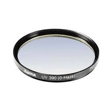
Whilst some photographers don’t like having extra glass in front of their lens I can strongly recommend having a Daylight (UV) filter in front of your expensive lenses. The reason is simple, it is an inexpensive sacrificial form of protection. I have scratched and chipped a few now but my lens glass is still fine. It also means you don’t have to take off and replace your lens caps all the time, when out taking photos and changing lenses. These lens filter don’t have to be the expensive types, I’ve mainly had Hoya brand. They do come in different sizes so you will need to check the size of the lens you wish to protect. Buy one for each lens, rather than share one around.

The straps that come with cameras (to hang them around your neck) and pretty much despised by any serious photographer. They usually hurt your neck and look so touristy! There are moderately expensive Sling-style Straps (eg Joby or Black Rapid) which are very trendy at the moment, These let you hang the camera at your hip but allow quick lift and aim (a bit like a gun slinger). I noticed this nifty little gadget called a camera strap buddy that lets you connect your shoulder strap to the tripod connector. This can also be use to make a very handle portable monopod by tying some string about your height to the connector and then put your foot on the string and pull the camera up tight, you be surprise how much it steadies your grip on the camera

Following on from the simple strap connector, which will probably only appeal to a few of the home-brew geeky types, not that there is anything wrong with that, are the quick release plates which also screw into your camera base but have the profile to snap into many tripods quick release mechanisms. Not all tripods are the same, so check out what they have, but the joby ultraplate fits is a good example of a plate that is compatible with many tripod, monopod, strap and a scree mounted accessories

I know these three sound boring but they are likely to be appreciated gifts

A trendy new area of smartphone apps are remote controls for DSLR Cameras via your phone. This frequently involves a special cable but some systems work on WiFi, and a few even with Infra Red. The features on offer also vary and so does the price. They are all quiet manufacturer and  model specific, so you will have to do some research. So this is one gift I suggest you first seek some advice at your local camera shop rather than buying off the net Canon and Fuji Cameras seems to have the most options and may just require the downloading of a phone app.

Other Christmas gift suggestion list for photographers on the web this year have a lot of camera inspired “blig”. Like keyring torch cameras, cuff links, necklaces, t-shits, cookie cutters (yes for biscuits), faux lens look a like cups and even Christmas decorations. The prices of the ones recommended on the net frighten me a lot, and don’t forget about shipping! The red “to expensive” light is flashing. However if you can find such photo-curios in the $2 shop or amongst the bubble wrapped accessories at the camera shop they certainly will be fun stocking filler.


Nothing is as encouraging as seeing one of your own photos in print or hanging on the wall so a gift Vouchers for Enlargements or a basic Photo Book is something that could bring joy to your aspiring photographer.

I’m going to suggest hanging off recommending software this year because so much in terms of processing power and storage is available free on the net on social web sites, and in free phone apps. In theory a software subscription could make a good gift (like a magazine subscription) BUT I’m less than enthusiastic about adobes creative cloud and feel it needs to prove itself, so maybe next year.

Tablets, IPads, Windows Surface or the Android style, are the most popular gifts this year, but their cost is way above the stocking filler line. They are becoming really popular with photographer as a place to review photos and do a few edits quick edits. If your photographer already has a IPad or other tablet, a stylus could give them some extra ease and precise when doing some touch up work and other intense graphic applications. There are a number of apps like Pixlr for editing photos on tablets, or phones, that will give your photographer most of the edit functions they need and these apps vary from free to reasonably priced. A new group of interesting interesting photogrpahics apps are for the cross device sharing and management, like mosaic and photofeed, they mainly have a subscription style pricing.

Oldies but Goodies

Last year I suggested SD cards and they are still a great gift, The memory card size doesn’t need to be all that big probably what is more appreciated is speed. Lens caps are another good gift, I always keep loosing mine, I must admit they are a hassle and easily mislaid, If you can find a brightly colour one that could help your photographer keep track of his or hers (Make sure you get the right size for their lens)


With special thanks of Jessica Hische of Daily Drop Cap for the wonderful start to this post

Thursday, March 21, 2013

Photographers are busy little bees

IMG_0465-3Photographers are in general very “busy bees”, wandering around, eyes pressed on the viewfinder or looking at the LCD screen. Then moving a few steps and performing the steps over again, a few steps back, click click, a few steps to the right, click click… Sometimes when there are a few cameras and photographers around there might be an unspoken contest “Mine is bigger than yours” Such is the happy life of a photographer.

Saturday, March 09, 2013

Photographing the dawn


Photogrsphing the dawn, originally uploaded by imageo.
As the first rays appear the beach was already full of joggers and dog wakers, and photographers!