Showing posts with label compare. Show all posts

Monday, August 31, 2020

Comparing RAW rendering of a camellia

 I decided while a had a couple of other big name photo editors under extended trial I should attempt a few comparisons. Then I came up against the very limited formatting capabilities on the new blogger. ...gramble, moan yet again!


So it looks like I can only present the images one on a line, at a time. Oh well so be it.

So what I am attempting to show here is how each package take the RAW image (in this case an .ORF from my little Olympus and renders the RAW image ready to edit. At the superficial level they are all very similar.


Yet they are all just subtle difference. Perhaps not different enough that once edited they are edited anyone could end up with the same result.


In a line up I would probably pick the Jpeg straight from the camera. Still my little Olympus is like that and it doesn't surprise me. So how do I justify having expensive software and spending lots of time to try and do better. Or even spending more money on more software. You'll need to watch this space as I work through that question.


Tuesday, September 25, 2018

Looking at Photographing Art Works (again)

I have known for a while that my conventional flatbed printer/scanner doesn’t do a particularly good job of photographing coloured art works. (BTW Its fine for ink line drawings such as cartoons)

Last night I went to a great talk by Wayne Degenhardt at the Watercolour Society of Victoria, about Photographing Art. This inspired me to take some photos of my multimedia sketch I created at the Discover Nature through Drawing workshop last week, because I was a little disappointed with the scan, it was flat and very pale.

drawing on nature - As scanneddrawing on nature - As photographed on my phone

drawing on nature - As photographed on my HP tabletdrawing on nature - As photographed on my olympus camera

The results shocked me!

I haven’t gone to a lot of trouble to make this a scientific comparison, the cropping and rotation are inconsistent for a start. Further, the results are all jpegs, straight out of camera with only cropping but importantly all taken under the same lighting conditions. Upper left is the conventional scan (on a HP 8110 Photosmart printer) The apper left is my Android HTC 11 Cameraphone. The lower left is camera on my HP Spectre Tablet. The lower right is the jpeg from my Olympus OMD EM10iii.

So which is best?  Well, none really! If I had to choose one it would be the cameraphone but i’d have to lighten and correct the colour f the background. I can see further investigation is required here.

Saturday, September 22, 2018

AI enhanced .vs. classic HDR

I’ve already commented that I am finding the jpeg straight out of my new Olympus camera fine for those quick uploads (eg instagram or email) where time is important. I also have Auroa HDR 2018 & now Photolemur 3.1 on my handy little HP spectre and both of these came give really great images from processing RAW files (.orf files) straight up with little intervention. So here I will to compare the three approaches.

Original

Photo

ISO 200 f11 1/320sec 42mm

3 Bracket

Photo HDR


PhotoLemur

AI Adjusted

P9220019 P9220019hdr P9220019
There are differences, however they are subtle. I do see the two images derived from the RAW files to show better detail and crisper colour rendering. It probably then gets down to personal preferences which you like best. The classic HDR required three bracketed images (here at 1 EV steps) and then some time to merge, align the photos, tone map the HDR version, and a couple of personal manual tweaks (in this case polarization to get a bluer sky and lifting the exposure a little at the bottom of the image) perhaps 2 minutes of editing, compared with the 10-15 seconds that PhotoLemur takes to do its magic (automatically). Both are fast enough to appear pretty instant but I probably still prefer to spend the extra time on the classic HDR approach (which includes taking the three bracketed photos)

Monday, August 20, 2018

Out of camera .jpeg versus RAW …continues

OLYMPUS DIGITAL CAMERA out of camera jpeg    Continuing a comparison of the jpeg photos straight out of my camera with RAW images, from my new Olympus E M10 iii. I’ve chosen a photo of a passing pelican that came up to say hi! (ok he was probably looking for food) but he seemed happy enough and continued down the canal oblivious to my camera. I must admit I like getting candid bird photos this way.

The two images below are default rendering by ON1 Photo 10 and just default tone mapping from Aurora HDR of the single .orf file. Once again I was using the 2x digital tele-converter, so the jpeg is enlarged whereas the .orf RAW file isn’t. I must admit I prefer the Aurora rendering, interestingly it is also much closer to the out of camera jpeg.

On1 Photo rendering of the .orf RAW file Aurora HDR rendering of the .orf RAW file

However I then did my own cropping, tonal & colour tweaks in ON1 photo develop.

On1 Photo used for cropping, tonal & colour tweaks

Confirming that the jpegs out my little Olympus EM 10 iii are really decent but if you have the time and motivation you will be able to bring out a little more from the RAW file. RAW+jpeg is still my preferred setting

Saturday, August 11, 2018

Comparing .jpeg & RAW ..with a surprise

I’ve deliberately left this just a simple comparison, so you can decide yourself.

RAW taken into Auroa HDR & Tone Mapping with Realistic Balanced Preset  Default jpeg out of camera (no post processing)RAW taken into ON1 and default render of .orf

Which photo do you like best?

Move you mouse over each image to find out more about it

Thursday, August 09, 2018

Are the jpegs good enough to Abandon using RAW?

I am conscious that the jpeg version of any photo from my new Olympus E M10iii is pretty damn good straight from the camera. Potentially alleviating the extra effort to post process a RAW (.orf) image file. So let’s do some comparisons. The original photo is on the left. The default render of the Olympus is shown on the right, I'm guessing it is not a surprise that they seem very close (if not identical).

Original Jpeg Default rendering of .orf file from Olympus Viewer 

Compare these with the default RAW Rendering by On1 Photo 10 & Aurora HDR images below.

New Caledonia, Noumea P8070342

Once again this does convince me that the jpeg file straight out of my Olympus are very good and probably perfectly adequate for typical social media uploaded (eg like this blogs or Instagram). The rendering from different Raw processors find a little more colour and tonal range, however this stars getting into personal preferences (and the time to tweak).

Sunday, October 16, 2016

What I am looking for from HDR

Its a very overcast day after yesterday’s strong wind but with that calm before a storm feel. Not an exciting time to take a few photographs (yet). What I did notice was a new yellow rose had a few buds about to flower but had been very dried by the winds so I gave them a light spray of water and took a couple of bracketed photos of the new buds.
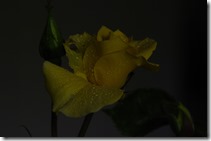
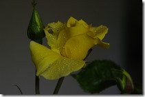
_IGP5315 EV=-1_IGP5316 EV=0_IGP5317 EV=+1
The close up simple composition gives me a great opportunity to compare three of the HDR programs I have used recently, and specifically to discuss what I like to use the HDR Technique to do. I have written a fair bit about HDR. However few people realize how often I use it. I think that is because I am just trying to create an image as I remember the scene, rather that what the camera recorded. The images above are all a bit dark, but that usually doesn't matter within the HDR process. If I was to process just one image I would choose the one on the right and lighten it a little and increase the contrast. Since I have a RAW file that would be simple.


However here are alternative ways to process these photos

Picturenaut

Importing 3 Photos to ProcessThis was my go to program for a long while because it was easy to use, free and could process RAW files (which I reasoned gave the HDR process more dynamic range to work with). Importantly for someone that usually hand holds while taking the bracketed set, it has a decent alignment correction. The ghosting (removing ghost from people or things that moved between exposures) work for small movement but my experience was it could misbehave so I only used it when I saw obvious ghosting without it. I also found that it would often need the EV setting of the images updates (ie they would often just all read EV=0). In the table beside each file used.

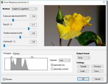
Main Screen Once HDR File is created  Tone mapping screen
The HDR image (which can be saved) is very dark like my original photos but when I select Tone Mapping I generally select adaptive logarithmic method and accept the default settings and save it was a .tiff file. Preferring to then finish the result in either Lightroom or OnOne.


AfterShot HDR

Selecting files to mergeWhen the HDR was added to aftershot in version 2 I became an immediate convert. It is also handles alignment (mostly ok). It also handled RAW files (unfortunately version 3 of aftershot Pro does not pass raw files nicely into the HDR merge program, so I must maintain a Version 2 copy just to do HDR) and it is vary easy to set up you just select the files you wish to use and then right click and select to Edit With AfterShot HDR\Exposure Merge

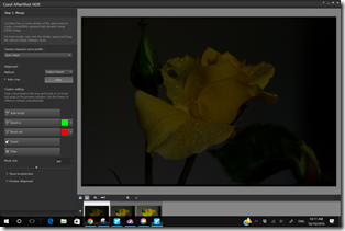
Selecting files to merge Alignment Screen
The ghosting has to be fixed by masking away the ghosts you don’t want (on specific images) which can be a little tedious but can be much better controlled than the automatic methods. Again the aligned image looks very dark. However when you process the three images into one the image generally looks much better exposed (its not magic the dynamic range is being stretched to fit the image)

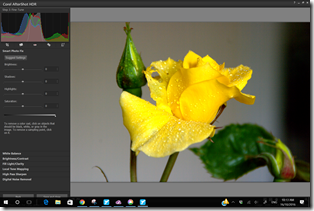
HDR File Created Screen & options Final Screen giving additional edit options

I have the presets turned off and generally only make some minor tonal adjustments. My preference is to add a little contrast and deepen the midtones and/or shadows. In AfterShot there is an extra step where there are as a number of basic edits to finish the image but again I prefer to save the resulting photo as a .tiff file and then do my finish in Lightroom or OnOne.

Nik Efex HDR Pro

Exporting files to Efex HDRWhilst I’ve had Nik software since google offered it for free download. I was a little slow to try out the HDR merge features. I have been working through the various screen via the rather big collection of presets. To my taste a lot of these are just hideous, those strong halos around constraty edges and super crunchy detail and lurid colours are off putting. Still I like enhanced colours and a little extra contrast so I can see a few presets that are getting me close to the nature feel I am looking for. These include default, balanced, Soft Colour and soft Landscape presets. Nik Efex HDR needs to be run from Lightroom and it has to be started a little differently to other plug-ins. Instead of the normal Edit In option, you have to export the photos to Efxex HDR  Pro via a specific option in the export menu (shown on the right). Lightroom does take a little time to prepare these exports.

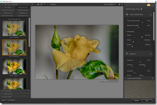
HDR Merge Screen HDR file view and preset options

I am still experimenting with how to do minimal tonal adjustments, but already have discovered that I need to slow down the drama (mostly) and often experiment with structure which is a bit like lightroom clarity and OnOne’s dynamic contrast. Again I prefer to save the .tIff image at this stage and do the tonal finish in lightroom. Perhaps with a little more practices I’ll gain more confidence. For the moment Nik’s Efex HDR pro remains an interesting diversion rather than a go to tool.

In the end I choose the Aftershot Pro .tiff image as having the closest to my feelings looking at the water droplets on the new buds. I finished this in OnOne 10 using the perfect eraser to get rid of the hole in the petal and a small curl of another bud below left, crop in a bit and add my favourite big softy vignette to bring the rose forward from the background a little more. #290 The refreshed new buds

All of these steps take considerably longer than just processing a single image but I tend to think the extra time spent is worthwhile and creates a stronger and more real image.

Friday, May 02, 2014

Viva La Difference

IMGP9892 Shot with Pentax K20D   IMG_7704 Shot was a Canon EOS 1100D.

A lot of folk ask me why I shot with two different cameras. The simple reason is I mainly use the Canon if I am likely to also take a movie, or it is to document my consulting work but the Pentax remains my “goto” camera. So I’ve started to take a few comparisons with each in different situations. What I can see (and have known for a while) is the Canon colour is always warmer, which actually Taken on my Android Phonedoes a good job with making portraits more complimentary, but it might not be a as true to the subject as the Pentax capture. The other observation is the canon tends to show more contrast. So the JPEG straight out of the camera can have more immediate appeal.

Enough to change my mind of which is my “goto” camera NOT YET!

Sunday, January 12, 2014

An opportunity to compare

I was refilling my little watercolour sketching palette with fresh paint and the beautiful light suggested a perfect opportunity to compare a the software I normally use to post process my photos. This is an example of an image with strong highlights (the white palette) and strong shadows without a lot of intervening tonal gradation. It is the sort of images a lot of cameras will have trouble capturing. Luckily my original photo is reasonably exposed.
Original jpeg from Camera (unprocessed) Jpeg image auto enhamced in Google+ Photo
picasa histogram, I can’t as yet find a histogram presentation in Google+ Photo
RAW Image processed in Lightroom RAW Image processed in AfterShot Pro
lightroom histogram aftershot pro
So there isn’t a massive difference between the results. The main difference is in the “blow out” (or clipping in adobe parlance) at the white and black ends of the spectrum. All the images are reasonable but it is in the midtones and particularly in the yellow hues that there is most difference. My preference is the Lightroom image, but maybe that’s because I was specifically trying to avoid the clipping and improve the clarity.