Showing posts with label calibration. Show all posts

Thursday, July 02, 2026

Introducing a DIY Calibration Chart

Why You Should Calibrate Your Screens (And How This Little Chart Helps)

Ever wondered why a photo looks perfect on your phone but flat and washed out on your TV or a print? It is not you. It is your screens. Even the best cameras, monitors and printers cannot capture or display the full range of light and colour that your eyes can see. That is where a simple calibration card comes in, and once you understand how to keep your equipment acceptably accurate.

Photographers talk about dynamic range, the span of light a device can capture, measured in stops. Each stop doubles the amount of light involved. Your eyes can handle around 15 stops. A good modern camera manages 9 to 11. Most TVs and monitors only reach 7 to 9, and even quality printers top out around 6.5.

That gap matters. When a device cannot handle the full range, it clips the extremes. Dark tones near black collapse into pure black. Bright highlights blow out into pure white. Detail and colour simply disappear at both ends.

Colour is its own puzzle, it doesn’t really exist as something physical, and there are two divergent interpretations of what creates it. How a device captures and reproduces colour is pure physics and maths of energy and light. How your brain perceives colour is much more personal, shaped by cognitive psychology and the lighting around you. Neither view is more "correct" than the other. The calibration chart will not give you laboratory precision, but it will nudge your average colour rendering and tonal contrast in the right direction.


Step One: Calibrate the Input (Your Camera or Phone)

Tonal calibration, getting the brightness and darkness levels right, is the single most useful adjustment you can make for realistic photos.

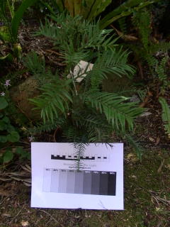
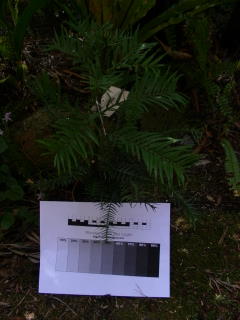
Look at the calibration chart and you will see a grey scale gradient running from black to white, with small grey rectangles down each side. On the right, the rectangles start light grey and get progressively lighter toward an almost white target. On the left, they start darker and step down toward a very dark target. Each little step represents a 2 percent shift in light intensity.

Here is the trick: point your camera or phone at the chart and check how many of those rectangles you can actually distinguish. You will probably lose a few, especially near the very dark or very light end. That is completely normal. Digital sensors simply cannot match your eyes' range, and cameras are designed to expose for an average middle grey tone anyway, so they will usually “clip” the extreme tones.

Start with your camera on an automatic exposure mode (A, P, or the green auto setting on a DSLR or mirrorless camera, or the default mode on your phone). Manual exposure is not necessary here.

Check the result somewhere you can actually see the screen properly. Camera and phone screens are notoriously hard to read in bright daylight, so review indoors or in shade.

If you can only spot a few rectangles on the dark side, the chart probably needs more light. If you cannot add light, try adjusting the exposure value (EV) on your camera or phone instead.

Advanced camera calibration (colour accuracy, white balance, lens distortion, sharpness) varies wildly between brands and models, so this card will not replace a proper colour profiling system. What it can do is flag obvious problems, like a consistent colour cast, or tonal issues worth investigating further.

Step Two: Calibrate the Output (Your Screens)

Now views a photo of the ca on your monitor, TV, phone or projector. This is where brightness and contrast come in, usually tucked inside a picture or display settings menu, accessed through a settings button or remote.

Start with brightness. Push it up and the screen gets lighter, revealing more rectangles on the dark side. Pull it down and you will see more detail in the light rectangles instead. The goal is a balance where you can see a good number of steps on both sides.

Next comes contrast. This stretches or compresses the range of visible tones. Getting it right is a bit of a balancing act between contrast and brightness. If you can see plenty of rectangles on one side but hardly any on the other, nudge the contrast up slightly, then pull brightness back to rebalance.

A quiet warning here: if you regularly use your screen in a bright room with strong light behind you, chances are your contrast is already cranked to maximum, which clips both ends of the tonal range. If that sounds like you, reset contrast to the middle, adjust brightness first, then slowly bring contrast back up while rebalancing.

Screen technology has changed a lot over the decades, from old cathode ray tubes to today's LED and LCD panels, and every manufacturer implements these settings a little differently. Materials also degrade over time, which is worth remembering if your screen seems duller than it used to be. When in doubt, the factory reset option is usually a safe, well calibrated starting point.

Step Three: Get Your Colours Right

Once tone is sorted, it is time for colour. Look for settings labelled colour, tint, colour temperature, hue, saturation or intensity, though the exact wording  and what bit changes depends on your device.

Saturation is often cranked up by default to compensate for ambient light, so check the row of coloured dots on the card. They should look natural sitting against the mid grey background, not artificially intense.

Many screens also offer picture modes such as vivid, natural, cinema, standard or eco. These bundle together saturation, brightness and contrast settings, so cycling through them is often the fastest way to find something that suits your eyes, though be aware they can override the careful brightness and contrast work you just did.

The chart itself has a colour temperature section running from warm reds, oranges and yellows through to cool blues and violets, sitting on a clean white background. If that background does not look properly white, you likely have a colour cast issue.

Small reference squares next to this section are arranged in 5 percent increments of colour strength. The top row handles colour temperature, from yellow through to blue purple. The bottom row handles “tint”, from magenta through to green. The middle row, goes from a red to a cyan .

To use them, simply check which square looks whitest against the background. If the background leans slightly green, for instance, a square on the magenta side will probably look closer to true white. That tells you which direction to nudge your tint control.

One last thing worth remembering: your room's ambient lighting will influence how you judge all of this. Do not calibrate for magenta while sitting in a room bathed in green light. Match your adjustments to the conditions you will normally be viewing in, and you will end up with a screen that shows your photos the way they are meant to be seen.


You should now have better screens to judge your images, that may be photographing your art, a portrait or to judge your results as you edit or modify your photographs with filters and app.


Saturday, November 10, 2018

Colour Calibration :: Before You Panic II :: Tonal & White Balance

Back in the HSL Luminosity Tint & Shade post, I suggested that luminosity has a big impact on how we judge colour. I also showed how getting a tonal balance in black and white tonal range first, then switching the colour back on can enhance the feeling of colour. There is another important tool to help your colour judgement in a photo and that is White Balance.

The Idea behind white balance is an adjustment to match the colour temperature of your light source, and this is achieve by either warming (usually adding magenta) or cooling (usually adding green) the overall colour rendition. Human vision automatically undertake these changes so we seldom notice the effect of different light sources. However cameras will record these colour cast and that often leads to an unnatural looking image. In the early days of colour film, specific film stocks where developed for different light sources (specifically incandescent and tungsten lights). You needed to use different film under different lights. Digital Photography has enable these adjust to be undereaten in the camera when it prepares the jpeg render of the image. Most DSLR & mirrorless cameras can be White Balance calibrated for given scenes and lighting conditions. RAW formats which record more details of the image and only carry out the white balance (so AWB or Auto White Balance is ok) to render the jpeg thumbnail embedded in the RAW format in camera. However the photographer is able to carry out white balance after the photo is de-mosaiced and re-rendered in postprocessing steps. White Balancing can also be used to remove colour cast created by strong reflections of highly coloured surface.

Example of White Balance eye dropper in LightroomIt is my experience all the software I have used, with a white balance feature, can do a reasonable job removing colour casts providing you pick a neutral grey tone (or White or 18% grey card) in your photo.  As discussed on the video above those packages that let you then copy the white balance adjustment across a number of photos, then let you take a reference image perhaps with a “white balance” card infront or held by your subject. make an adjustment and then copy that across the rest of that set of exposures.

There seems to be quiet a school of thought that you can not perform White Balance on a Jpeg files (including the video above) after it is captured, but my experience is if you have a reference shot of a suitable card (with a white or neutral grey patch) you can improve the reliable rendition of colour. The example below is a jpeg file straight from my Olympus OMD EM10iii camera, which I post processed in Picasa 3 (ie an old bit of software).

.Example of using White Balance eye dropper in Picasa

In the example above I have already adjusted the tone to get the the white on my test strip lighter then I used the white balance eyedropper and pointed to one of the two very light grey patches on my test card and clicked. That’s all that’s required. Note I haven’t had to use an expensive bit of specialist gear or customised colour profile.

PB100015PB100015-002

It is my observation that it requires both Tonal and White Balance together to “clean up” colour in a photo.

Friday, November 09, 2018

Colour Calibration :: Before You Panic I

On the internet Blogs, Podcasts and You Tube are full of advice that you have run to buy and expensive bit of gear and calibrate your monitor immediately. Well you don’t but its a bit complex after that.

If you want to go the full colour calibration route you actually need to start at the camera,  cameraphone or scanner, then you can calibrate your monitor, and perhaps phone and data projector, then you must calibrate your printer. Only then can you reliably start using specific colour profiles.  If you want to use outside print services or book publishers you will have to trust their calibration and colour profiles. There is a lot involved in that workflow chain and a lot of it is device specific.Then you will find that your photos look flat, unless you start with really good light. This might sound depressing but…

Ok I’ll start with your computer monitor which is where most folk feel they need colour help. If you’ve got a recent LCD or OLED screen you probably don’t need to worry. Most are carefully colour calibrated during manufacture and/or have some colour calibration features in their setup menu. They generally will be well set when you first unbox the screen. Over time the screen suffers a bit of degradation (normally in luminance of the all pixels) if they are heavily used. The older issues of fading and images burning in (if a single image is continually displayed) were a problem for the old CRT Monitor and TV screens). Some early Plasma TV screens had been reported as noticeably degraded in colour intensity over time. Recent discussion seem to claim plasma screens degrade slower than LCDs. I don’t have a plasma screen  so I just have to accept that as true.image

Really the only thing you need to check is the tonal balance of your monitor which you do with the brightness and contrast adjustments only. There are many calibration web apps but I have found the one on Photo Friday is very simple to use and always gives great results. Rather that use the screen capture here I suggest you go to the Photo Friday site and the Monitor calibration is down the bottom. The basic idea is you need to be able to see a true black and a true white on your screen (not grey approximations of them). Just go to the site and follow the on screen instructions. Believe me it works nicely. Once you’ve done this tonal calibration I’m sure you will notice improved colour rendering.

Yes the first step in good colour calibration is to work in Black & White.

Monday, September 26, 2016

Tonally adjusting your monitor is important.

Quick monitor check test pattern

I noticed that the new photofriday included a monitor adjustment. I also found this older article on flickr central, which goes into a far bit more detail about doing the tonal adjustment for you computer monitor and its just as relevant today.

It is not me that benefits from you doing this, it is you that benefits. You will be able the better appreciate the effort good photographers have undertake to capture well balanced and rich tonal ranges.

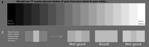
If you are serious about looking at photos on-line check out the test strip above (it shoud show 17 shades of grey plus black and white. Commonly it is the strips at either end that might look the same. Dive into the post to see what needs to be adjusted

Friday, September 16, 2016

An Update at PhotoFriday

I’ve been submitting photos to the weekly PhotoFriday challenges somewhat routinely for a long time, and I normally post the photos here in this blog. I liked their site but it has been significantly upgraded (specifically you can see the images directly without having to click through. It is much more Instagram like and easy to contribute to. It may take me a while to get used to but I’m willing to keep contributing and that means signing up and perhaps not posting the photos here (just their background story if and when they have one)

image

The one thing that instantly grabbed my attention was the monitor calibration. Something I wish more people would do. However I also know that colour calibration is a big issue (way beyond those devices that supposedly do it for you) and the ambient lighting has a lot more influence on the colours you see. Further it may not always address the tonal accuracy either. I know that it is the tonal aspects (brightness and contrast) that most folk stumble with and either have super contrasty, very dark or extra light monitors and they have got used to it. This sometimes means all the tonal effort a photographer has gone to, often gets lost on the viewers. PhotoFriday’s calibartion screen will probably get you to a much better place to appreciate the tonality of good photo. If you see subtle targets in the black and white circles in the test above you probably ok but if either the black or white shapes is just a single circle you need to do the calibration. Remember to follow the instructions (eg dims the room lights)

Try it its free!

Thursday, November 23, 2006

Dark subjects

From past experience I know that taking a good photo of dark subjects can be difficult, with modern automatic digital cameras. The technical explanation is to do with the cameras automatic light meter, it is trying to average the exposure over the image to match an average grey. However some subjects, such as rocks, dark skins and even low level light are just a much darker overall tone. The result is, the camera will choose a setting that tends to over exposed the photo, because the camera is actually trying to lighten this darker tone by taking a longer exposure This gives the resulting photo a flat look (and gerenally a lot of detail will be lost)


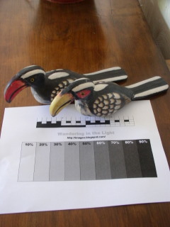
Most modern digital cameras have a system whereby you can easily adjust exposure, often this is called EV (exposure value). This combined with a simple reference sheet you can download and printout (click on the link and it should take you to google docs and let you print it or download a web document). Place the reference sheet beside your image and take a series of photos


My camera has a bracketing setting BKT, which lets you take a number of shoots with progressively adjusted EV settings by just holding the button down. Many digital cameras have controls to toggle adjustment (it may not be referred to as EV) that allow you to do the same task

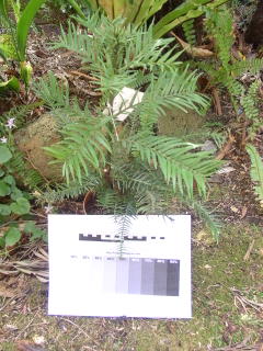
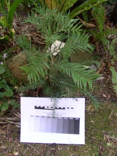
+1.0EV {BEST}+0.5EVAutomatic Selected Exposure-0.5EV-1.0EV

+1.0 EV

+0.5 EV

0.0 EV

-0.5EV

-1.0EV


+1.0EV+0.5EV {BEST}Automatic Selected Exposure-0.5EV-1.0EV


Either look at the images in your LCD screen or better still download them and have a look on a larger screen. The photo that best exposed the reference card could well not be the exposure your camera light meter has selected


Studio portrait photographers have a similar ""secret". They often have a test card that is 18% greytone. When it is “just” perceptibly different to white on a test shot the exposure is considered right. They may still fiddle elaboratly with a hand held light meter, but maybe this is just to take more time so they can charge you more. On my reference card this would correspond to the 10% grey looking white and the 20% the first distinct light grey. In both my example sequences above I will benefit from putting a positive EV correction.

Finally remember the reference card is light and will influence the light meter if it takes up a lot of the image space, so you may like to consider making a smaller single (either 18% or 20%) greytone card of final calibrations for important photos