Monday, February 29, 2016
Saturday, February 27, 2016
More walking to KEEPMyTracks


Then I went for the walk, only to immediately find their was no footpath for the first part of my trip. That’s ok I just cut through the trees and mga carpark. The obvious photos being the vista over to Mt Dandenong, Alas every where I tried to get a good vantage point the view was partly blocked, Then I discovered the my track on my android was frozen (or my tracks had not actually started taking readings, which is a problem I had noticed before on both my phones). The downhill on the first leg was easy. The uphill on the next two legs more challenging and rose a sweat. When I was only half way up the second leg and the gps read I had travelled 2.33 km I started to think something fishy here. The finished loop gave me a reading of 3.91km. That’s big discrepancy that can not be easily explained by my small deviation along the way by necessity or to take photos. When I look at the tracks and compare the two phones, the newer LG phone has quiet a few jaggy bits which I clearly did not take. The HTC path is much more constant and follows the road more closely but is missing perhaps the first 300m (it gives remaining distance as 2.5km). With my confidence in the gps tracking a little dinted by this, I then discovered that the normal update to google drive didn’t work. The kmz files where making it to the web its just the desktop app that keeps a local copy of my google drive is “unable to connect”, and no way to find out why. has the desktop sync app for google drive been [DEPECATED ] as well? Google what's going on?
Maybe this gps tracking, and its precision, needs further investigation?
Wednesday, February 24, 2016
Stacked filters in Dreamscope
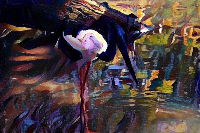
Example of "stacked filters" in dreamscope. A custom filter based on my photo of a peacock's head as a custom filter to enhance the rich blues and greens followed by a purple shade filter. In other words I'm trying to move towards what might be an artist's interpretation of the right colour palette to suit this image, if they were painting this scene.
A rethink on those one click wonder photo filters

However three packages which offer such one-click filters, but with the ability to modify them and/or stack them, are changing my mind. Googles first version of snapseed, as implemented in Google+ photos let you select a filter and make standard changes but with the option that you arrive on a page with various sliders that created that look and then lets you refine the changes. In other words you select the basic look and then can tweak it (often just to bring it back a little). Unfortunately snap seed is no longer used for default edit in google photos on the web and has gone missing on the android phone app for google photos. However you can still download it as a standalone app on the android (albeit with less effects filters)
The second software, which surprised me, but had the biggest influence on my change of mind is OnOne 10. In their effect tools they has been working towards the analogy that the effect worked like adding a set of filters in from of your lens. However there was always the actual sliders, buttons and dials very prominently on the left hand side. This is where you did most of the adjustments. there where thumbnail of the main tools on the right hand side and you could get larger version showing the effect on your photo from there. The Version 10 interface has been reworked and it a lot cleaner however I think most of the tools remain. (Resizing images was one overlooked but has been added back now (version 10.1.0) There is now more emphasis on the tiles (they are bigger than thumbnails by default now) and it is easier to start on the right. Many tools have a few tiles with slightly different settings on the original sliders. I’m now becoming convinced it is easier and more natural to judge an effect visually than remember how far or my what setting to adjust a given slider. As before you can save the filters stacks as presets, making the system very powerful. You could previously add effects on top of each other but the analogy of stacking filters is really obvious and powerful. even when they are stacked you can still make refined adjustments individually over on the left, OnOne have done great things here, even though they are essentially cosmetic.
The third app is dreamscope, which is a total surprise to me, because it was the classic, up-load your photo and here are a number of alternative looks to select (end of options). Admittedly the effects were very interesting (and often could be creatively used). I have been using them off and one for a while mainly for icons or simple graphics to support my blog posts. They must have been listening closely to user feedback and have now added larger output, customizable filters and most recently the ability to stack filters. Their users have embraced these changes and their home photostream is looking a lot less like “more of the same” and more “wow that interesting”,
Creativity is allowing yourself to make mistakes. Art is knowing which ones to keep.
Sunday, February 21, 2016
Revisiting edits inside flickr :: Rotate & Crop
I had never imagine a big toe could be so painful, but a sudden attach of gout has laid me out for a couple of days and frustrated my daily photo project. Still I have my android camera phone and that’s fine to take photos. Pain killer and rest seems to be working for the toe but the long term prospect of having to give up so many of the foods I like is not so attractive. The one ray of sunshine is that coffee and complex carbs, as in nuts, are not banned and may actually be good for me.

I needed to go into aviary, to do the crop. I had used aviary quiet a lot (and liked it) back in the days before flickr bought it and it was still a stand alone. When first first bought into flickr however it forced you to save a copy go out of flickr and save you edits as a new post. The round trip seemed a bit tedious and I stopped using it. the new version still sets up a separate window (and probably a new process) but it no longer appears like a round trip.


Friday, February 19, 2016
PhotoFriday :: White
Choosing can be the challenge
It was a very grey overcast afternoon, not that exciting for summer or photography. Yet there are a few flowers bringing a little brightness to the garden. Now the problem is choosing which should be my daily photo post?
Wow I’ve made it to my 50th. Daily Photo.
Thursday, February 18, 2016
Taking a deep breath and getting on with it.
Whilst I do like to get to the bottom of things, I think I have reached the point where I just need to side step the irritations of things not working like they used to (aka, Microsoft Windows 10, Google Picasa and My Tracks.) Its time to stop wingding in here, to take a deep breath and get back to enjoying life.
Microsoft, no longer living on the edge
![]() I’d update so many drivers and re-installed more software and I care to think about. So who cares about edge (and the modern apps) Windows 10 can become like Windows 7. The minimum thing here is to redefine the default applications to some key files types (like pdf) that the update to windows 10 has usurped for edge. Chrome is a better browsers anyway. Whilst I cannot find a way to replace everything in the start menu, a right click on start gets you most of the same functionality (in the old Windows 7 jargon). So I’m essentially back to using Windows 10 like Window 7. Can someone explain to me why I was encouraged to upgraded in the first place?
I’d update so many drivers and re-installed more software and I care to think about. So who cares about edge (and the modern apps) Windows 10 can become like Windows 7. The minimum thing here is to redefine the default applications to some key files types (like pdf) that the update to windows 10 has usurped for edge. Chrome is a better browsers anyway. Whilst I cannot find a way to replace everything in the start menu, a right click on start gets you most of the same functionality (in the old Windows 7 jargon). So I’m essentially back to using Windows 10 like Window 7. Can someone explain to me why I was encouraged to upgraded in the first place?
Not Trusting Google, looking for other tools instead
![]() I really do want to keep using Picasa and My Tracks, so I will hang on till the end. AND I’m enjoying my little gps doodle protest project. But I’m a realist, google is unlikely to take notice so I need to search out some alternatives and/or look for contingencies to move what I can to other applications. That’s not just the files themselves but how I use the tools in conjunction with other software. For example my images posted in this blog are stored on google (once upon a time in Picasa Web Albums now in google photos). I also use Picasa to act as a catalogue of my photo archive. Do I need to archive a copy of the software as well as the photo? However don’t panic I will take my time looking at these issues and hopeful have some good advice before things get turned off.
I really do want to keep using Picasa and My Tracks, so I will hang on till the end. AND I’m enjoying my little gps doodle protest project. But I’m a realist, google is unlikely to take notice so I need to search out some alternatives and/or look for contingencies to move what I can to other applications. That’s not just the files themselves but how I use the tools in conjunction with other software. For example my images posted in this blog are stored on google (once upon a time in Picasa Web Albums now in google photos). I also use Picasa to act as a catalogue of my photo archive. Do I need to archive a copy of the software as well as the photo? However don’t panic I will take my time looking at these issues and hopeful have some good advice before things get turned off.
Look Up
Sometimes the best thing to photograph requires looking up. Using a multi-stitch approach can nicely ground your subject, often at the cost of distorted perspective, This type of image and has been given the constructed name of a Vertarama. As seen on keep my tracks gps doodle walk
Wednesday, February 17, 2016
Please Keep MyTracks
 My first deliberate “gps doodle”, I have unknowing done some before, is by way of a spatial protest icon. Google are planning to [DEPRECATED], in other words kill off, the nice little GPS tracking app MyTracks on April 30th,. I like many others would like them to let us keep using it. So here is a nice little protest activity for those who love the My Tracks android app. Go for a walk, run, ride your bike or even drive and trace out a large scale version of the arrow icon from MyTracks. Then post a screen capture of the trace, tweet the gpx or even the kmz file for google earth everywhere you can, with the hash tag #KEEPMyTracks.
My first attempt is only 1.97km long, took me 38 minutes because I took 120 photos along the way, and importantly I had fun.
The idea of “gps doodles” comes from Stephen Lund. If you are inspired to create some gps art yourself you need to begin by watching his amazing TED Talk.
Tuesday, February 16, 2016
Late Afternoon
Irritation is an understatement :: Windows 10 needs fixing
 For what must the the tenth time, I have lost the start menu functions. I can’t access the modern apps, or search, no pdf reader or use edge or cortana (ok I could never get cortana to work and I’ve certainly lost motivation to try). Unfortunately I have spent many hours attempting to fix these problems with the weird array of special powershell commands. using safe mode and … the list goes on. These only work temporarily if at all. I have now lost these functions on all my windows 10 computers (two Toshiba laptops & 2 HP desktops) and none of the fixes helps anymore. My machine have been downgraded not upgraded.
Looking on the net and specifically on Microsoft related communities. This is a wide spread problem and has been such for 6 months now.
 How can you leave so many user in limbo, with significantly hindered systems Microsoft?
Once I am forced to go back to windows 7, I doubt I will return
Monday, February 15, 2016
Redecorating a place for my smallest camera(s)
 My android phone started to complain about lack of space a while back. I had been putting off deleting things when It ran out of battery (thanks to leaving the gps on). Once it was charged and restarted all the screens including the home screen had been reset to the factor defaults. Everything else was there including recent photos, so I’m not sure what happened. Anyway it was a chance to rearrange the screens and particularly my photo tools, which had become over-crowded (perhaps 7 different cameras is to much?). So I rearranged things mainly removing viewers altogether, with drop box, tumblr and flickr going to a separate page. I did mull over google photos, because I haven’t been using it for some time now but with the demise of picasa I may have to. The simple little cameras Camera 51 and Open Camera are getting more use, I like the simplistically of the open camera GUI, and the leveling aid that can be displayed on the screen is a great idea. Another goto favorite now is QuickPic, its simple, fast and shares with everything I need. I haven’t joined the free CM Cloud space (yet) so the tile asking me too is starting to feel like nagging. But once again I might have to find an alternate on-line “cloud” space, so I’ll tolerate the silent reminder a little longer.
Six months ago I playfully suggested I was having a race between google photos and flickr in a contest to see who could manage my phone phones. It was a real tortoise and hare epic but in reality Dropbox actually won. It remains my preferred method of uploading and backing up from the phone (because its simple, reliable and no wire have to be involved) but I also like the flickr app both to view photos on my phone and upload new ones. Its no fuss and does wait long enough for me to cull the bad images (it like Drop box only works when I have WiFI access, it is also polite and seems to always let dropbox go first). Importantly both dropbox and flickr load the photos as private. If I want to share drop box is my first choice because I just need to email a link (the recipient doesn’t have to have drop box). Thus I don’t see an urgent need to embrace google photos on my android phone just yet.
Saturday, February 13, 2016
The last straw :: GOOGLE IS SHUTTING DOWN PICASA
Today’s top story on Engagdet today is that goggle is shutting down picasa. Yes Picasa, that photo software that has millions of loyal users including me. Well they used to have loyal users.
This has probably been on the horizon since the google plus days but it will leave a big void. The on-line thing called google photos is nothing near as useful as picasa, it is the emperors new clothes for cameraphone types and its flashy autoawesomes over which the user has little control are smoke and mirrors. When they could be wonderful creative tools for photographers. The free storage is nice, but the issue trust is very real now.
I guess a bit of user input could have helped google to understand this but have you ever tried to contact google?
The time line doesn’t seem that clear but it will probably start occuring after may 1st. The date when exitsing Picasa web album will be migrated somewhere else. The google/picasa blog does state that you can download picasa up till 15th. march. After that it will not be supported and the upload function probably won’t work but picasa itself should still work on your PC. Thats my hope! My trust in google not to do something evil had dissapeared (through not consulting its users base and scant details of changes) Their history of [DEPREECATED] applications does given me any confidence,
Can you still trust Google with your photos?
I foresee a lot of heartache. So if you have a lot of photos on google photos already. It is time to think about storing them somewhere safer!
Thursday, February 11, 2016
A different type of straightening

A perspective straighten is very useful manipulation for some situations where you cannot find a enough room to get back from your subject (a window or large painting across the room or a building across the road). With a wide angle you will get diagonals running in several directions. The edges may even be noticeable curved. Lightroom now has a Upright command to do this under the lens correction menu. I assume it is doing a fair bit of distortion transformation mathematics, but it can do a good job providing the distortion isn’t too large (and perhaps it needs to recognise the lens). I have found a marvellous alternative in a plug-in for AfterShot Pro called zPerspector which achieved much the same transformation via a set of four sliders that independently adjust the sides/quadrants of the photos. With a little experiment it is easy enough to fix even extreme diagonals. You can also use the plug-in to create your own extreme perspective.

Wednesday, February 10, 2016
Some thoughts on using Photo Reference for Paintings
There is a lot of very misguided opinions on the internet and the use of photo reference for paintings seems to be getting more than it fair share of pretentious humbug. I suspect the uninformed believe it is cheating. Whilst I don’t suggested that photos should be copied in absolute details (I am convinced the resulting painting is then going to look very boring). I do however appreciate that having an “aide-mémoire” handy can help check on details of the subject, pose or posssibly atmosphere. However I don’t have great expectation that a single photo will reliably capture all the tones, fleeting effects of light or shadow and colours are typically flat. Photographers strive to capture detail in high fidelity, massive mega pixel dump of just a momenr but I dare to suggest this is not the “reality” an artist sees (when a couple of 4” y 6” snapshots may be more helpful).
Photos definitely solves the issue of translating a 3D reality onto a 2D surface and this can definitely help resolve perspective issues and refibe composition. But it is no substitute for being there and “seeing” (and experiencing) the place or subject. The act of sketching not only consolidates that seeing but also helps focus on the key aspects, and concentrating on those characteristics, colour, texture, atmosphere that later will bring life into the painting, that a photo only may lack. So I feel strongly that photographic reference is fine but it should be collected alongside some “plein air” sketches and observation, and more than one photo is better.
A sketch can also help you better post process an image to retrace what you remembered the scene, not just the lifeless RAW file.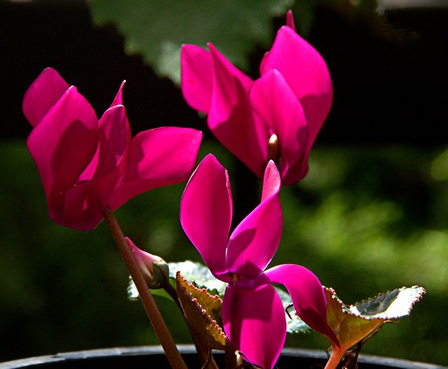 This is a clone painting (below) created with Corel Painter and a fair bit of manual input, it is a computer created painting not a traditional watercolour. I hope it illustrates that there is more life in this and the post processedf photo above than in the original photos (which aren’t so bad either)
The Grape Poachers
My ripest grapes are being stripped from the vine just as the crop seems to be maturing beautifully. Well the poachers have become very brazen. Time to get some netting! I’ve also had to bring in the ripest bunches already, so I can enjoy at least some.

Tuesday, February 09, 2016
Last Rays of the Day
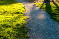
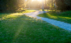 There was a fair bit of hype yesterday, under the hashtag #MELHENGE, where the sun would set perfectly aligned with the inner streets of the melborne grid, known as the hoddle grid. Whilst I didn’t get into the city I
 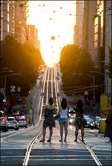 was in Jell’s Park late in the evening and concentrating on my below my feet theme, taking photos of some of the pathways (above). Taking photos towards the sun (Contre-Jour) is not a simple task, It is easy to overexpose the image and be overwhelmed by just silhouetted shadows. So I didn’t expect great images and most where strong silhouettes but one photo on flickr by werden (on left) did capture some of the golden light reflected on both sides of the urban canyon and capture some of the curiosity with the event, with detail in the shadows! Nice job.


