Monday, October 29, 2018

PhotoProject :: My #HandDrawnPhoto approach to #AIart

The success of the Belemy portrait auction, has encouraged me to compare Obvious’s DAG approach to my use of Google Deep Dream algorithm. Deep dream uses a convolutional (foreword chaining) neural network to find and/or enhance patterns in an image. This can be applied in two ways Style & Inception (google’s terms). The inception process tries to find the characteristics of a given object/pattern within a photo and tends to produce surreal images. Style on the other hand  seeks to put characteristic patterns back into a photo based on features the trained neural network has recognized. This is the technique I have become very interested in as a way to put my characteristic marks (and sometimes colours) back into a photo. Hence the name Hand Drawn Photos for my approach. The method does have superficial similarities to Onvious’s DAG Approach.

the pine treesPA280054Here I am using my sketch for inktober as the image to be processed and a photo of the same trees as my training image used to build the neural network (AI). The Photo here is acting like the discriminator in Obvious’s approach. The result (below) is tonally similar to the photo and kind of a messy squiggly version of something I might sketch.  But…

the pines 1

PA280054the pine treesIn this, my preferred approach, I am using the photo as the image to be modified and my sketch as the image to train the neural network and letting the system modify the photo to “find” my characteristic mark making (aka style) and modify the photo. In this case I am taking the colours from the photograph, but that is not essential.

the pines 2

I feel this second result is much cleaner and fresher, closer to something creative and artistic, Although I am strongly guiding the outcome by using my own sketches (as opposed to an automated algorithm). So the big question is “Do you consider this #HandDrawnPhoto to be legitimate AI art? I’m warming to answering yes.

If you are interested here is the link to my profile and public images on Google Deep Dream website. (Its free to join and use)

Love to hear your views,  please leave your comments here.

Sunday, October 28, 2018

The Obvious & the “first” Auction Sale of #AIart

Just a short break in the discussions of digital colour.

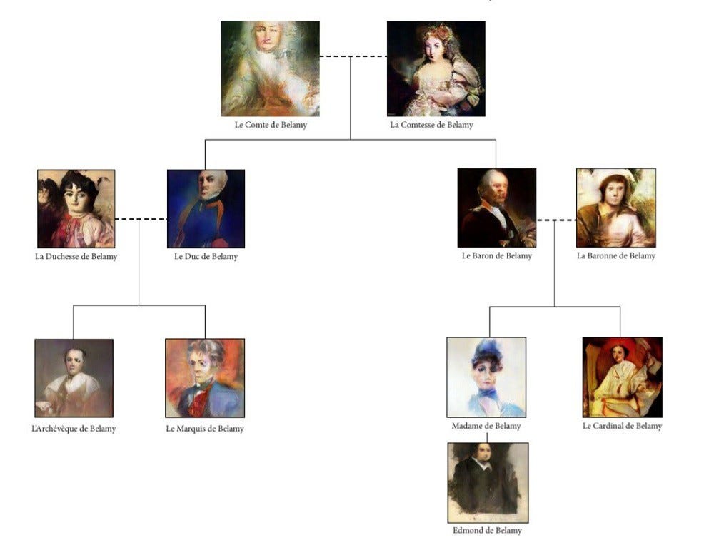
Pierre Fautrel, Co Founder of Obvious beside the "Portrait of Edmond de Belamy"I have been following with some interest the much hyped Auction at Christies of a the “first” AI produced artwork to be sold at auction. The expect price range was USD$7,000 to $10,000 but the actual sale price was USD$432,000 (or around AUD$612,000), That’s a lot given the picture is just 70cm by 70cm. Ok its nicely framed, but…! However I’m sure the value has been realised because it is a first and also the technology and artistic intent behind the image.

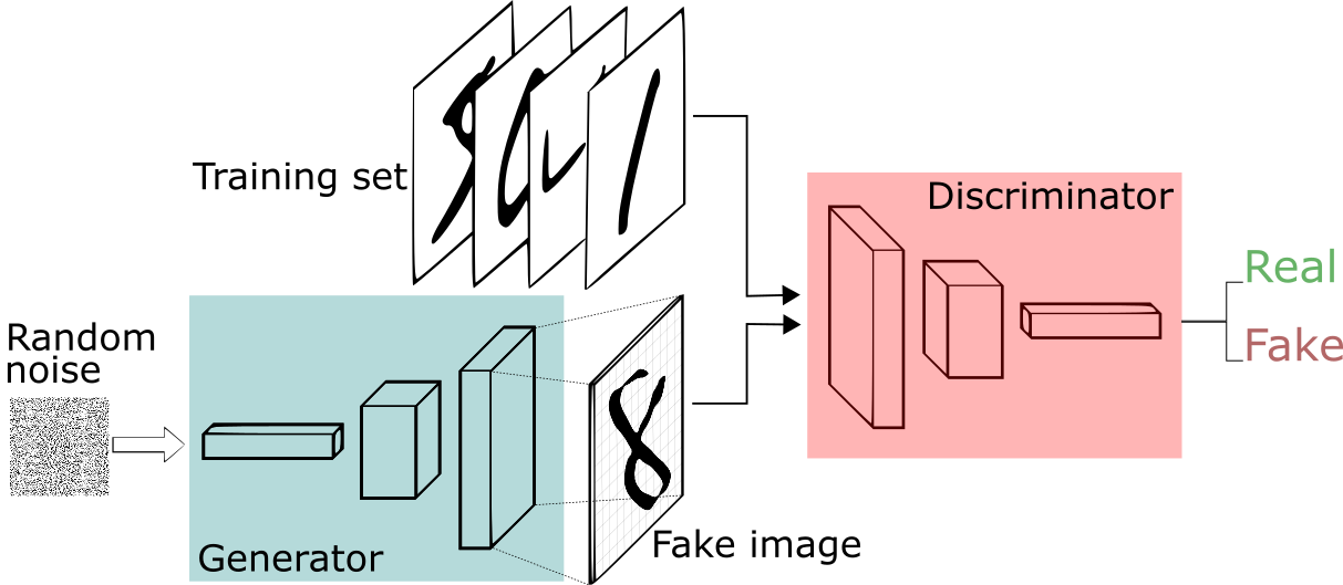
The image was produced by an AI (artificial intelligent) under a Paris-based collective of artists, calling themselves Obvious. Their object was pretty simple “Can an algorithm be creative?”. The their approach has been to carefully select a dataset of 15,000 portraits (this is a very manual step by the way) done between the 14th and 20th centuries, which showed a number of characteristics they where interested in and used this to train their AI (presumably a neural network). Next they applied a GAN (Generative Adversarial Network) whereby two algorithms compete to find and acceptable outcome. They called there algorithm the generator (which took an input of random noise and using the trained network created a “fake” portrait which the Discriminator would then rate are a real or fake outcome from the combined trained results, In simple terms the generated portrait was accepted if the discriminator was tricked that it was actually the features expected (from the training set). This stakes a lot of data processing and their images where small. So they added and additional step where they upscaled the image (again algorithmically) to imply a higher definition outcome.

In a fitting testament to the method the collective have signed the portrait with the mathematical formula of their discriminator.

If you want you learn more I suggest you start at the articles on medium at the bottom of the Obvious web site. You will also find other portaits obvious have produced of other members of the fictious Belamy family.

They name Belamy being a light hearted acknowledgement of Ian Goodfellow one of the originators of the DAG approach (ie Good fellow loosely in french Bel Amie)

Saturday, October 27, 2018

Just How Many Colour Models/Spaces are There?"

The complexity of colour doesn’t stop at RGB versus CMYK or even the traditional colour wheel. Different industries and investigators have established a myriad of others ways to express colour systems. For now it is enough to group them into 5 main groups.
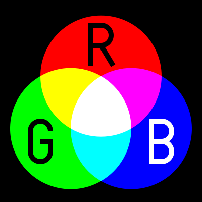

RGB, (Red, Green, Blue) is used in Camera Sensor, LED Computer Screens and Digital TV Screens, they use these three colours from light emitting or sensing technologies to produce any given colours, through Additive Colour Mixing of the light. Its not really a colour space but a colour model.

Unfortunately there are several variants and this is the first place many digital photographers can get caught out. in 1996 HP & Microsoft cooperated on developing a stand 8-bit colour space based on RGB and it was subsequently adopted as standard for monitors, printers and widely internet applications (eg Browser) and is know as sRGB. With the result that most printers, monitors and software can now correctly render this colour space. When in doubt this is the best colour space to use to avoid disappointing changes in colour and tone. In the meantime other colour spaces with greater bit deep have developed such as Adobe RGB and ProPhoto which can in theory render more colours, BUT your monitor or printer may not be able to show them.
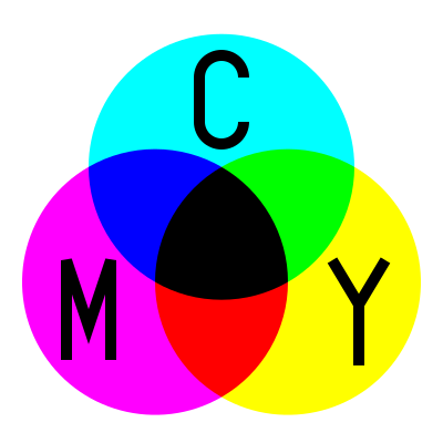
CMY[K] (Cyan, Magenta Yellow)The CMK model is relative new, as it required intense and transparent  synthetic inks & dyes the can mix cleanly. Also the technology of Halftoning (or screen) whereby tiny dots of ink are printed in a pattern small enough for humans to perceive a solid colour, A set of separations for each primary colour was made and overprinted with close attention to properly registering the images.

These days there complex but reliable colour space converters that can take an RGB image and render it in the closest CMYK colours and these are usually built into your printer drivers. This approach forms the fundamentals of ink Jet printer technology., Older printers, including some high end larger format printers may still need conversion (or even tone separation) carried out separately. However most photo services will accept SRGB and do conversion  automatically to CMY if required.
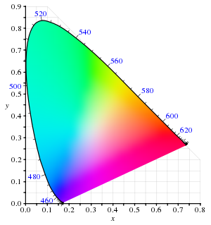

LAB (or CIELAB) is a special colour space in that it includes all perceivable colours.   It is extensively used to compare the colour rendering and matching capabilities of a wide range of technologies and devices, particularly the CIE XYZ graph shown on the right. The L is for lightness and the A and B represent Green-Magenta and Blue yellow components but they are non linear mappings with elaborated transformation functions. However the key is the the three axes use real numbers (rather than positive integers, for bit mapped colours) so an infinity number of colours can be represented. The CIE chromaticity diagram, shown on the right, covers all the colours visible to the human eye and the outside of the convex curve enclosing the colour space show the Wave length of light that corresponds with that colour. You are likely to see this diagram when a manufacturer is extolling their virtues, aka wide colour gamut, of their new devices

Adobe’s PhotoShop has a LAB mode to allow device-independent colour.

.

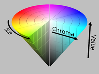
HSL or HSV, are the cylindrical equivalent of the RGB additive colour model but include the brightness of luminance L (sometime B for brightness), as well as hue H as a radial measure and saturation S as distance from the centre. The system was originally invented in 1938 by George Valensi as a method to add colour to and existing monochrome (L signal) Broadcast (see also below how this might be encoded). The V in HSV stand for value and in the variant of the colour model to top of the cylinder is white and the base if black and may better represent how paints are mixed. It is frequently represented as a cone. This model has been widely accepted and applied in most image editing and computer graphic applications and
YUV,  of Y’ (luma) UV (chrominance) is a technology that was widely used in analogue colour TVs , PAL Digital and some movie formats. Its original begin when B&W analogue TV was being upgraded to colour. The Luma channel is exactly the original Black and White signal. The colour channels  U & V utilize the fact that the green sensitivity of the human eye is somewhat overlapped by the red and blue cone receptors and therefore the signals bandwidth could be reduced by not transmitting the green information.  The original TV engineers, following VAlensi model,  brilliantly worked out that rather than use absolute R (red) and B (blue) they could send the U & V the difference from a reference average and tell the TV to just shift the colour of a specific pixel without altering its brightness. Thus an older B&W TV which could not decode the difference signals would just how the normal B&W picture, thus avoiding making older TVs redundant!  When you use the yellow plug, composite video, you will be using some variant of Y’UV. Standard Digital PAL and HDTV also use modern variants of this colour encoding method.

If my very limited description has confused you Cambridge in Colour has a great article of visualizing and comparing colour spaces (well except they use the color spelling)

Now for the really interesting part, many of these colour system describe colours, that we can not see, our cameras (even the expensive ones) cannot differentiate or cannot be reproduced either on our computer monitors phone screens or inkjet printers. In fact most devices have a limited capacity to reproduce colours, and the range of colours they can produce is usually referred to their colour gamut. More on that to come in future posts.

Friday, October 26, 2018

Building a Digital Colour Wheel

PA260003Most of us are familiar with the conventional colour wheel. It is the colours of the rainbow wrapped around and joined at the purple/violet segments. It normally shows 12 colours, the primaries (Red, Yellow & Blue) then the secondary colours easily mixed from those (Orange, Green & Purple). Finally the six tertiary colours mixed from the adjacent primary and secondary colours. Whilst many people instinctively know a harmonious colour scheme (eg red & green, Blue & Orange, Yellow and Purple) They might find it difficult to describe why. The tradition colour wheel can come to the rescue here, colours on opposite sides of the circle are called complementary, beside each other are call analogous, In addition if one of the complimentary colours is left out but the analogous colours either side of the missing compliment are present then this is described as a split complementary. All these combinations are know to be harmonious (and desirable for an artist, photographer, home decorator or fashion designer). The colour wheel is very useful and you can read a bit more about Basic Colour Theory at Color Matters.

PA260004PA260002

Some complications arise when you start to look at how cameras and TVs work. They use a three colour palette RGB (Red, Green & Blue). This doesn’t fit onto the traditional colour wheel very well (first image below). These three colours are also know as the additive palette. These three colours do work well in terms of how our eyes (specifically the three types of  “cones” in our retina) recognize colour. A lot of people not familiar with this system are very surprised at the lack of yellow, but if you add red and green light sources you will see yellow. Things get even more strange when you consider the approach developed by traditional colour printers (including your ink jet printer) which use the  CMY [K] (Cyan Magenta & Yellow) subtractive palette. The K in square brackets stands for blacK, as printers find they need a true black, because a mixture of magenta, cyan and yellow inks or dyes tends to be a muddy dark grey and leaves images flat. Black is not really a colour, but I wish to avoid the argument on that for now. It is even harder to fit these colours on a traditional colour wheel (there is no matching segments for Magenta or Cyan for a start). You can read a bit more on the RGB & CMYK colour systems at Colour Matters.

Trying to fit the RGB coloursTrying to fit the CMY colours

This is the point where I decided to combine these two palettes, and form 6 new primary colours. I’ve since discovered I’m not the first to have attempted this (eg see Warren Mars website) and this configuration is often known as the modern or digital colour palette, sometimes even the RGBCYM[K] palette.

Formulating a Combined RGBCYM paletteThe New Digital Colour Wheel's 6 primary colours

You can then fill in the intermediate segments with new secondary colours to get a simple 12 colour wheel again. Amazingly if you employ the idea that opposite colours can be complimentary or adjacent colours analogous and you find they are also harmonious. What is going on here is the traditional colour wheel wrong? Perhaps for both their photography and printing aspects digital photographers might be wise to adopt or at least consider this new colour wheel. I will be discussing many of the issues for digital photographers in coming blog posts.
The New Digital Colour Wheel's 12 primary & secondary coloursThe Colours offered by Adobe

The very last image shows the colours Adobe Photoshop and Lightroom give you control sliders over. I’m still no closer to being able to explain this colour selection.

Wednesday, October 24, 2018

Photographing Artwork with a Copy Frame (update)

IMGP2780Somewhere along the line (with window 10 updates I suspect) lightroom became very flackey in tethered mode (at first I suspected the canon drivers, but installing updates just made the problem worse). Thus the benefits of my repurposed copy stand connected to the computer evaporated. It was back to clicking the shutter button. However I soon discovered using my little Olympus, with the tilt screen set up at a suitable viewing angle  could let me regain a little of the productivity. I could use the touch screen to both select focus and/or trigger the shutter.  So it was back to -

  1. Position the art work.
  2. Check the screen, perhaps refocus...
  3. Tap the screen again to take a photo.
  4. onto the next artwork…

Still considerably faster than scanning.

I like to use an mid grey background (matte board), to avoid the colour and/or tone biasing the artwork (particularly useful in preserving the white of the paper in sketches)

IMGP2782Using the OI.share app I can also set up my phone, Using remote control to get a live view from the camera, set all the key controls, focus and take the shot. All that is required is to set up the camera to connect to my phone via WiFi. I loose the screen view on the back of the camera but can see everything on the phone. I’m not sure it is any faster than just using the touch screen but it does remove the possibility of moving the copy stand as I tap the screen. It is also a bit of geeky fun, think of it as wireless tethering to your phone.

One big advantage of using OI.share on your phone is you can then post the captured image directly to instagram from the camera (and/or go through snapseed if you want to incorporate edits )


Friday, October 19, 2018

Yet another Reason to Photograph Art, rather than a scanner

PA180248I’ve been using the built in scanner in my HP Photosmart printer (an A4 typical all-in-one style inkjet) for my INKtober works. However yesterday’s included some Fluro acrylic paint to match my grand daughters pattern on her school art project (a hand painted mould of her hand), I a strang loop self reference sort or manner I decided to use that as my subject for my INKtober sketch for today,

I remembered that I had had trouble scanning the fluro colours before (on my beach people project) so I also took a photo (under artifical light). The differences are again shocking!

I probably should have waited for natural light and/or worked on the white balance but the camera (images on the right) gives a much better representation of the feel of my art work and closer to the true colours.

Scanned VersionPhotographed version

Wednesday, October 17, 2018

Towards a new Colour Wheel, but Why?

For a while now I have been bending the ears of my colleagues and friends incessantly about a “digital” colour wheel with 6 primary colours rather than 3. Looking back in the blog post I  hadn’t posted anything in here (yet!) So now is the time to fix that.

Adobe Primary &
Secondary
Tertiary
Red Red
Red Orange
Orange Orange
Yellow Orange
Yellow Yellow
Yellow Green
Green Green
Aqua Blue Green
Blue Blue
Blue Violet
Purple Violet
Magenta         ?Red Violet

I started to personally  question the colour wheel adopted by adobe ( within lightroom and photoshop) for their omission of some colours in their digital post processing. It only gave me 8 colours, halfway between the convention 6 primary & secondary or the 12 primary secondary & tertiary colors I expected)?

Why have they done that?

So I looked at the ways are colours are handled in the camera, computer screens and then onto printers. Well they are not even in the same colour spaces, or built using the same colour models. Cameras and Computers screens (and any direct transmission of light) follow the RGB (Red Green Blue) colour model.  This an called an additive model of how colour works, because different wave lengths of light get added together. This somewhat matches the rods in out eyes which give use colour perception. We can only discern colour because different cones in or retina can detect different wavelength. If you mix projected light of these three colours you get pure white. Ok good but should that be yellow rather than green (green is a secondary colour isn’t it?). Damn if I mix colour wheel idea 2green and red light I can get yellow?

Things get even more bizarre when you start looking at printing colour.  Traditional three colour printing and many inkjet printers use a different set for their primary colours (CYM) Cyan Yellow and Magenta! This is called a Subtractive colour model because certain wavelengths are removed from the reflected image. What is going on here? When in comes to reflected light and pigments mixing colour is again different, for example to get green you mix your light blue (cyan) and yellow!! If you mix all the three colours you get a dark muddy colour, close to black but not a true black. So many primers (and ink jet manufacturers) also use a per black to create the CYMK (K for black) scheme.

Close to a year ago I was doodling in my sketch book, and realized by combining these two colour schemes I had a new colour model with 6 primary colours. Not surprising, the idea of a RGBCYM[K] colour scheme has occurred to others and is sometimes called the modern or digital colour wheel.

I know I haven’t answered the big question why Adobe and many other photoeditors only give to eight color sliders. I can’t find out why (at the moment). This is a big topic so I will build and develop over several blog post to come.

Other Blog posts in here around the mysteries of Digital Colour Theory

Tuesday, October 16, 2018

Putting Linux to work on my Air Gapped Archive

PA180239aurYesterday’s realization about Linux, reminded me that I have an older computer dedicated to Linux, the Ubuntu flavour. I only use it occasionally (only 3 times in the last year) and its not connected to the Internet. Its my Air-Gapped Archive. However it is a very important to me. I use this older netbook to handle my photo Archive of original Photographs, including RAW images & photos of my art works.

I choose Linux for a couple of reasons. First the attempts to upgrade my little toshiba netbook to windows 10, initially half worked and progressively slow until an attempted system reset ensured it never worked in Windows again, but I found it worked well with Ubantu . Second Ubantu (and Linux) are Open Source, not propriety operating system so there is less chance of being depricated or abandoned.

I must admit I have only updated twice so far since setting it up and today will be the third update (effectively I’m averaging every 4 months (not 3 months) and that means each year I will be running through the full cycle of Son – Father – Grandfather. This year I’m using a series of Old Hard Disk, which I have reformatted and now I am copying on the complete back up set a fresh (from the external Hard drives (in this case in the red covers). Its not fast, I expect it will take about 3 hours to copy and verify approx. 2.7TB of data.

I have also downloaded a couple of programs to help me out if I end up with only the LINUX access at any time. These are Linux version of XNView MP, a cross platform version of the popular photo/movie viewer and converter, and DarkTable, an excellent open source photo editor, that is also available on several platforms including Linux. Both can handle jpeg and the three RAW format I have .cr2, .pef .orf, I feel happier being able to see my photos. Even though this archive is essentially a digital dataset, seeing it is the best assurance that it is a true archive.

PS I left the complete rebuild run over night and it seems it took closer to 6 hours o copy and verify 2.8GB of photos & videos

Monday, October 15, 2018

This came as a bit of a Surprise

imageI’ve a had a weekend of well meaning folk giving me a hard time because I avoid apple products, particularly the IPad and IPhone and most things “appleverse” (like calling their shop a “city square” and their salespeople “geniuses”). I’m not an apple hater. I still have my iPod, (even though its battery is shot and can’t be user replaced, an incredibly common design flaw in most apple hand held devices, giving them only a guaranteed 2-4 year life expectancy). I just think they are overprices and whilst they do a restricted number of things very well they are pretty inflexible at others… ok I’ll stop there because I don’t want the emotion rhetoric or flame war to start. Anyway it piqued my interest and I decided to look at just who looks at my blog. This is the summary graph by operating system produced by blogger, which hosts this blog

I was surprised! Even If I add together all the Macs, iPhones & IPads its a little over 15% of my readers. So the apple fanboys probably won’t be reading this anyway. What did stun me was the number 39% for Linux users. Obviously I assume I must appeal to the free thinkers, less conventional and nerdy types (or maybe just search bots) as well as the corporate world and more precisely those that can afford the cheaper PCs (windows user 38%). The lesser surprise is the also small number of phones 10%, whereas my website stats have shown viewing with a smart phone to be approaching 50%. Is this because blogger is a bit ordinary in mobile mode or there are no popular HTML “readers” for mobiles. Maybe I am not seeing the true picture, but perhaps it is good that I have avoided the “shiny new toy” syndrome that seems to just focus on gear, (most photography podcasts, you tubers, blogs, and owners of the latest apple gear) not how they can be used. It steels my resolve to return to the mission I started with this blog over 15 years ago, that is “Things They Forgot to Tell You About Digital Photography”.

Sunday, October 14, 2018

Can you find the Kookaburra?


Find the Kookaburra

Taken on the Jells Park Photowalk :: Seeing as the Camera Sees.

This is a good example of my new approach to handling a (big) batches of photos without wasting time and waiting for (slow) software. (ie bringing the fun back into photography). Taken from the camera card with Photo Mechanic (180 images, 90 pairs of jpeg+raw), adding metadata, select and rating the best (under 3 minutes) then pumping 40 raw files out to photolemur 3.0 to see what is possible (another 2 minutes for that to happen, time to make an espresso) Then I sat down (5 minutes later) and choose half a dozen photos to work on.  All I had to do with this one was crop the photolemur output. Voilà.

Then I used Photo Mechanic Upload tools to send this cropped image to both flickr and twitter (in less than 2 additional minutes)

For a couple of photos I will go back and take them into On1 Photo RAW and three sets of 5 images each I will take into AuroraHDR 2019. Even though I’m not under any time constraint taking the chore aspect out of culling ranking and caring for my photos before I can even start the fun of enhancing things, give to time to reflect and hopefully lift my creativity

Wednesday, October 10, 2018

Missing Files after a Windows 10 Update, with the Benefit of Deja-vu

Microsoft could have avoided the brew-ha-ha over missing files, after the latest Window 10 update, if they had bothered to reply to any of my several reports on the problem (to their support sites), all ingored , back in the last update in June. There were probably several hundred others in a similar difficulties reporting to various forums, and microsoft was silent.

The reported discovery that the missing files was cause by the "Known Folder Redirection (KFR) which is supposed to help remove duplicate files, makes sense to me as it was files or folders I had recently been using that “disappeared” during the june Windows 10 update. So this is not really a new issue.

I had a good backup of my working files (on a mirrored NAS drive and a separate external USB drive). I discovered my own work around, just take the affect USB external drive to a different computer, and the missing files were visiable! However I had to go through about 6 weeks of angst and update distress.  Not to mention a total reset and reinstall all my software (and explain to various venders that I need to reinstall software on the same computer (ie without exceeding my install/sites limit). My trust in Microsoft was severely dented and I for one would be happy if I could say NO to any future windows updates. This latest admission is not helping me change my mind.

The big question is how are these problems getting through Microsoft’s testing and their much hyped Insider feedback system? I know, they probably ignored them as well….

Tuesday, October 09, 2018

The Sunset in HDR :: three ways

There was a half decent sunset tonight, and a perfect opportunity to test out a 5 bracket exposure and three different approaches to post processing the higher dynamic (and 32 bit colour) image in the new AuroraHDR 2019.

PA090051PA090052PA090050PA090053PA090054

PA090050aurPA090050aur vividPA090050aur warm landscape

Firstly I really confirmed that the default tone mapping is pretty good (almost good enough by itself). However it was then easy with the adjustable Gradient filters to add a little vibrance and warmth to the top of the photo. Giving a result perhaps a bit closer to what I experienced. Then I tried a couple of presets (now called “looks” in Aurora HDR) and settled on Warm Landscape as the best match albeit perhaps a little too colourful. This is powerful stuff and a joy to use.

Saturday, October 06, 2018

Playing with Looks & LUTS in AuroaHDR 2019

The new Aurora offers a many new capabilities, particularly in how it “prepares” RAW files to be merged by applying an AI (artificial intelligence) neural networks derived from how other photographers approached exposure, tone mapping and colour renderings of similar scences, to the individual input photos before they are combined. Rather than formulaic presets/filters applied to the merged and higher dynamic images after they are prepared. The difference is a bit like an unseen black box process. There are a few aspects however of the new Aurora that make themselves very obvious to the user. These are looks (the new name for presets) and LUTS (look up tables).

PA030006aur aged lutPA030006aur instagram

PA030006aur silk screenPA030006aur  2stripprocess lut

I thought for now I would just show how much these can affect a single input photo of some native flowers. They are all achieved with a single click once the input image is tone mapped.

Friday, October 05, 2018

First look at AuroraHDR 2019

I had been eagerly awaiting the release of the update to Aurora HDR (AuroraHDR 2019) particularly to see what use Skylum would be making of their AI capabilities (Quantum HDR engine). I was impressed but also a little surprised!

PA050098PA050097PA050099

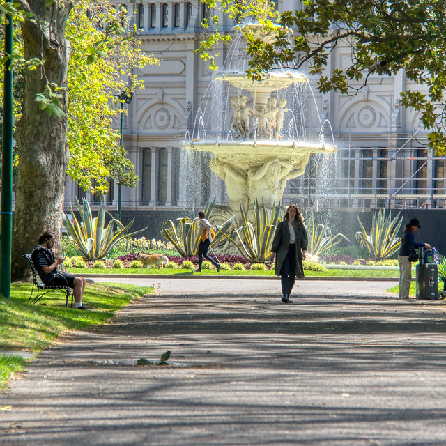
I needed to use the anti-ghosting selection because the girl on the path is walking towards me and the leaves on the trees were blowing in the winds. It worked well.

The way the AI  enhancements are applied is individually to each image before they are merged (a surprise but probably the best approach). However this slows the merge process considerable as the program goes through the following steps (at least it tells you what is it is doing, where several other programs just show a static screen and make you wait.

  • Loading Images
  • Detecting Scene Type
  • Detecting Scene Objects
  • Improving Dynamic Range
  • Enhance Image Structure
  • Improving Colour
  • Final Touches to make it Awesome*

i*after the google+/google photo failed attempts at AutoAwesome, I’ve been sceptical of any awesome claims]

The wait is worth every bit of the delay. The default tone mapped image was really great, (I refuse to use the word awesome) and the tiniest amount of adjustments to smart tone, highlight and shadows, then straightening and cropping gave me the wonderful results below. Pretty dare good for a first run through.

Towards the old Exhibition Building

Tuesday, October 02, 2018

Marvin returns for INKTOBER inspiration


Marvin : Mate how about cleaning me up and colouring me.
Norm : But I'm not suposed to use a computer for inktober sketechs
Marvin : I fell nude in raw ink
Norm : OK, Just for you.