Saturday, November 03, 2018

Chasing the missing colours further

The mystery of the missing adobe colours turns out to be is as simple as understanding the Colour Space being used in the HSL sliders, some unfortunate naming, and confusion on my part. I have exhausted my way around bothLightroom and Photoshop documentation and on-line tutorials etc. I did find a few others asking similar questions and found a few also doing direct tests on Lightroom with colour charts (see my approach below). I still had that empty feeling I was misiing something important.

I decided to investigate the missing colours for myself, I took a series of of different colour wheels into Lightroom (below is a conventional painters colour wheel) and just played around with the Hue Sliders in the HSL panel of Lightrooms Develop Module. This can be a lot of fun and well as giving you a sound understanding of how the sliders work. I strongly recommend trying it out for your self.

Conventional Colour Wheel in lightroom

What I discovered  was first that the sliders did actually cover the full Hue (colour) range. Adobe have provided 8 slidesr so they where spaced 45o apart (ie 360o/8). Also each slider has an adjustment  range form –100 to +100 which seemed to cover 3 or 4 segments on the standard 12 division colour wheel (shown below). There also appeared to be some overlap with the adjacent sliders.

The next bit of the analysis is just my approximation. I assumed that each slider goes half way to the next slider plus a bit (ie 45o/2 = 22.5o plus 10o) Then doubling that for the full movement of the slide from minus to plus yield 64o (32o*2) which is inline with my observations above. Now things where coming together,  I could build the table below and work out the range of HUEs in terms of the angular HSL measure.  the –100 column if the anticlockwise Angular number (eg, –23o) and the –100 column is the clockwise angular number (eg, +23o), give the extent of that slider in terms of Hue.

Adobe Colour -100 Hue +100 Better Colour Name
Red 328o0o 32o Red
Orange 13o 45o 77o Orange-Yellow
Yellow 58o 90o 122o Yellow-Green/Chartreuse
Green 103o 135o 167o Green
Aqua 148o180o 212o Cyan
Blue 193o 225o 257o Blue
Purple 238o270o 302o Blue-Purple/Violet
Magenta 283o 315o 347o Magenta

I also to a HSL Circle (colour wheel) on which our common colour names had been applied to given segments. The obvious feature is our colour names don’t forma linear arrangement around the circle. Some colours (eg Yellow) have narrow range while others (eg green have a very broad range) at least in terms of their name.

image

Suddenly some of my previous observations, like if I used the yellow slider it was more likely to adjust the grass and foliage than the orche coloured yellowed of bleached grass or rocks. That the reds were very sensitive to their sliders whereas blues and greens less so. I also have taken the opportunity to better name the colours of the sliders. Thus now the Orange slider (now Orange-yelloe and the yellow slider (yellow-green) might both be required to enchance of shift the Yellowness of an image. Admittedly things get a little complex when luminance is also considered, that can be a latter topic for a post, but for now a better understanding of which hues are affected is a big step in the right direction to understand how to control colour in your Photograph.

So in conclusion, rather than there being missing colours, I found the names the HSL sliders where given in lightroom had lead me to think back to a conventional colour wheel (3 primaries, 3 secondary and 6 tertiary colours, ie 12 colours). Instead I should have realized Adobe had split the 360o of the HSL Hue Circle into 8 division rather than 12. C’est la Vie

Friday, November 02, 2018

The Sting in the Tail for Free Flickr Accounts

Part of the Banner Meesage on flickr todayDespite the rhetoric from Don MacAskill and others when SmugMug bought Flickr from Oath, today they announce a couple of big changes. Suggesting “This newly-independent community can shape the future of Photography itself”, whatever that means. The cost  of the Pro Account remains the same USD$50, with the same basic features (Ad-free,Unlimited Storage & More Detailed Stats). Its actually it’s still comparable with Smug Mug’s Basic account USD$3.99 (~USD48 annually). There are a couple more things offered like a 50% discount on a smug mug Portfolio, and promise of increased resolution and expanded Colour space, and 10min video rather than 5mins The various and proposed offerings for Pro (paid) membership do offer various advantages compared with the free account but not enough to excite me. At the moment I’m not likely to commit to an ongoing fee for the service, as I’m retired, I have to carefully mange my cashflows and I’m not wishing to use flickr as cloud backup/storage.

imageThe sting in the tail is the proposed changes for the free accounts, and I am a long time free account members. From February next year free accounts (currently unlimited number up to 1TB disk space, but you get ads) will be limited to 1,000 photos. 1000 photos at even one a day is over 3 years worth of posts.  C’est La vie.

I lived with Yahoos limit of 200 photos for free accounts for several years. That was you could only see the last 200 of your photos, However if you posted your photos to groups or had “official” links your photo could still be displayed (in other words the photo still existed on the platform). From what I understand the new limit will be enacted differently. Once you reach the 1000 limit you will be blocked from uploading. Also, and more significantly, if you have more than 1000 images stored Flickr will deleted the excess starting with the oldest! They will be gone forever from flickr. I expect this to be very unpopular, and lead to some ill informed rants. So get ready for the social media backlash! Not sure if deleting old photo once I reach the limit will free up space to  let me add new ones (I can’t currently find any specific reference to this).

I’m hopeful I will be able to remain using Flickr as a place to show my recent photos, but with a bit of extra work on my behalf (ie deleting other photos to give me space). Which in theory gives me the opportunity to curate my collection and improve the quality.

So the ride could get a little bumpy but I’m prepared to hang in there.

UPDATE Don MacAskil has posted on the flickr blog a fairly detail explanation of why free flickr accounts will be limited and the background behind the choice of the 1000 photo limit. Aslo of interest there is a well reasoned article by Thomas Hawk on PetaPixel on Why Flickr limiting free users to 1000 photos is a smart move.

Thursday, November 01, 2018

The Gamut of Different Colour Spaces


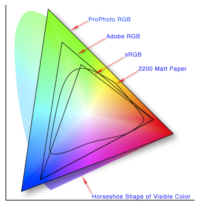
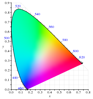
In the previous posts I hinted you may be using colour spaces in which exist some unique colours that can not be displayed or printed.  This post will explain why. A nice way to compare these is with the the CIE 1931 xy chromaticity diagram, which is designed to encompass all colours the average human eye can see (the horseshoe shaped background). The full extents of the colours perceived is termed the colour gamut.

This version of the graph shows the extent of common colour spaces applied in camera capture and editing software. For instance  8-bit sRGB if the default space for jpeg files and most new LCD screen. It is probably adequate, but is under half the possible colours we can see.  Compare this to Adobe RGB (12-bit) which gives more definition of unique colours in the greens and some blues. But remember if you are looking at the photo on an older computer screen you are probably only looking at a small colour space equivalent to sRGB. ProPhoto RGB (12 or 16bit) gives an even wider range of green and blue and some extra eds. However now it is possible to generate colours that our eyes can not discern.

The real rub comes when you output shown as the more curved shape , 2200 matt paper) indicates the colours possible when using CMYK colours (eg ink jet printer inks) on a standard matt paper. Gloss papers which appear more contrasty can give a slightly higher gamut.

The software we use in theory takes care of the conversion between t6hese colour spaces, but not always. If you think the colour look strange, before you buy and expensive colour calibration system. Check the colour space, your monitor or printer might not be able to handle your setting of ProPhoto in lightroom. If in doubt using SRGB is the safe setting in lightroom or your favourite software. Also setting exported files you take to the local photolab, should always be OK when you set to SRGB.

It is possible to use the higher gamut colour space if you use appropriate colour profiles but they generally need to be set up for your software, printer model and type of paper. This is so individualised most paper supplied offer a calibration service, where you load up a test image and print it on their paper, then send that to them and you get a customised colour profile returned. The gamut of the result is not wider because the colour gamut depends on the inks and the paper, However the mapping of colours back into that gamut will be significantly improved.

Wednesday, October 31, 2018

Merging for HDR :: On1 Photo RAW 2018.5 .vs. AuroraHDR 2019

The photos on the track also gave me a some clearly high dynamic range scenes to compare the two HDR merging applications I currently like.  I began with a set of 5 bracketed photos (-1.3EV, -0.7EV, 0.0EV, +0.7EV,+ 1.3EV) and used the RAW versions on these (shown below is the unaltered jpegs straight out of the camera)

PA300155PA300156PA300154PA300157PA300158

I then merged into both packages using the align image and de-ghosting options in both systems. The On1 version being faster to get to the basic higher dynamic range image (with a generic tone map) which you can pick that up and do further tone and colour refinement as desired. As noted previously the new version of aurora actually refines the individual input brackets using an AI guided system (called by Skylum their Quantum HDR engine) , which takes longer to get to the default tone mapped image. However that default tone map is somewhat optimized to the features of the underlying image. The results where just cropped, but in the case of the AuroaHDR image also vertically transformed to avoid the converging of the tree tops.

Merged with ON1 PHOTO RAW 2018.5Merged with Aurora HDR 2019

The results are both fine, but which is better? The photo on the left comes from On1 Photo RAW and it definitely has done a magnificent job with the shadow detail however it is a little flat compared with the Aurora HDR on the right, which has stronger contrast and slightly more vivid colour. I’m sure I could easily further adjust the On1 Photo RAW output to also show stronger contrast and colour but for now I’m happy with both but Aurora being the new toy has become my favourite. Of course Aurora HDR can not stitch panoramas.

It is worth mentioning that my version of Aurora has been recently updated to version AuroraHDR 2019, whereas my version of ON1 Photo RAW is still version 2018.5

The Big Vert-a-rama

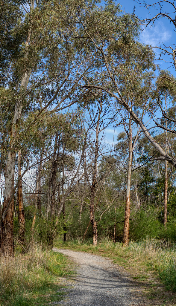
Stands of Gum trees can be hard to photograph because they are so tall. Also I was looking for examples of this isssue of showing verticality for my up coming sketch crawl (in the context of David Hockney’s observations on photography and seeing for his bigger picture series).

pencil sketch of grass seedsIn front of me on the track I was meandering along (actually doing detailed sketches, like these on the right). I looked up and in the strong Australian afternoon light was typical challenging composition, the understory in shadow, very tall straight trunks, some almost white in full sun others dark in shadow but the canopy just lacy against the deep blue sky. I know a single exposure is a recipe for blown out sky and/or blown out shadows. So I grab my little Olympus switched over to multi-bracketed exposure. I’ve been really pushing hard against Aurora HDR 2019 and hitting it with 5 exposures (-1.3EV, -0.7EV,  O.OEV, +0.7EV, +1.3EV), to see if their was notable differences in the image quality (not so noticeable in detail but possibly there is in better colour rendition) Then I did three “compositions” the path and understory the top of the understory and tree trunks and finally up above into the canopy.  Rather than holding the camera to a given exposure/ISO regime I left it in automatic so the average exposure could suit the section of image being photographed. So I had 15 exposures (saved in both Jpeg & RAW formats ie 30 files). I used the RAW files in Aurora, to start with higher dynamic range.

PA300176PA300177PA300175PA300178PA300179

PA300171PA300172PA300170PA300173PA300174

PA300166PA300167PA300165PA300168PA300169

First I ran each set of bracketed exposures through Aurora HDR 2019 and save the default tone mapped image (ie no tonal tweaking or use of “looks” (presets). So far so good. I saved them as as both .tiff (to keep the extra bit depth of colour) and Jpeg (sRGB) to show here.

PA300165aurPA300170aurPA300175aur

Finally I assembled the three tiff files using On1 Photo RAW 2018.5. I did a little rotation and cropping and exported the full image (now 4079by7105 pixel) but no other edits now as a final jpeg (back to sRGB). There is great detail in the understory and also a nice blue (not overblown sky). This combination has worked well, below is a link to the image on flickr which is the full resolution (click on it to view in flickr)

The Big Vertarama

Tuesday, October 30, 2018

Getting more colours with Bit Depth

Another area where there is a lot of misconception about colour is the topic of colour bit depth. Really there should be, because it is a simple the numbers of binary numbers (0 or 1) have to describe each primary colour (red, green, blue) in the pixel (colour channel) the more unique colours will be available (and the closer the steps between colours will be. It does not necessarily mean that a wider range of colours will be possible (ie colour gamut). This effect is most easily seen in the image histograms.

As an example and 8-bit coding system, of SRGB, gives each pixel up the 8 bits  or 28 = 256 combination. By convention zero (0) is no colour (black for that channel) and 255 is the maximum intensity of colour in that channel. When all the three primary colours are combined there are 28*3  = 16,777,216 different colours definable for any given pixel. This is often described as “true colour”. This is often called the “bits per pixel” (bpp)to describe the sum of all three colour channels and that represents a pixel.

An interesting fact is most human eyes can only perceive around 10 million discreet colours, so displaying any image in more than 24 bpp will go unnoticed.

Most modern camera, will capture images in 8 bit SRGB (24 bpp) and standard .jpeg has this bit depth. Some higher end cameras now offer other colour spaces (Adobe RGB or ProPhoto) and greater bit depth. Remember you probably will not be able to see the difference in terms of enriched colour or image quality. The extra bit depth however can be very handy for post processing and particularly when “stretching” the tonal range of an underexposed RAW file (which can often lead to colour banding in the shadows). Much photo editing and computer graphics software can handle 16bit colour and  .tiff formats can be saved up to this bit depth.

The Cambridge in Colour site has a simple tutorial of Bit Depth, including a great visualization of the effect of bit depth. The African Shutha project has a wonder summary of the topic my Graeme Cookson.

Monday, October 29, 2018

PhotoProject :: My #HandDrawnPhoto approach to #AIart

The success of the Belemy portrait auction, has encouraged me to compare Obvious’s DAG approach to my use of Google Deep Dream algorithm. Deep dream uses a convolutional (foreword chaining) neural network to find and/or enhance patterns in an image. This can be applied in two ways Style & Inception (google’s terms). The inception process tries to find the characteristics of a given object/pattern within a photo and tends to produce surreal images. Style on the other hand  seeks to put characteristic patterns back into a photo based on features the trained neural network has recognized. This is the technique I have become very interested in as a way to put my characteristic marks (and sometimes colours) back into a photo. Hence the name Hand Drawn Photos for my approach. The method does have superficial similarities to Onvious’s DAG Approach.

the pine treesPA280054Here I am using my sketch for inktober as the image to be processed and a photo of the same trees as my training image used to build the neural network (AI). The Photo here is acting like the discriminator in Obvious’s approach. The result (below) is tonally similar to the photo and kind of a messy squiggly version of something I might sketch.  But…

the pines 1

PA280054the pine treesIn this, my preferred approach, I am using the photo as the image to be modified and my sketch as the image to train the neural network and letting the system modify the photo to “find” my characteristic mark making (aka style) and modify the photo. In this case I am taking the colours from the photograph, but that is not essential.

the pines 2

I feel this second result is much cleaner and fresher, closer to something creative and artistic, Although I am strongly guiding the outcome by using my own sketches (as opposed to an automated algorithm). So the big question is “Do you consider this #HandDrawnPhoto to be legitimate AI art? I’m warming to answering yes.

If you are interested here is the link to my profile and public images on Google Deep Dream website. (Its free to join and use)

Love to hear your views,  please leave your comments here.

Sunday, October 28, 2018

The Obvious & the “first” Auction Sale of #AIart

Just a short break in the discussions of digital colour.

Pierre Fautrel, Co Founder of Obvious beside the "Portrait of Edmond de Belamy"I have been following with some interest the much hyped Auction at Christies of a the “first” AI produced artwork to be sold at auction. The expect price range was USD$7,000 to $10,000 but the actual sale price was USD$432,000 (or around AUD$612,000), That’s a lot given the picture is just 70cm by 70cm. Ok its nicely framed, but…! However I’m sure the value has been realised because it is a first and also the technology and artistic intent behind the image.
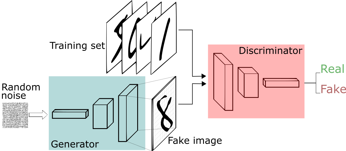
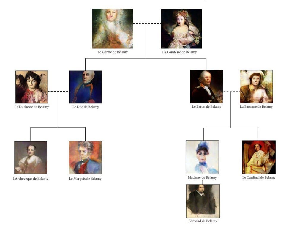
The image was produced by an AI (artificial intelligent) under a Paris-based collective of artists, calling themselves Obvious. Their object was pretty simple “Can an algorithm be creative?”. The their approach has been to carefully select a dataset of 15,000 portraits (this is a very manual step by the way) done between the 14th and 20th centuries, which showed a number of characteristics they where interested in and used this to train their AI (presumably a neural network). Next they applied a GAN (Generative Adversarial Network) whereby two algorithms compete to find and acceptable outcome. They called there algorithm the generator (which took an input of random noise and using the trained network created a “fake” portrait which the Discriminator would then rate are a real or fake outcome from the combined trained results, In simple terms the generated portrait was accepted if the discriminator was tricked that it was actually the features expected (from the training set). This stakes a lot of data processing and their images where small. So they added and additional step where they upscaled the image (again algorithmically) to imply a higher definition outcome.

In a fitting testament to the method the collective have signed the portrait with the mathematical formula of their discriminator.

If you want you learn more I suggest you start at the articles on medium at the bottom of the Obvious web site. You will also find other portaits obvious have produced of other members of the fictious Belamy family.

They name Belamy being a light hearted acknowledgement of Ian Goodfellow one of the originators of the DAG approach (ie Good fellow loosely in french Bel Amie)

Saturday, October 27, 2018

Just How Many Colour Models/Spaces are There?"

The complexity of colour doesn’t stop at RGB versus CMYK or even the traditional colour wheel. Different industries and investigators have established a myriad of others ways to express colour systems. For now it is enough to group them into 5 main groups.


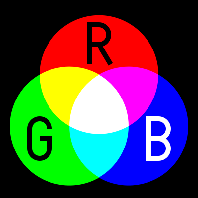
RGB, (Red, Green, Blue) is used in Camera Sensor, LED Computer Screens and Digital TV Screens, they use these three colours from light emitting or sensing technologies to produce any given colours, through Additive Colour Mixing of the light. Its not really a colour space but a colour model.

Unfortunately there are several variants and this is the first place many digital photographers can get caught out. in 1996 HP & Microsoft cooperated on developing a stand 8-bit colour space based on RGB and it was subsequently adopted as standard for monitors, printers and widely internet applications (eg Browser) and is know as sRGB. With the result that most printers, monitors and software can now correctly render this colour space. When in doubt this is the best colour space to use to avoid disappointing changes in colour and tone. In the meantime other colour spaces with greater bit deep have developed such as Adobe RGB and ProPhoto which can in theory render more colours, BUT your monitor or printer may not be able to show them.

CMY[K] (Cyan, Magenta Yellow)The CMK model is relative new, as it required intense and transparent  synthetic inks & dyes the can mix cleanly. Also the technology of Halftoning (or screen) whereby tiny dots of ink are printed in a pattern small enough for humans to perceive a solid colour, A set of separations for each primary colour was made and overprinted with close attention to properly registering the images.

These days there complex but reliable colour space converters that can take an RGB image and render it in the closest CMYK colours and these are usually built into your printer drivers. This approach forms the fundamentals of ink Jet printer technology., Older printers, including some high end larger format printers may still need conversion (or even tone separation) carried out separately. However most photo services will accept SRGB and do conversion  automatically to CMY if required.


LAB (or CIELAB) is a special colour space in that it includes all perceivable colours.   It is extensively used to compare the colour rendering and matching capabilities of a wide range of technologies and devices, particularly the CIE XYZ graph shown on the right. The L is for lightness and the A and B represent Green-Magenta and Blue yellow components but they are non linear mappings with elaborated transformation functions. However the key is the the three axes use real numbers (rather than positive integers, for bit mapped colours) so an infinity number of colours can be represented. The CIE chromaticity diagram, shown on the right, covers all the colours visible to the human eye and the outside of the convex curve enclosing the colour space show the Wave length of light that corresponds with that colour. You are likely to see this diagram when a manufacturer is extolling their virtues, aka wide colour gamut, of their new devices

Adobe’s PhotoShop has a LAB mode to allow device-independent colour.

.

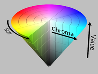
HSL or HSV, are the cylindrical equivalent of the RGB additive colour model but include the brightness of luminance L (sometime B for brightness), as well as hue H as a radial measure and saturation S as distance from the centre. The system was originally invented in 1938 by George Valensi as a method to add colour to and existing monochrome (L signal) Broadcast (see also below how this might be encoded). The V in HSV stand for value and in the variant of the colour model to top of the cylinder is white and the base if black and may better represent how paints are mixed. It is frequently represented as a cone. This model has been widely accepted and applied in most image editing and computer graphic applications and
YUV,  of Y’ (luma) UV (chrominance) is a technology that was widely used in analogue colour TVs , PAL Digital and some movie formats. Its original begin when B&W analogue TV was being upgraded to colour. The Luma channel is exactly the original Black and White signal. The colour channels  U & V utilize the fact that the green sensitivity of the human eye is somewhat overlapped by the red and blue cone receptors and therefore the signals bandwidth could be reduced by not transmitting the green information.  The original TV engineers, following VAlensi model,  brilliantly worked out that rather than use absolute R (red) and B (blue) they could send the U & V the difference from a reference average and tell the TV to just shift the colour of a specific pixel without altering its brightness. Thus an older B&W TV which could not decode the difference signals would just how the normal B&W picture, thus avoiding making older TVs redundant!  When you use the yellow plug, composite video, you will be using some variant of Y’UV. Standard Digital PAL and HDTV also use modern variants of this colour encoding method.

If my very limited description has confused you Cambridge in Colour has a great article of visualizing and comparing colour spaces (well except they use the color spelling)

Now for the really interesting part, many of these colour system describe colours, that we can not see, our cameras (even the expensive ones) cannot differentiate or cannot be reproduced either on our computer monitors phone screens or inkjet printers. In fact most devices have a limited capacity to reproduce colours, and the range of colours they can produce is usually referred to their colour gamut. More on that to come in future posts.

Friday, October 26, 2018

Building a Digital Colour Wheel

PA260003Most of us are familiar with the conventional colour wheel. It is the colours of the rainbow wrapped around and joined at the purple/violet segments. It normally shows 12 colours, the primaries (Red, Yellow & Blue) then the secondary colours easily mixed from those (Orange, Green & Purple). Finally the six tertiary colours mixed from the adjacent primary and secondary colours. Whilst many people instinctively know a harmonious colour scheme (eg red & green, Blue & Orange, Yellow and Purple) They might find it difficult to describe why. The tradition colour wheel can come to the rescue here, colours on opposite sides of the circle are called complementary, beside each other are call analogous, In addition if one of the complimentary colours is left out but the analogous colours either side of the missing compliment are present then this is described as a split complementary. All these combinations are know to be harmonious (and desirable for an artist, photographer, home decorator or fashion designer). The colour wheel is very useful and you can read a bit more about Basic Colour Theory at Color Matters.

PA260004PA260002

Some complications arise when you start to look at how cameras and TVs work. They use a three colour palette RGB (Red, Green & Blue). This doesn’t fit onto the traditional colour wheel very well (first image below). These three colours are also know as the additive palette. These three colours do work well in terms of how our eyes (specifically the three types of  “cones” in our retina) recognize colour. A lot of people not familiar with this system are very surprised at the lack of yellow, but if you add red and green light sources you will see yellow. Things get even more strange when you consider the approach developed by traditional colour printers (including your ink jet printer) which use the  CMY [K] (Cyan Magenta & Yellow) subtractive palette. The K in square brackets stands for blacK, as printers find they need a true black, because a mixture of magenta, cyan and yellow inks or dyes tends to be a muddy dark grey and leaves images flat. Black is not really a colour, but I wish to avoid the argument on that for now. It is even harder to fit these colours on a traditional colour wheel (there is no matching segments for Magenta or Cyan for a start). You can read a bit more on the RGB & CMYK colour systems at Colour Matters.

Trying to fit the RGB coloursTrying to fit the CMY colours

This is the point where I decided to combine these two palettes, and form 6 new primary colours. I’ve since discovered I’m not the first to have attempted this (eg see Warren Mars website) and this configuration is often known as the modern or digital colour palette, sometimes even the RGBCYM[K] palette.

Formulating a Combined RGBCYM paletteThe New Digital Colour Wheel's 6 primary colours

You can then fill in the intermediate segments with new secondary colours to get a simple 12 colour wheel again. Amazingly if you employ the idea that opposite colours can be complimentary or adjacent colours analogous and you find they are also harmonious. What is going on here is the traditional colour wheel wrong? Perhaps for both their photography and printing aspects digital photographers might be wise to adopt or at least consider this new colour wheel. I will be discussing many of the issues for digital photographers in coming blog posts.
The New Digital Colour Wheel's 12 primary & secondary coloursThe Colours offered by Adobe

The very last image shows the colours Adobe Photoshop and Lightroom give you control sliders over. I’m still no closer to being able to explain this colour selection.