Sunday, August 31, 2014

ThePatch :: Toy on Parade in Nature

Meet Blue Lego Guy (created with Lego Digital Designer)The patch theme this month is Toy On Parade, and the same toy needs to be in each photo. After having fun with my grandson making the automobile awesome motion gif earlier in the year I figure this was a challenge made for a bit more lego fun. If you have seen the lego movie on DVD and watched the special features you will have seen one of the designers describing some of the designs He is using a program called Lego Digital Designer, which can be downloaded from Lego. The models for the lego movie where largely developed with this easy to use CAD like program. It can be a little daunting (if your older than 6), it has a database of every lego part there is!  I quickly realized it does give me the ability to create a character that could be easily pose & animated. Perfect for this challenge, assuming a virtual character can be on parade. My young lego advisor loved the project and wisely helped choose a very simple character with which to build some adventures and hopefully some good photos. Meet Blue Lego Guy.

blue wren & blue lego guy in Paint.NET LayersHis first adventure in Nature, clearly was to be based around a small blue wren I had seen and photographed at a Jells Park lake on Friday. With some head scratching, even reading the manual and using the layers in Paint.NET I was soon able to acquaint blue lego guy with the blue wren.  Ok not so convincing and I liked a different photography anyway, with some raindrops on the grass around the wren but with depth of field giving a more blended background onto which to superimpose blue lego guy. A little bit of posing adjustements back in Lego Digital Designers and adding a camera, yellow of course. Getting convincing perspective was a bit of a challenge and I had to wing that in the end as well as guessing the relative height he might be.  A little bit of cloning to put a couple of blades of grass in front of his legs and some suggestions of shadows. Finally a cinematic wide screen crop.
Voilá ….Smile Mr Wren!


Preview of blue lego guy at work


Wasn’t so hard after all. Stay turned for more Blue Lego Guy adventures.

Saturday, August 30, 2014

Taming duplicates

I have had the exclude duplicates item ticked on my picasa imports by default, for the longest time. This helps avoid a lot of duplicates turning up because some photos where left on a card or a phonephoto was uploaded via wifi more than once or via different services, However because I now have my photos flow across several computers and software packages it is surprising just how many duplicates do turn up. So I have also been using a neat little utility program from digital volcano called duplicate cleaner, which is design for all file types but does work very well with media files like photos, video and music. The biggest feature of this cleaner is that it can recognise the same file contents, even if the name is changed. If the file is a jpeg and has been post processed it will be considered as different. Also if the jpeg has been rescaled it will also be considered different. This is fine I probably want to keep these,

During and particularly as I reach the end of the month I move my photos from the collection points (laptop computers) onto a backup drive and it is at this point that it is most useful to run the duplicate cleaner (if you have a lot of files it can take a while …so go get a coffee). After this I then copy the backed up files to the archive drive and make my DVD/CD backup set of the archive (this is my one remaining traditional backup, everything else is now on portable hard drives). I don’t delete the photos on the collection computers until I have finished the backup –> duplicate clean –> Archive cycle. The very end of the month is the right time to do this.

Friday, August 29, 2014

PhotoFriday :: Warmth


For PhotoFriday‘s topic Warmth

The truth is out there

I not sure how many times I have heard good photography (including my own) dismissed as faked in Photoshop. Further I’m also not really a fan of a lot of the on-click Artistic apps around. However there is definitely a place for intelligent post processing, in the whole process of art  –> graphic art–> photography. By example is you shoot RAW it is almost certain that you must undertake some post processing to get an acceptable image. It is just unfortunate that fakery seems to dominate people perceptions and photoshoped has become such a disparaging adjective for a photo.

The cartoon is a golden oldie by Aaron Johnson, and his work a quite photocentric you can see more of the duck here.

Source : As seen on PetaPixel, via Mosaic Lightroom Newsletter

Thursday, August 28, 2014

PhotoProject :: How to Photograph Nothing

I just read an interesting article in The Artist Magazine by Paul Talbot-Greaves titled “How to paint nothing” (January 2014), in which he comments,

“Many people have said they probably wouldn’t notice the subject in one of my landscapes and would probably walk straight past the scene, … So just how do you notice a composition of nothing?”

There is a video of Paul painting a watercolour below (it is speed up but takes just over 10minutes, and is well worth watching to see how he uses a simple colour palette and strong tonal shapes, lines of the river, skyline and a few trees to quickly build a wonderful yet conventional landscape composition). Unfortunately a well meaning (and probably very experienced) photo critic would suggest his landscape needs a red canoe with the canoeist in a bright yellow life-vest positioned at the first bottom “thirds point of interest”, but he would be wrong it doesn’t need to be like that (ok it might be if you want to win the camera club photo of the month and he is judging!). It needs the artist eye to see the colour, composition and tone! That’s all.

I am inspired to apply his insights into the photographic process. One in particular is that  “compositional designs are best when strong lighting is involved”, for example using shadows to create exciting negative shapes and add dimension to an image. Paul also is attracted to “the bright, high chroma colours against darker muted tones”

So over the past couple of days I have been quick to pick up my camera whenever I see that strong light variation and strong colours against shadows, and particularly interesting shadow patterns. My photos of nothing setDid not really matter what the subject was after all it is a photo of nothing, I was just looking for the right lighting ambience, boldish colour and shadows.

This set of images (on the right) are simply of the shadows of a potted yucca plant on my partly open patio doors. I was sitting enjoy a coffee in the sun at the time. I had the foresight to include an EV bracketed set of exposure, so I sent that set off to Google+ Autobackup and this time they did return a decent *HDR autoawesome, but the composition, as shoot, was a bit boring. Also it had a few damaged leaves on the yucca and they were an unnecessary distraction. My favourite tool to fix composition in any photo is the crop tool, It is normally a simple logo of two opposing L shapes, occasional with a curved rotation arrow. Google+ photos has some good edit tools on-line and the crop tool (shown below) has a feature to control the ratio (aspect of horizontal & vertical axis) to keep the crop within given standard size combinations. There is a separate icon at the top of the panel on the right to do any rotational (straightening) adjustment.

Google+ photo crop tool

I have not bothered about the rule of thirds of any other compositional rule, I was looking for a pleasing combination of colour and shadow and I like the contrast of the vertical door frames and the angled shadows with their lost and found lines feel. An image like this is a great place to experiment with all sort of crops, so don’t stop at your very first try. The wooden door handle on the white door frame is a little distracting but I have not managed to find any cloning tools in Google+ Photo so I have had to downloaded the edited image and then take it through OnOne’s Perfect Enhance 8. Perfect Enhance has a really magic Perfect Eraser which is content aware and does a both quick and reasonable job of removing the handle. Finally I add a big softy vignette.

Final photo of nothing

So the exercise of photographing nothing can be rewarding, and encouraging both seeing more like a painter might but also forcing some creativity in you post processing (in this case perhaps a little more abstract albeit more thoughtful cropping).

Sunday, August 24, 2014

PhotoProject :: Straightening Out

There is nothing wrong with photography, if you don't mind the perspective of a paralysed Cyclops.” - David Hockney
I believe what David is highlighting here is that the camera’s view of the world is from a single lens with a specific perspective. We have two eyes and “see” a much richer three dimensional worlds and our vision can be influences by our expectations. For example when we are dwarfed by tall trees we know we are surrounded by autostitched panoa strong vertical world. Our camera however see a more curved representation (depending on the zoom) and we will probably notice wide angle views tend to show curves where we expect strong vertical lines. For this reason many architectural photographers go to some extreme length with special cameras and lenses to overcome this perspective distortion. The Tilt/Shift lens being very popular because they do allow control of this distortion. A number of tilt/shift filters are also now becoming popular because they can be used to create the effect of looking at a miniature world.
The zPerspector dialogueIn this vertarama, made from three *HDR photos (created by google+ autoawesome) you can see the trees enclosing over me as the camera moves higher. Ok this is pleasing in some respects but I want to show the strong vertically of these pines, so I have Tried out a plug-in for after-shoot pro called zPerspector. There are a number of similar perspective adjustment plug in fro Photoshop, gimp & even paint.net. The all perform varaiable scaling  and/or warping to adjust the image. zPerspector has a very easy to pick up approach where you can stretch and pull at each of the corner edges of your photo to thus arrive at the expected view. In my example below I am not trying to get all the trees straight and vertical (because they weren’t really) what I was looking for for trying to reproduce the strength of the trees towering over me as I remember it.
in the pines pano after striaghtening out

Saturday, August 23, 2014

A Better way to post Google+ Photos in Blogger

The Insert Picture Dialogue in BloggerThere is another way to get your photos from google+ photo into blogger, that gives you a little more control, thanks to a relic from picasa web album days (picasa web album is now google+ photos). If you look inside the new post screen in blogger and click on the insert picture icon, you see the dialogue window (shown on the right). The third item lets you insert from a picasa web album, but here is the rub, you may not find any recently uploaded photos, They must be in an album. This means you have to nominate an album when you upload the photo or Move the photo from the general date based Auto-back or The Move & Add to album dialogue in Google+ PhotosAutoawesome areas into an album (you can create a new album in that move operation if ot doesn't already exist). I don’t think you actually move anything you just create a link to the photo from the album view. (Yes it is pretty obviously smoke and mirror stuff). Thus avoiding the duplicate comments/posts issues I have struck using the share/embed approach from within google+ photos. Once your photo has been posted it also shows up in an special extra Photos from your Post album. The image of the frustrated dog chasing his tail is getting stronger!
Yes, yesterday was magnificent!

Friday, August 22, 2014

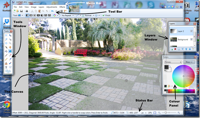
The Anatomy of the Paint.NET Workspace

It may seem strange to include paint.net in my Photographic Workspace Series. Originally intended as a free replacement for the Microsoft Paint, it has grown into a powerful yet simple image and photo editor tool. It is still supported by the original developer (who appreciate donations to help enhance the software) and an active community. The outstanding aspect of this very useful little program is its simple and intuitive to use and a nice introduction into the power of image manipulation. It supports a wide variety bitmap formats (but not RAW formats) and offers all the basic manipulation tools and also has the ability to work with layers, including a number of ways to blend them together (a very good way to familiarise yourself with layer methodology before jumping into more challenging to learn software such as photoshop).

image
The main workspace, which is called the canvas, has a menu and a tool bar above the canvas and a status bar below. The tool bar has two layers, the upper layer is for the most common actions and the lower layer is context sensitive for the current tool you are using. Unlike a lot of other software paint.net has several floating panels (or windows) that can be positioned anywhere on the screen. These can be toggled on and off using the small icons on the upper left of the screen. The three most useful panels ate the Tools window (where you select the tool you wish to use), the Layer windows and the Colour Panel.

In the example above I am using a gradation layer to modify the photo on the canvas. However I most commonly use this program to annotate screen captures, photos and diagrams, using the text and arrows (also shown above).

Trying to get Google+ photos into blogger


Whilst I can embed google+ posts (as shown above).

It is somewhat disappointing that it is not easy to grab a simple link address for posting a photo. It is also a little distressing because the embed code doesn't actually show anything on your blogger new post page. The really distressing part is this method of embedded posting then also triggers a duplicate post back in google+, but without the image (because it is now considered two small!) The duplication doesn't end there it also adds a comments with the same text as in your post to your posts. I have an image of a disoriented animal chasing its own tail. There is a better way, but still with a bit of tail chasing.

The photo is actually a Google+ *HDR, but I will admit the afternoon did have wonderfull light.

Thursday, August 21, 2014

ThePatch :: Kitchen/Let’s Eat

This is the last of the patch themes on the kitchen and simple captioned let’s eat. I had already figured out in the ingredient challenge that there is a fair bit more to photographing food than a simple set up and snap. Perhaps I can become a food blogger after all.

In search of Colour &/or Composition

My first investigation was colour, more specifically the impact of the background colour on the richness of the food. No surprises here, the background colour has a big impact! But which smoked salmon roll looks the tastiest?
_IGP5972  IMGP5967  _IGP5970_1
My next thought it I need to add something to Strengthen the composition, more dramatic positive & negative spaces or maybe just simplify the subject matter?
`  `  IMGP6006-Edit-001

Over-cooked with HDR

IMGP5968-HDR (1)-001  IMGP5979-HDR-001  IMGP6009-HDR (1)-001
I thought I would also try out some more HDR, the google+ autoawesome variety (above) and also even using HDR Camera (below) on my android phone (to consolidated the food blogger feel), They are snappy but I’m not convinced that the clinical sharpness and strength of HDR dynamic range stretching is how I like to see food, I think food needs to be gooier and softer, perhaps even with a warmer glow.
2014-08-21_13-12-51_HDR  2014-08-21_13-17-39_HDR

Some Pop Art Inspiration

I am still reading (and enjoying) Beyond Digital Photography. It has a chapter of using pop artist as an inspiration for a creative photo manipulation. Personally I find Andy Warhol’s Campbell Soup cans pretty boring and mundane (but I believe that was his point). I do like both Wayne Thiebaud and David Hockney’s food still-lives, but neither really considered themselves pop artists. They both use simple colour and shadows to help the form and composition so I figured I needed to get outdoors, to stronger light. My first objective was to use fewer colours and the technique usually call posterization let me limit the palette to just 7 colours. Yes that gave me an “arty” look but it was very dull (and contrived) so I just upped the saturation and contrast (ok a little harsh) so I use layered compositing and masking to add some detail and tone down selected areas with a semi translucent (lower opacity) using OnOne’s Perfect Layers. Success! I like the result it is ambiguously between a photo and something an artist might paint.
Original Photo Posterized Version Heavy on Saturation_IGP6024-002

This technique does required a few steps and jumping between programs. I did like the shadows on the wooden table in a different photos (without the place mat) so I ran that through the method again, with a less heavy hand on the saturation on the posterized layer and more feathering of the opacity between the original photo layer and the posterized version (see below)

Its a slice of banana, nut & chocolate cake with some strawberries & greek yoghurt, was delicious!


The Moral: I’d probably rather eat the food, than delay the enjoyment while I photographed it.
However using this as an art inspired challenged was fun.But enough playing with food.

Monday, August 18, 2014

The Anatomy of the Corel Aftershot Pro Workspace

This is a wonderful little program (it is about 1/8th the size of Lightroom) that is a repackage version of the popular raw image enhance post/processing program Bibble. It is very much in the shadow of other non destructive photographic management programs, particularly Lightroom. However I think it deserves better exposure particularly for less committed and/or new photographers. It is also worth considered as a fast pre-processing of raw photos (ie before loading into Lightroom Catalogue). As well as being fast it is easy to pick up. Hopefully a quick walk around the workspace and you’ll be ready to use the software in earnest,
anatomu of aftershot pro main screen with labels
The biggest difference with Lightroom is that everything is referenced from one screen, there are no different modules to move between. This has its good and bad points but screen real-estate becomes very important because a lot of options are available on the screen.
anat aftershot basicHowever editing a single or group of photos is very simple. Click on the file system tab on the left hand side and the browse through the file system navigation, to select the folder (sub-directory) containing your photos. Then scroll through the thumbnail and select your photo which will be displayed in the centre of the workspace. Now you can use the tools on the right hand side of the image and the standard Tab. Which contains most of the basic adjustments is normally display at the top of the list of tool tabs, there are a few extra tools to crop and rotate the photo on a toolbar below the workspace and some metadata and ranking tools on the tool bar above the works space. You can also easily add keywords (and keyword sets, found over on the tool tabs), making sure your photos are easy to find. You can easily save this in standards XMP file to load into other programs like lightroom.
anat aftershot colour plug inIn the example here I have just used aftershot pro to do a very of very standard enhancement (well my preferred ones) which involve a little bit of tonal adjust to lift the highlights a little and deepen the shadows, then ticking on perfectly clear and a touch of vibrance, Because the sky is a little washed out I have use the colour equalizer (a free plug in I’ve loaded, found at the end of the tool tabs) to reduce the luminosity of the blue (which deepen the blue sky). All done with a few clicks on a single screen.


ThePatch :: Kitchen/Liquid & a Bit of Science

_IGP5885-MOTIONThis weeks theme for The Patch is Kitchen/Liquids and I realised there was the perfect opportunity to combine a quintessential kitchen item (the kitchen sink) with a bit of science, specifically the Coriolis effect. The theory really applies to large scale fluid movements of the earths surface due to the rotation of the earth (ie weather and ocean currents) but it is widely held view that toilet and sinks flush anti-clockwise in the northern hemisphere and clockwise in the southern hemisphere, which they often do, (but not always, read the wiki article in the link above for more details). I first tried just water, and it was in fact clockwise but subtle and  difficult to photograph. I then added some soap bubbles, better but still under whelming and finally resorted to some burst mode images and a google+ *motion autoawesome (shown above right) Ok it is not awesome because it has combined across some burst sessions. Such is life.

coriolis0001So it was back to the drawing board. The idea was to have a series of almost self reference style repeated images with a slightly rotated positioning between each photo. I like the idea of letting each outer image becoming a little paler on each step.spin coriolisThen I wanted the innermost image to be moving, just enough to see the rotation. All sound simple enough but I’ve been down many dead ends and learnt a lot, but it all takes time and the deadline for posting is approaching, I’m happy with the outer spiral and using white borders and I am starting to get the overall design to work but I just can’t figure out how to get the inner photo to work as an animated gif.

So I’ve run out of time and I’ll have to compromise, just using a very cropped version of my burst mode photos to recreated the animated gif. At least it does show my kitchen sink is happy draining clockwise.


Saturday, August 16, 2014

PhotoFriday :: Into the Abyss


into the abyss
not the film, more into a deep reflective dream


For PhotoFriday‘s topic Moody

Friday, August 15, 2014

More Milky Way Mapping

milkyway pano 2

This is quite a large segment of the milky way, now largely overhead. It covers from almost the northern horizon to well over head. Made of 5 photos combined with autostitch with auto straighten turned off. (The image below has it turned on)

milkyway pano 1

Tuesday, August 12, 2014

PhotoFriday :: Behind the Veil of Gaia

Returning to the theme of the Veil of Gaia as an art project,
the scratch illustration is loosely based on Botticelli's Venus
For PhotoFriday‘s topic from Nature.