Sunday, March 31, 2013

Returning to a bit of novelty

Dumpr has always seemed the more creative of the online photo montage/filter sites (ok photofunia is also good and somewhat more face/portrait oriented) but I noticed they are no longer showing the decorated easter eggs filter on their menu.

Don’t worry it is still there, you can still create the photoeggs via this direct link www.dumpr.net/easter-egg.php. However they are now charging non-members to download their creations, so it is worth joining (its free!)


the sunrise - easter egg collage

Friday, March 29, 2013

Vert-o-rama in three versions

autostiched pano with extra saturationshe oaks collages from picasaHDRi version
This was a welcoming little alcove within a mature stand of sheoaks [Casuarina] beside the jells park lake. Because it was a closed-in area it was hard to comtemplate how to show that in a photo. I decided to do a vertorama, which is just a fancy term for a stitched panorama combined as a vertical strip rather than the more conventional wide horizontal format. I also decided to try this in three ways, firstly as a autostitched panel (left hand side), then as a ”joiner” style collage (center panel) even a HDRi version (right hand side).

Thursday, March 28, 2013

PhotoProject :: Artfully Colourings

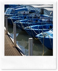
IMG_9740-originalI’m continuing with the colour and filter themes, probably to the extreme, by investigating ways that a fairly common theme for painters, moored boats, is tackled by “artistic filters” in some common photo manipulation packages.  In general terms I really don’t like the one click “artistic” offerings in any software packages. They really don’t address the issues of composition, colour harmony and creativity as an artist’s eye would bring to the transformation of the photo into an artwork. So I looked at this project with a more aesthetic eye and beginning with something an artist might like to paint. There were a few tweaks in lightroom and direct export to the software (using the photo/edit in option) but I then only used the one filter in the destination package. Perhaps with a little slider adjustment on the filter concerned. The only exception being in corel’s painter essentials, which generates the work as a series of brush strokes that need to be “stopped” when a pleasing effect is reached. Perhaps I have been a little harsh in my judgment of these one click wonders. But is it even close to art?
IMG_9740-Edit colour pencil
IMG_9740-Edit-watercolour
IMG_9740-Edit-modern_Painting
Adobe’s Photoshop Elements
Coloured Pencil
Corel’s Photo Paint
Watercolour
Corel’s Painter Essentials
Modern Painting
.

Interesting Lighting


interesting lighting, originally uploaded by imageo.
This was an experimenting with flickr's new mobile app in conjunction with the share facility on android, to both post to flickr & blogger at the same time. It certainly uploaded the photo easily, and posted the blog post but I had my phone in landscape orientation and the uploaded photo was rotated 90 degrees to what I actually wanted (on my phone I just rotated it naturalyl so I wasn't aware of this)

A dark sky, a gap in the clouds and strong side lighting does make for very interesting photos, even of a shopping center car park! I unusually didn't have either of my DSLR's handy but HDR Camera+ on my phone did a nice job and let me test out the new flickr app.

Splashing Colour on your Smartphone.

created with ColorSplashFX on my android phone
When it comes to colour manipulation on photos of course “there is an app for that”, in fact there are many. Here are a few fun android apps to try. Of these three I liked colour splash FX best, but in the end they where all a bit frustrating to use. The colour splash promotional video below is fun and worth a look.

Color Splash Effect


If your screen is small, your fingers are too big and your aging eyes growing dim these smartphone apps won't be for you either!

Wednesday, March 27, 2013

PhotoFriday :: Candid

blow that horn
For PhotoFriday‘s topic candid shot

Selective Colour through masking in Photoshop

I actually don’t have photoshop (I do have Photoshop Elements, which i don’t use much) but I though I needed to include reference to using photoshop and layers to achieve a similar colourization to the post yesterday. The basics are very similar, desaturate the image and in this case using masking bring back the selected areas of colour you want.

There are dozen of YouTube videos describing this process but this one is simple and easy to follow. So like yesterday it is time for you to have fun, follow the proces in the video to start but experiment and be creative.

Tuesday, March 26, 2013

PhotoProject :: One Colour at a Time

Adobe Photoshop Lightroom - Develop Module show onOne presetsThose that know me may realize I tend to stay away from the latest trendy filters, those zany pre-sets or must-have, over the top plug-ins. My reasoning is that everyone's fashionably filtered photos then tend to look the same-ish and I’d much rather work out my own post processing style and look a bit different. However there is one technique that a lot of folk ask me about and that is taking an image back to black and white but only highlighting one colour (or maybe a couple) there are actually a number of ways to do this so I though It might make a good series of  photoprojects to follow through a couple of examples. The first and easiest way, is actually to recommend that you  look at some presets in Lightroom, onOne offer a number of lightroom, photoshop and aperture plug-ins and presets. Their prefects effect 4, set of lightroom presets are free to download and includes a neat single click set of “hand tinting” functions. See a few of these hand tints below.

onOne Hand Tinting-Blue onOne Hand Tinting-green
onOne Hand Tinting-Yellow onOne Hand Tinting-Red

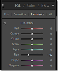
This is all extremely easy (and fun) but it is actually pretty easy to make your own colour filers using the HSL,Colour, B&W group on the develop menu in lightroom. In this case I’m using the HSL (Hue, Saturation & Luminace panel) and I have destaturated all but the colours green, yellow,aqua & blue, So these desaturated colours are greyed but the colours I selected remain. Time to have some fun with colour, one colour at a time.Adobe Photoshop Lightroom - Develop Module showing HSL sliders

What is the future of Picasa?

I have been waiting a while now for Google to announce the shelving of Picasa, dreading the announcement is probably be a more accurate description. I’m pretty sure that there will ongoing support the uploading of photos, because there are just so many users. However it is likely that the web side of things  will become rebranded as Google+ Photo (I don’t have a source for such a rumour but its pretty much openly discussed and there is already a thing, code named pulsar, see the last paragraph).
If you hadn’t already noticed (and I can not find any official notification) your picasa web album is being “redirected” to an equivalent Google+ album. The google album layout is different and much “cleaner” but you will loose a few nice features, like number of views counter (not available in google+ photo view), being able to select the way you licence the sharing of your photo (ie full copyright or one of the creative commons licences, are not displayed under the google+ photo view) and the ability to share with someone else by email (this is replaced by sharing to your circles in google+ photo).
At the moment you can review your photos under both the picasa web album format and google+ format,  I’m fairly convinced that the photos are in the same location it is just the way you view them that differs. Alternatively if you use chrome, there is still a free picasa chrome app on the google web store that will show your on-line photos in the older picasa web album format. Finally if you view your on-line album via the following link they will also be in the older picasa web album format.
https://picasaweb.google.com/lh/myphotos?noredirect=1
The first downside of the revised google+ approach is that anything you share with others can be tagged by them and further shared.  You do get notification of any tagging but not the sharing. Unfortunately this is basic social network behaviour, most other social web services do the same BUT this really negates the idea of being able to confidently share a photo in private, as many celebrities have found out the hard way. So if you are worried about privacy just don’t share your photos using any social networking tools (facebook especially, but twitter & google+ included).
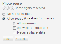
imageThe second downside from my perspective relates to the terms of reuse of the photo, which had its own little display and dialogue area at the lower left beside the photo in the Picasa web album view. Whilst the google+ photo view shows nothing, and I suspect most social network users will then just assume if you share a photo it can be reused. So here is another warning if you are worried about copyright of your work, don’t share your photos using any social networking tools.
There is one clear upside to working through google+ photos, it will instantly increase your storage capacity, by default it resizes and uploads at a 2048pixel width. For this size and smaller your storage is free.
I’ve had a look at some screen shots of a candidate for an upcoming google+ photos app for chrome (aka Pulsar), Thanks to +Francois Beaufort for the details of how to get it. I did try downloading the code but got lost in the java script errors. So I’ll have to wait. Looking at the screen captures of the interface, its looks very clean and simple but oriented to storing your photos on-line.  I am not sure that automatically upload all or “your best” images to the net is what the current picasa users really want. They probably are happy with a desktop application that does a good job of managing their precious photos (privately on their own computer). By the way, you can still (at the time of writing this)download the PC version picasa for free.

Monday, March 25, 2013

PhotoProject :: Colour My Day

purple blue green yellow orange red

Over the past week I have been trying to take a coloured themed photo each day, and it was harder than it might seem. Yet colour is everywhere, pretty much anywhere with light starts to deliver a spectrum of wavelength that we see are colours. The photographic challenge here was to see those situations where one colour dominated.

Saturday, March 23, 2013

Towards Blue(r) Sky(s)

Original (Polarizing)

Increased Saturation

Decrease Luminance

original taken with polarizing filter After Increased Saturation After Decreased Luminance
The light in summer here in Australia is very intense and it is really hard to get a decent blue sky. So I normally have a polaroid filter screwed on the front of my camera from November to April. The filter works a lot like the sun glasses, at different angles they will filter out and cut the intensity of the light. By rotating the filter you can see the darkening. As well as helping darkening the blue of the sky versus gulls or clouds, the polaroid can also work like a mini neutral density filter, to give you a slightly longer exposure on some landscapes. The common approach is just make the sky bluer by increasing the colours saturation.
blue sky saturation

In Lightroom you’d go to the develop module and slide the saturation slider to the right. Notice the gulls beak is also a more intense yellow
blue sky intensity
This is a less obvious route, In Lightroom you can go down to colour adjustment and in the HSL tab go into the Luminace panel and hold back on the blue a little. This just darkens the blue only and leaves the tonal range and colours on the gull untouched.

Red for Red

IMG_4015-3

Friday, March 22, 2013

Not a Flower


Bougainvillea in the morning light. There are two interesting things about this plant. First the bright "petals" at the end of new shoots are not flowers at all, they are juvenile leaves, the actual flowers are the two very small white/yellowish dots (you will need to zoom in). Second whilst it is a tropical rainforest plant it isn't from New Guinea or Bougainville Island. It was named by a grateful botanist who accompanied Bouganinville on his circumnavigational voyage of discovery. The thorny but colourful plants originate in South America.
 Posted by Picasa

Thursday, March 21, 2013

Photographers are busy little bees

IMG_0465-3Photographers are in general very “busy bees”, wandering around, eyes pressed on the viewfinder or looking at the LCD screen. Then moving a few steps and performing the steps over again, a few steps back, click click, a few steps to the right, click click… Sometimes when there are a few cameras and photographers around there might be an unspoken contest “Mine is bigger than yours” Such is the happy life of a photographer.

Purchasing My Photos

In reviewing new apps in the flickr app garden, I saw a link to PrintedArt. They are a USA based photofinishing service that offer direct access to the best available printing technology for a unique, modern display format on materials such as aluminum dibond, acrylic, museum mounts and canvas. As far as I can make out it was in the app garden primarily as a simple way to order your own version high end prints from flickr. . The production costs and shipping are also high end but reasonable within that context for North American and European Purchasers. The service also offer printing via picasa, smugmug and studio sign-up, so I’m expecting it could be very popular with professional photographers and enthusiasts alike. They also offer curated collections for those wishing to purchase “off the wall” photos/art. A very snazzy feature is being able to see the image on your own wall before you purchase, using the augment app on your iphone or android phone. A see it on your wall button helps printout a QR code. Point the phone at the QR Code on wall where you want to hang the photo and using augment reality technology there will be the selected photo scaled and superimposed on your wall for you to assess.
I haven’t filled my PrintedArt Photolab space with lots of images (yet!). However I will start by offering anything from my blog or flickr that you like, for sale through this service, Just email the details and I can set up the photo so you can get it printed at the quality it deserves.

Wednesday, March 20, 2013

Leaves are…

GreenGreenerGreenestgreen title

Stop ASKing

Iimage’m becoming a bit annoyed at those third party junkware things, that hitch hike on other useful stuff and sneak onto your system. I was looking at some the neat animations on the space weather site, suggested in the previous post, and got warned to update my version of java. Ok that's easy enough! Then horror of horrors, ask.com has weaselled it way onto my standard toolbar and a more prominent toolbars of its own beneath that. The problem is under chrome I can not unclick the enable box The_Donbotin the chrome extensions for this unwanted toolbar, unlike most after apps I have.  This toolbar can only be uninstalled via the control panel, ie Windows Start Menu > Control Panel > Programs (Add/Remove Programs for older versions) > Programs and Features > Select both ask toolbar and Ask updater and click "Uninstall".

Damn you third party sneaks!

Genie, ….in a box & the nightsky

How about this for a remarkably clever little device.

Thanks to +Trey Ratcliff, at google+ for the heads up on this. You can contact the NZ makers at syrp.co.nz

I’ve been out a bit the past few nights just hoping for a glimpse of the aurora austarils, as there have been some extreme magnetic storms occurring, the Australian weather bureau actually have a great space weather forecast site. No luck on that aurora front in Melbourne though, but I have managed some interesting long exposures and was even contemplating how to make a time lapse sequence of the night sky. (Now I realize there might be an easier way, with the help of a little genie, plus the near $1,000 price tag!)

Southern Cross as viewed from Venus Bay  Southern Cross as viewed from Melbourne  Southern Cross as viewed from Venus Bay