Showing posts with label colours. Show all posts

Tuesday, July 16, 2024

The Dilemma of "Bully" Colours in Watercolour Palettes


As I mapped my watercolour pigments onto a hexagon grid, seeking to merge colour systems from RGB and CMYk to the likes of Ostwald and Munsell, I noticed an interesting pattern. The warmer colours (yellows, oranges, reds) spread out more on the grid's edge, while cooler colours, blues and greens and even deeper reds and purples on the outer sections seemed to merge in tone and hue.I wondered if this was because I had picked the darker richly pigmented “bully” colours? Those strong staining colours that look so overwhelming straight out of the tube.  

This observation led me to two questions:

1. Do I have enough variety in my blues, deep reds, purples, and magentas?

2. Should I retain strong, staining "bully" colours in my basic palette?

To address the first question, I experimented with new colours during a trip to Queensland. I bought some extra colours shown here that I added to my normal palette using little half pans stuck in with bluetak. I was particularly chasing tropical colours and I also wanted at the same time to try out a couple of MaimeriBlu colours. My choices were  good. This exploration will be covered in a separate post.

The second question about "bully" colours like phthalo green and blue is more complex. These intense pigments can be powerful in mixes but require careful handling. 

They offer several benefits:

1. Desaturating complementary colours while maintaining harmony

2. Creating strong contrasts when used sparingly with analogous colours

3. Adding warmth (Quinacridones) or coolness (Phthalos) to mixes

4. Achieving split-tone effects, like warm highlights with cool shadows

Instead of discarding these pigments, I'm considering using them as mixing aids rather than relying on convenience colours like naple's yellow or sap green or any of those gorgeous pigments you may have impulse purchased but seldom used. This approach might help create a more nuanced and harmonious palette.

Thursday, March 26, 2020

Indoor #photoassignment :: Chasing a Rainbow of colours


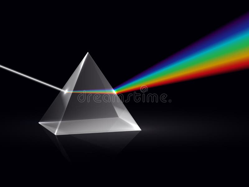
This is a week-long assignment for those confined inside (ie roughly half your self-isolation period). Issac Newton suggested there were seven colours in the spectrum/rainbow of colours he could split daylight into using a glass prism.

They are Red, Orange, Yellow, Green, Blue (a lighter blue a bit closer to cyan) Indigo (a darker blue) & Violet. Each day select one colour and find a place or object around your home that is full of that colour. (Hint you might be doing a lot of close ups). The colour need not be vivid it could be a paler or pastel shade it just needs to convey the essence of that colour.

A  lot of modern renditions of the rainbow only show 6 colours. Which colour have they left out?

If you don't have a glass prism handy and want to show the kids how light can be broken into a rainbow of colours. Find an old  CD, DVD or BluRay disk and look at the underside, it has a defraction grating built in which acts like the prism for the laser reading the disk. You will see at least two strong rainbow lines radiating from the center.  The number of line you see will depend on the number of strong light sources in the room. Again how many colour can you see?