Friday, June 25, 2010

Take me to the future

If you use flickr, you may have noticed the invite to take you to see the future, in a pretty pink banner across the top of the page.take me to the future Well I took the bait and had a look from my laptop. Opps the new page is so big I could only see half of it. Not a good look. Yahoo should get ready to expect a lot of negative comments Ok the extra screen real estate is used displaying more. But why?new flickr page If you want to see the whole screen at once you can use the <Ctrl><-> key combination. This scales down the photo and whole screen display, but it also makes the font smaller. flickr actionsYou can scale it backup with <Ctrl><+>. The next issue that might upset a few folk is the icon bar of things to do, which originally always sat above the photo, it appears to have gone missing. Don’t Panic, they are still there under the action pull down menu (its on the left above the photo) and there are now a few more options available. The other surprise is where to find the direct links to photos and the very useful html code to embed in comments or blogs. It is now to be found under the share this pull down menu (beside the action pull down) and the grab HTML item.

flickr grab html For those not impressed with the future there is a Leave this Preview link back up in the pink strip.

Friday, June 11, 2010

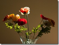
Rawing Still Life

Post prossed with Photoshop Element's filter paint daub

This almost painterly image came about as a the comparing the processing of some of my RAW files using different software. One of te packages i was “testing” was a trial version of the latest Photoshop Elements. There beside the image on the right hand side is a filter dialogue box and it is set to Artistic (the alphabetically first option) and there is a nice looking apple  and if you move your mouse pointer over it you see it called paint daubs. To temping for me and the image above is the result.

Original JPEG Produced in the CameaProcess in Pentax Photo Laboratory Processed using Raw TherapeeProcessed in Photoshop Elements

Ok back to the actual comparison, well to be honest there is very little in it. The original photo, artificial flowers taken with strong natural light backlighting, in the top left is the version my camera also creates when I take a RAW image (because I told it too). I liked the lighting and think is is a good image for a comparison of RAW capabilities. The next three are the results you get when you run each piece of software using it auto process or fix option. All three RAW converts have less distinct noise in the background and from there the differences are subtle. Raw Therapee is by far the simplest and fastest to use. The Pentax Lab result is still the one I like best but the Photoshop Elements version is pretty much the same, just slower and a two step process to reach (and the luminosity noise fix is not part of the default).

I am still not totally convinced the extra load for “processing or converting” RAW version is really all that justified in routine snap shot stuff. For difficult exposure, like low light or really special subjects and fleeting moments I now usually hit the RAW button but for the rest of the time I am still likely to be taking JPEG, getting a lot more photos on my memory card and I doubt most folk will even notice.

Wednesday, June 09, 2010

Red Sky at Night


Warning or Delight it is still always worth a photo (or two)
Posted by Picasa

Friday, June 04, 2010

Thursday, June 03, 2010

Almost Origami

Shooting RAW images and using a higher megapixel camera, means I have ended up having a large and rapidly increasing collection of “backup” disks. Also I tend to buy the “Barrel of Disks” Barrel of disksstacked on the spindle variety (they are cheaper than the individually boxed version)

I have already discovered that using the spindle and drum as a storage is a big no no! The Disks are stacked one on each other and the recorded surface can become quickly scratched as the drum is repeatedly handled.

So I have lots of “precious” disks without a secure home. For a while I was using old floppy diskette envelopes. These envelopes worked just fine and are very compact to store in a common storage boxes (yes even shoe boxes). Example of my Origami Disk cover Page LayoutThen I got the idea of making my own origami envelopes. A google search will find 100s of origami folding designs for CD or DVD covers , including this amazing spiral one. However I have something much simpler and easy to do. First you need to get a blank page on your favourite word processor. Then using Tables or its draw tool, create a square box 12.5cm by 12.5cm. Align it horizontally in the center of the page but slightly below the center vertically. As long as the page is big enough it doesn’t matter if it is A4, 8” by 11.5” or quarto, it is the size of the square that matches the size of a CD/DVD that is important. You can type a label in the box and have fun with the wordprocessor’s features if you want. Print this. Then follow the pictures below. Fold along the vertical edges of your box first. Turn the sheet over and fold these two sides back on the the back. Then fold the lower flap ontop of this. Next slide in your CD or DVD and finally fold down the top flap. If you press down on you folds you do not need to stick or tape anything down. The envelope will hold its shape nicely, and it is nice and thin to store. If you wish to use recycled (previously printed) scrap paper it is very important to have a blank side for the inside of the envelope, to minimize ink contamination inside the envelope (this is particularly important if you are using laser printer or copier scrap). A final warning, not all copy papers, and especially recycled papers are acid free, which is required for long archival life of your precious photos.

Label both your DVD and the cover Fold Along the vertical edges of you box first Turn the page over and fold the flap back Fold up the bottom flap and slide in your DVD Flod back the top flap, and press down the edgesFinsihed DVD envelope ready to store

Thanks to my wife who took these photos of the process

Tuesday, June 01, 2010

The Full 360


This 130 megapixel photosynth is based on 37 photo. It was taken handheld just south of Beach One at venus bay and illustrates the recent erosion at the back of the beach. The photosythyn was created by Microsoft ICE (Image Composite Editor).