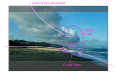
 I was happy with this photo, it did achieve what I had seen. The break in the clouds the pools of light on the beach and the billowing dark clouds above. So I figure it is a good example to demonstrate how cropping can help improve composition and what Features I wanted to enhance. The Center of interest is slightly off-set to the right, something i did deliberately in the viewfinder. It has has two distinct focal points, firstly the dark against light tones in the clouds, above the brightly lit waves below. There were three distinct lines/shapes for the eye to follow already. So I concentrated on was keeping the center of interest close to the vertical line that divides the composition into two thirds and one third (the rule thirds) That just left the option of vertical cropping to more a more panoramic format, keeping the lower focal points in the golden ratio from the top & bottom. The lower cropping also accentuates the strong diagonal of the reflection on the wet sand.
No comments:
Post a Comment