Showing posts with label green. Show all posts

Wednesday, June 11, 2025

Chasing Light and Colour: The Magic of Rare Optical Phenomena

The pursuit of colour leads to unexpected places. What began as an attempt to recreate Oswald's colour circle evolved into a deeper appreciation for the rare and magical moments when nature reveals colours that exist at the very edge of human perception. From the laboratory discovery of Olo to the legendary green flash at sunset, these experiences remind us that the world of colour extends far beyond our everyday experience.

The Laboratory Meets the Beach

The connection between scientific colour discovery and natural observation became strikingly clear during my artworks at Venus Bay. The sea-green illuminated waves I sketched, created by late afternoon sunlight penetrating the surf, bore an uncanny resemblance to the Olo colour described in laboratory conditions, which matches Ostwald's Sea Green. Reminding me that the best artistic subjects often combine practical purpose with natural beauty.

This wasn't mere coincidence. Both phenomena involve precise conditions—specific angles, particular wavelengths, and the right environmental factors. The laboratory uses laser precision to activate cone cells in extraordinary ways, while nature uses the angle of the sun, the clarity of water, and the movement of waves to create equally extraordinary visual experiences.

The Elusive Green Flash

Nature exhibits other amazing colour phenomena such as the mysterious green flash—a brief burst of vivid green light that appears just as the sun disappears below the ocean horizon. At Venus Bay, with its north-south running beach and western ocean view, conditions are theoretically perfect for observing this rare event.

I've witnessed it once: a fleeting moment of intense green above the setting sun, gone almost before the eye could register it. The experience was so brief that I didn't have the opportunity to photograph it, yet the memory remains vivid. This phenomenon has been famously observed in Hawaii and Cornwall, locations that share Venus Bay's advantage of an unobstructed western horizon over open water.

The green flash occurs due to atmospheric refraction—the same physics that creates rainbows and mirages. As the sun sets, Earth's atmosphere acts like a prism, separating sunlight into its component colours. The green wavelength, being shorter than red but longer than blue, becomes visible for a split second as the sun's red light is blocked by the horizon while the blue light scatters into the atmosphere above.

The Science of Rare Colours

These phenomena—whether laboratory-created Olo or naturally occurring green flashes—share common characteristics. They exist at the boundaries of normal perception, require specific conditions to manifest, and challenge our understanding of how colour works.

The Olo discovery reveals that our eyes are capable of perceiving colours we never normally see. The specialised equipment required to create this experience highlights how much of the visible spectrum remains unexplored in terms of human perception.

Similarly, the green flash demonstrates how atmospheric conditions can reveal colours that exist in sunlight but are normally invisible to us. 

The emergence of AI-generated content about the Olo discovery represents another layer of this colour story.

What strikes me most about this entire journey—from filling a Wilcox palette to witnessing the green flash—is how it demonstrates the persistence of wonder in an age of technological explanation. Despite our sophisticated understanding of wavelengths, cone cells, and atmospheric optics, these colour phenomena retain their magic.

The sea-green waves at Venus Bay still take my breath away, regardless of my understanding of light refraction and wavelength. The green flash remains mysterious and beautiful, even when I comprehend the atmospheric physics involved. The Olo discovery fascinates not because it's inexplicable, but because it reveals new possibilities within our existing understanding.

Rob Candy's gift of the Wilcox palette initiated a journey I never anticipated. What seemed like a simple project to match colours became an exploration spanning historical colour theory, contemporary vision science, natural phenomena, and artificial intelligence.

The palette sits by my easel now, filled with pigments that approximate Oswald's 24-color circle. But its real value lies not in the colours themselves, but in the journey they inspired. From mixing stubborn phthalo pigments to capture elusive sea-green, to witnessing laboratory breakthroughs that reveal new dimensions of human vision, to standing on a beach waiting for that fleeting green flash—each experience deepened my understanding of colour's complexity and beauty.

In this age of digital reproduction and artificial intelligence, the rarest colours still require us to show up—whether in the laboratory or on the beach—and witness them with our own eyes. Some things, it seems, cannot be replicated or explained away, only experienced and celebrated.

see also Part 1 The Quest for Sea Green

Tuesday, June 10, 2025

AI, Technology and Traditional Observation

 AI Enters the Conversation

The intersection of art, science, and technology became even more intriguing when I discovered an AI-generated "podcast" discussing the Olo discovery. Created using NotebookLM with Google's Gemini 1.5 model, it featured realistic male and female "hosts" providing a surprisingly good summary of the technology and theoretical aspects. 

WARNING : It runs for about 20 minutes and is worthwhile watching.

While the AI presentation contained inaccuracies—confusing device names with methods, occasionally getting technical details confused—typical misconceptions, like the Richard Dawkin's premonition of the discovery—it offered a far better starting point than the ill-informed clickbait posts "Scientist discover new colour" now flooding social media. The realistic conversation format makes complex scientific concepts accessible, but not totally trustworthy. Yet in this case, the so-called "deep dive" is impressive, hopefully the shape of things to come.

If you consider, yourself a careful observer you might spot telltale AI artifacts in the hosts' hand movements. Then again you might have already spotted the podcasts title "Deep Dive An AI Podcast" up in lights behind the presenters or the warning from YouTube "Altered or synthetic content" as the video starts.

Don't just accept what AI tells you—run it through your own filter first. Draw on your personal observations and whatever expertise you have, whether that's art, science, engineering, or any field you know well. AI is getting very impressive, but it's not infallible

Monday, June 09, 2025

When Art Meets Science: The Discovery of Olo

Art and science have always been intertwined, but this connection has been reinforced in my recent experience with colour theory, painting, and an extraordinary scientific discovery. What began as sketches of surf rescue boats transformed into a meditation on the nature of colour itself.

From Sketch to Exhibition

My observations at Venus Bay, capturing the interplay between the red inflatable rescue boats and the sea-green illuminated waves, evolved into a series of paintings. The composition fascinated me—horizontal lines of waves contrasted against the strong diagonal of boats running up the surf, foam splashing dramatically in front.

I developed this theme through various sizes: sketches and smaller tests up to half-sheet paintings to perfect the colours and composition. Despite struggling with worsening eyesight, the work progressed well. The culmination was a submission to the Poetry of Watercolour exhibition at VAS, which was accepted—a gratifying validation of my ongoing colour exploration.


The Olo Discovery

Just weeks after my exhibition acceptance, an announcement emerged from the United States: scientists had discovered a new colour called "Olo." This wasn't just any colour discovery—it represented a new direction in how we understand human vision and colour perception.

I first heard of the discovery on local radio where Professor Ren Ng, originally from Melbourne, was interviewed, revealing something extraordinary. Olo isn't a colour we can see in everyday circumstances. It requires precise adjustments to how our eyes' cones are activated, specifically targeting mid-wavelength cones through sophisticated machinery.

The Science Behind the Sensation

They used a machine/system known as OZ Vision, after the equipment developer. This firstly has to map those cones, the eyes colour receptors in a tiny section of retina,.  Then, micro pluses of laser beams of very specific wavelengths—corresponding closely to turquoise and greenish turquoise colours—are directed at these cones. The S (shortwavelength) and L (longwavelength) responding cones were not targeted. Resulting in the viewer seeing an intensely vivid colour that closely resembles what Oswald called his "sea green." only much brighter.

What makes Olo particularly fascinating is its demonstration that colour sensation is essentially an illusion created by energy in the form of visible light of specific wavelengths. The discovery doesn't necessarily suggest colours exist outside the boundaries of the chromaticity diagram, or outside the rainbow as widely reported, but rather reveals new possibilities for how we might experience colour. While we may not see new ways to see a broader range of colours or artificial pigments immediately, the research opens possibilities for enhanced colour experiences, perhaps fixing colour-blindness and a deeper understanding of how our brains process visual information.

The name "Olo" is a little scientific geeky: 010, zero-one-zero representing the signal pattern to different cone types—0 signal to the S cones, 1 or full signal to the M cones, and 0 signal to the L cones. This precision underscores the scientific rigour behind what might otherwise seem like an abstract artistic concept.

Art as Scientific Method

Perhaps most remarkably, this experience demonstrates how artistic practice can parallel scientific inquiry. My methodical approach to colour matching, systematic observation of natural phenomena, and documentation through sketches mirrors the scientific methods in many ways.

The artist's patient observation of colour relationships, light conditions, and natural phenomena provides a different but equally valid path to understanding. When Rob Candy gave me that Wilcox palette, neither of us could have predicted it would lead to connections between 19th-century colour theory, contemporary surf rescue training, and 21st-century vision science.

This convergence reminds us that the boundaries between art and science are often artificial. Both disciplines seek to understand and represent reality, whether through pigment and brush or laser and laboratory equipment. The discovery of Olo proves that there are still new colours to be found—not just in nature, but in the remarkable machinery of human perception itself.

see also Part 1 The Quest for Sea Green

Sunday, June 08, 2025

The Quest for Sea Green: Reconstructing Oswald's Colour System

When artist friend Rob Candy passed onto me a round Michael Wilcox palette—companion to Wilcox's book "Blue and Yellow Don't Make Green"—I was immediately struck by its resemblance to the Oswald colour circle. What seemed like a simple project to fill the 24-colour circle with my own watercolour pigments matching Oswald's colours turned into a fascinating journey through colour theory and the elusive nature of certain hues.  

The Challenge of Colour Matching

Researching the actual colours and layout to match the Wilcox wheel proved more challenging than anticipated. While reasonable examples of Ostwald's circle exist online, the colours captured and reproduced are, to put it politely, not very reliable. Matching small colour swatches is always difficult, but I was determined to fill the circle with original pigments from watercolour paint tubes I already owned.

Starting with the watercolour paints I had on hand, I managed to fill most pans, purchased a few additional tubes, and eventually had to mix a few colours myself. The result wasn't perfect, but it was a reasonable start that taught me valuable lessons about colour relationships, richest (highest chroma) colour mixes always came from mixes of adjacent pans. It was however, difficult to match the value (lightness or darkness) of colour shown on published wheels; frequently, my watercolour needed to be diluted.

Understanding Oswald's System

The concept behind Oswald's colour circle construction is rooted in opponent colour theory and four psychological colours: red, yellow, green, and blue. These form two pairs—red-green and yellow-blue—creating orthogonal axes in a planar graph.

In Oswald's work, his red was specifically a crimson red, while the green was what he frequently referred to as "sea green"—a bluish green or greenish turquoise. These colours formed the horizontal axis, with the magnitude representing colour intensity: one equalled the most intense red, while minus one represented the most intense green.

The vertical axis featured blue versus yellow, though Oswald famously struggled to find a yellowish blue that wasn't actually green. This challenge led to his systematic approach, with blue positioned on the base and yellow on the top.

The Birth of L*a*b Colour Space

Oswald's work included a third dimension—neutrals ranging from black (absence of light) through shades of grey to white. These three axes became known as L (lightness), a (yellow-blue axis) and b (red-green axis), forming what mathematicians and scientists among colour theorists embraced as the L*a*b colour model. It still forms the basis of the Natural Color System (NCS), and underlying metrics for colour grading in many cinema systems, demonstrating the lasting impact of Oswald's theoretical framework.

The Elusive Sea Green

Reasonable matches for most of Oswald's colour circle elements proved achievable, except for that troublesome sea green. Even after purchasing additional paint tubes, this greenish version of turquoise continued to elude me.

The solution came from mixing two adjacent colour elements: the notorious phthalo pigments that stain everything they touch—plastic palettes, synthetic brushes, and inevitably, fingers. These two "dangerous" but strong colours finally yielded a reasonable facsimile of Oswald's elusive sea green.

Nature's Colour Laboratory

The quest for sea green in nature took me down to Venus Bay. The surf beach runs essentially north-south, so late afternoon viewing faces west. In late summer and early autumn, when the sun angle is lowish, sunlight penetrates the waves, illuminating them with a beautiful turquoise, actually a green version of turquoise that even commercial pigments struggle to capture.

A slight offshore breeze lifts the waves, creating pure magic. This natural phenomenon provided the perfect subject matter for sketches, attempting to match these incredible colours with my developing colour chart. The scene was made even more dynamic by local lifesavers training in their IRBs (motorised surf rescue vehicles), jumping waves in displays of both skill and pure joy.

The sketches revealed something remarkable: they contained two important Oswald colours—the red of the inflatable rescue boat and the sea green of the illuminated waves. Ostwald's fundamental pair of complementary colours. The composition of horizontal wave lines contrasted with the strong diagonal of the boat created a perfect harmony of colour theory and natural beauty, proving that sometimes the best colour education comes not from books, but from patient observation of the world around us.


Monday, September 27, 2021

Lowdown on Lockdown


The promised easing of lockdown conditions, didn't materialized (ok they are pshed forward a few days). It was however a great day to get out and have a picnic of one household and sepearted groups.It Jells park it wasn';t even possible to park so we (my wife & I) had to go a little further.

Everything is nice and green (alternative pring sun and rain) is doing wonders but the grass is getting tall. A great opportunity to get down low..

Tuesday, March 31, 2020

GREEN Colour #photoassignment

There is lots of green in the garden at the moment but I haven't photographed the staghorn fern near the front door in a while. I noticed a new frond unfurling so I got in close.

When you look around the house and look, really look in detail its amazing what you might find to photograph, especially when you look close

Thursday, March 02, 2017

HDR on the forest floor

HDR on the Forest floor

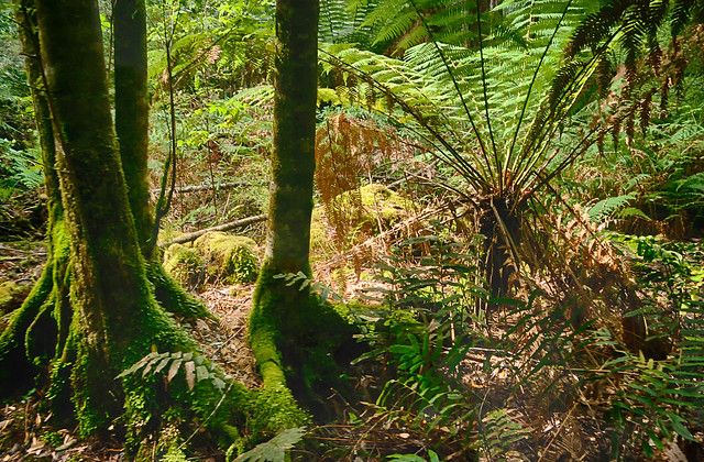
I visited the Tahune Air Walk and forest on a largely bright (summer) sunny day, but rainforests are typically dark (shaded) places on the forest floor. Shouldn’t a sunny day be a better time to photograph?

The answer is NO! The dynamic range of light (the range in strength of illumination, from darkest to brightest) on a sunny day is significantly higher on the sunny day, The bright splashes of foliage where shafts of full sun light is reflected many times brighter than the nearby glom of full shadow, yet there is detail there also. Whilst our eyes can handle this situation a camera and the dynamic range it can capture will probably be a lot less than required.  Typically you will your photo will have correctly exposed (or maybe slightly overexposed foliage behind dark silhouettes of tree truck of overhanging vegetation. On an over cast day this difference is much narrower, and you are much more likely to get a decent picture.

imageSo it seemed logical that this is a perfect opportunity for getting better images with a set of bracketed images (using EV steps, see screen capture on the right) and HDR post processing these images. Here I am using lightroom and the NIK software add in which has worked fine. The resulting HDR image does manage to get the shadow detail and preserve (not over expose) the colour of the foliage. I is much closer to what I remember seeing (and feeling). There is a lot that can be done at the post processing stage and this is usually referred to a tone mapping, how the extra illumination and colour detail is mapped back into the colour image and this is where HDR can get its bad name because you you can push the colour, local contrast and other aspects into very surreal and painterly abstractness. I am becoming a fan of NIK HDR Efex and their realistic presets (either balanced of deep) because they stay closed to my expectations.

I have returned to using lightroom to mamage photos on my HP Spectre and definite use two organization tools, Colour (eg. I flag bracketedimage sets with yellow) and then I stack the original images together. Thus reducing the clutter or many images that are the same.

I also have gone one step further in this image and used OnOne 10’s enhance and magic eraser to reduced the impact of a dead fern frond in the upper right and also detail filter to reduce overall digital noise, but keep as much detail as possible.

Friday, June 17, 2016

ArtInspired :: The Banksia in the rain

Still thinking of the process used by artist to create an image versus how a photographer might capture that image. It has been a overcast and drizzly day but I managed to get a photograph of a banksia cone in flower. A almost good photo in itself and I had run a bracketed set (handheld) but it was windy so it was hard to merge and properly register. Rather than commit them to the reject bin it was a worthwhile starting point to reconstruct an image in the manner an artist might.

I’m just using my HP Spectre Tablet in tablet mode so I started with the original image and used the Polarr app to add a little contrast, contrast and strength to the red (both luminance and saturation, but not two much). I might have normally preformed this in lightroom and/or OneOne but they are not as touch screen aware as Polarr, which is a pretty neat photo edit app with really intuitive and easy to use basic tools that can easily be used by hand in tablet mode. An artist might start with the background and the overall colour, so I switched to Corel painter essentials and first set up what they call smart blur (which help highlight the strong compositional elements) and also refined the colour palette (I just wanted to enhance the two colours red and green, classic complimentary colours so I pulled back the saturation of any other colours). I use painter essential to do a very quick starter clone painting of the background. Unfortunately this smeared out the red so I use a soft clone brush to bring out sharper edge  of the Banksia flower (this helped later registration of the images). Next I re-ran the HDR merge using Aftershot Pro, with particular focus on getting best registration on the banksia. However the droplets of water where no longer perfect.

_IGP6049 original photo enhanced in Polarr prelim clone painting in Corel Painter HDR created with After Shot pro

I now had three separate and subtly different images and used OnOne 10.5 layers to blend them together.  The background from the clone painting, the foliage and water droplets on the upper stamens from the original photo and the flower itself a combination (a soft blend mode) of the original photo and HDR image (mainly to enhance the colour).  With a Brush Border from OnOne Enhance

Between Painting & Reality

I’m not sure how to refer to this style of image. Is it digital art, a faked photo (aka photoshopped which of course it isn’t) or photomontage or something different (and new)?

“We called it photomontage because it reflected our aversion to claiming to be artists”  …Hannah Höch

Friday, March 18, 2016

Best laid plans …

_IGP1335All to often if you are chasing creativity, you can get struck in a rut. Today was really wet and overcast most of the day but the sun broke through for a few brief moments so I grabbed my polarizing filter and headed out to try and photograph a rainbow and see if I could enhance the colours using the polarizer (because the rainbow colours are reflected and thus polarized light I was convinced I should be able to darken the sky but brighten the rainbow). Despite dodging sun showers and cold winds I saw no rainbows. One the way back inside I saw my cretaceous garden was beautifully backlit for a just few moments and the revived gingko looked resplendent in its refreshed green.

20160318_IGP1338_after_the_storm

I think it was Matt Kloskowski that once said if you see good light you must photograph it. Not a wonderful composition or compelling subject but the light was terrific enough to become my photo of the day.

Moral :: Don’t try to plan creativity

Wednesday, February 10, 2016

The Grape Poachers

_IGP0150  _IGP0153

My ripest grapes are being stripped from the vine just as the crop seems to be maturing beautifully. Well the poachers have become very brazen. Time to get some netting! I’ve also had to bring in the ripest bunches already, so I can enjoy at least some.

20160209_IGP0128_First_Pickings

Saturday, January 23, 2016

Experimenting with layers

Yesterday was wet and drizzly most of the day (I’m not complaining about that we need the rain) but it discouraged going out to get my daily photograph. Just had an opportunity to capture some interesting seed pods but into a bright background. I like the seeds hanging down but decided to refine the background, with layers in OnOne 10. There are three layers the original photo, tweaked in lightroom, the texture “brocade cool” from the Onone sample textures, and an “interrupted” autoclone watercolour paint of the photo with more saturated colours. The photo is the upper layer and I’m using a luminosity mask to just show through to the brightest background areas, with some hand adjustments to keep those lights in the seed pods. The brocade layer is next and has the opacity slider back to about 20%. The autoclone watercolour is on the base, a true underpainting.

IMG_9940-Lightroom Brocade Cool IMG_9940-Autoclone_Painting

Not sure I’d rave about the result, but the approach has potential

20160122_IMG_9940_Experimenting_with_ayers

Tuesday, January 13, 2015

PhotoFriday :: HDR+Macro

Gingko Leaves
Raindrops on Gingko Leaves
Trying out HDR techniques with Macro (close up) Photography


For PhotoFriday‘s topic Macro

Wednesday, November 19, 2014

Thursday, November 06, 2014

Tree Fern Verta-rama

Tree Fern Verta-rama
For #thesecretlifeoftrees series.

These tree ferns towered above me and I had to use a stitched panorama approach (using Autostich) but in a vertical sequence. The resulting perspective however leaves the trees curving in on you towards the top of the image, so I used the zPerspector plug in for After shot to straighten things out a little. Original: imageo.withknown.com/2014/tree-fern-verta-rama

Monday, July 07, 2014

The Patch :: A bit of Green & Gold

This weeks the patch theme is your colours & celebration, which would normally suggests sporting club colours for an Australian, we are deep in the "real" football session at the moment, but I felt the our national sporting colours, green and gold would be a better choice, not that I'm following the soccer. I think the hockeyroos did good. In the back of my mind I remember that the colours are derived from the wattle, which does start to bloom this time of year, so I went in search of some and managed to find one brave young tree just starting to bloom. There are plenty of buds on the older trees so the bush should be a glow with yellow over the next few weeks.

The story of how these colours became official and in the public domain is interesting,