

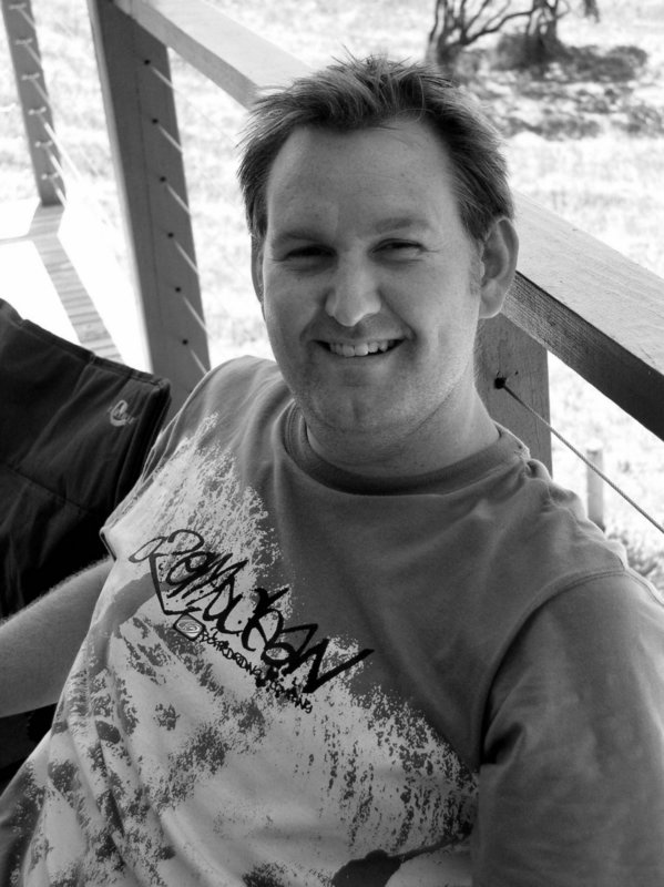
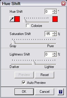
Tom Ang's idea is to firstly desaturate the colour. This process does not actually remove the colour, instead it just balances the red, green and blue channels to the tones appear neutral. Areas of intense colour tend to be lighten and deep shadows darker compare with a simple grey scale conversion. You may have already tried the saturation slide control, its usually on Hue or Hue/shift item in the menu. Most new digital photographer will instinctively move it to the right. Increasing the colour saturation, and creating a gaudy unnatural print. Instead move the slide full to the left. It gives your image the appearance of traditional black and white, a slightly more contrasty image with a richer tone range. It you truly new a non-colour image you can convert the desatuarated image to greyscale and the richer tones will be preserved.
No comments:
Post a Comment