
onder where the colour has gone? You remember![]() stronger or richer colours and probably the subject was better lit. Some of the many issues that contributes to this disappointment, are exposure (colour get paler and washed out when overexposed or is in very strong light), the light comes from a variety of sources (AWB Automatic White Balance might not be appropriate) strong contrast (which can greatly influence the saturation) harsh light desaturates colour (so many just take photographs in the golden hours after sunrise and before sunset) or the colours in the scene just bring each other down (contrasting/conflicting colours). At the simplest level the human eye can process a greater dynamic range of light than a camera but there is also a lot of psychology associated with colour perception.
stronger or richer colours and probably the subject was better lit. Some of the many issues that contributes to this disappointment, are exposure (colour get paler and washed out when overexposed or is in very strong light), the light comes from a variety of sources (AWB Automatic White Balance might not be appropriate) strong contrast (which can greatly influence the saturation) harsh light desaturates colour (so many just take photographs in the golden hours after sunrise and before sunset) or the colours in the scene just bring each other down (contrasting/conflicting colours). At the simplest level the human eye can process a greater dynamic range of light than a camera but there is also a lot of psychology associated with colour perception.
After reading a series of articles about colour harmony by Soraya French in the artist magazine. I realised something very significant. Most artist understand colour as a relative concept. Whereas most of the photographic purists seems to be stuck in a very detail absolute colour calibration obsession. However how we see colour is anything but well calibrated and consistent.
The outcome is a deep yearning in many photographers for "snappy" colours, because what they have captured doesn't really match what they thought the saw. The issues are partly the materials and equipment but a lot is in the eye of the beholder. If an artist wants a red to look redder he or she will surround it with green (or perhaps a darker cool tone), whereas the photographer grasps at the saturation slider and moves it to the right (often just too far to the right). Perhaps just trying to use the light, within equipment limitations and means of reproduction isn’t enough. Colour is a relative issue we may need to take care of colour mix. just like we need to compose a photo in the viewfinder, rather than expecting post-processing and perfect calibration to deliver rich colours.

“we do not have yet have the chemical processes that permits the complex breaking down and reconstitution of colour (in the pastel range, for example, the gamut of green is made up of 375 nuances!)”.
Pigments and dyes and the surfaces we can print onto have improved a little since then but we are still looked into the same “constrained” mindset in a lot the digital photographic software and tool. Artist today don’t seem to be so restrained and frequently stray into gorgeous colour schemes without concern for media they are using or the intensity of the colour, but they usually understand the illusion of how the colours work together.
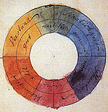 Any talk of colour always brings you to colour theory, (and yes I have spelt colour the correct way), but theory is in my view the wrong word here. What we know as colour theory, the colour wheel, complimentary and harmonious colour schemes is really more a practical guide to mixing colours beginning with primary colours (red, yellow & blue). Trouble is there can be many exception. The knowledge that colour could be both additive (in light) and subtractive (mixing pigments), dates back to Issac Newton but it was the German poet and thinker Goethe that formalised the colour wheel (his wheel in on the right) and introduced the idea that colour had a theory. This colour wheel web app, is meant for web designers but it is immediately useful to both artist and photographers, the Kuler tool in adobe’s creative creative can now go one step further and pick colours off your photo.

")

Perhaps it is time photographers demanded some better colour tools.
With special thanks of Jessica Hische of Daily Drop Cap for the wonderful start to this post
No comments:
Post a Comment