This is a simple recycling tip, to help keep your brushes happy. Stay watching for the Extra Bonus Tip about cleaning watercolour brushes at the end.
Still experimenting with new techniques and tools to create these videos. I just updated my very old version of VideoStudio, to the last every (2023) version. Despite the "end of the road" vibes. It does what I need. Faster rendering and higher resolution. Not to mention several new features to learn. This video for YouTube was filmed on my phone and edited with Corel VideoStudio.Thursday, December 04, 2025
Another Quick Tip - Experimenting with new tools and techniques
Saturday, November 22, 2025
Returning to YouTube Quick Tips
I've been away from making Quick Tips videos for YouTube for a bit. I'm guessing you know how it goes, equipment issues, new gear to figure out, just not as much to share. But I'm ready to jump back in with a few small tweaks. I'm splitting things up into "Quick Art Tips" (keeping that with the original music!) and "Quick Photo Tips" which might be less frequent, and I'm still hunting for the right music for those. I'm also playing around with different camera setups and experimenting with new ways to capture nic shots for these upcoming videos.
Today's tip is super simple but really useful: how to
make sure your camera is perfectly square to your artwork. This works
whether you're using a traditional camera, a DSLR, or just your smartphone.
All you need is a small compact mirror. Ladies, you
probably already have one! Guys, seriously, these little things are incredibly
handy. Beyond makeup touch-ups, they're great for bouncing light into dark
corners, checking behind things, and even signaling for help if you're ever in
a pinch.
Since most artworks are flat, you want your
camera lined up in a parallel plane to whatever you're photographing, whether
it's on a desk, wall, or floor.
The technique is dead simple: place the mirror in the
center of your artwork, then position your camera so you can see it reflected
directly in the middle of that mirror through your camera's viewfinder or screen. You
don't even need a tripod unless you want one.
If you're shooting something on an easel or wall, have
someone hold the mirror for you. If the artwork is way above or below or o bthe side of your position,
you won't see your camera's reflection showing on the mirror, as view from that camera. Just adjust
your camera position accordingly.
Sure, modern software can fix these alignment issues later,
but why rely on fixing distorted images in post-production? I think it's way
better to spend a few extra seconds getting it right in-camera when you're
capturing your precious artwork.
See you on YouTube!
Wednesday, November 05, 2025
Measuring the Blueness of the Sky
This video was prepared by an AI, Google’s Notebook LM, to summarise some key sources that collectively establish the cyanometer's historical significance, its scientific function, and its continued relevance as an artistic and educational tool for studying colour and the environment.
Saturday, November 01, 2025
Inktober is Over
Unlike in previous years, I submit my artwork to every day’s prompt during Inktober. A few might have been late at night, but all were submitted on the day in question. I had decided to have fun doing inkwork rather than stress myself about the ideas or the quality of the inkwork. I’m still getting over some unusual problems related to my corneal graft, particularly with close things that are on my right-hand side. Don't worry; my vision is improving, and this demonstrates I can do stuff like drawing and inking.
The final Inktober prompt was “award”. So an award, such as a certificate or something for my favourite pen, was the obvious item to draw. I sketched this out, and it was pretty boring. I suppose I could spend a lot of time doing fancy cross-hatched edges and Lettering. Then it struck me I should have an awards ceremony, like a gold Oscar or Logie. A Greek goddess holding my favourite pen, which is still the Faber Castell Pitt Artist Pen range. They impressed me with their reliability, and they run smoothly for Indian Ink, giving a solid black line. They’re not the cheapest pens, but they seem to last, and I do find their line work suits my style. I have a few fixed-width fineliners, I dominantly use the thicker ones eg. 0.7 (M). My real favourites are the brush pen (B) and soft brush (SB) both of which give great flexibility in linework, the line width and expressive curves.
So it wasn’t hard to make a decision that the award should
be part of the awards ceremony with a Statuette of a Greek Goddess holding the
winning pen.
BTW I did have fun participating in Inktober this year and
feel quite proud that I submitted something every day and finished the whole month.
Sunday, October 26, 2025
My Inktober Pen Collection (and Paper Woes)
You know how Inktober rolls around and suddenly you're reassessing every pen you own? That's me right now, staring at my ever-expanding collection of ink tools.
I've got the whole spectrum here. There are handmade bamboo dip pens gathering dust. My Micron-style fine liners seem to multiply on their own, along with the usual Sharpie felt pens. And yes, I have Copic markers, but I'm not their biggest fan, except for the soft brush ones.
I like Gel pens, especially the water-soluble ones. Here's the trick: I'll sketch my lines, then quickly grab a brush pen and tease out a wash from those fresh gel lines for instant shading. It's brilliant for quick sketching. I've hoarded quite a few coloured gel pens as well, though I really should use them more.
For the last few years, my absolute favourites have been Faber Castell Pitt pens. Proper Indian ink pigment, they last ages if you're disciplined about capping them (which I am). I've also got traditional Indian ink for dip pens, Chinese ink with a grinding stone, Chinese brushes. Ok, I can't help myself, I splurged on a set of Schmincke AquaDrop watercolour pigment inks with a pair of refillable pens. So yes, I'm well stocked.
I've been illustrating my pens and brushes on the back pages of my sketchbooks for years. I even made a video about this "obsession" once. This Inktober, as I use each tool, I'm drawing it in the back of my colour compendium. It adds a playful meta-layer to the whole challenge.
Where I'm slack is with surfaces to draw onto. I'll just grab whatever scrap is nearby, often printed on the other side and start sketching in a 2B pencil before inking over it with a Sharpie. It scans fine for dry work, but add any water? Instant crinkled mess. This year I'm trying to be better, grabbing actual sketchbooks with a page or two left when I need to use a colour wash.
When I have time to be properly organised, I reach for mixed media pads (120gsm cartridge paper, designed for ink and light watercolour). Hot-pressed watercolour paper works too, but it feels too expensive for casual Inktober fun. Bristol Board was the gold standard for ink work from my cartooning days, but I haven't found a good source lately. Honestly, I do most cartoons digitally now anyway.
So that's my setup. Now, where did I put that scrap paper?
Monday, October 20, 2025
Two Ways to Inking: Traditional vs Digital
The term "inking" has been part of cartooning vocabulary for decades, it's simply the process of going over your rough sketch with a final layer of ink. These days, most artists do this digitally, but the name has stuck around.
I wanted to compare traditional and digital inking methods using my Inktober 2025 submission for Day 19: Arctic. My cartoon shows penguins who've clearly lost their way (fun fact: penguins live in the Antarctic, not the Arctic!).
My Traditional Approach
I started with a rough sketch using a Copic brush pen. I'll be honest—I'm not a fan of Copic fine liners. They clog constantly, so I stopped buying them years ago. But their brush pens? Those are superior. They keep their flexible tips and create line work similar to traditional dip pens, which suits my cartooning style perfectly.
Here's where I made a rookie mistake: I started on paper that was too thin to handle water without buckling. So instead of traditional watercolour washes, I switched to Inktense pencils and blocks. These are great because you can apply them dry, then activate them with just a light touch of a water brush. Hopefully, this would prevent the paper from wrinkling too much.
My Digital Method
After scanning my preliminary sketch, I moved to my computer-based process. One I developed years ago after attending a cartoon workshop. This technique became the foundation for my blog "Meet the People" and its character Alvin and his wife.
My workflow goes like this: I scan the line work into Paint.NET for editing, then paste it into CorelDraw (I've been using it since version 3, originally for technical diagrams). The magic happens when I convert the bitmap into vector line work using CorelDraw's autotrace tools. These automatically smooth out the kinks in my original ink work.
The key trick I learned was to enclose any shapes I wanted to colour. Then colouring becomes simple—just click and select. I use Pantone colour patches for consistency across all my illustrations. When shapes are simple, colouring is quick and easy. Complex shapes with lots of fixing? That can get tedious.
The Verdict?
So which approach is better? That's for you to decide! Each has its charm—traditional inking has that organic, hands-on feel, while digital offers flexibility and polish. What's your preference?
Thursday, October 16, 2025
Inktober 2025 Progress
I managed to get halfway through Inktober submit something everyday on the day it was due. A couple of submissions were late at night. Still I impress myself with staying power. I’m now looking at the prompts and trying not to do the really obvious. Not that there is an obvious illustration for a more conceptual ideas like today’s blunder.
I guess there’s a lot of scope, blundering into something, you don’t want to make a blunder. But then I remember about the old fashion blunderbuss, the 17th century equivalent of a rifle. It could be loaded it with all sorts of things and instead of having a finely machine barrel to keep the bullets on track it had a wide open end. I guess it would have worked a lot more like a shotgun scattering bits and pieces all over the place. I’ve seen a couple of these gun and quite liked the way they were shaped and might be interesting to illustrate.
So I got onto DuckDuckGo and asked for illustrations of blunderbuss’es and I got a lot of cartoon-ish pilgrims carrying the definitive shaped rifle. hunting and bringing back home turkeys. Ahh, It’s about to be Thanksgivingin the USA! Nice Coincidence. We don’t have Thanksgiving in Australia, it’s not a family get together here. I guess we do have the Melbourne Cup about a week later which is a big deal an opportunity for a holiday and party, still I felt bad bets blunders might be a slightly different take on this theme, just a bit harder to draw.
Hope you enjoy my inktober submissions, I post them daily on my Instagram @normhansonart.
Tuesday, October 07, 2025
Inktober 2025, and an Extra Challenge
I’ve been doing some of Inktober prompts for the last several years. Not full on, just occasionally. Usually, I start and get about halfway through, then life takes over and there’s never enough time. Still I do have a bit of fun, getting to exercise pens that I have almost forgotten about. Sometimes it easy to get distracted because sometimes the prompts can become pretty obscure.
Just before this year’s Inktober I noticed Danny Gregory of SketchBook Skool had undertaken a little project. “How long should it take to do a drawing?” where he painted the same object in three different time frames. 15 seconds, 90 seconds or 15 minutes.
I was both intrigued and inspired so I decided to do a similar exercise as I started inktober this year. First, I started with the simple prompt moustache and only gave myself 15 seconds which is actually more time than it sounds. Then I moved on to weave prompt in 30 seconds, which was an obscure ode to Michel Eugene Chevreul, a 19th century French chemist asked to settle a dispute between weavers and dye makers. His investigations lead to his formulating the Rule of Simultaneous Contrast (of Colours). Which in turn inspired many os the French Impressionists. Next a crown in one minute, but now as I’m trying to do fairly precise lines, a minute didn’t seem very long at all. I just doubled the time allowed for each new prompt.
When I got to 16 minutes for my starfish, I figured there was enough time to create a decent ink drawing. So I stopped timing after that, I normally try to get my pen work done around the 20-minute mark. If I’m doing an ink or watercolour wash it’s fairly easy, but when I do stippling or cross-hatching it can take a lot longer. Dating back to my early cartooning days I do find stippling and cross-hatching somewhat therapeutic You’re just drawing the same pattern over and over again keeping you in the present, the aim of most trendy and expensive wellness workshops. It isn’t really spoiling the fun, just extending it and free!
Remember those days before all the computer tools, when a single click that can now fill in a shape didn’t exist, OK we had Letraset patterns which you could cut out and stick on. But for most ink shading we had to do it by hand.
You can follow my inktober submissions on Instagram @normhansonart
Thursday, September 18, 2025
Photo Ingestion: From Chaos thru Workflow and back to Ad-Hoc
Over the years, my photo ingestion process, jargon in digital photo world for uploading your photos say to a photo managment system, has evolved from simple to semi-chaotic, shaped by changing gear and software quirks. I started out loading JPEGs straight from the SD card using camera-branded software, then shifted to Lightroom Classic’s folder-based system. It was slow, and I quickly ditched metadata tagging in favour of a manual copying of the files and folder structure, yearly, monthly, daily, based on the camera’s default naming.
As RAW formats became standard and file sizes ballooned, I had to juggle multiple SD cards and software that didn’t always play nice. Initially my Canon EOS 1100D required its own viewer for RAW and MOV files. Then in 2017, I won a copy of Photo Mechanic, a game changer. It mimicked old-school contact sheets, let me tag and sort on the fly, and even added GPS data, which was perfect for my sun-chasing road trips around Australia. I also had two Pentax DLSR cameras, a K200 and a bigger K20, both nice cameras and I really liked Photo Mechanic. It was a very useful little programme when loading photos particularly when you’re travelling because it significantly reduced the amount of time and fiddling.
I had become interested in mirrorless cameras and got the little OMD-10. Unfortunately, Photo Mechanic didn’t support Olympus RAW, so I pivoted to Olympus, now OM Workspace. It was free, handled most formats, and even updated camera firmware. Slowly, it became my go-to for the OMD-10 and later the OMD-5, which became my main camera.
Now, with just a single smartphone and mainly Olympus gear, I can upload in a mixture of USB cables, card reader, Wi-Fi transfers, and Microsoft’s Phone Link. It works, but it’s again ad hoc.
The challenge now is keeping everything backed up and organized across formats, folders, and devices.
Saturday, September 13, 2025
ASI: The Good, The Bad, and The "AIslopocene"
It should be clear I have mixed feelings about AI these days. I love some AI applications. Photo editing tools? Fantastic! On-line apps that help clean up my dyslexic writing? Impressive!
But here's what's bugging me: Large Language Models (LLMs) are becoming a real problem. They're scraping everyone's creative work without permission, then spitting out convincing-sounding nonsense that's often completely wrong. We're heading into what many are calling the "AIslopocene", an era where slick, AI-generated content floods the internet while actual creators get nothing for their stolen work.
The worst part? Big tech companies are making billions by building expensive gateways to these models while contributing zero original content themselves. Meanwhile, the models are trained on everything from conspiracy theories to biased opinions, sometimes producing genuinely dangerous outputs, like when Grok started spouting Hitler's ideas.
I've been working with AI since the late '70s, so I'm not anti-technology. But what we're seeing now feels more like ASI, Arte-ficially Superficial Intelligence. It looks impressive on the surface but lacks real depth or understanding.
That's why I'm being transparent about my AI use. I've been hash tagging my #AIart since 2017, using specific AI icons/watermarks over images since 2023, and now adding footnotes when I use AI tools for editing or research.
I believe in ethical AI tools that genuinely help people while respecting creators and truth. But we need to stay vigilant about what's real intelligence versus what's just a shiny illusion designed to keep us scrolling.
Proof reading and summary assisted by Claude Sonnet 4 (AI)
Wednesday, September 03, 2025
Living in the AI Slopocene
We're living in a new era some call the "Slopocene" defined by overproduced, low-quality AI content flooding the internet. This isn't just about poor posts cluttering our feeds; it represents a fundamental erosion of information reliability.
The problem is multifaceted: people's trust in science, journalism, and credible sources is crumbling while tech platforms prioritise profits over truth. Meanwhile, AI-generated "slop" low-effort, high-volume content; dominates online spaces, creating what the Conversation article (see link above) describes as a potential future where "recursive training collapse turns the web into a haunted archive of confused bots and broken truths."
As AI systems increasingly train on AI-generated content, we risk a feedback loop of degrading information quality, like making photocopies of photocopies until meaning is lost.
This isn't the digital future anyone wanted. We're caught between technological dependence and growing awareness of these systems' limitations and misuse. While there are no simple solutions, being more intentional about information consumption, more critical of sources, and more supportive of genuine journalism and research becomes crucial.
In this age of AI slop, authentic human insight has never been more valuable or more at risk.
I’m using this post to hold an interesting experiment. There are actually two blog posts one here and the other on Meet the People. They both express the same ideas, but one is an original written by Norm and the other is a reinterpretation by an AI. Could I ask you to read both? Then leave a comment on the article you believe is generated by the AI (Claude Sonnet 4) and the post written directly by me.
Saturday, August 23, 2025
Don't Forget Your Digital Lifelines: A Traveler's Guide to Tech Accessories
Travelling with multiple devices means juggling way more than just your laptop and phone. Between my smartphone, Garmin watch, camera, and laptop, I've learned the hard way that forgetting the right cable or connector can add unnecessary stress to your trip.
The real challenge isn't the obvious stuff like chargers - it's all those little connectors and adapters that keep everything talking to each other. I've streamlined my setup into three essential kits that pack flat and won't eat up precious backpack space.
First up is my "USB Octopus" - a clever bundle of standard cables wrapped together with spiral cable wrap that folds into a neat circle. It handles all my older devices that still need dedicated connectors.
Next, I keep the modern adapters in a homemade green cloth wallet (thanks to my wife's sewing skills!) with sewn pockets and velcro closure. This holds my USB-C to HDMI adapter, USB-C hub, and other current-generation connectors. Don't forget an SD card reader if you're shooting photos!
Finally, there's my trusty external hard drive - an old 1TB unit that serves double duty as backup storage and entertainment centre. It keeps my work and photos safe while carrying a few movies and music for downtime.
The key is thinking beyond just power - you need connectivity, storage, and backup solutions all working together. Once you've got your system down, travelling with tech becomes much less stressful.
Proof reading and summary assisted by Claude Sonnet 4 (AI)
Thursday, August 21, 2025
The Evolution of My Photo Storage Journey
Remember when SD cards were "tiny" one-gigabyte things? Those days feel like ancient history now! Back then, I'd religiously transfer photos to my computer using whatever clunky software came with my camera, delete everything from the card, and start fresh. Simple times.
As cameras evolved with bigger sensors and RAW formats, everything changed. I learned that constantly writing and deleting files degrades flash memory over time – certain parts get marked as unreliable. Who knew? Now I format my cards monthly instead of deleting individual files, which is apparently much better for the card's memory.
These days, I keep about a month's worth of photos on my 64GB card before reformating. It's like having a built-in backup system. If something goes wrong with my main computer storage, I can always retrieve that month's shots from the card in the camera.
The hardware side has been a comedy of errors. Every built-in card reader in any computer I've owned eventually died, and those cheap USB readers weren't any better. I finally invested in a decent dual USB-A/USB-C reader that's been rock solid for two years.
Cloud Storage? Still figuring out that one. When travelling and you need them most, access can be tediously slow or not reliable. Monthly data storage costs can soon skyrocket as your photo collection grows.
Proof reading and summary assisted by Claude Sonnet 4 (AI)
Sunday, August 17, 2025
Travelling with Modern Electronic Devices
Back in the day, most of my travel gadgets used standard batteries, usually AAA or button batteries. Things were simpler. But with the rise of laptops, smartphones, and digital cameras, power demands grew and so did the number of chargers I had to carry. Each device came with its own special battery and charger, which meant packing a tangle of cables and adapters just to stay powered up.
I do have a charger for my Olympus batteries, just not with me.
Over time, many devices started supporting USB charging, which helped reduce the clutter. But even then, it’s easy to forget that tiny USB transformer. And while the plug end might be standard, the connectors on the device side became increasingly varied and confusing. So now, instead of fewer cables, I often end up carrying a whole collection of them.
Thankfully, my Olympus OMD 5 can recharge via USB, albeit more slowly than with its dedicated charger. I even have the correct cable connector. So I’m safe for now.
Modern Life? convenient? complicated! and always a little unpredictable!!
Proof reading and summary assisted by Copilot (AI)
Thursday, August 14, 2025
Interesting stories about the colour Caput Mortuum
Mummy Brown and the Pre-Raphaelites
In the 1800s, mummy brown, also called caput mortuum, a pigment reportedly made from ground-up Egyptian mummies, was widely used by European artists for its rich, warm tone and excellent transparency. It was especially popular among the Pre-Raphaelite Brotherhood, a group of English painters who sought to revive the detail and vibrancy of early Renaissance art.
One of the most striking anecdotes involves Edward Burne-Jones, a prominent Pre-Raphaelite artist. According to multiple sources, Burne-Jones was horrified when he learned that the pigment he had been using was made from actual human remains. His nephew, Rudyard Kipling, recalled the moment in his autobiography:
“He [Burne-Jones] descended in broad daylight with a tube of ‘Mummy Brown’ in his hand, saying that he had discovered it was made of dead Pharaohs and we must bury it accordingly. So we all went out and helped ... according to the rites of Mizraim and Memphis.”
This symbolic burial of the pigment in his garden marked a turning point in the ethical awareness of artists. Burne-Jones’s reaction wasn’t unique many artists began to abandon mummy brown as the supply of mummies dwindled and the moral implications became harder to ignore.
Sources for Further Reading
- Art UK: The Corpse on the Canvas – The Story of Mummy Brown
- Wikipedia: Mummy Brown
- JSTOR Daily: When Artists Painted with Real Mummies
- Explore more of Evie Hatch's insights in the Ask an Artist podcast interview
- Or her writings on Jackson’s Art Blog.
I’ve been using the colour for some time, it’s a deep, brownish-purple pigment derived from iron oxide (Fe₂O₃), specifically hematite or a synthetic equivalent. It is a common hue in soft pastels, with most brands also offering hues in a couple of lighter tints. Unfortunately, it is less common today in other media such as oil, acrylic or watercolour paints. It’s a good colour for enriching and warming up shadows. Although it is not an intensely chromatic or bright colour, it does strike a pleasing simultaneous contrast with turquoise or stronger greens. Modern versions have variable opacity but are an excellent help to mix or emphasise clean neutral colours.
Wednesday, June 25, 2025
The Reality Check: Why You Can't Trust AI Writing Without Human Oversight
Large language Models like Claude, Gemini, and ChatGPT promise to make writing easier, especially for individuals like myself who face challenges such as dyslexia or vision issues. But here's the uncomfortable truth: AI output is often unreliable and sometimes flat-out wrong.
I have moved from someone forcing my outrageous dyslexic spelling and punctuation into a word processor to someone who relies on dictation due to my current vision problems. I've discovered a love-hate relationship with AI writing tools. They solve my spelling and punctuation nightmares, but they create new problems. My red spelling underlines have been replaced by green grammar highlights – different errors, same frustration.
My Simple But Essential Process
After dictating my rambling thoughts, I ask AI to "summarise as a blog post in plain English in less than 300 words."
This post only took about 12 minutes total, dictating text to suggested summary. Now comes the crucial part: I print the results and highlight every sentence using five categories:
- OK as is (left unhighlighted)
- Needs rewording
- Sycophantic (fake flattery and bias bubble reinforcement)
- Needs fact-checking
- Clearly wrong (delete immediately)
The results are sobering. Often, only 20% of the AI-generated text survives unchanged. Thankfully closer to 40% for this post
But the real troublemakers are levels 4 and 5. Level 4 – "needs checking" – is actually the worst offender. AI loves introducing new "facts" or concepts that sound plausible but require verification. Sometimes it's genuinely adding something I missed; other times it's complete nonsense dressed up as insight. The tedium of fact-checking these assertions is exhausting, and anything questionable gets left out.
Level 5 is pure fabrication – AI making things up entirely. The good news? I'm seeing less of this since limiting word counts, which seems to reduce how far AI can wander into fantasy land.
Meanwhile, level 3's sycophantic language tells me I'm brilliant and reinforces whatever biases it thinks I want to hear. This echo-chamber effect mirrors social media manipulation. This is an area I must stay alert.
AI can help dyslexic writers like me organise thoughts, but it requires rigorous human oversight. Every sentence needs scrutiny. The fact-checking alone often takes longer than the original dictation, but it's essential for maintaining integrity.
Use AI as a starting point, never the finish line.
Proof reading and summary assisted by Claude Sonnet 4 (AI)
Wednesday, June 11, 2025
Chasing Light and Colour: The Magic of Rare Optical Phenomena
The pursuit of colour leads to unexpected places. What began as an attempt to recreate Oswald's colour circle evolved into a deeper appreciation for the rare and magical moments when nature reveals colours that exist at the very edge of human perception. From the laboratory discovery of Olo to the legendary green flash at sunset, these experiences remind us that the world of colour extends far beyond our everyday experience.
The Laboratory Meets the Beach
This wasn't mere coincidence. Both phenomena involve precise
conditions—specific angles, particular wavelengths, and the right environmental
factors. The laboratory uses laser precision to activate cone cells in
extraordinary ways, while nature uses the angle of the sun, the clarity of
water, and the movement of waves to create equally extraordinary visual
experiences.
The Elusive Green Flash
Nature exhibits other amazing colour phenomena such as the mysterious green flash—a brief burst of vivid green light that appears just as the sun disappears below the ocean horizon. At Venus Bay, with its north-south running beach and western ocean view, conditions are theoretically perfect for observing this rare event.
I've witnessed it once: a fleeting moment of intense green
above the setting sun, gone almost before the eye could register it. The
experience was so brief that I didn't have the opportunity to photograph it, yet the memory
remains vivid. This phenomenon has been famously observed in Hawaii and
Cornwall, locations that share Venus Bay's advantage of an unobstructed western
horizon over open water.
The green flash occurs due to atmospheric refraction—the
same physics that creates rainbows and mirages. As the sun sets, Earth's
atmosphere acts like a prism, separating sunlight into its component colours.
The green wavelength, being shorter than red but longer than blue, becomes
visible for a split second as the sun's red light is blocked by the horizon
while the blue light scatters into the atmosphere above.
The Science of Rare Colours
These phenomena—whether laboratory-created Olo or naturally
occurring green flashes—share common characteristics. They exist at the
boundaries of normal perception, require specific conditions to manifest, and
challenge our understanding of how colour works.
The Olo discovery reveals that our eyes are capable of perceiving colours we never normally see. The specialised equipment required to create this experience highlights how much of the visible spectrum remains unexplored in terms of human perception.
Similarly, the green flash demonstrates how atmospheric conditions can reveal colours that exist in sunlight but are normally invisible to us.
The emergence of AI-generated content about the Olo discovery represents another layer of this colour story.
What strikes me most about this entire journey—from filling a Wilcox palette to witnessing the green flash—is how it demonstrates the persistence of wonder in an age of technological explanation. Despite our sophisticated understanding of wavelengths, cone cells, and atmospheric optics, these colour phenomena retain their magic.
The sea-green waves at Venus Bay still take my breath away, regardless of my understanding of light refraction and wavelength. The green flash remains mysterious and beautiful, even when I comprehend the atmospheric physics involved. The Olo discovery fascinates not because it's inexplicable, but because it reveals new possibilities within our existing understanding.
Rob Candy's gift of the Wilcox palette initiated a journey I
never anticipated. What seemed like a simple project to match colours became an
exploration spanning historical colour theory, contemporary vision science,
natural phenomena, and artificial intelligence.
In this age of digital reproduction and artificial intelligence, the rarest colours still require us to show up—whether in the laboratory or on the beach—and witness them with our own eyes. Some things, it seems, cannot be replicated or explained away, only experienced and celebrated.
Tuesday, June 10, 2025
AI, Technology and Traditional Observation
AI Enters the Conversation
The intersection of art, science, and technology became even more intriguing when I discovered an AI-generated "podcast" discussing the Olo discovery. Created using NotebookLM with Google's Gemini 1.5 model, it featured realistic male and female "hosts" providing a surprisingly good summary of the technology and theoretical aspects.
WARNING : It runs for about 20 minutes and is worthwhile watching.
While the AI presentation contained inaccuracies—confusing device names with methods, occasionally getting technical details confused—typical misconceptions, like the Richard Dawkin's premonition of the discovery—it offered a far better starting point than the ill-informed clickbait posts "Scientist discover new colour" now flooding social media. The realistic conversation format makes complex scientific concepts accessible, but not totally trustworthy. Yet in this case, the so-called "deep dive" is impressive, hopefully the shape of things to come.
If you consider, yourself a careful observer you might spot telltale AI artifacts in the hosts' hand movements. Then again you might have already spotted the podcasts title "Deep Dive An AI Podcast" up in lights behind the presenters or the warning from YouTube "Altered or synthetic content" as the video starts.
Don't just accept what AI tells you—run it through your own filter first. Draw on your personal observations and whatever expertise you have, whether that's art, science, engineering, or any field you know well. AI is getting very impressive, but it's not infallible
Monday, June 09, 2025
When Art Meets Science: The Discovery of Olo
Art and science have always been intertwined, but this connection has been reinforced in my recent experience with colour theory, painting, and an extraordinary scientific discovery. What began as sketches of surf rescue boats transformed into a meditation on the nature of colour itself.
From Sketch to Exhibition
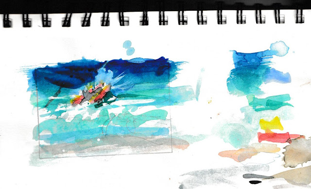
My observations at Venus Bay, capturing the interplay between the red inflatable rescue boats and the sea-green illuminated waves, evolved into a series of paintings. The composition fascinated me—horizontal lines of waves contrasted against the strong diagonal of boats running up the surf, foam splashing dramatically in front.
I developed this theme through various sizes: sketches and smaller tests up to half-sheet paintings to perfect the colours and composition. Despite struggling with worsening eyesight, the work progressed well. The culmination was a submission to the Poetry of Watercolour exhibition at VAS, which was accepted—a gratifying validation of my ongoing colour exploration.The Olo Discovery
Just weeks after my exhibition acceptance, an announcement emerged from the United States: scientists had discovered a new colour called "Olo." This wasn't just any colour discovery—it represented a new direction in how we understand human vision and colour perception.
I first heard of the discovery on local radio where Professor Ren Ng, originally from Melbourne, was interviewed, revealing something extraordinary. Olo isn't a colour we can see in everyday circumstances. It requires precise adjustments to how our eyes' cones are activated, specifically targeting mid-wavelength cones through sophisticated machinery.
The Science Behind the Sensation
They used a machine/system known as OZ Vision, after the equipment developer. This firstly has to map those cones, the eyes colour receptors in a tiny section of retina,. Then, micro pluses of laser beams of very specific wavelengths—corresponding closely to turquoise and greenish turquoise colours—are directed at these cones. The S (shortwavelength) and L (longwavelength) responding cones were not targeted. Resulting in the viewer seeing an intensely vivid colour that closely resembles what Oswald called his "sea green." only much brighter.What makes Olo particularly fascinating is its demonstration that colour sensation is essentially an illusion created by energy in the form of visible light of specific wavelengths. The discovery doesn't necessarily suggest colours exist outside the boundaries of the chromaticity diagram, or outside the rainbow as widely reported, but rather reveals new possibilities for how we might experience colour. While we may not see new ways to see a broader range of colours or artificial pigments immediately, the research opens possibilities for enhanced colour experiences, perhaps fixing colour-blindness and a deeper understanding of how our brains process visual information.
The name "Olo" is a little scientific geeky: 010, zero-one-zero representing the signal pattern to different cone types—0 signal to the S cones, 1 or full signal to the M cones, and 0 signal to the L cones. This precision underscores the scientific rigour behind what might otherwise seem like an abstract artistic concept.
Art as Scientific Method
Perhaps most remarkably, this experience demonstrates how artistic practice can parallel scientific inquiry. My methodical approach to colour matching, systematic observation of natural phenomena, and documentation through sketches mirrors the scientific methods in many ways.
The artist's patient observation of colour relationships, light conditions, and natural phenomena provides a different but equally valid path to understanding. When Rob Candy gave me that Wilcox palette, neither of us could have predicted it would lead to connections between 19th-century colour theory, contemporary surf rescue training, and 21st-century vision science.
This convergence reminds us that the boundaries between art and science are often artificial. Both disciplines seek to understand and represent reality, whether through pigment and brush or laser and laboratory equipment. The discovery of Olo proves that there are still new colours to be found—not just in nature, but in the remarkable machinery of human perception itself.
Sunday, June 08, 2025
The Quest for Sea Green: Reconstructing Oswald's Colour System
The Challenge of Colour Matching
Researching the actual colours and layout to match the Wilcox wheel proved more challenging than anticipated. While reasonable examples of Ostwald's circle exist online, the colours captured and reproduced are, to put it politely, not very reliable. Matching small colour swatches is always difficult, but I was determined to fill the circle with original pigments from watercolour paint tubes I already owned.
Starting with the watercolour paints I had on hand, I managed to fill most pans, purchased a few additional tubes, and eventually had to mix a few colours myself. The result wasn't perfect, but it was a reasonable start that taught me valuable lessons about colour relationships, richest (highest chroma) colour mixes always came from mixes of adjacent pans. It was however, difficult to match the value (lightness or darkness) of colour shown on published wheels; frequently, my watercolour needed to be diluted.
Understanding Oswald's System
The concept behind Oswald's colour circle construction is rooted in opponent colour theory and four psychological colours: red, yellow, green, and blue. These form two pairs—red-green and yellow-blue—creating orthogonal axes in a planar graph.
In Oswald's work, his red was specifically a crimson red, while the green was what he frequently referred to as "sea green"—a bluish green or greenish turquoise. These colours formed the horizontal axis, with the magnitude representing colour intensity: one equalled the most intense red, while minus one represented the most intense green.
The vertical axis featured blue versus yellow, though Oswald famously struggled to find a yellowish blue that wasn't actually green. This challenge led to his systematic approach, with blue positioned on the base and yellow on the top.
The Birth of L*a*b Colour Space
Oswald's work included a third dimension—neutrals ranging from black (absence of light) through shades of grey to white. These three axes became known as L (lightness), a (yellow-blue axis) and b (red-green axis), forming what mathematicians and scientists among colour theorists embraced as the L*a*b colour model. It still forms the basis of the Natural Color System (NCS), and underlying metrics for colour grading in many cinema systems, demonstrating the lasting impact of Oswald's theoretical framework.
The Elusive Sea Green
Reasonable matches for most of Oswald's colour circle elements proved achievable, except for that troublesome sea green. Even after purchasing additional paint tubes, this greenish version of turquoise continued to elude me.The solution came from mixing two adjacent colour elements: the notorious phthalo pigments that stain everything they touch—plastic palettes, synthetic brushes, and inevitably, fingers. These two "dangerous" but strong colours finally yielded a reasonable facsimile of Oswald's elusive sea green.
Nature's Colour Laboratory
The quest for sea green in nature took me down to Venus Bay. The surf beach runs essentially north-south, so late afternoon viewing faces west. In late summer and early autumn, when the sun angle is lowish, sunlight penetrates the waves, illuminating them with a beautiful turquoise, actually a green version of turquoise that even commercial pigments struggle to capture.
A slight offshore breeze lifts the waves, creating pure magic. This natural phenomenon provided the perfect subject matter for sketches, attempting to match these incredible colours with my developing colour chart. The scene was made even more dynamic by local lifesavers training in their IRBs (motorised surf rescue vehicles), jumping waves in displays of both skill and pure joy.The sketches revealed something remarkable: they contained two important Oswald colours—the red of the inflatable rescue boat and the sea green of the illuminated waves. Ostwald's fundamental pair of complementary colours. The composition of horizontal wave lines contrasted with the strong diagonal of the boat created a perfect harmony of colour theory and natural beauty, proving that sometimes the best colour education comes not from books, but from patient observation of the world around us.
Friday, May 30, 2025
Are the leaps and bounds in #AIvideo what we want?
They probably are exactly what people want. But first, I know exactly where that dismal robot in dystopian world in my last post came from, he lives in an even more dystopian and frightening universe within the multitude of tokens being accrued in the rapidly growing Large Language models.
WARNING you might find this video distressing
The German YouTuber called Fear Tube (there might be a hint there) who created it, notes.
I Asked AI to Create a World of Mysterious Scenes and AI Created a Mysterious World You Won't Believe! Immerse yourself in a fascinating world of epic fantasy! Breathtaking landscapes full of mystical creatures, steam-powered machines and impressive monsters await you in this video generated by artificial intelligence. A journey into a universe where magic and mechanics combine harmoniously.
AI video generation has exploded recently, and honestly, it's everywhere now. Social media platforms like TikTok, Instagram Reels, and YouTube are completely flooded with AI-generated content, though a lot of it feels pretty pointless. What's really concerning is how hard it's becoming to tell what's real anymore. Deepfakes are getting scary good at cloning people's voices and faces, and unfortunately, bad actors are using this tech to deceive people without any consent from those being cloned. And don't get me started on my feed constantly showing me these weird AI videos of scantily dressed women running around game worlds with giant weapons - it's not my thing at all, and I'd rather not see dystopian content either. There's also this trend of people making instructional videos about creating AI clones to run online stores overnight with chatbots and video avatars. I'm not sure I would be ready to trust them.
That said, some of the creative stuff is genuinely impressive. For some reason, my algorithm keeps serving me steampunk videos, and while I'm not sure why, they're incredibly detailed and almost surreal in a fascinating way. The dream-like surrealist videos are pretty interesting too, even if they're deliberately obscure. I've seen some AI-generated music videos as well - not really my taste, but I can see the creative potential there.
What bothers me most is the bias problem. Most AI-generated content features beautiful young mostly white women. Sure, you'll see young men, athletes, working guys, even older men, but older women are practically invisible. I don't think this is necessarily the AI's fault - it's more about the people using these tools and what they choose to create. It makes me wonder: can we actually be trusted with this powerful technology to stay creative and inclusive?
Thursday, May 29, 2025
What's Next for AIart? (Dystopian Surprise!)
Lately, I've been a bit out of the loop with the rapid developments in generative AIart. Life threw a curveball with some eye issues and a corneal graft, which severely limited my computer time – even with NightCafe's regular emails urging me to claim my daily free credits.
My vision is improving, and I decided to jump back in by following one of NightCafe's invitations. This time, the free credits led to another invite to join one of their weekly challenges; they even pre-filled a prompt for me! I only caught the first couple of lines but decided to see what might happen. I'd previously experimented with prompts about AI/robots making art, so I wondered if that had "seeded" my new prompt, or perhaps another AI had "scanned" my earlier work on NightCafe (nothing impressive, just me playing around with the generative AI tech, by the way).
The image generated quickly, and I was genuinely taken aback
by how dystopian and depressing it felt. It struck a chord, echoing my own
concerns about the "look-at-me" culture of celebrity-seeking masses,
which often feels like a desperate race to the bottom. Are we, as real artists, being
replaced by soulless images churned out by "pseudo-intelligent"
applications, all designed to grab attention so that advertisers pay more? Was I becoming just
another cog in a process, simply there to click a link or hit enter?
"A melancholic robot with glowing eyes, standing in an abandoned art studio, surrounded by discarded paintbrushes and canvases, with a single tear of oil streaming down its metallic face, in the style of surrealism, with melting clocks and distorted perspectives, reminiscent of Salvador Dali, with a matte background and a somber, introspective mood."
Upon looking at the full prompt (above) and selected Flux model settings, I realised this prompt was likely just a refinement of my last work from a month or so ago (when I was effectively blind in one eye), rather than a new AI "spoon-feeding" me. The original prompt was:
"a blind artist being assisted by an AI robot to create a large abstract painting surrealism Salvador Dali matte background melting oil on canvas."
Perhaps this is the true moral of the story for the artistic and creative communities: Keep an eye on what's going on, but don't worry too much. There's a lot of real life happening away from your computer or phone screen, and it's okay to let the over hyped generative AIart 'race to the bottom.' A bit sad really, if we want to benefit from the technology.
P.S. I even used Gemini Ai (Gemini 2.7 Flash) to help fix up my dictated jipperish for
this post!
Wednesday, May 07, 2025
Last night of dodgy one-eyed sight and trying to take some photos
The evening before my corneal graft surgery, I decided to venture out with my camera despite my severely compromised vision. With my right eye essentially non-functional any bright or contrasting lights causing lasting effects in both eyes, photography has become a challenge of trust in my camera rather than precision.
Adapting to Visual Limitations
My relationship with photography has transformed dramatically. Electronic viewfinders are now unusable, and even the flip-out LCD screens present a significant challenge. I've adapted by:
- Returning to spot metering in the centre of the frame (reminiscent of my old Pentax Spotmatic days)
- Trusting my camera's autofocus setting to use that centre point
- I don’t fully trust the cameras “averaging” exposure so I set up my Olympus's back wheel for quick exposure value adjustments
- Taking multiple shots to compensate for uncertainty
Despite these adaptations, my photography outings have become rare as my vision keeps me indoors most days.
An Evening in Parliament Gardens
I stayed near the hospital and across the road from Parliament Gardens for my pre-surgery evening. As sunset approached, I noticed St. Paul's spire beautifully illuminated by the fading light. Just as I captured the scene, the bells began to ring—perhaps marking the time or the beginning of a conclave to select the next pope.
After uploading to my computer, I enhanced the raw file using Olympus's Vivid Mode, I had slightly underexposed the scene to preserve the golden hour tones, so lightened the shadows marginally, and cooled the overall temperature to deepen the sky. Not bad for someone with compromised vision!
Moonlight and Palm Trees
The moon caught my attention next, visible at that perfect moment when its illumination balances with the sky's brightness. I framed it with a palm tree swaying in the strong breeze, slightly underexposed again, and trusted my focus on the centered moon. Back at the computer, I applied the same vivid treatment, cooled the colour temperature, and cropped the image to position the moon slightly off-center.
Dinner on Spring Street, with a bit of creative post-processing
We continued our evening at a café on Spring Street opposite the Parliament building. The ambience was magical—lights just coming on while the sky remained bright, creating that challenging exposure scenario where automatic settings typically give you a bleached-out sky and detail-less shadows.
Rather than being discouraged, I saw post-processing potential. Using Luminar Neo's AI sky replacement and relighting features, I enhanced the scene to reflect the warm, pleasant Melbourne evening we experienced. The result captured the ambience of outdoor dining perfectly, despite not having a spectacular natural sunset.
In these moments before my surgery, photography became not just about seeing perfectly, but about adapting, trusting my equipment, and finding creative ways to preserve memories despite visual challenges.
Monday, March 03, 2025
Tools to Disrupt the Unethical Scraping of Art: My thoughts on Glaze and Nightshade
For my anti-scraping tools experiments, I chose a personally meaningful AI-generated image from 2018. Created using an early version of Google's Deep Dream Generator in style transfer mode, the image merges a photograph of my right eye (taken during a rejection episode of my then three-decade-old corneal graft) with a cloud formation.