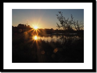
Exhibiting your photos can be a really rewarding experience, and why not start locally such as at Local Camera Clubs, Local Councils and Schools (often as fund raisers) often run such exhibitions (usually with a reasonably small submission fee). If you haven’t created pictures for an exhibition before, here are few hints and guidelines to help your decision process.
1. Viewing distance
Galleries and conference centres often put a lot of work into this issue and it is in fact a complex issue depending mainly on a comfortable viewing distance, the viewer’s eyesight and the type of illumination. The crispness, sharpness of the images seldom even gets a look in key decisions. In most cases you will have no control over illumination but can assume it will be ok. The next issue is how the viewers is expected to see a lot of detail, a normal view or find the maximum distance before it is hard to appreciate the image. There are several complex theories and calculations, but there is also a decent rule of thumb that assumes the viewer has between 20/20 & 20/40 vision. It is called the “4:6:8” rule, and related the ratio of viewing distance to the height of the photo.

This viewing rule of thumb works well for your home as well, for example if you want a print to wow visitors across your 3m entry hall you should consider a print that is at least 38 cm (~15”) tall, which is 3000/8, to be appreciated. If you have put a lot of effort into the crispness to should consider 50cm (~20”) tall which is 3000/6. If they need to really see the detail they can walk across the hall and take a closer look. But you will have grabbed their attention by now and when your print is the right size they probably will want to take that closer look.
This is very much focused on the vertical distance, because most viewers will be standing not lying down. The horizontal width is also important and depends on the orientation (ie Portrait or Landscape). Thus 8” by 12” might be fine (A4 is close but a little smaller) for a portrait orientation but an 11” by 14” would be desirable for a landscape (A3 is a little larger but lends itself to allow more cropping options at the matting stage).
Assuming your are matting your photo (and well matted photos do look good, so why wouldn’t you) you need to allow for a decent margin for the matte around the photo, when selecting the final framing size. The general advice for a 16” by 20” size, which is a very popular size for exhibition photos, should have a minimum of 3” on each side of the narrowest margins. (eg Portrait mode probably shouldn’t be wider than 12” horizontally & Landscape mode shouldn’t be wider than 14” horizontally). It is also common to have the matting with a photo slightly higher than midpoint vertically. This especially applies to longer thinner panoramas.
2. Aspect Ratio
The aspect ratio of most cameras (so called APC crop sensor and Full Frame sensors) follows the same aspect ratio as 35mm film which is 1 to 1.5 (often described as 2 to 3) BUT most common photographic print sizes are not in this ratio. The Micro Four Thirds camera have a sensor ratio of 3 to 4 and this is a little closer to common print aspects/print sizes.
The next post will options when getting your photo printed at a local store or service.


No comments:
Post a Comment