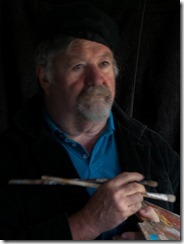
 I have been to Rembrandt's studio and he only has a row of windows on one-side, (there are heavy shutters to blank off the bottom windows and a bleached canvas blind hanging above an end window) So I suspect Rembrandt himself would probably fail the studio lighting work shop. What he definitely would not have failed is portraiture and particularly low key look (ie where most of the tonal range is in the darker tonnes) Some of his deep
  richness may have come with the age of his painting (most are now over 350 years old) but if you have every seen the original of his portarit paintings (such as his 1659 self-portrait) I’m sure you will recognise the fresh feel and emotional connection.
I quickly dropped the theatrics of trying to be visably arty, and just focussed on a natural lighting from a single window. I had to add a dark backdrop and use a white sheet of paper as a diffuse reflector on the righthand side. With my camera on a tripod and set with a timer on the shutter, it was then only a matter of adjusting aperture (first) and then ISO/speed to get the right low key exposure. A little further adjustment to warm the shadows (raw umber-fy) and adjust the black clipping point in lightroom to avoid too much gloom. Unfortunately I can be seen more worried about the shutter timer working than trying to look artistic. But it is a decent selfportrait.

No comments:
Post a Comment