When I think of highkey in art I think of the impressionist, they painted light as colour, shunning the murky tonal focus of the art academies of their day. Whilst the french impressionist are well known, few know of a small group of Australian painters usually called
the Heidelberg School following the same ideas at roughly the same time. I have always loved their work as a lot of it was painted in the area I grew up and I do like Charles Conder’s “
A Holiday at Mentone”. The old baths are no longer there but I can remember them and the white cliffs (also no longer visiable), The strands of dried sea weed still frequently can be seen and the beach and its promenade are still a popular stop on a sunny day. I earnt my first swimming certificate here. I am also a member of the Victorian Artist Society and this painting was first exhibited in their Spring Exhibition of 1888. I have also visited this site previously to test out an upgrade to
my homemade tripod watercolour easel. So there is plenty to connect me and a self portrait to this site.

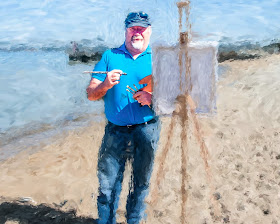
I actually took this photo a few weeks ago on a beautifully sunny spring day. Forgetting somewhat that Australian light (even in early spring) is very harsh and contrasty. So I couldn’t exactly get a true high key image without totally blowing out the highlights. Fortunately I took a couple of EV bracketed sets and found an image without to much clipping of the shadows and without excessive blown out whites. So all I had to do was use some tonal adjustments. Classic tonal curve stuff and yet an artist would not approach the task in such a mathematical way. I have come to like the basic tonal sliders in lightroom (highlights, shadows, whites & black, these are much simpler to understand in terms of controlling tone of your image). I’ve even found that clicking on one of the tonal ranges in the histogram itself. and sliding the histogram, also moves the corrsponding sliders. So I eased the histogram over to the right (to create the high-key) and lifted clarity and vibrance to keep the colour. The background and my figure had significantly different contrast/tonal ranges so I started to use layers to separate foreground and background and soon got the idea of re-sampling the background layer in corel painter with an impressionist brush. Then using perfect layers to merge the layers back together to give me a very hybrid self portrait this week.

 When I think of highkey in art I think of the impressionist, they painted light as colour, shunning the murky tonal focus of the art academies of their day. Whilst the french impressionist are well known, few know of a small group of Australian painters usually called the Heidelberg School following the same ideas at roughly the same time. I have always loved their work as a lot of it was painted in the area I grew up and I do like Charles Conder’s “A Holiday at Mentone”. The old baths are no longer there but I can remember them and the white cliffs (also no longer visiable), The strands of dried sea weed still frequently can be seen and the beach and its promenade are still a popular stop on a sunny day. I earnt my first swimming certificate here. I am also a member of the Victorian Artist Society and this painting was first exhibited in their Spring Exhibition of 1888. I have also visited this site previously to test out an upgrade to my homemade tripod watercolour easel. So there is plenty to connect me and a self portrait to this site.
  I actually took this photo a few weeks ago on a beautifully sunny spring day. Forgetting somewhat that Australian light (even in early spring) is very harsh and contrasty. So I couldn’t exactly get a true high key image without totally blowing out the highlights. Fortunately I took a couple of EV bracketed sets and found an image without to much clipping of the shadows and without excessive blown out whites. So all I had to do was use some tonal adjustments. Classic tonal curve stuff and yet an artist would not approach the task in such a mathematical way. I have come to like the basic tonal sliders in lightroom (highlights, shadows, whites & black, these are much simpler to understand in terms of controlling tone of your image). I’ve even found that clicking on one of the tonal ranges in the histogram itself. and sliding the histogram, also moves the corrsponding sliders. So I eased the histogram over to the right (to create the high-key) and lifted clarity and vibrance to keep the colour. The background and my figure had significantly different contrast/tonal ranges so I started to use layers to separate foreground and background and soon got the idea of re-sampling the background layer in corel painter with an impressionist brush. Then using perfect layers to merge the layers back together to give me a very hybrid self portrait this week.
No comments:
Post a Comment