It may seem strange to include
paint.net in my Photographic Workspace Series. Originally intended as a free replacement for the Microsoft Paint, it has grown into a powerful yet simple image and photo editor tool. It is still supported by the original developer (who appreciate donations to help enhance the software) and an active community. The outstanding aspect of this very useful little program is its simple and intuitive to use and a nice introduction into the power of image manipulation. It supports a wide variety bitmap formats (but not RAW formats) and offers all the basic manipulation tools and also has the ability to work with layers, including a number of ways to blend them together (a very good way to familiarise yourself with layer methodology before jumping into more challenging to learn software such as photoshop).

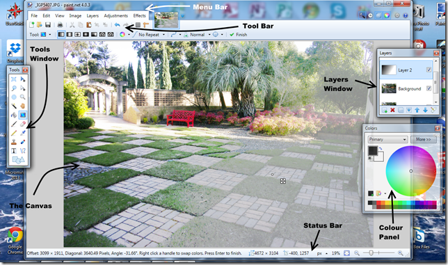
The main workspace, which is called the canvas, has a
menu and a
tool bar above the canvas and a status bar below. The tool bar has two layers, the upper layer is for the most common actions and the lower layer is context sensitive for the current tool you are using. Unlike a lot of other software paint.net has several floating panels (or windows) that can be positioned anywhere on the screen. These can be toggled on and off using the small icons on the upper left of the screen. The three most useful panels ate the
Tools window (where you select the tool you wish to use), the
Layer windows and the
Colour Panel.
In the example above I am using a gradation layer to modify the photo on the canvas. However I most commonly use this program to annotate screen captures, photos and diagrams, using the text and arrows (also shown above).

No comments:
Post a Comment