Monday, May 30, 2016

Don’t know why …

imageI don’t know why but I have joined up to Instagram. It wasn’t easy because I’m not at all apple enthusiatic and then I spent a fair bit of time reading the TOS (Terms of services). Definitely written by legalistic “tossers”. Its been updated since I last read it. Gone is the draconian, we own everything you uploaded, goodbye. It is replace by something that sound more conciliatory, but pretty much means they are reserving the right to do what the likely with your images.

image

So mental note I shouldn’t upload finished images, those I might want to sell. Sarcastic smile

Ok now for the interesting stuff how do I upload photos…… a lot of research and frustration later. Its still the same as discouraged me from joining originally, You can really only “legally” do it from a phone.

That’s no fun.Sad smile

Not having an iPhone, I downloaded Instagram from the google play store onto android phone (the distribution setup is only 20mb and it was only 40mb when installed, and it can be moved to an SD card) BUT I could get it to installed till I has 280mb of free internal memory. Spent some frustrating time deleting apps clearing caches and data from google apps try out the download again, more deleting… and so on.

I suspect this is an android/google problem not and Instagram issue.Annoyed

I finally got it downloaded and installed and them I tried to run it and I couldn’t log in. Another day of frustration and looking for instructions (they are their under support but the didn’t help me. It looks like because I had joined on the web and not replied to my confirmation email my account was in limbo. However I could not change my password, even though it let me log into the web site.

Eventually I gave in and said I had forgotten my password and I was sent the change password email.Annoyed

2016-05-30-12-22-49The android app is simple and well put together but really just scrolls the photos one at a time. The weird thing to me is the menu bar at the bottom which appears to have the options greyed out (but the actual situation is these are tabs and the one that isn’t greyed out matches the current display) I must admit I’m so used to any greyed out option not being available from the current screen. The ability to edit an image and/or add a filter only occurs when you upload to Instagram, but you do get a copy of your uploaded image saved on your device.  At first its a bit like using a reverse polish notation calculator, but easy enough once you follow the steps. Its actually a very light weight app really, which may explain its appeal.

I’ve never been a fan of the “zany” ”one click” filters and Instagram’s have non obvious names, but they are more restrained than many others. The tools for basic editing are pretty basic and only the crop tool is forced on you. Instagram used to only accept square images, but now seems to take any aspect ratio.

The Instagram display format is just single image at a time, with a caption below it and a lot of white space,  you have to scroll down onto the next image. Very clean but pretty much the opposite of other site like flickr & google photos, where a denser matrix of images is presented often on a dark background.   You can click on a person and jump over to there photo stream but again you start at the most recent and scroll back. I also note you can include twitter style # hashtags in the caption. One good part of its set up is you only see the photos of the people you follow, so its kind of a friends only sharing BUT that puzzles me because Instagram is often enthusiastically recommended as a way to expand your audience. The hook is you need to ne an Instagram celebrity, followed by the scrolling hordes.

Now that will be a challenge. Sarcastic smile

If your are on Instagram and want to see something original follow me at @apimageo.

So can I get a link to share my photo through my blog. At last a win.Smile

Nice wine (same bottle as yesterday) but a wasted day

A photo posted by norm hanson (@apimageo) on


So what is the purpose of Instagram? Is it just a click magnet, a place to chase celebrity or chance the dream of web fame and likes by the thousand. A place to just scroll through an apparently endless set of photos.

Yeap, I think it is probably  as hollow as that.Nerd smile

My conclusion so far this is not far from my original assessment, when I couldn’t even download it, this is not a place to be original. I don’t think I will last long in there.Thumbs down

Sunday, May 29, 2016

Tuesday, May 24, 2016

CreativeSpaces :: Automating the Copy Frame

Placing my sketch book on the floor & copy stand on tableEarlier in the year I modified a small enlarger stand to become a desktop copy frame. I love it and use it often. However one tiny draw back compared with a conventional desktop scanner is you have to wait, take the card to the computer and load it before you see the scan in detail. Not a big hassle but can mean you need to go back and re-photograph some works if something was not quite right.

eos utility remote control panelI had an A3 sketchbook full of quick life studies and figured it was time to automate things. With the Copy stand on a desk and the sketch book on the floor, it was easy enough to get a good photo. Also I had previously run the canon tethered through lightroom but not everything on the camera can be adjusted so I when back found the original CD that came with the camera and reloaded the EOS Utility program Live View Windowwhich among other feature (such as uploading photos from the camera) allows you to set ALL the controls on the camera. It also can work in a live view mode to check lighting and exposure. Perfect for what I wanted.

So I can put the live view & remote control on the big screen in the studio and took the mouse down to the floor and control everything from there as I turned the pages in the sketchbook, click, turn the page, click … I powered through the 45 pages of sketches in less than 5 minutes (actually faster than I could have scanned smaller pages on my desktop scanner)

an example scan

Monday, May 23, 2016

PhotoFriday :: Civilization

_MG_7368 The Windsor

The once very civilized Windsor Hotel over shadowed by progress

For PhotoFriday‘s topic Civilization

Sunday, May 22, 2016

Daily Photo becomes a diagram

My daily photo today tries to explain my idea of photoflow being more important to the creative and originals, who need to know ways to do the craft. Not a step by step procedure within a rigid workflow (which tends to have all the output looking the same) but alas makes difficult to learn software at least a little attractive. I still like to idea explained to me by Misho Baranovic, a great local mobile photographer, the workflow is in fact simple just SHOT, EDIT & SHARE [the edit bit being optional]

#142 photoflow

I have written quiet a bit about workspaces, photoflow and workflow, and my views are getting stronger. It is important to understand the steps, what tools are available and how to use them. There may well be an apprenticeship period where you learn by copying and following strict recipes. However there will be a time when you need to open your creative wings and fly over new territory, if you have mastered your media you will have a wonderful journey.

Of course there are other organizational aspects, like culling, flagging, keywording, backups that are also important to the long term management of any photo collection, but they need not get in the way of creativity, or taking a daily photo.

Saturday, May 21, 2016

Aftershot Pro 3 is available & Z Series Plugins are back

Aftershot Pro 3, is already here and prompting itself as providing the world's fastest RAW processing. Aftershot pro 2 in the 64 bit version on my HP Spectre with the SSD drive is certainly already lightening fast. So I’m not sure about the need timageo upgrade right now but camera calibration interest me (as it is the one thing my lightroom is still more useful for). I will probably be cautious and try out the free trial first.


I really loved a couple of the Z Series Community developed plugins, but they where mainly 32 bit versions and didn’t work in the 64 bit version of Aftershot Pro 2. whilst I didn’t complain I missed them especially zPerspector. Well the good news they are back in 64 bit version ready for Aftershot Pro 3 (which I understand is only available in a 64 bit version). However is you have a 64 bit version of Aftershoot Pro greater than or version 2.2 you can install them now. zPerspector is a set of  perspective correction tools. It isn’t automatic like Lightrooms upright, but is actually more powerful because it gives the users many up and down and in and out adjustments, rotations and scaling. In this case just a couple of slight adjustments get the horizontal and vertical lines looking more natural

#142 IMGP7330_The Hanging fern

Thursday, May 19, 2016

PhotoProject :: Experimenting more Artist Tools into Photography

_IGP5359 Gingko leaves again


A very well known technique artists to help make compositions more interesting using  a simple techniques of lost and found lines (or edges). These leaves room for interpretation of the the image or more particularly the form of the subject.


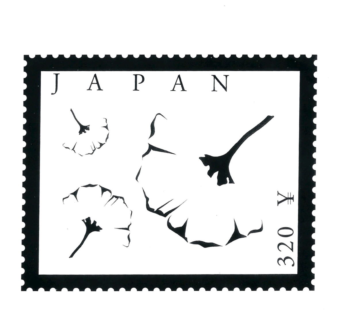
This very simple black and white image on a japaneese stamp that show gingko leaves, but none of the leaf edges actually join to the stems but the image can be clearly interpreted as three independent leaves. Our subconscious vision processing has happily seeks where hidden lines or non obvious edges are likely to be and presents us with an easily understood image. The artistic hook here is the brain has become more interested in the image.

IMGP7245


An experiment with lost and found lines in a photo

Wednesday, May 18, 2016

Time for a coffee & creative ideas

Its later in the afternoon and not a daily photo taken yet. So I was finishing a coffee and contemplating what to do. I had an idea to try a series of my self looking at the camera and painting as if it was a self portrait, perhaps to make into a time series collage. So I set up my canon on my tripod and set it to take a series of images. I finished my coffee and then played with the brush.

A blurry series that should have been rejected

However it was one of those session where nothing worked as planned. Just as the cameras started firing the sun came out, brilliantly, casting unfortunate shadows. Collage of dreamscope images of me finishing coffeeThe camera was still manually focused, and everything turned out  blurry. There where many other problems especially that I had other more urgent duties to attend to, so I didn’t get a chance to repeat the photos. All I had was 12 terrible exposures, normally they would be deleted BUT I often tell people to keep a few rejects to experiment on. These were terrible and thus perfect for an experiment. My first thoughts was to try some simple dreamscope transforms and build the collage, but the three initial images of me finishing my coffee told the best story. Yet the simple transforms didn’t exactly look creative enough.

I decided to build three layers, The painting ground I made by leaving the image blurry by increased luminance and saturation. Next I made a simple stipple pattern and used it back in dreamscope as my custom filter, and created some line work. Then I recreated the the final patterned overall with the watercolour cartoon filter. I finally I experimented with OnOne Layers and different blend modes to give a composite image, that was once a rejected photograph.

#139 Coffee Drinker & Yellow Vase

Monday, May 16, 2016

Thursday, May 12, 2016

Fire in the sky

_IGP5455_HDR Fire In the Sky

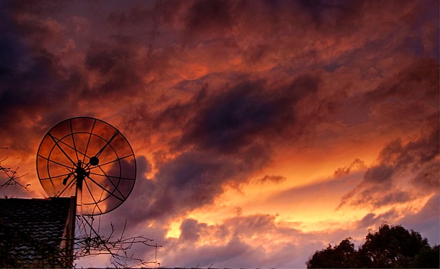
Tonight’s sunset was spectacular, for a few minutes at least, as the clouds parted and then closed over again. I was keen to get a few more bracketed EV photo sets to test out the three options for making HDR images I currently have on the silver spectre (my new laptop).

image


My old favourite Picturenaut, is not exactly on the laptop (it lives off site on my backup disk drive and/or my Black Darkroom USB key. It is fortunately software that does not have to be installed on a specific computer and can run as a portable app). I purely use it to do the merge and feature alignment, deghosting and colour balanced and the most basic of tone mapping then “finish” the 16 bit HDR tiff-image using OneOne or Lightroom. 


Image result for aftershot pro 2 logoMy new toy, is the HDR merge within Aftershot Pro 2, which tries to take over all the steps, and can lead to those over the top surreal images. However by being a little constrained it can do a realistic albeit snappier results and optionally align features. It can also work directly from the RAW files and can store 16 bit tiff files, to give gorgeous results without a lot of tone mapping required.


Image result for nik hdr efex logoThe really new kid on the block is Nik’s HDR Efex Pro 2, which is currently free to download thanks to google loosing interest in it. I haven’t had much of a chance to play with it but It can be used as an add in from Ligthroom and now OnOne 10.5 (although I can not figure out how to do the merge direct from Onone 10 browse. I can get the merge, alignment, deghosting and defringing done in one set as a special export from lightroom. the raw HDR file actually looks pretty good, ie natural but maybe a little contrasty & dark. It has a number of tone mapping presets to finish the image.


Picturenaut

Aftershot Pro 2 HDR

NIK HDR Efex Pro 2

picturenaut HDR with adptive log tonemapping Basic HDR Merge NIK HDR Efex defalut tonemap
Finished in Lightroom, a little contrast & saturation of purples Finished with OnOne 10.5 Tonal tweak & Dynamic Contrast NIK HDR Efex pro 2 balanced Preset

So which image have I chosen as my Daily Photo?

You need to go the flickr to see.

Playing with Light & Layers

Glass angel under incadescent available light Lit by handheld & moving LCD mag lite Brocade Warm Texture

I’ve just downloaded the update to OnOne 10.5 which comes with a fair number of updates including some improvement to their perfect brush for nicer masking and extra textures. So I had a play with two different light sources on a glass angel on black glass. Then I combined the two images, the first under incandescent light and the second side light with a LCD mag-light and loaded a brocade texture merged into the background. I had fun

Glass Angel under two lights

Wednesday, May 11, 2016

In the Surrealist Shadow

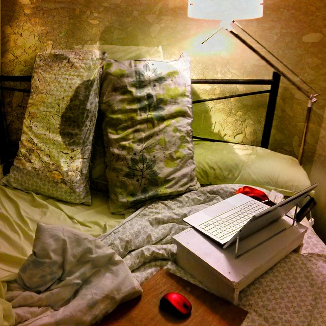
Paying homage to the surrealists seems logical on the 112th anniversary of Salvador Dali’s Birthday. Shadows and dreams are common motives so making a composite of my shadow superimposed on an unoccupied bed seemed to fit. 
2016-05-11_17-14-58_HDR  _IGP3146-001
I used my phone and HDR Camera+ for the unoccupied bed (the dreamer is “away”) and a silhouette portrait taken of my shadow on the ground (again the body is not shown). I used OnOne layers and the soft light blend mode to combine them, nothing trickier than that.#132 In The Surrealist Shadow

Tuesday, May 10, 2016

Failing Light, a Collage & a Clone Painting

Melbourne’s weather is notorious for its changeability, and the past week or so has been see-sawing between strong winds, rain and perfect sunshine. This afternoon the rain cleared and there was some fantastic low angle light so I grabbed my camera and headed into Jells Park.A Series of Bracketed RAW filesHowever as I arrived the dark clouds rushed over head and the air chilled. It didn't rain but I almost missed the good light. Still I did take a few bracketed sets.HDR Images in Joiner style collageWhilst the individual RAW file looked pretty ordinary I was able to get decent HDR images, using After Shot Pro 2 HDR merge directly on the RAW files with a little local tone mapping. They make a nice collage and  fine stitched panorama, (not shown). But the colouring inspired some further experimentation with Corel Painter Essentials 5. This is somewhere between a filtered photo and a clone painting, having partial layers of each and it does capture the drama of the end of the day.

Halfway between a Phone & a Clone Painting