Sunday, June 28, 2015

not so fast now

Neither of the two runners are drawing away, in the smartphone photo upload to the cloud race, while I am in low connection - infrequent WiFi land. Not that that worries me, I’m used to uploading photos from my phone regularly. A few images are getting through to the separate clouds, but interestingly they are not the same photos and appear at different times. I haven’t counted exactly but google is probably ahead

Old reliable picasa to the rescue (creating a new Web Album)The biggest issue I am having is trying to group the one’s I want not those chosen by the google photo assistant (aka annoy-ant). Put simply I don’t like google photo not allowing me to use those new potentially good tools and wasting my time with photo I’d rather overlook. Changing the name from autoawesome to assistant doesn't help, it just annoys me now. Also there is the confusion of terminology now that collections are being used instead of album in some places but not in others, For example if you click on a photo on-line it says add to album but the default view is via collections (aka albums). I also ran into a catch 22 when trying to create a new album from a selected photo when I click on add to album it just showed a dialogue of selected album thumbnails to click on, I could not find anywhere to create a new album of collection on the web version of google photos, BUT it appears you need to be on-line to do it. I had to resort to using the old reliable picasa to create a new album. I can add a collection on the phone and it becomes an album! Its all a bit messy and to be honest I just still prefer to do my organizing in picasa on my laptop

imageThe second issue is how to share the images privately with just nominated family and friends. I have for a long time used picasa web albums (and later google+ albums) to share a progressive updates to an album dedicated to my travels. However some time last year this facility was changes so that the photo could only shared with those that had a google account (which annoyed a lot of people to the point where they would bother looking). Has google photos fixed this? It claims it has. You can get a link you can share and it seems to work. However it is not clear if the collection/album remain private. This combined with the restrictions on staying organized if I’m not spending a lot of time on-line, himageas made it a bit to difficult to set up my normal progressive album/slideshow just for family. I am still preparing an album in picasa of my travels at the moment but…,. I’m frustrated by try to understand what’s going on with the sharing

imageThis is where flickr is streaking ahead, it is really clear what is private and what is public (via a sharing icon watermark) and when you share private photos you get a link and it clearly states that the photo can only be seen by those that receive the link. If you email this link to a family member only they can see the photo (which is the way it should be) Once again you need to be on-line (ie connected via 3/4G data or WiFi) before you can do any organizing of your uploaded photos in the flickr app. However the phone app and web features are much closer to each other, so you get an integrated feel and they do the job simply and well. I’m actually changing over to using flickr for my progressive trip album to share with family & friends

Saturday, June 27, 2015

PhotoFriday :: Soft as a Koala


Koala's are supposed to be soft & cuddly.
Sleepy & grumpy more likely.


For PhotoFriday‘s topic Soft


Photographed at Rainforest Habitat Port Douglas

Remember that Spare Battery

Battery life can be a real spoiler for a lot of digital cameras, specifically for those without a separate optical view finder, such as most compact cameras or the newer mirrorless cameras. The problem is you need a fair bit of power to light up the LCD screen on the back. Especially to get it bright enough to read in ambient light. A few mirrorless cameras offer a view finder with a tiny LCD screen. My experience was these has been mixed, the earlier versions of such systems where very “laggy” and not so clear but the technology has improved a lot and perhaps also the power consumption. However with one of these cameras it is pretty likely you battery will run out at a crucial stage. The solution is a spare battery in your camera case

I always take a photo of the discharged battery when changing batteries

Owners of the traditional DSLR, with the mirror that has to flip up, generally get much better battery life. I changed the battery today after 83 days and 2643 photos taken (but I have taken only a few flash photos). I always take a photo of the discharged battery when changing batteries as a easy way to keep track of my battery rotation (and likelihood of being low on stored energy). I must admit I probably only consult the LCD screen on the camera occasionally, usually on the first few shots in a new location/lighting. Evidently moving the mirror must take a lot less energy that lighting the screen.

It doesn’t matter which sort of camera you have

Buy yourself a second battery for your camera and keep it fully charged and in you camera bag.

Friday, June 26, 2015

Thursday, June 25, 2015

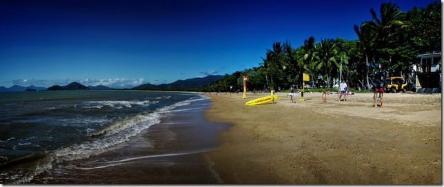
PhotoProject :: A better day on the beach

A better beach day, but still collecting photo references and sketchesMulti-image Panprama stitched with AutostitchJoiner style collage created with picasaMulti-image Panprama stitched with Autostitch_IGP0040 RAW photo finished in Perfect Effects Watercolour Sketch

Monday, June 22, 2015

PhotoProject :: a joiner collage, stitched pano, sketch & HDR

Phone photos made into a joiner collage using picasa


My first day in FNQ (Far North Queensland)
was nice and warm and I had a great coffee with a very late lunch at a wonderful cafe with a great view, so much so I have recorded it in 4 ways,


Multi panel pano bprepared in autostitchMy Watercolour SketchHDR prepared in Aftershot finished in perfect effects

Mostly Harmless :: The race continues

I gave up trying to stop the new apps on my phone uploading all my photos, well I really just decided to let flickr & google photos tough it out and see which did a better job. Well my findings so far is both are essentially harmless, they don’t seem to interfere with me at all. Google photos has turned itself on from my computer, which is annoying as I try to figure out how to turn it off, and flickr keeps adverting its Flickr Uploadr (just another image vacuum cleaner).

What about difference in the systems otherwise, well there are many similarities. The best way to view the images is clearly as time lines (flickr calls this the camera roll). Both systems attempt to auto classify the images (via adding tags or allowing search by common themes) and flickr seems to be a slightly more accurate here, but neither is really reliable yet. Flickr now has a small filter above any display that lets you select between private and the various public views. I have not found an equivalent in google photos (yet!). Flickr displays everything uploaded in view all mode, but I found google photos often slips into “highlights” mode (where it selects the “best” photos to view). Once again I am going to have to search to find out how to avoid this.

Shared from Flickr via HTML code

It seems that sharing is the area where the two system differ most. flickr share dialogueFlickr is miles ahead here, well in my view, following much the same way it has always shared (including direct and simple links to facebook & twitter). For sharing into blog posts (or web pages) I like the snippet of html code approach (see photo link on the left and share dialogue on the right) this approach is tried and reliable. The google photo share option still doesn’t have a link to the actual imagegoogle photo share dialogue, the get shareable link goes to a webpage that then connects to the image so the common methods of linking to am image within embedded HTML won’t work. You have got links back into google plus, facebook and twitter not that I have tried these. So there is no photo directly shared from google photo here (despite blogger being a google product!). So I definitely prefer the turtle here, not that the race is over yet.

My biggest disappointment with google photos is actually to do with the total lack of information about the licencing and sharing of photos when you view your photos. This is really unforgivable since this information can already be associated with each image, and really only needs small icon to be displayed either as watermarks on an image or beside the photo. As I suspected all auto backed up photos are private, to find out I used the special link to view the photos in Picasa Web Album view, and there are the little padlock icons, to indicate the auto backedup photos are private!

A picasa web album view of my photos

SO WHY NOT ALSO DISPLAY THESE PRIVACY ICONS IN THE GOOGLE PHOTO VIEW?

Sunday, June 21, 2015

PhotoFriday :: Flowers


And now for something completely vertical.


Taken on my LG Phone, using HDR Camera+.
Vignette & Borders using Perfect Effects


For PhotoFriday‘s topic Flowers

Saturday, June 20, 2015

The Importance of the Physical

I’ve just been to the 25th birthday party of the monash gallery of art and shared some of the yummy birthday cake. Best of all the place was buzzing and not just with friends of the gallery, lots of kids where enjoying the photobooth and other activities or just running around in the wonderful surrounding outside. Not a soul with their eyes glued to their phone or iPad.The current exhibitions brings together some highlights of the mga photographic collection, which in turns includes many key photos in the Australian photography. The photos are hung in salon style and their physical presence is very powerful, and yet they display much originality and clarity in the essence of the subject captured. This is a very welcome change when so much of what is promoted as art is gobbled up on social media and small screens. Yet it is dominantly just look at me, wanna-be celebrity, copy cat stuff. It is a pleasure to step back a pace or two and contemplate good photography hung large (well 10” by 8” up) on a wall.
Felicity by Patricia Piccinni

Friday, June 19, 2015

PhotoProject :: Focus Stacking

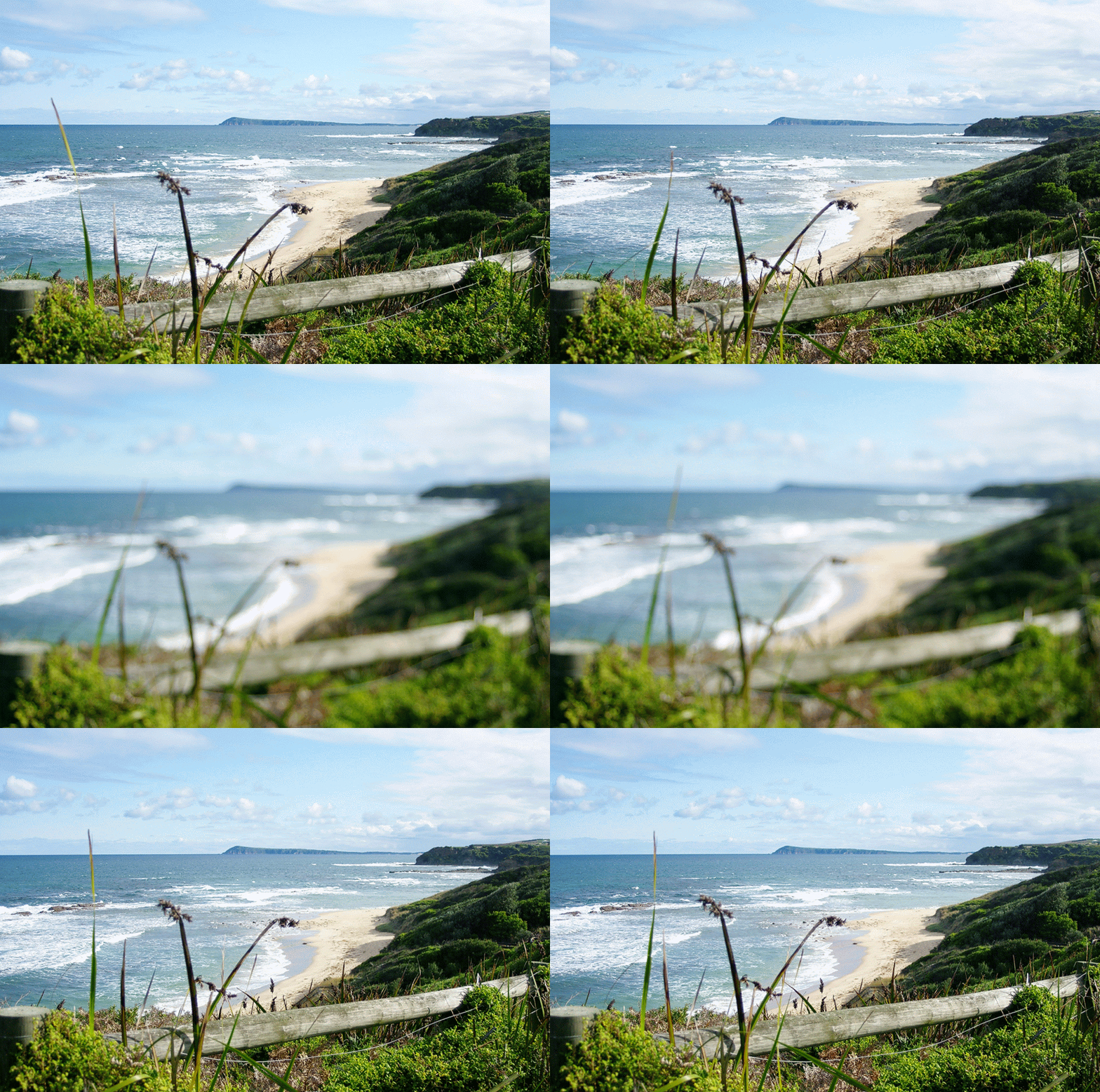
This month theme for the 12 Months with Matt Kloskowski group on flickr (its a private group for those that have upgraded or purchased OnOne’s Perfect Photo Suite 9) is photo stacking, something I have never tried. I was have lunch at a favorite stopping point and could see a perfect place to try out the technique. I opened up the aperture as far as it would go (just f 5.6 on this kit zoom lens, my good lens has a broken mount), in the mistaken thinking I could challenge myself. (opening up the aperture reduces the depth of field)


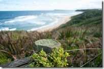
The first spot I picked to try out the focus stacking series had some good point of interest from the bluff in the background the beach and waves an the foreshore vegetation and then the fence. Trouble was the stiff breeze (aka gale) was straight from Antarctica. So the reeds in the foreground here dancing around and the waves are pounding in. Not to mention my fingers where freezing. (the google photo auto-gif doesn’t record how cold it was). The other important issue I realised as I took these photos was I realised I was taking the series hand held in the wind, which was likely to make merging the photos a challenge. I walked along a bit further and found another overgrown fence post with a view down to the beach. Having warmed my hand in my pockets and braced myself against the wind I took another three set. Firstly focussed on the distance, then focused on the near beach and finally the vegetation on the post.

_IGP9463 _IGP9462 _IGP9461
Distance Focus Near Beach Focus Vegetation on Fence Focus
These are not the only photos I took but they appealed to me most to bring together a number of points of interest at different distance and still have an interesting composition. The photo still bounce around a bit (compare the horizon and exposure of the sky) and I did have to be patience adjusting the images to fit (this is because I hand held the camera) using the Transform Tool in Perfect Layers. Would have been a lot easy if I’d used a Tripod. The actual blending of the layers was easy, even though the images have noticeably different exposure. I use 50-75% feathering between the distant and near beach layers but only 25% feather and a smaller brush to lift out the fence and vegetation. While I was at it I used the magic eraser to remove the fencing wire. None of the photo really has the top of the fence post in crisp focus so I had the feather between the close up and near beach focus to fudge the weathered post end. I probably should have taken a fourth exposure (or more sensibly used a smaller aperture (like f8 or f11). All that remained to do was use Perfect effect to finish the photo using the Dynamic Contrast Natural filter, but moving the medium detail slide a fair way to the right and the Big softy vignette.First Attempt at focus Stacking>

So what did I learn?
  1. Use a solid tripod! (especially in the wind)
  2. Don’t go crazy with a trying to use a low F-stop (ie don’t try and show off)
  3. Take extra intermediate focus points, when in doubt.
  4. Its a fun way to maximize your depth of field.

Monday, June 15, 2015

MDR rather than true HDR

I’m using the abbreviation MDR to mean Maximum Dynamic Range, to differentiate these approaches from “true” HDR.

Something I haven’t tried out in a while is Amalence’s HDRAW standalone utility. This utilizes Tone Mapping technique, allowing it to preserve the details while fitting the highest dynamic range image, taken from a single RAW photo, into the limited dynamic range of a single JPEG or any other 8-bit format.

Example of The Hdraw Main Screen

It displays the options in popular filter examples that you just need to click on the most pleasing option (ie not shinny painting please)

Another way  I have seen described to get a HDR set from a single image is to take a well exposed image and create an overexposed version and save that and then an underexposed version. Normally by moving the exposure slider by the equivalent of one f-stop. This might let you use tone mapping tools but it does not get you extra tonal range, you can find in bracketed exposures. If you want to follow this approach the new AfterShot HDR has this as its second option to create a HDR file (I don't recommend this approach)

The final approach, which I feel is the most obvious, is to use software like lightroom to stretch the tonal rendering to its maximum (well maximum acceptable amount). In this example I am using lightroom’s development module I just use the basic tonal controls controls at the top of the development tool panel. I fist try the whote balance, although in this case I feeel the as shot does reflect the warmth of the first dawn light colours well. Next I have a adjusted the exposure up a little (moving the whole histogram a littel to the right because it is so heavily biased to the left, the dark side). Next I adjust the shadows and blacks to keep the forground dark (and hide the shadow detail, for pictorial reasons). Finally I lift the highlights and the whites (there aren’t many as shown by the histogram). I lift the clarity (local contrast) and vibrance (the intensity of the deeper co0lours just a little.  I do have a preset I developed ages ago called SDR+ which follows these steps but I actually prefer to do the steps manually because I can finesse the sliders in each step.

image

A number of software programs offers histogram stretching tools and they can produce HDR like results but they are less easily controlled than the tonal tools in packages like lightoom and AfterShot.

A Beautiful Dawn and being Accustomed to My Camera

The blurred first imageEven though I was still half asleep and had not put in my contact lenses, I couldn't help but notice the magnificent sunrise. So I quickly grabbed my camera, despite being dark and not being able to see clearly I was able to get the camera in Exposure Priority and dial up what I thought might have been a higher ISO (I got both right) But I could tell the exposure would be way to slow (ie 1/4 second) to be hand held (click on the image on the right to see how blurry the resulting photo turned out). I didn’t even check the screen and cranked the aperture wheel down a few notches (not knowing or being able to see). These sounded better, possible quick enough, and I took a couple of overlapping images to make a panorama..
Prelim collage created in Picasa
The image above is just a quick collage created with picasa. I think my beloved Pentax has done a great job even though I wasn’t able to visually check the setting or button I was pressing. Naturally I could see enough where to point the camera in the right direct and could hear the autofocus tracking my lens back and forth.
This story continue (I took a few sets of bracketed), after using my muscle  memory to select my user programmed mode on the main dial (which is preprogramed to create a series of EV values)
sunrise pano  created in autostitch
I had breakfast and put my lenses in, upload the photos and like the initial pano set. So I have taken it though Autostitch and used Perfect Enhance to hold down the digital noise.
The exercise of using your camera without looking at the dials, and just taking the picture is highly recommended. (Even in the Dark)

Saturday, June 13, 2015

PhotoEditTools :: AfterShot’s HDR

Despite being a fan of HDR (used with restraint) and having had Version 2 of AfterShot pro for a while (and used it often), I actually had not got around to trying out its new HDR feature. I figured I’d work on this series of a stormy sky for this weeks PhotoFriday, perhaps HDR can enhance the drama of a coming storm?
image
There are a three modes in which you can run the corel aftershot  HDR, and I will just used the conventional method of working with a set (three in this case) of bracketed exposure. To do that you simply select the photos you want and then right click and select the Edit with AfterShot HDR option. This takes you into a new window (and new process) shown above, which merges the three images into one with a wider dynamic range. At this point you have the ability to select individual photos as if the are layers and paint in or out details from that photo. I haven’t used this feature here but I can imagine it is going to be very useful.
image
After you click on process you get a new panel which undertakes the tonemapping (it is called HDR Adjustments) and there are the typical series of garish Presets (the don’t have typical tone mapping names) but the all tend to overbake the effects, eg disturbingly contrasty and gritty or lurid false colours. They are not my style so I turned off the presets and underneath this filter panel are a series of more conventional tone sliders and I just lowered the shadows a little. Normally this is where many HDR systems would leave you but Aftershot HDR has another panel.
The third and final step in the Aftershot HDR, which is called fine tuning gives you access to a histogram with some basic tonal sliders. Lower down on this right hand panel are a number of other fine tunning tools. This is actually a smart idea because I normally take the HDR tonemapp and do some further “fine tunning” on it in say lightroom or perfect photo suite. I have aftershot pro on my laptops rather than the  lightroom/prefect photo heavy weights so this is going to be very useful. If you are happy with the tonemapped version you can just press the Save and close key at the bottom of the screen
image
I should have tried this earlier.
Here is the photo after some extra post processing in Perfect Effects

Friday, June 12, 2015

PhotoFriday :: Atmosphere

The Coming Storm


For PhotoFriday‘s topic Atmosphere

PhotoEditingTools :: Looking Sharp

image
I’ve stayed away from the use of sharpening. Especially on RAW files because sharpening often lead to extra digital noise. Over sharpening can be very distracting, producing halos around dark or very light edges, How much sharpening is to much? Its a personal decision. All to often the extra detail in a sharpened image is not real just an artifact. It can happen in HDR when too much contrast is included in the tone mapping. So some restraint is desired and access to good sharpening tools esential. Here I am using perfect effects, which splits the sharpening into three groups. the last two are for the screen (not as contrasty) or printer (which then has a series of paper styles) and is much stronger sharpening (to the point of looking a little scary on the screen). However my favourites sharpener are in a group called Fix Focus. My particular favourite being High Pass sharpening, which is also available in Photoshop & Aftershot Pro

Thursday, June 11, 2015

And the race is on

The new apps on my phone are all busy trying to upload every image that I collect, soon after I photograph or collect it.  At the same time drop box, upon which had to began to rely to upload new phone photos whenever I have WiFi access, seems to be falling behind.

The new andoid google photos app seems to have infiltrated several other apps on my phone, including the native android camera and gallery apps.  Despite the fact I had turned off its predecessor desire to upload, it is happily vacuuming up any new graphic images and posting them to google photos whenever a WiFi connection is available (at least it remembered this part of my settings). Otherwise it seems harmless.

The new android flickr app has also taken upon itself to upload photos from a phone.  However it is probably more polite in doing this.  It seems to only upload from a limited number of directories, specifically once used by my camera apps.  Further doesn't rush to upload new photos, I have the feeling it trickles them up.  Only when I am specifically looking at new photos in the flickr app does it upload things.

So in the race to grab all of my images it appears to be a rabbit and tortoise affair.  I like fables and therefore have decided to let the race continue for a month or so, providing I can see its not going to end in tears.  The vast majority of my phone photos are unimportant anyway so I don't want to flood my “social media” presences with such mundan-ity.  So fingers crossed and let's see where this goes.

There is a big difference in what I see on-line of this race to collect everything.  The tortoise may be doing better here.  All the photos are being flooded up into the clouds are private, which is good.  Many are being automatically tagged with the most common subject tags, also good.  They are displayed in my camera roll in date order, importantly with the small padlock icon to indicate that they are private, very good.  It is a relatively simple matter to click on a specific photo and the click on the two arrows icon in the upper right to display the photo page. Then under the heading additional info the first line is viewing this photo and you are able to select from appalled and list from private through family and friends to public, for public photos you will see the padlock icon change to an eye, beside which will be displayed the number of views of the photo.
image
In comparison the rabbit, the google photos web view is a bit more brash. The icon are larger, the layout is still a time line (rather than albums). What is missing is any indication of weather the photos are private or public. In fact I can’t find anywhere in the google photos view that can assure me they are private. Not good enough! I’m pretty sure they are private and will remain so until you share them, but I can not confirm that at the moment So whose the bunny here?
image

Wednesday, June 10, 2015

Not all is harmony in the XMP World

Whilst many software applications can share metadata via XMP files, the situation is far from a recognized standard.  XMP is an extensible XML style format, which means it can be customised.  Applications that read this data, need not be able to understand everything.  They just need to honour (and not modified) any such data.  Adobe itself use the XMP the file to store details of proprietary Post Processing methods within Lightroom, These methods are unlikely to be known by the software, and that software should not be expected to reproduced the exact Lightroom process.  Corel’s Aftershot Pro also uses its own proprietary XMP format for its processing, but also offers the opportunity to save standard XMP files by which it means just the metadata.

Is in the area of metadata that there does seem to be good agreement between packages.  Specifically key wording, star ranking and the colour flags/patches or classifications do seem to be reliably exchanged between programmes.  Most of the EXIF data seems to be so exchanged, when exception might be camera settings and lens identifies (usually of read from RAW files) that don't always make it into XMP files. Some some software does not acknowledge IPTC metadata.

Finally I don't expect to be told what isn't read from and XMP file.  Anything that isn't under stored get ignored.  So for example you may have set the Likes and Dislikes in OnOne's perfect photo suite, but they will not be interpreted as Flag as Pick or Set to Reject  in lightroom so they just don’t show up.