 |
| Threatening Rain |
 For PhotoFriday‘s topic Park


I have steered cleared of doing camera reviews, mainly because I think any digital camera these days are good enough to take decent pictures. However there is a such a range of camera available deciding where to begin is quiet a challenge. I notice on the flickr blog, they are tackling this very question, and they are in the wonderful position of seeing millions of photos loaded with a wide range of camera. They have a neat summary table of the main classes of camera versus the type of photo you wish to take. I have added colour to highlight the great, versus good versus ok. This is the first in a series of articles planned for the flickr blog so make sure you visit them again and follow the series.
I have to admit I own cameras from 3 of these 4 classes (I don’t own a mirrorless/micro 4/3rds. camera;yet!) Smartphones can be expensive, but the camera will seldom be the key purchasing criteria, the other cameras get more expensive as you move to the right. The interesting observation here is that the micro 4/3 cameras are satisfying the more common  photography generas, their reasonable pricing probably make them a better choice these days than the compact style cameras, and if you haven’t already invested in the larger and heavier DSLRs they are probably an obvious choice of a new photographer (in training/aspirations).
If your getting down to the purchase decision it might also be worth checking out the Flickr Camera Finder, you get to see not only the cameras popularity and technical specs but importantly you can get to see a range of photos taken with that camera.
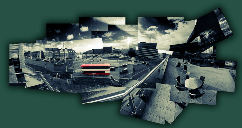
 Whilst photo collages have been around a long time its is the joiners developed by David Hockney that can bring a rich artistic feel of personality and being an original work. His original joiners where just polaroid images (lots of them) assembled and stuck down to make a larger image. Not necessarily taken from the same vantage and often deliberately not quiet matching. I have found the collage maker in picasa is an idea place to build similar joiner style collages. However there is plenty of software out their to do a similar job (Hockneyizer is a wonderful “filter” style app,originally for flickr photos but you can upload any photo to it directly, that will take a single image and break it into a hockney style collage)
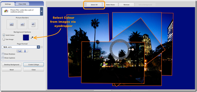
 In picasa you just need to select the photos you want and the select the collage builder tool (either the Create/Picture Collage menu item or collage button if you have one on the bottom toolbar). The first step is to select the picture pile format which is as if you are just scattering the photos on your desktop. under that is a series of border templates (the collage above has the polaroid frames, in homage to Hockney but they are not what I wanted for the final image. I prefer borderless option.) However I like to using a drop shadow which emphasis (rather than hides) the join between photos. The next step is to move around and possible resize and reoriented to photos. When you select a given image a control circle if overlayed on the photo click on in and moving your mouse slides the photo over the surface. You can resize the photo with the mouse wheel (or clicking on the orange dot on the little control button on the edge of the circular tool and moving it in and out (horizontally). To rotate the image again click on the orange dot and now move the mouse vertically and you will see the image rotate. the controls are very easy to master and you will soon be able to rotate and resize at the same time.
 One of the bigger charms of Hockney’s later joiner work is that he did not try to fill the whole space and left ragged edges and some gaps but he did take time to judge a suitable background colour, something that could bring the whole together. I like this approach and so I used the eye dropper tool to select the dark blue of the sky as my background, Then a bit more rescale and realignment of all the photos together (press select all at the top of the workspace and all the photos will be outlined and can be reoriented and scaled as one). You must then hit the create collage button, which creates the composite image and puts them in a separate album called collages. You can then work on this as any other photo in picasa so I did a fraction more cropping. The advantage of the picasa’s tool is you can return and re-edit the original collages in the collage album at any time.

 My trial of Perfect Photo Suite 9 had not been progressing well, I was running up against an 1018 error which relates to Open/GL 2 support and the graphics card. My Toshiba laptop having two graphics cards an standard intel and the Higher performing Nvidia GeForce but alas I was only seeing the intel driver and the 1018 error of a warning about Open/GL support. A fair bit of research and asking the right question to OnOne support has got me through this serious "trial" of my patience.


 For PhotoFriday‘s topic Metal
 |
| Clone Painted Self Portrait (via Corel Painter Lite) |

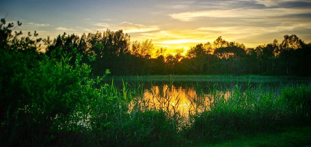
 My original intention for this week’s The Patch theme on Landscape and Water was to be a dramatic surf seascape, but circumstance keep me from getting down the coast, and a usual time was running out. Saturday night bought the heaviest overnight rain for many years so I next morning I headed for the Jells Park Lake expecting to see flooding everywhere (or at least some good puddles to get a reflected landscape. Trouble was the sky was a dull grey, with just the occasional glimpse of blue and it was still drizzling!

 |  |  |
I was taking some clouds when a jet flew over leaving a long contrails ( or chemtrails if your a conspiracy theorist) or maybe it was dumping fuel, but it did leave a fascinating bright streak across a bright blue sky.
 |  |  |
 I’ve never had reason to doubt the analysis of Google, or any other social media service. Mainly because Views, Favs, Likes or Plus Ones are not things I follow too closely. However the recent discussion on the worthwhile podcast This Week in Photography which focused on “Where’s the party at?” dealing with social networking for photographers got me thinking about they way things where going, less community and sharing and more a focus on klout scores, likes, views and copy cat homage of the perceived trendy and celebrity photographers (aka those with big numbers of followers). Ok I have a personal conviction that all this is discouraging creativity and originality. Anyway when +FredrickVanJohnson mentioned declaring Social Media Bankruptcy, I had to smile, but it made me have a quick reconciliation of where I getting the most “connection”. Looks like Flickr & Google+ get more response than Blogger and Twitter, for me at least. I soon lost interest again but I did discovered there was quiet a discrepancies on what google was reporting for one of my recent ThePatch posts.
How can I have more Plus Ones than Views? Especially when google+ photos reports no plus ones of views for the actual photo that was shared! I have previously noted that the number of views can suddenly change from zero to many hundreds. This doesn’t worry me personally but there does seem to be a lot of questioning of the counts on the web and this post by +YonatanZunger tries to explain what the counts mean. However I still find it hard to explain what I see.
For the record I follow +ThomasHawk, +MattKloshowski & +TreyRatcliff and think they consistently show great creativity and originality. They are definitely worth following on both Google+ and Flickr. I don’t include them in the great celebrity photographer fairytale.


 I need to refer you back to when I first noticed significant differences in how they are displayed (in picasa). This is because after a while Picasa tries to give the best exposure to the RAW data (at first it just use the small jpeg embedded in the RAW file, which will match visually what the Jpeg from the camera looks like at thumbnail scale) it inevitably ends up with a fairly boring average look. Lightroom avoids this comparison because when you have a Jpeg & RAW pair it only displays the RAW version. How and when it tries its best on the rendering of the raw file depends on your load settings (I’ll leave the details on that for another post) but it will also pretty enviably gives you the bland average version. THUS it is my conclusion that RAW files always need at least a bit of post processing (usually just a small amount of colour and/or tonal tweaking). Whereas the Jpeg render follows my camera settings (which give me extra saturation and contrast because I prefer it that way). SO if you just want to post to the net, such as sharing on a social network WHY NOT just play round with your camera settings and just take Jpeg photos (they are smaller).
 The sharing process involves two steps in flickr, and three or four steps in blogger. Thus I have found it best to have both flickr and blogger open in separate tabs in your browser. To begin open the photo page for the image uploaded from Known, click on the share icon (which is the right facing curved arrow on the right hand side of the image. This brings up the share dialogue, click on the HTML radio button and copy the HTML code in the bottom dialogue line (see example on the right). This is HTML code that will display the photo in blogger while the photo itself stays on flickr. Now go to the blogger page and select the Create New Post (it is a pencil icon up on the top left, but I’m sure if you blog you already know that). Firstly change the edit mode from compose to HTML on the blogger post page. Now paste in the HTML code from flickr into the post text area,(see the example below in the blue dashed line highlight box). Next return to the flickr page and click on the small edit icon (again a pencil icon) beside the title and comment section. This will them show you the actual HTML version of the text from your know po
 st (see example on the left). Copy this and return to the blogger page and post it under the image HTML (also shown within the green box below). You know have a post almost identical to the post back in known. unfortunately like the google+ link any hashtags will not be automatically transferred so if you want to use any you will need to enter them manually using the lables button on the right hand side of the blogger page.

 I doubt it will ever be made available. So I went looking for an alternate approach and it is pretty straight forward. Once you have published on Known, you just need to click on the date entry under the post (see example above) and you will be shown just that post with the permalink to that post displayed in the URL address at the top of your browser. Next you need to select that address and copy it into your cut/paste buffer. Now you can go into google+ and select the link icon, which brings up the link dialogue, shown on the right. Now paste the permalink to you known post onto the Attach: line. Google+ will soon check your post and make a sort of summary selecting a photo (if one exists in your known post) and the title of your post. If you want to use hashtags your need to type them in the google+ status box (at the top of the dialgue screen). You may also want to change who to share with,(eg Public, Circles, Communities) on the To: line. Then finally click on the green share button.

 There are many interesting things to see in any forest for #thesececretlifeoftrees