Wednesday, November 28, 2012

Why is a Defringing Tool so useful.

IMG_7768-1Tonight’s full moon was the classic harvest moon colouring, an orange yellow, even though its late spring here. I’m guessing its all the dust and pollen in the air. So I grabbed my telephoto and took a few exposures hoping to get something decent (most just showed a bleached out disk, the rest had those distracting purple halos.)

imageThere is a new set of sliders in Lighroom 4.2, under the Development Module, there has been a Remove Chromatic Aberration section for a while, way down the bottom of the panel under Lens Correction section. These sliders now give some much easier to use tools to deal with those annoying colour halos and fringes that often show up in many photos, especially in backlight subjects or high contrast areas, low f-stops (fast lenses) and high ISO sensitivity.Tings like the moon and the sun are classic cases as they are much brightyer than the sky around them.  In the Lightroom jargon these halos are grouped under the term a colour fringe, and thus defringing just means removing these colour artifacts.

Unfortunately the way my screen capture works I can not show you  the eye dropper in action, but the tool is very easy to use. You just click on the eyedropper in the Remove Chromatic Aberration panel and the cursor becomes an eyedropper with an associate panel that shows the fringe colour you have picked, by pointing the cursor/eydropper at the part of the halo you want to remove. This then automatically sets the individual sliders in the colour Chromatic Aberration sub panel, that deal with specific colour halo ranges and in most instances does a fine job of removing the colour halos  The slides do let you control which colours to want to remove from the halo and the two markers on each of the purple Hue & Blue Green Hue sliders can be used to set the range of colours you want removed, move them apart to remove the colour halo and “heals” the fringe around the subject. In this case the moon had a purplish rim (it may look red but it is more a purple hue.). I actually tweaked the sliders a little ;lift the strength of the puirple correction.It not perfect, the edge is still a little fuzzy but it is a decent image now.

Sunday, November 25, 2012

Instagram Workshop :: Lesson 1

Spiral Composition red car bollywood dance workshop
godfrey being square & red purple car Diagonal composition

My little post yesterday didn’t include one very important point about Instagram. It uses only square crops! However when you are used to 3:4 and landscape formats the square is somewhat constraining and particularly how you tackle composition does require a rethink. Misho’s suggestion to center the subject and keep the background simple were a great start, but this still left me plenty of room to experiment.

Instagram Workshop :: Lesson 2

picasa collage - bollywood dance lesson
This was probably an incidental side lesson, but misho’s approach to adding text captions onto a series definitely helps viewers see the actual story behind his photos (see #wvaindia in Misho’s instagram photostream). This inspired me to think about using a series of photos to tell a story. Here I am using a panorama format to tell two stories of the day. Above is a time series collage of a lesson in Bollywood style dancing. Below is an "interactive" panorama of a multi-image sequence telling a few glimpses of the story of people taking in different aspects of art in the park (click to view and use your mouse to navigate around or click on the play triangle to see a 3D-like slideshow


Who says a photographer shouldn’t be a story teller?

Saturday, November 24, 2012

Alternatives to Instagram?

imageI am booked into a Instagram workshop with Misho Baranovic  a being held as part of Monash Gallery of Art, Art in the Park Day. One prerequisite is that you download the instagram app to your phone, which sounded easy enough! However I ran into a catch 22 situation, both my wildfire and my wife’s iphone use older version of software and the new instagram app will not download to either (without upgrading the operating system). Damn because earlier I had down loaded a previous android version for my wildfire, but soon after testing it, I deleted it and my instagram account. So rather than risking grief on the phones I figured I’d just use instagram via the web BUT you can now only register by using the apps on your phone so I’m locked out now. No matter I don’t mind being away from the popular “must have” and “look at me too” crowd and I have found I usually learn much more in the long run by finding my way around such constraints. So what are the alternatives for me to using instagram?

A quick google search of “Alternatives to Instagram” yields a lot options, and a lot are very anti-facebook, or just anti-apple-verse. The article by Adam Dachis of Life Hacker, covers the angst between the ios fan boys, android-ites and the facebook-haters , with some decent alternatives, both for apple and android. This PC World Slideshow gives some sound alternatives for android users. I quickly grew weary of the opinionated outpourings in many of the other articles and was surprised how little investigation or discussion into what makes instagram so popular. My conclusion is instagram just makes it easy to share photos to the web and its photo filters can help make something boring a bit more zanny! Am I selling instagram short?

So what do I really need to prepare for the, probably nothing, because I already have these capabilities on my phone.. One important aspect of a previous misho workshop was the 3 step work flow on cameraphones 1.Shoot, 2.Edit,3. Share message, and instagram does fit this approach. So my best preparation is probably just to make sure I have these steps covered. The final share step is the big one, clearly i can not upload to the instagram site but I have been uploading to shared sites for a while now and flickr is probably the easiest (not that i have been using it a lot) offering a good range of ways to upload from mobile phones. Albeit with just the fancy filters, with iconoc city names. For the edit step I prefer aviary, for my android, and whilst I only use it occasionally it does have some decent filters and editing features. The shoot step is obvious. I’ll find out tomorrow if I am prepared enough!

Thursday, November 22, 2012

Cloning away the unwanted

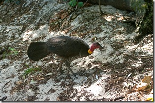
Clone Tool is an unlikely name for a photo retouching tool, but it is the best way to remove blemishes of unwanted detail from a photo. It works by letting you pick up the another part of the picture andexample of the photo-paint clone tool paste it into a different location (usually via a fixed offset. Most decent photo editors (I exclude phone apps which don’t routinely have an equivalent to a clone tool) will have clone tools (it may sometimes be called retouch, blemish removal or even a rubber stamp) and it is probably one tool you should learn to use, but with restraint. The basic operation is to select the clone tool, pick the point you want copied and the select the area you want it copied to  You can the generally move the paste point and the copy point will follow, click the mouse and paste tis new image will be copied. Its quiet natural once you get the hang of it, However if you are copying a lot of textured background you can end up with obvious repeating patterns if you are not careful so it pays to alter the relationship between your source and destination points from time to time and perhaps even the size to the section being copied. In this case I have used the clone tool in Corel photo-paint because I can control the size and type of brush How you set the source area, destination,etc varies a lot in the software so you will need to read the help, or the manual and practice a little. That skill can come in very handy from time to time, like now for me I like the photo of the bush turkey but not the wire fence.
now you see it  now you don't
A couple of minutes of cloning and the fence has gone. A little tweak of clarity and vibrance to 'lift" the final image.

Sunday, November 18, 2012

Autofix Revisited

Its been a long time since I looked at autofix features in software, mostly because I consider them a feature or button that takes up valuable screen space. However I had a prompt to revisit this concept after I noticed a nifty light weight app call Color Leap on the google play site (for android phones). Its claims that “true photo enhancement was never so easy.” seemed a bit extravagant and in need of testing. I have noticed cameraphones have particular limitations when they are pointed towards the light, and particular contrasty backlit subjects. They are often hazy,having flared highlights and underexposed detail, they just look flat!  Well Color leap promises to do 4 common enhancement without any user intervention, no buttons with weird names no sliders. promises to remove under and over exposure, fix problems like smoke, haze and dirty lens smears, reduce “colour” noise in low light conditions and even sharpen objects that are “slightly” out of focus. So it was out with my HTC Wildfire and off to get a few examples. I’m sure I could have taken worse photos, but I just wanted to take some realistic examples and I used my phone’s basic camera so I had an original reference photo (you can also take the photo directly in colour leap) I then processed each “on the phone” from the gallery using the color leap app which is truly as simple and automatic as claimed, with the option to view both the original and processed result using a toggle key overlay at the bottom of the screen. I finally loaded the originals onto my computer and used Picasa’s I’m feeling lucky and Lightroom’s Auto White Balance/Auto Tone Combination. So the verdict:  clearly all the Autofixes offer some improvement but as to which is good, better or best is a more objective judgment.
Original
Color Leap
Picasa/Google+
Lightroom
IMAG0688 2012-11-18 04.49.05-proc IMAG0688-001 IMAG0688-2
IMAG0685 2012-11-18 04.49.28-proc IMAG0685-001 IMAG0685-2
IMAG0686 2012-11-18 04.48.34-proc IMAG0686-001 IMAG0686-2
Whilst I actually seldom use the Autofix features of my software I would like to suggest that as you are learning your own style of photo processing it doesn’t hurt to “have a quick look” at these best automatic attempt at “enhancement” and then do better with your own little tweaks. If you are just looking to quickly upload your photos to instagram, twiitter or facebook maybe color leap will get you there without much effort and no manual to read or complex controls to remember.

Wednesday, November 14, 2012

PhotoProject :: Stay at Home Eclipse


The total eclipse this morning saw a hoard of photographers heading for Cairns and Port Douglas. Although I would have liked to be with them I was committed to being in Melbourne, which only got a partial eclipse. However this was an opportunity to expand on the telescope image projection technique, I have used back during the Transit of Venus Project in June this year. The method involves using a conventional telescope to focus the image of the sun projected onto a screen behind it. It worked particularly well to capture the partial eclipse, see sequences of images above, which I’m sure would have gone undetected by most in Melbourne despite the cloudless conditions.


As anyone with a decent telescope will know the tricky part is finding the object you want to observe. Under any decent magnification, the sky is a huge place. This is made even trickier because you must never look at the sun directly at any time and especially not through a telescope, so using the small siting scope is out. Then I had a brilliant realization, a bit like in the movie “The Dish”" when they were trying to locate the tiny Apollo 11 in the vastness of space!! (I won’t spoil the plot if you haven’t seen the movie yet, it is worth it). Well I realized I just needed to orient the shadow of the telescope so the barrel just became a circle and was thus pointing directly at the sun. All too easy and no looking directly at the sun required! A few minor tweaks where still required to ensure the projected image of the moving sun stayed roughly on the screen.

No Photos!! Windows Live & Blogger no longer good friends

I was surprised to get this message when I tried to upload a blogger post I had prepared in windows live (as I often do), The error number 500 and description as an Internal server error didn't make a lot of sense and  I just found dead ends searching on Google & Bing but notice a few others have noted similar problems, particularly when loading pictures. So I tried uploading a windows live post with and without an image and clearly the error relates to loading images (mine are loaded via picasa web).

So does anyone have an explanation? Is it problems/changes in picasa web (ie google+ification of the place) or is something broken in windows live writter?

Using the blogger,com web tools to upload pictures is a viable work around for now. But....

Thursday, November 01, 2012

Noosa Nights


Available light of the moon reflected on Laguna Bay
Posted by Picasa